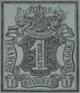
Spud Papers – Oldenburg
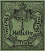
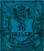
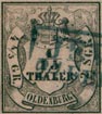
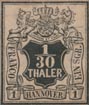
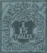
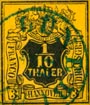
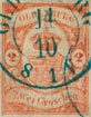
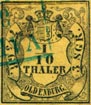 1851. Black on Colour, 1/3 S.GR., 1/30, 1/15 & 1/10 Thaler.
Genuine
The stamps of the first issue have the appearance of being engraved on stone, but I am not sure whether they are engraved or not. The design varies slightly for each value. In the 1/3 S.GR., the cross on the top of the crown is partially obliterated by the inner boundary line, which cuts right across it. The mantle is knotted up without tassels, and there are 19 tails on the ermine. The bottom of the shield breaks into the scroll, exactly above the centre of N in OLDENBURG.
In the 1/30 Thaler (as well as in the 1/15 and 1/10), the cross does not go near the outer line. The cord which knots up the corners of the mantle, shows two tassels on each side. There are twelve tails on the ermine. The bottom of shield touches the scroll over first stroke of N.
In the 1/15 Thaler, the shield barely touches the scroll below it. In the 1/10 Thaler, the cords and tassels on the right-hand side are very thick and clumsy. There are eighteen or nineteen tails on the ermine (these are difficult to make out). The point of shield does not touch the scroll at all. There is a stop after OLDENBURG.
The colours are as follows:
- 1/3 S.GR. Dull yellow-green
- 1/30 Thaler. Dull dark blue
- 1/15 Thaler. Dull pink
- 1/10 Thaler. Bright yellow
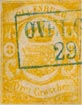
Forgeries
These are all from the design of the 1/10 Thaler; so I will describe the various points in which they differ from that stamp. The cross on the crown is inclined a little to the left, as though it had had a blow which had bent it. In the genuine, the cross is perfectly upright. There are about sixteen tails on the ermine, but they are very indistinct. Copying the genuine 1/10 all the values in the forgeries have a stop after OLDENBURG, which stop is only found in the of the originals. The horizontal lines of shading behind the shield come up, in the forgeries, as high as the center of the crown, whereas, in the genuine 1/10 they reach only as high as the tassels on the mantle. The blank parts of the scroll, between the words of value and the name, are cross-shaded in the forgeries; but in the genuine, the lines of shading are all parallel with the boundary-lines of the scroll, without any crossshading.
The colours are as follows:
- 1/3 S.GR. Blue-green
- 1/30 Thaler. Pale chalky blue
- 1/15 Thaler. Violet-pink
- 1/10 Thaler. Bright yellow

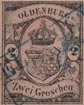
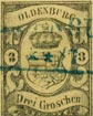 1858. Black on Colour. 1/3, 1, 2 & 3 Groschen.
Genuine
The two scrolls, with name and value, are shaded for nearly their whole length. The orb, surmounted by a cross, at the top of the crown, stands well out from the crown. The lion, in the base of the shield has no visible features, and his crown barely touches his head. All four of his legs are perfectly distinct, and so is his tail. The shield does not touch the boundary line of the oval containing it in any part. The right-hand little oval, containing figure of value, just touches both the central oval and the frame.
Forgeries
Scarcely any shading on the scrolls. The crown looks as though its last wearer had been “bonneted”, so that the orb is pressed down and buried half-way in the top of the crown. The lion has a large dot in the very center of his countenance, by way of features. Only three of his legs are visible; his crown is very small, and appears to be almost buried in his hair. There is a shapeless lump upon his hind-quarters, which does duty for a tail. The base point of the shield almost touches the containing oval, and the sides of the shield are also very close to the said oval. The colours are all brighter than in the originals. Both the little ovals (which, by the way, are more like circles) are at some distance from the central oval and the sides.
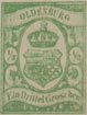
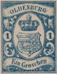
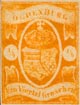
 1860. Lithographed colour on White. 1/3, 1, 2 & 3 Groschen.
Genuine
The stamps of this issue are very ordinary lithographs, but, fortunately for us, the imitations are more ordinary still. The designs differ for each value, and the two new fractional values (1/4 and 1/2 GR.) are very different from the others. The stamps, value 1/3, 1, 2, and 3 Groschen, are exactly the same in design as those of the last issue just described (except, of course, that they are printed in colour on white, instead of in black on colour), and the description of the stamps of the 1858 issue, with this exception, will serve equally well for this issue. The two new values, 1/4 and 1/2 GR., have the center oval coloured instead of white. A single thick white line defines the oval, and the crown is very much larger than in the other values.
Forgeries of the 1, 2, and 3 groschen. Exactly the same as forgeries of the last issue, except that they are printed in colour on white.
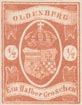 1/4 and 1/2 Groschen.
Genuine
These I will describe separately, to avoid confusion. The shading on the scrolls is rather coarse. The last complete lines of shading on the upper scroll pass between the o and L of OLDENBURG on one side, and between the R and G on the other. In the lower scroll, only about one-fifth is shaded on either side. The left outer arch of the crown is ornamented with eight pearls, the right-hand outer arch has ten, and there are no pearls along the other three arches, except three transverse ones at the base of each arch, upon which the arches rest. The lion is very indistinct, and appears to possess only three legs, but those three are of the proper length.
Forgeries
The shading on the scrolls is very coarse, and the lines are absurdly far apart. The whole of the upper scroll is covered with shading, except the N of OLDENBURG, and the lower scroll is also covered with lines, with the exception of about one-sixth in the center. There are seven pearls on each of the outer arches of the crown; the ce ntrearch is badly drawn, and the other two have pearls instead of jewels. The poor lion has been fearfully maltreated by the artist, and only the stumps of his legs are left.
From “The Spud Papers” by Atless, Pemberton & Earée, 1871-1881.