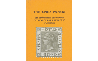
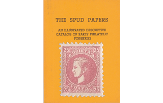
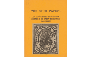
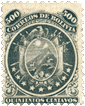
Spud Papers – Lübeck

1859, First Issue.

Each value of the genuine is from a separate die; but one matrix has been made to do duty for the set of forgeries. The colours of the latter, with the exception of the 1 Schilling, approximate pretty closely to the originals.
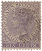
Spud_Lubeck11/2 Schilling.

Genuine

Eagle’s right beak does not go against the wing. The bird does not touch the label in any place. There is no period after SCHILLING. The lines by which the figures are divided are very fine, and the figures themselves are small.

Forged

The right beak of the hermaphroditic eagle touches the wing. The three upper segments of the left wing nearly touch the riband, and the fourth quite touches it. There is a period after SCHILLING. All the lines dividing- the fractional figures are very bold, and the numerals themselves are large.
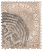
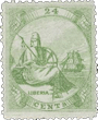
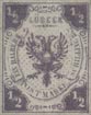
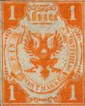
Spud_Lubeck21 Schilling.

 Genuine

Eagle very much like the one upon the genuine 1/2 Schilling, but the right-hand head is more flattened, and consequently shapeless, EIN is in letters of the same size as those used in the words following it.

Forged

Eagle as in the 1/2 Schilling. EIN in much larger letters than the remainder of the inscription. The figure I, in upper left-hand angle, has no bottom stroke.
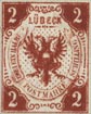
Spud_Lubeck32 Schilling.

Genuine

Eagle’s left beak touches the wing, and the right one nearly so; there are no dots between the heads and wings. Over the u a diaeresis of very small solid dots.

Forged

Similar eagle to the last, G in SCHILLING smaller than its companion letters. Between each of the eagles’ heads and wings are dots. The diaeresis over U in LUBECK is composed of small circles. The second dot on the first row of the dotted ground is considerably above the level of the others.
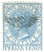
Spud_Lubeck42 1/2 Schilling.

Genuine

Eagle’s left claw is at some little distance from the inscribed riband. No full-stop after any of the words. All the fractional figures are very small, and the strokes dividing them nearly indistinct. The top-most of the three dashes under the upright stroke upon the left hand is merely a dot.

Forged

Eagles as before, both claws touching the label. A period after both SCHILLING and POSTMARKS. The tail of the 2 in the upper left- hand angle almost touches the white line of frame. Figures altogether stand out boldly. The three horizontal strokes under the perpendicular line on the left side are nearly of one length.
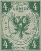
Spud_Lubeck54 Schilling.

Genuine

The third segment of eagle’s right wing touches the riband. There are either four or five dots (but only three are clearly formed) in the hollow between the beak and wing, and those not together, but dispersed, P in POSTMARKE almost touches the fold of the band.

Forged

Eagle as in the other values. Three dots one above another just at the bend of the right neck. The right wing is at some little distance from the riband. There is room for the insertion of another letter between the line representing the fold of the riband and the p of POSTMARKE.

Spud_Lubeck61864, 1 1/4 Schilling.

In addition to the values described in our last paper, the great Hamburg facsimile firm are the makers of a very passable imitation of the 1 1/4 Schilling.


Genuine

There are two dots between the necks of the eagle, and the tail touches the frame. The lower portion of the B is wretchedly done.

Forged

Between the necks of the eagle is a single dot; the tail of the bird is at some distance from the bottom of the oval, and the B of LÜBECK is well-shaped. The forgery is usually on bluish paper; the original always on white.


From “The Spud Papers” by Atless, Pemberton & Earée, 1871-1881.

Spud Papers – British Virgin Islands

Spud_Virgin_Islands1One Penny.

Genuine

Groundwork of oval is finely-engraved; the lamp-cords are barely discernible; and the letters in the lower inscription are considerably less in depth than the label containing them.

Forged

The lines composing the groundwork of the central oval are uneven and far apart. The cords, from which, the lamps are suspended, are very distinct. There is only a slight space above and below ONE PENNY.

Four Pence.

Genuine

The dots surrounding the lettering are small and rather indistinct. The pattern of the ground is finely and evenly engraved, and resembles chain-armour. The stars are small and separate, and the head of the virgin is clear and expressive. The devices in the angles are both of one size and design.

Forged

The dots above, below, and between the several words forming the inscription, are a great deal too prominent. The mosaic pattern of the groundwork consists of little ringlets in coarse squares,

comparatively speaking, far apart and irregular. The stars surrounding the head are ” blotchy,” and almost run into each other, in a way that quite sets the planetary system at defiance. The head itself gives one the idea of a gentleman suffering the miseries of tic-douloureux, with his face bandaged up. The ornament in the left-hand corner is smaller than the one on the right, and of a slightly different pattern.

Spud_Virgin_Islands3Sin Pence.

Genuine

The centre has a very fine, but still distinct groundwork of wavy lines. None of the lamps touch the border on the right side. The nimbus is at some distance from the border, and the foot barely touches it.

Forged

This is the worst forgery of the quartet, the execution being simply wretched. The groundwork of the stamp is almost white, from the lines being so indistinct. The lamps are much too plainly drawn ; three of those on the right side touching the border. The nimbus touches the upper border line, and the foot of the virgin the lower, G in the inscription is almost an o.

Spud_Virgin_Islands4One Shilling.

We have not seen any forgeries with the broad border, but only with single-lined frames.

Genuine

There are no spaces in the positions upon which they are found in the forged; but there are rays extending from behind the figure underneath the sleeves, more prominent upon the right side than on the left. The eight stars can be distinctly counted.

Forged

There is a white space extending from the right shoulder of the virgin to just below the sleeve of her tunic, and a similar space below the sleeve on the left side. The stars are mixed in one chaotic semicircle.


From “The Spud Papers” by Atless, Pemberton & Earée, 1871-1881.

Spud Papers – Turkey

Spud_Turkey11863, Crescent and Sign-Manual, 20 Paras.

Genuine

Between the crescent and ornament in the left-hand corner, there is considerable space, and the center of the Sultan’s signature is solid. The upper parts of both the bottom devices are pretty much alike, the great difference being that the one upon the right-hand is more pointed and bolder than its companion. Value is contained in a design having a likeness to a heart; the dot following the Arabic 2 is placed just under the top stroke of that figure.

Forged

The crescent upon the left side almost touches the corner ornament. The center of the sign-manual has an ill shaped dot within a small blank space. The top of the device in the left-hand lower corner is formed like a double tooth, the right fang almost touching the crescent, whilst the top of the right-hand pattern somewhat resembles an acorn placed sideways. The space containing the figures of value is egg-shaped, the line being unbroken. The numerals are placed in the position here indicated.

Spud_Turkey21 Piastre.

Genuine

The right side of the crescent tapers to a fine point. The stem of the leaf-ornament on the left touches the crescent, but they are divided by a narrow space upon the right. The second Arabic character touches the top of the crescent, but not the bottom; the figure of value does not extend quite to the bottom of the oval.

Forged

The crescent has a jagged point upon the right side. There is no space between the crescent and the stem of either of the leaf-like devices beneath it. The bottom of the second Arabic letter (reading from the right) touches the line of the crescent at its base. The figure reaches from the top to the bottom of the oval containing it.

Spud_Turkey32 Piastres.

Genuine

The crescent is engraved evenly, but if anything, the right point is the longest. Both-the leaves are at some distance from the frame; which, last, has but twenty-one circles at foot. The numeral is properly formed.

Forged

The left point of the crescent extends higher than the right. The leaf-ornament under the crescent upon the left side touches the frame, that upon the right almost, but does not quite touch it. There are twenty-four circlets composing the bottom of the frame. Numeral is straight at the top.

Spud_Turkey45 piastres.

Genuine

There is a space between both of the corner ornaments and the crescent. The stroke below the circle holding value, touches the border. There is a plainly drawn diamond, containing a dot, at the left-hand upper angle of the frame; and there is a badly-shaped one at the opposite side, but the lower corners do not show any. Numeral thick throughout.

Forged

The crescent is brought at both ends to an extremely fine point; that upon the left runs into the corner ornaments, and that upon the right very nearly does so. The little semicircular stroke under the disc holding numeral, does not touch the border. There are boldly engraved diamonds at each angle of the frame. The o is very thin at each side of the central space.

Spud_Turkey51876. 5 Piastres, Red and Blue.

Genuine

Lithographed in two colors, on very thin white wove paper, perf. 13 1/2. The groundwork of the whole stamp is of a pale blue, with Turkish letters and figures upon it in white. The curved head of the 5 points up towards the ornament above PIASTRES; and the right-hand end of the said ornament points upwards towards the M of OTTOMAN. None of the letters of the word PIASTRES touch each other, and the last S of that word leans over considerably to the right. Two of the lines of the design meet in a point exactly over the middle of the second O of OTTOMAN, and the corresponding lines on the other side of the stamp end almost over the colon after EMP. But the easiest test is made by the round ornaments in the crescent. The largest of these on each side consists of two concentric circles. The second on each side is a circle with a dot in the center of it, the third on each side is a simple circle, and the fourth on each side is a dark dot, which does not touch the outline of the crescent on either side.

Forged

Lithographed in two colors, on tolerably thick wove paper, very much thicker than the genuine. Pin-pricked 12 1/2. The groundwork of the whole stamp is of a very pale green, the white letters and figures being very faint indeed. The head of the 5 is almost straight, and points directly backwards. The right-hand end of the curly ornament above the word PIASTRES points towards the A of OTTOMAN. The letters IA of PIASTRES touch each other at the bottom, and the last
S is perfectly upright. The point where the two lines of the design meet on the right-hand side of the stamp is above the second T of OTTOMAN; and the corresponding point, on the left-hand side of the stamp extends almost far enough to be over the first O of OTTOMAN. The circular ornaments in the crescents are as follows, each side being exactly like the other. The largest one is a circle, with a colored dot in the center, and a very tiny white dot in the center of that. The second is a very badly-shaped circle, with a dot in the center. The third is a circle. The fourth is a dot, but it touches the outline of the crescent.

Postmarks

The genuine are postmarked with a double-lined ellipse, containing eight parallel lines, with a space in the center containing some characters; the whole struck in blue. The forged postmark is very similar, only the central space is diminished almost to nothing, and there are no letters or figures in it.

This forgery is not at all bad; and owing to the complicated nature of the design, it is very difficult to describe: but I hope the tests I have here given will prove sufficient for its detection.

Spud_Turkey61876. 5 Piastres, Unpaid, Surcharged with Value in French.

Genuine

The blue groundwork is lithographed, but the Turkish and French surcharges are typographed. Printed on very thin white wove paper, machine perforated 13 1/2. Each of the corner numerals is like an 0, laid on its side; the frames of white lines round these numerals are octagons. There are 48 pearls round the central oval. The inner concave part of the crescent is outlined by two white lines. The rays from the star are very evenly distributed, and do not run together into a white blotch at all. The lower rays almost entirely fill up the hollow part of the crescent. Most of the upper rays nearly touch the outline of the oval. The colour is a sort of sky-blue, and the postmark is a blue oval gridiron.

Forged

The whole of the design is lithographed, surcharges as well. It is printed on thick, soft, white wove paper, and pin-pricked 13. Each of the numerals in the corners is like an 0 placed obliquely, instead of lying on its side. The frames round these numerals are circular, and this will be found a very easy test for these counterfeits. There are only 43 pearls round the central oval. The inner concave part of the crescent is outlined with only one line. The rays from the star are very blotchy, and all
run into one mass of white just outside the star. The lower rays do not anything like fill up the hollow part of the crescent. None of the upper rays go near the outline of the top of the oval. The colour is a very pale, chalky, greenish blue; and the postmark is like the genuine.


From “The Spud Papers” by Atless, Pemberton & Earée, 1871-1881.

Spud Papers – Straits Settlements

The same head and inscribed circle has been adopted for the six lowest values of the genuine stamps, but each value has a different design in the angles. The 32 c. and 96 c. are also alike, with the exception of the corner devices.

The originals are engraved in De La Rue’s best style, but the forgeries are coarse, and heavy-looking.


Spud_StraitsSettlements10Two Cents.

Genuine

The face is lined throughout, and there is only a very little space at the bottom of the neck. The throat is rounded naturally.

Forged

The details of the genuine have been very carefully copied; so much so, in fact, that it is very difficult to describe the differences between it and the forged. In the latter, the lines do not extend right across the face, there being a space left between the eye and chin; this last slants into the throat, giving the Queen a “bull-necked” expression. There is a well-defined space at the back lower portion of the neck.

Spud_StraitsSettlements11Spud_StraitsSettlements12Spud_StraitsSettlements13Spud_StraitsSettlements14Spud_StraitsSettlements154, 6, 8, 12, 24 Cents.

Genuine

Each stamp has a device in the corners differing from that upon the forged 6 cents here shown.

Forged

These are detected with the greatest ease, all the dies being from one matrix, the denomination of value alone being altered. All the angles therefore contain an imitation of the one used in the genuine two cents.

Spud_StraitsSettlements1732 Cents.

Genuine

The corner designs are finely done, and are composed of four figures resembling fleurs-de-lis, diverging in contrary directions from a very small diamond. There is a white line above the linear ground, and its companion line at foot tapers slightly towards the right.

Forged

The ornaments in the angles are very coarsely engraved, and are thick and ill-shaped. There is no noticeable space between the line under POSTAGE, and those forming the groundwork. The bottom stroke of the A in POSTAGE runs into the G.

Spud_StraitsSettlements1896 Cents.

Genuine

The angles contain a device composed of a pair of crossed links; the remainder of the design is exactly like the previously-named value. The genuine stamps are always upon paper watermarked c.c. and crown, whereas the forgeries are devoid of watermark.

Forged

The angles being the same as in the 32 cents, no further description is necessary.


From “The Spud Papers” by Atless, Pemberton & Earée, 1871-1881.


Spud Papers – Serbia

Spud_Serbia10Spud_Serbia11 Spud_Serbia121866. 1 ,2 , 10, 20 & 40 Paras.

Genuine

Engraved (?) in colour on white wove paper. There are 77 pearls round the head of the Prince. In the central circle there are 16 white lines on the right of the head, and 19 on the left, counting in both cases, from the bottom of the circle beneath the neck. There are 49 wavy lines above the value label. The hair is short, and rather curly. The nose is well shaped, and of a Grecian character. The p of POSHTA has a well-marked bar across the top, and so has the P of PARA, in most copies.

Forged

Lithograped, on thick, soft white wove paper. There are only 59 pearls round the head. In the central circle there are 16 white lines on the right, and 17 on the left, counting from the
bottom. There are 42 wavy lines above the value label. The hair and beard are cropped as closely as though the illustrious Michael III. had just returned from an enforced sojourn in Newgate. The nose is snub, and vulgar looking. The P of POSHTA has no bar across the top, and looks like two capital I’s placed side by side. The P of PARA has no bar across the top either. The reader will understand that all these stamps are from the same matrix,
differing only in the figures of value; and this is true of both genuine and forged. The figures of value themselves differ considerably in the genuine and the counterfeits, but I have not judged it necessary to point out the differences, because the tests already given are amply sufficient. I may say, however, that in the genuine, the figure beneath the head is generally the largest in all the values; but in the forgeries, the four corner figures are usually larger than the one beneath the head. The forgeries are all imperforate, whilst the originals are found with small or large perforation; and in the case of the I and 2 paras, imperforate as well. The genuine stamps are postmarked either with a circular date-stamp, or a straight line of large capitals. The forgeries are obliterated with a large square of dots.

The inscription, in English letters, runs K. SRESKA POSHTA, which means, I believe, “Royal Servian Postage”. I must confess, however, to knowing little of the Sclavonic dialects beside the mere alphabet, so I will not vouch for the correctness of my translation.

Upon the same principle that we may admire the escapades of Jack Sheppard, or the daring robberies of Dick Turpin, we must accord praise to the forger of the current Servian, for the details of the archetype have been so closely copied as to render the differences between it and the facsimile more easily explainable by comparison than description.

Spud_Serbia1Spud_Serbia2Spud_Serbia31869. 1, 10, 15, 25, 35, 40 and 50 Para.


Spud_Serbia4Spud_Serbia5Spud_Serbia6Spud_Serbia7

In the genuine, the inscriptions are bold and stand out well. The first letter in the upper band has a thick top stroke extending beyond both uprights; in the forged, the connecting- line is very thin, in some cases quite absent. The third letter in the original consists of three upright strokes at equal distances apart, joined at the base by a horizontal line, which extends slightly beyond each of the two outside up-strokes. This letter in the forgery is a miserable abortion, the first upright slanting away from the others; the stroke joining these perpendicular lines is very thin, and in many specimens the first stroke stands by itself, without any connection with the remainder of the letter. The bottom line does not extend from beneath the third upright. The T and A are without foot-lines in the impositions; in the genuine, they have them.

The same idiotic expression, for which the originals are so well-known, has been reproduced with tolerable exactness upon the forged; only that upon the latter, the Prince has been made to look as if he had received a first-class flogging, and had not quite recovered the effects of it.


From “The Spud Papers” by Atless, Pemberton & Earée, 1871-1881.

Spud Papers – Romania

First Type. Head to right.

Only one die was engraved for the genuine 2 Parale; and the only differences discernible in the 5 Parale, are in the size and position of the figures in angles. Two dies are found of the highest value; the variations are but slight, and only noticeable by comparison. In one die the inscription might be read as PRANCO, which is due to one of the dots in the lattice-work ground coming between the two “fangs” of the F. We may as well state in this place, that the colour of the forgeries is no guide to their detection, as they are printed in numerous shades.

Spud_Romania12 Parale

Genuine

Inscription DOUA PARALE is easily readable. In the portrait the hair is very close to the oval. The final letter of FRANCO is rather smaller than the others, but well shaped.

Forged

The inscription above is very indistinct, and reads more like BODAPIOME than anything else. The head is much too small; the o in FRANCO is flat-bottomed.


Spud_Romania25 Parale

Genuine

The inscriptions are well defined, and all the figures are well matched, upright, and evenly formed.

Forged

All the lettering is badly formed, and the lattice-work ground is too strongly marked. Three out of the four 5’s look as if they had been sat upon,—they are so flattened. There is a little white speck (not found in the genuine) at the extremity of the hair upon the forehead.


Spud_Romania320 Parale

Genuine

The figures are pretty much of one size. The 2 in the top left-hand square touches the frame. The inscription DOUA DECI PAR. is moderately distinct; so much so, that it can be read. The expression of the face is sensible, and the nose is pointed.

Forged

This is an extra good facsimile, but the prominent failing is in the figures of value, all being too large and tall. The top of the 2 in the left-hand upper corner almost touches the frame. The upper inscription is not decipherable, and the head of the sovereign is narrow and elongated, the face having the “sheepish” expression which is common to all three values.


Second Type. 1866. Head to left, coloured paper.

The same head was used for the trio, but the number of pearls surrounding the disc varied in each value. There are also other minor differences, and of the highest value there are two dies.

Spud_Romania4 Spud_Romania52 and 5 Par.

Genuine

The head is evenly fixed in the circle. The Grecian pattern is thin and pretty even throughout. At the top of the left-hand lower device there is a very short stroke, considerably less in length than the bottom horizontal line of the said pattern.

Forged

These two values are from one matrix. The head is not placed in an upright position, but slants towards the left. The Grecian pattern in the border on the right-hand side is thicker than on the left, and is also coarse and heavy-looking. The bordering in the left-hand lower portion of the forgeries differs from the genuine in the following respects: that portion of the top of the design which runs towards the central disc, is almost as long as the similar line running parallel with it at the bottom.

Spud_Romania620 Par.

Genuine

Not badly engraved, with all the letters even and distinct. In one die the tail of the R in PAR is almost straight, in the other it slants towards the border. There are also marked differences in the position of the Grecian border.

Forged

Very coarsely executed in comparison with the lower values. The two A’S in ROMANA are much below the other letters. The Grecian pattern is of like character with the previously described shams.


Third Type. 1868-69. Head to left, white paper.

For each value of the genuine stamps two dies have been used. The discrepancies are not very apparent under a casual examination, but on closer inspection the differences will be plainly recognized. The framework is identical in all four values, and in each stamp upon every sheet, but the head in one die is at some little distance from the beaded circle, whilst in the other it comes very close to it,—but not touching. The lettering has evidently been added after the execution of the original matrix, as in one die the final letter of ROMANA is farther apart from the corner square than in its companion die. The figures also slightly vary. Some of the 2 bani have a small circular flaw under POSTA.

Spud_Romania7 Spud_Romania8 Spud_Romania9 Spud_Romania102, 3, 4 and 18 Bani.

Genuine

All the letters are tall and pointed. There is a dot over the 1 in value; not very perceptible on some copies, but still existing. The two border lines are so close together, that it would be impossible to place another line of the same thickness between them.

Forged

The facsimiles are all from one matrix, the figures only being afterwards added; so the description of the primary differences will apply equally to the quartet.

All the lettering is “flat” (i.e., not upright, and narrow). There is no dot over the 1 in BANI. The two thin perpendicular lines running up by the border upon each side are wide enough apart to admit of another line being ruled between them.


Fourth Type. 1869. “Posta Romana” at sides.

All the values are from one matrix. There is a leading point in the genuine, which is of course common to each value, and in which respect the facsimiles fail.

Upon the genuine the word POSTA is placed equally between the border and the oval, whereas in the forgery it is conspicuously nearer the former than the latter.

Spud_Romania1110 Bani.

Genuine

There is no mentionable foot-stroke to the final letter in BANI.

Forged

The 1 in Bani is the same below as at top.

Spud_Romania1215 Bani.

Genuine

CINCIS PREDECE is in thin upright letters, all of one form. There is a small semi-circle over and under PR.

Forged

Cincis is in thicker type than PRE DECE (printed as two words.) There is no break in the lines above and below the just-quoted inscription.

Spud_Romania1325 Bani.

Genuine

Lettering denoting value is thin and elongated; filling the band prepared for it. Above the C in DECI there is a slight break in the border, but no ” excrescence.”

Forged

The upper portion is composed of letters which leave a well- defined space between the lines enclosing them. Above and below the c in DECI is a small, but prominent wedge-shaped figure.

Spud_Romania1450 Bani.

Genuine

The denomination of value may easily be mistaken for a single word. The dot in lower line comes a little to the right of the final 1 in CINCI.

Forged

There is sufficient space between CINCI and DECI to leave no doubt as to their being separate words. There is a small dot (formed by the breaking of the line) between the last c and 1 below CINCI.

We have not yet seen any forgery of the 5 BANI of our fourth type, or of the PERIODICI impression; but if not already in the market, they probably soon will be.


From “The Spud Papers” by Atless, Pemberton & Earée, 1871-1881.


LupFor more information about the issues of 1865-1872, see —> Dan N. Dobrescu’s exhibition

For more information about the issues of 1872-1889, see —> Paul Hirsch’s exhibition

Spud Papers – Bolivia

Spud_Bolivia8Spud_Bolivia9Spud_Bolivia10Spud_Bolivia11Spud_Bolivia121868. 5, 10, 50, 100 & 500 Centavos

The quintet comprising the present issue are from one matrix; the forgeries are produced upon the same economical principle. With the exception that the impostures are coarsely lithographed, and the originals finely engraved, it is really a matter of some slight difficulty to describe the salient points of difference between the two.

Genuine

The lower banner-heads on the right- hand upper portion of the stamp reach to the extremity of the circle. The spear-heads above the top star upon each side are shapeless strokes. The lines in the central oval are very close together, and altogether the stamps have a finished look.

Forged

None of the banner-staffs on the right-hand side extend to the edge of the central disc. The staff-point above the uppermost star on the left of the stamp is well formed, and is forked to resemble a spear. The horizontal lines in the central design are coarse and far apart, and the Noah’s-ark looking sheep (if it is a sheep) is an object for commiseration.


From “The Spud Papers” by Atless, Pemberton & Earée, 1871-1881.


LupFor more information about the classical issues of Bolivia, see —> Carlos Royuela’s exhibition

See also –> Album Weeds – Bolivia

Spud Papers – Liberia

The genuine Liberian stamps are quite gems in their way, and it has therefore always been a matter of difficulty to produce successful imitations of these labels. By far the best facsimiles have emanated from the establishment of Messrs. Spiro; those by other persons being simply execrable.

In the originals, a separate die was engraved for each value, showing visible differences in the pattern of the groundwork. From the various states of the die, we find that, in some copies, the clouds are very clearly defined; whereas, in others, they are scarcely traceable: this is particularly noticeable in the stamps of the lowest value.

The forgeries are evidently from one matrix, and are struck off in sheets of twenty-five. They are always defaced by a circle inscribed MONROWA LIBERIA. All those we have seen have had perforations, differing but slightly in gauge from the genuine.

Spud_Liberia1Six Cents

Genuine

Wavy perpendicular lines compose the ground. There is no flag discernible upon the ship; and there is a considerable distance between the semi-circular piece of shading below the figure, and the inscription.

Forged

The groundwork is composed of diagonal lines caused in this and the two other values, by the face and shoulder of the central figure, is absurd; the latter being quite out of proportion. There is a flag pendant from the ship. Between the shading upon the stone and the word LIBERIA, there is scarcely any space.

Spud_Liberia2Twelve Cents

Genuine

Groundwork of undulating diagonal lines, so finely-executed as to give the angles of the stamp a solid look. A single thick line round the shield; the spearhead is well shaped, and the point does not touch the border of the circle. Altogether an elegant stamp.

Forged

Ground as in the previously described imposition. The rim of the shield consists of double lines; the point of the spear almost diamond-shaped and running into the circular border. The engraver does not seem to have troubled himself about the clouds, as there are none worth naming.

Spud_Liberia3Twenty-Four Cents

Genuine

A similar ground to the genuine six cents. In the figures of value, the 4 has a bottom stroke. Very little shading beneath the goddess, so that there is a wide space between it and the inscription. * It may be further remarked that the rock on which Liberia sits, is perpendicularly straight in the genuine red and green impressions , while the blue has it rounded off like the forged red shown on previous page.

Forged

The same horizontal ground as in its companion labels. The 4 in the value is ill shaped and without any stroke below. The shading beneath the figure almost touches the B in LIBERIA, CENTS is much too large and thick.


From “The Spud Papers” by Atless, Pemberton & Earée, 1871-1881.