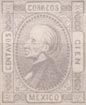
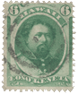
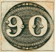
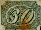
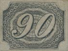
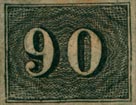
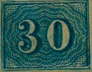
 1843. 90 Reis, Black.
Genuine
Finely engraved, in taille-douce, on yellowish or bluish white wove paper; imperf. The background is composed of an engine-turned design, the white lines of which are very fine, and the black parts, between the intersections of the white lines, of almost microscopic minuteness. The figures of value seem to be, as it were, laid upon the design of the background. Following the curves of the figures, there is a very light black outline outside the shaded parts of each; and the engine-turning of the background can be seen between the outlines and the figures.
Forged
Very coarsely lithographed, on yellowish white wove paper; imperf. The imitation of the engine-turning in the background is poor, all the white lines being very irregular, and of all thicknesses; and the black parts between the intersections of the white lines are very large. The figures of value do not stand well out from the background, although they seem much whiter than in the genuine stamps. There is a coarse outline following the shaded parts of each figure, and the spaces between figure and outline are perfectly white, with no trace of the engine-turning. Immediately inside the inmost line of the ornamental frame there is a sort of chain-pattern running right round the stamp, which is not to be seen in the originals; and inside this again, behind the figures, are three concentric ovals of double black lines, which are intended to represent the darker parts of the engine-turning in the originals.
The forgeries are postmarked RIO DE JANEIRO in large capitals, in a large double circle. A very similar postmark is often to be found on the genuine. I think I have said enough to show that these vermin are not likely to be at all dangerous.
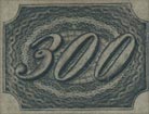
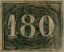
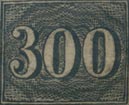
Italic Figures: 10, 30, 60, 90, 180, 300 and 600 Reis.

Genuine
Wove paper, very well made, and strongly resembling in texture the paper of our own halfpenny newspaper wrappers. The paper is a little thicker than that of the forgeries, but is very soft. The colour affords no great assistance in distinguishing the genuine stamps, because there are two sets, one on white paper, and the other on what is commonly called grey, but which seems to us to be a very pale yellowish brown. The background of the design is formed of fine engine-turned white lines, making what appears to be, on close inspection, a kind of lace-work pattern.
Forged
Thin, irregularly made, white wove paper; groundwork of design composed of dots; figures of value very coarse, and only partially outlined in some of the values. The dotted groundwork of the forgeries will always afford instant means for their detection, so that it is scarcely necessary to take each stamp and describe it; but there are many points of difference in the numerals. For instance, in the forged 10 Reis, the figure I is very blunt at the top and bottom; whereas, in the original, both are sharply pointed. The same holds good with the 180 Reis. In the 300 Reis, the center loop of the 3 is unfinished, instead of being carried round to touch the outline of the lower limb, as in the genuine.
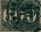
Roman Figures: 10, 20, 30, 60, 90, 180, 300 and 600 Reis.
Genuine
The paper is the same as that of the italic set, but the groundwork of the design is different. Like the other, however, it is composed of engine-turned white lines. We have not seen any forgeries of the 280 R. vermilion, and the 430 R. orange.
Forged
The paper of these forgeries is not always the same; for we have seen the 10 and 20 Reis on laid. Usually, however, they are on paper similar to the forgeries of the italic set. Sometimes they are printed very faintly, so as to appear grey, instead of black; but the majority are very dark and “smudgy”. The crucial test for these, as for the other set, is that the background is of dots, instead of lines. The right hand side of the foot of the figure in the 10 R., projects beyond the thick-shaded downstroke; whereas, in the genuine, the foot does not even touch the outer line. The top half of the 3 in the 30 R. is larger than the bottom; but in the genuine, the lower limb is the larger of the two. The center of the 6 in the 60 R. is a kidney-shaped blotch, instead of being a shaded oval. The tail of the 9 in the 90 R. is very thick where the final loop commences; and in the genuine, the part of the tail nearest the final loop is the thinnest part of the whole figure. The 8 in the 180 R. is very much taller than the figures on each side of it; in the genuine, all three are the same height. In the 300 R., the lower limb of the 3 is rather below the other two figures; and in the genuine, it is the upper limb which projects slightly above the other two. The same may be said of the 6 in the 600 R.
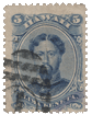
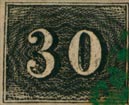
 Blue 10 and 30 Reis.
Genuine
Paper as before; groundwork of engine-turned white lines; colour, shades of prussian-blue. And now a word as to postmarks. We generally find that the obliteration on the genuine stamps are so very much blotched, that it is next to impossible to make out their form. The stamps of the italic set are very often obliterated in red. The most common obliteration (and which is even now in use) is a number of V’s arranged point to point in the form of a circle.
Forgeries
The paper is similar to that of the other forgeries; the colours are in shades of ultramarine; the ground-work is composed of blue dots and scratches.
The forgeries are almost all obliterated with 18 thick oblique bars, forming a large oval; but we have seen one or two cancelled with a date-stamp very like one of our own, containing some unreadable letters and figures.
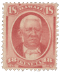
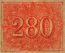 280 Reis.
Genuine
Engraved in taille-douce, on thin wove grayish paper. In almost all copies, the ink stands out much above the surface of the paper, and is, in some parts, very thick. The wavy outline of the engine-turned central oval touches the outer line in four places; at the left of the 2, above and below the 8, and at the right of the 0. The centers of the 8 and the 0 are heavily shaded. In the right and left hand bottom corners, there are fourteen horizontal lines, besides the boundary line. The colour is a deep vermilion, rather dull.
Forged
Lithographed. The paper is a trifle thinner than the genuine, and is rather whiter. The stamp itself is very poorly done, and instead of the fine engine-turning, there is a sort of oval chain- pattern round the central figures; the rest of the oval being filled in with wavy lines. There is no thickness of ink. The chain-pattern outline does not touch the top of the frame; but, to make up for this, two of the scallops touch the frame at the bottom, under the 8. The centers of the 8 and of the 0 are very lightly shaded. In the right-hand bottom corner there are only twelve horizontal lines, but on the left we find eleven or twelve, because the twelfth is not very conspicuous. It is printed a pale, washy orange, vermilion in the eyes of Messrs. Spiro.
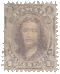
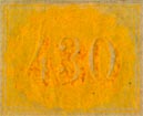 430 Reis.
Genuine
Engraved in taille-douce, like the 280 Reis. The wavy outline of the engine-turning only touches the border in three places; viz., the top, bottom, and left-hand. There are sixteen horizontal lines in the right bottom corner, and fifteen on the left. The engine-turning is (as in the 280 Reis) equally dark almost all over. The colour is lemon.
These forgeries are cancelled in two different ways; the first is a set of four concentric circles, as in the old Baden stamps; and the other is somewhat like the British Guiana cancel-stamps, without the numerals. The forgeries, as I have received them, are in double sheets; each sheet containing two blocks of 25 stamps, 5 x 5 . They are ungummed.
1867. 300 Reis, Envelope.
Genuine
Embossed on laid paper, with the lines running obliquely. The head stands out very much from the paper, but the lettering is not very much embossed. The 3 of “300” on each side of the head, does not go too near the side-boundary of the label. A straight-edge, laid along the center of
the first stroke of the B in BRAZIL, will cut into the E of REIS.
Forged
Embossed on plain wove paper. The head is not very highly embossed, but the lettering is all in high relief. The 3 of each “300” is almost jammed up against the side-boundary of containing label. A straight-edge, laid along the center of the first stroke of the B in BRAZIL, cuts through the 1 of REIS. There is a little white dot between the E and I of REIS; and another between the N and T of TREZENTOS, not quite so plain. The hair looks tumbled on the top of the Emperor’s head; whereas it is perfectly tidy in the genuine. I think the above tests will be found sufficient.
From “The Spud Papers” by Atless, Pemberton & Earée, 1871-1881.
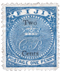
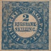
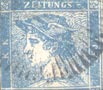
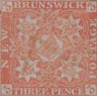
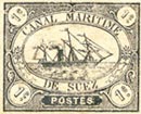
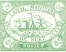
 See also:
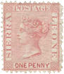
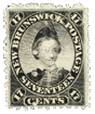
 April, l866. 17 Soldi, Vermilion, perf. 9 1/2.
 1866.—10 Soldi, Mauve, perf. 9 1/2.