Album Weeds – Bremen

Album_Weeds_Bremen1 Album_Weeds_Bremen2
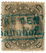
1863 & 1866. 2 Grote. Red, orange.

Genuine

Lithographed, on thin, porous, soft, white wove paper, perqe en scie, or machine-perforated 13, according to the date of issue. The quatrefoil, punched out of the center of the handle of the key, is dark. The point of the key does not touch the outline of the oval containing it. The central oval is surrounded by 24 rays of white, in the shape of sugar-loaves, each having a dark spot at its point, making the sugar-loaves appear to be split or cleft at the end. The ornamental engine-turning of the oval which bears the inscription BREMEN, ZWEI GROTE, touches the inner line of the frame at the left side near AD of STADT, and almost touches at the right side, near the M of AMI. It does not touch at the top or the bottom. There is a large, shaded white stop after the word GROTE. The outer edge of this same engine-turned oval is scalloped; there are 48 scallops, all of equal size and shape, and easy to count. The letters, hyphens, and stop of the inscription STADT-POST-AMT., are each and all ornamented with a white outline round them, and the outlines of the various letters, etc., do not run into, or touch each other. The left-hand knob of the handle of the key touches the thirteenth vertical line of shading in the central oval, counting from the left. The knob, which is white, is quite distinct; but the lines require a microscope. The engraver’s “secret marks” are coloured dots. There is one of these dots in the middle of the head of the P of POST; one in the top hollow of the S, and another in the bottom hollow of the S of that word; one in the center of the bottom half of the A of AMT; two in the S of STADT, the same as in the S of POST, and one in the A of STADT, the same as in the A of AMT. The stop after AMT is very nearly square.

First Forgery

Very coarsely lithographed, in dark, reddish-orange or orange-brown, on thin, white wove paper, imperforated, or badly pin-perforated 13 x 12 1/2. The quatrefoil, punched out of the handle of the key, is white, with a dark outline. The point of the key touches the outline of the containing- oval. The said oval is surrounded by 19 white rays, in the form of pyramids, sharply pointed, of different sizes, and without the dark spots at their points. The border of the imitation engine-turning of the central design touches at the top, under POST, and also at the bottom, but not at either of the sides. This border is very irregular; the scallops are of various shapes and sizes, and quite uncountable. There is usually a dim blotch to be seen after GROTE; but it is not in the least like the square, shaded white stop of the genuine. The outlines of the letters, etc., of STADT-POST-AMT., all either touch or run into one another. The left-hand knob of the handle of the key touches the eighth vertical line of shading in the central oval, counting from the left. There is a dot in the lower half of the S of POST, but the other dots are absent. I do not think this forgery at all deceptive; though it is commonly to be found in small albums. It is coarsely done; whereas there is not a coarse line about the genuine.

Second Forgery

Lithographed, on rather hard, stout, shiny, white wove paper, the face of which is coloured a very pale lemon-yellow. The orange is more yellow than in the genuine; and the stamp is very nicely machine-perforated 12 1/2. The quatrefoil, punched out of the handle of the key, is dark, as in the genuine. The dark outline of the point of the key seems to almost touch the outline of the containing-oval. Only two out of the 24 sugar-loaf-shaped white rays round this central oval have their points cleft, i.e., one just to the left of the bottom, and one just to the right of the top. The rest are plain, and all of them are too broad. The two bottom rays are jammed very close together. The scalloped border of the inscribed oval does not touch the frame anywhere, though it is very near to it, just to the right of the A of STADT. There are 49 scallops round this oval, and they are not all of equal size; being very large to the right of the O of GROTE, and very small to the left of the B of BREMEN. There is not the faintest indication of a stop after GROTE. The outlines of the letters of STADT-POST-AMT., hardly touch or run into each other at all; though the letters AD of STADT are joined together at the bottom. The left-hand knob of the handle of the key is extremely indistinct, and quite dark; it seems to touch the twelfth vertical line in the oval; but the said lines are all so indistinct, being so very close together, that, even with the strongest power of my microscope, I have not been able to decide positively. This central oval appears to be the darkest part of the stamp, in consequence of the closeness of the vertical lines; but, in the genuine, the engine-turned oval, containing BREMEN ZWEI GROTE is the darkest portion. The A of STADT has a blotch in its top half, and a small dash in the bottom half, and the head of the P of POST has some indications of a dot in it; the rest of the secret marks are absent. The stop after AMT is a hyphen, in an oblong frame.

Third Forgery

Lithographed, on thin, rather soft, unsurfaced wove paper, perf. about 15 1/2 (my specimen is imperfect, and I cannot be sure of the gauge). The quatrefoil in the key is dark, like the genuine. The point of the key plainly touches the oval outside of it. The bases of the sugar-loaf-shaped rays do not all touch each other; indeed, there is an absurdly large space between the one which points to the A of STADT and its neighbor, which points to the D of that word. This is an easy test. The scalloped outline of the oval, containing BREMEN ZWEI GROTE, does not touch the frame outside it anywhere. This scalloped outline, in the genuine, is formed by interlacing crescents; but, in this forgery, many of them appear to be merely white triangles. The lettering of the inscription STADT POST AMT is a good deal too small, the dark part of the letters (not including the lines round them) being only i mm. high, instead of about 1 1/4 mm. The left-hand knob of the handle of the key touches the tenth vertical line of shading in the central oval, counting from the left. There is a coloured dot in the head of the S of STADT, but I cannot make out any others. The stop after AMT is circular, and placed very much to one side of the center of its (circular) frame.

Fourth Forgery

This is much the best, and might easily deceive. Very nicely lithographed, on thin, white wove paper, perf. 15 1/2, or on somewhat thicker paper, perf. 12 1/2. The point of the key seems to just touch the dark outline of the oval round it. The top sugar-loaf is not cleft, and the one to the right of the bottom one has only very slight indications of being split. The scalloped oval only touches the frame on the left side, where two scallops touch it, under the A of STADT. The left-hand knob of the handle of the key touches the eleventh vertical line of shading in the central oval, counting from the left. There is a coloured dot in the lower half of the A of STADT, but the other secret marks are absent. There is a coloured mark, like a flaw, at the top of the tail of the S of POST, outside the outline.

Postmarks

These are generally in black, but may occasionally be found in blue.

Genuine.—1, 29 (date in centre, VEGESACK at the bottom, between the circles, and a little key, between two parentheses, at the top, between the circles), 71. Also an oblong like 71, but with rounded corners.

Also BREMEN BAHNHOF in a sort of ellipse. Also the word FRANKO, in very large capitals, without frame. Also 5, with numerals 303 in centre. Also TT and date in a circle. Also BREMEN TH. & TX. I have mentioned here all the postmarks that I have heard of; but of course not all of them are to be found on the 2 Grote. I give them all together, to save repetition.

First Forgery.—71.

Second Forgery.—71. Also five parallel bars, thick, and close together.

Third Forgery.—71.

Fourth Forgery.—Uncancelled.

Album_Weeds_Bremen3 Album_Weeds_Bremen4 Album_Weeds_Bremen5
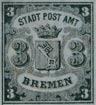
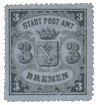
1855, 1863 & 1866-67. 3 Grote, black on blue.

This stamp was employed to frank letters between Bremen, Bremerhafen, and Vegesack. There are three types, which may be distinguished by the vertical lines in the oval ornament, below the first stroke of the M of BREMEN. Type I. has one vertical line in the oval, Type II. has two lines, and Type III. has three lines. The following is a fuller description of the differences between the three types.

Type I

There is a single vertical line in the oval, below the first stroke of the M of BREMEN, and the top of the oval is closed. There is a black dot above the crown, touching the very center of the top of the central trefoil. The middle jewel in the base of the crown is a pearl, not a diamond. The top of the key does not touch the top outline of the shield. There are 18 vertical lines in the shield, counting the thin, left-hand outline of the shield, but not the thick, right-hand outline, and most of these lines have been drawn very slightly too long, so that the ends of them can just be seen above the top outline of the shield. The last line to the right goes very close to the thick outline of the shield. The shaded bottom point of the shield is exactly centrally above a little round ornament, which has a black dot in it. The shield does not touch the outline of the ornamental frame of the left-hand 3.

Type II

There are two vertical lines in the oval, below the first stroke of the M of BREMEN, and the top of the oval is almost closed. The black dot, above the top of the central trefoil on the crown, is a little too much to the left. The middle jewel in the base of the crown is a pearl, but it is not quite so round as in Type I. The key just touches the center of the top outline of the shield. There are the same number of vertical lines in the shield as in Type I., but the last line to the right is further off from the right-hand outline. The ends of some of the lines can be seen above the top outline of the shield, as in Type I. The shaded, bottom point of the shield points far to the right of the center of the circular ornament below it. This ornament is considerably larger than in Type I., and has a small circle in its center, with a vertical line in it. The left side of the shield touches the ornamental frame of the left-hand 3.

Type III

There are three vertical lines in the oval below the first stroke of the M of BREMEN, and the top of the oval is widely open. The black dot, on the top of the central trefoil, is too much to the left.

The middle jewel on the base of the crown is an unmistakable diamond, and the one to left of it is a pearl, instead of a diamond. The one to right of it is also very nearly circular, instead of diamond-shaped. The top of the key, as in Type I., does not touch the top outline of the shield. There are 19 vertical lines in the shield, counting as before, and the nineteenth is exceedingly close to the thick, right-hand outline, so that, in heavily-printed copies, it will probably be invisible. None of these lines show above the top of the shield. The shaded, bottom point of the shield is exactly central above the circular ornament. The said ornament, by the way, in this third type, is more an upright oval than a true circle. It contains another oval, with a vertical line in its center. The shield does not touch the outline of the ornamental frame of the left-hand 3.

Genuine

Lithographed, on blue laid paper; the laid lines may be either horizontal or vertical, but I think the horizontal lines are much more usually to be met with than the vertical ones. The varieties of type and perforation are as already described. The tests now to be given are common to all three types, unless otherwise mentioned. The wards of the key are like two T’s, placed back to back. The three lobes of each of the trefoils on the crown are all of about equal size. The top of the T of AMT does not touch the M. There is a tiny circle, or pearl, in the horizontally-shaded part of the upper, and also of the lower limb of each large 3, i.e., two in each numeral. The left lower knob of the handle of the key touches the ninth vertical line of shading in the shield, counting the thin, left-hand outline.

First Forgery

I think this is meant for Type II., but it is a poor imitation. Badly lithographed, on medium, hard, bluish-lavender or neutral-tinted wove paper, unperforated, or pin-perf. 13. The wards of the key are like two E’S, placed back to back. The upper lobe of each trefoil is larger than the other two lobes. The top of the T of AMT is joined to the M. The two little circles, in the top and bottom of the body of each large 3, are absent. The left lower knob of the handle of the key comes between the tenth and eleventh of the vertical lines of shading in the shield, counting the thin, left-hand outline of the shield. The oval below the first stroke of the M of BREMEN appears to be widely open, and to contain two vertical lines, but I cannot be positive, as, in my only three specimens, the postmark happens to obscure this test in all. There is no black dot at the top of the central trefoil on the crown. The jewels on the base of the crown are all diamonds, and there seems to be a dot in the right-hand one. There are 21 vertical lines of shading in the shield, counting the left-hand outline, and the last line, each side, goes very close to the outline, thus differing from all three types of the genuine. The fourth line from the right has been drawn too long, and projects considerably above the top of the shield. The top of the key does not touch the center of the top of the shield. Four vertical lines of the background can be seen through the quatrefoil in the handle of the key. The shaded, lower point of the shield, and the circular ornament below it, are as in the genuine Type II. The left side of the shield does not touch the ornamental oval, round the large left-hand 3.

Second Forgery

This is an extremely nice-looking counterfeit, and I fancy it has had a large sale. It is probably quite modern, as I do not remember seeing it until after the second edition of this book was published (1892). Very well lithographed, on blue laid paper. All my specimens have the laid lines horizontal. It is copied from Type II. The stamps may be found imperforate, percé en scie, or perf. 125. The little oval, below the first stroke of the M of BREMEN, containing the two vertical lines, is quite closed. There is no black dot above the point of the central trefoil of the crown. The central jewel on the base of the crown is a perfectly circular pearl. The corner-point of the key touches the center of the top outline of the shield, as in the genuine Type II.; but there are only seven of the vertical lines of the shield (counting the thin left-hand outline) to be seen to left of this point, reckoning along the top line of the shield. In the genuine Type II., eight lines can be seen. None of these lines project above the top of the shield. The shaded bottom point of the shield is only slightly to the right of the center of the little circular ornament below it. The ring round the barrel of the key is decidedly wider than the corresponding rings round the projecting knobs of the handle; though they are all of equal width in the genuine stamps of all three types. There is one easy test in the little black outlines, below the letters of the word BREMEN. In the genuine Type II., there is one of these lines (like an _|) under the right foot of the M, another similar but longer one under the whole of the E, another similar one under the left foot of the N, and one (shaped like a _|) beginning under the right foot of the N. These are all quite separate from one another in the genuine. In this forgery all these lines run together into one unbroken piece.

Third Forgery

According to the lines in the shield, this should be Type III., but according to the oval below the M, it is Type I. Fairly lithographed, on blue wove paper, rather thin, nicely perf. 12 1/2. There is no black dot above the crown. An easy test for this forgery is that all the jewels in the base of the crown are pearls. The top corner of the key, at the center of the top of the shield, touches the tenth line from the left (counting the left-hand outline) instead of the ninth. There are 21 lines in the shield, instead of 18, counting as before. The third and tenth lines from the left show above the top outline of the shield. The last line to the left goes very close to the outline, as in Type III. of the genuine. The shield touches the ornamental oval, round the large, left-hand 3. The right upper knob of the handle of the key touches the thick black outline to right of it; this is not the case with any of the genuine types. There is a very fine hair-line, joining the tops of the letters T AMT, and a similar line, connecting the bottoms of AMT. They look like guides for drawing the letters.

Fourth Forgery

This is an imitation of Type III. Nicely lithographed, on thick, hard, vertically-laid blue paper, percé en scie. There is no black dot above the point of the central trefoil. There are only 18 vertical lines in the shield, instead of 19, counting the left-hand outline. The line which shows very close to the right-hand outline, in Type III. of the genuine, is absent in this forgery. The shield just touches the ornamental oval, round the large, left-hand 3. I cannot see any other very salient points of difference between this forgery and the genuine Type III., but hope these tests will be sufficient.

Fifth Forgery

This is not like any of the genuine types. Lithographed, on blue wove paper, unperforated. The two T’S in the wards of the key are not alike; in the lower T, the hanging ends are split or double. There is no dot above the point of the central trefoil. The circles in the large numerals are absent. There are only 16 vertical lines in the shield, and the last two to the left are close together, as they are in Type III. The left lower knob of the key touches the eighth line from the left. The oval below the M of BREMEN contains four vertical lines. There is no black dot above the top of the central trefoil on the crown. The jewels on the base of the crown are like Type III. None of the lines of the shield show above the top outline. Four lines can be seen through the quatrefoil of the key, and three of them slant down from left to right, instead of being vertical. The shaded point, at the bottom of the shield, actually touches the circular ornament below it, and the said ornament contains three vertical lines. The left side of the shield is firmly joined to the ornamental frame of the large, left-hand 3. There are no circles in either 3.

Sixth Forgery

This has the oval of Type I., but the shield is more like Type III. Lithographed, on blue wove paper, perf. 12 1/2. The letters of STADTPOST BREMEN are only 1 mm. high, instead of 1 1/2 mm. The left outline of the shield is thicker than in any of the stamps yet described, all of which have the said line exactly the same thickness as the lines in the shield. Including this line, there are 21 in the shield, the last to the left being exceedingly close to the outline, closer than in Type III. of the genuine. The left lower knob of the key touches the eleventh line from the left. Three lines can be seen through the quatrefoil of the handle. The oval, below the first stroke of the M of BREMEN, is closed, as in Type I., but it seems to have two broken lines in it, with a dot below the space between them. There is no black dot above the central trefoil on the crown. The jewels on the base of the crown are altogether shapeless, except one to the left of the center, which is more or less circular. The shaded corner of the key does not quite touch the center of the top outline of the shield; it touches either the tenth or eleventh line in the shield, counting from the left. None of the lines project above the top outline of the shield. Two vertical lines, and a part of a third, can be seen through the quatrefoil, in the handle of the key. The shaded, lower point of the shield is the same as in Type I., but the little circular ornament below it contains a perfectly distinct, vertical line. The left side of the shield is firmly joined to the ornamental oval and the large, left-hand 3.

Postmarks

Genuine.—As before.

First Forgery.—71.

Second Forgery.—Uncancelled, but more frequently with a horizontal blue pencil-line.

Third Forgery.—Uncancelled.

Fourth Forgery.—71.

Fifth Forgery.—71.

Sixth Forgery.—Uncancelled.

Album_Weeds_Bremen6 Album_Weeds_Bremen7 Album_Weeds_Bremen8
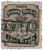
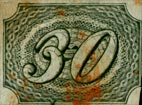
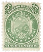
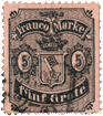
1856, 1862 & 1866-67. 5 Grote. Black on rose.

This stamp was issued for letters to Hamburg. There is a good deal of variety in the colour of the paper. I have seen it in pale rose, pale flesh-colour, and even in a sort of salmon-colour. The tint was, as Mr. Westoby says, very liable to fade; and I fancy the stamps, as issued, were generally of a far deeper colour than the tints which we now see; though, occasionally, unused specimens that have been kept from the light are of a fairly deep rose. There are two types, and they are not very hard to distinguish. Here are some of the salient points:

Type I

The right upright-stroke of the M of MARKE is very little higher than the left one. The point of the central trefoil on the crown does not go centrally into the wedge-shaped opening in the scroll above it, but is too much to the left, so as to graze the left side of the opening. In the central shield, the last vertical line to the left goes very close to the thick, left-hand outline of the shield. The lowest row of waves or semicircles, at the foot of the stamp, shows II 3/4 complete semicircles, the three-quarter semicircle being at the left-hand end. The base of the crown touches one of the semi- circles, in the row which runs between it and the top of the shield.

Type II

The right upright-stroke of the M of MARKE is taller than the left stroke, to quite a ridiculous extent. The point of the central trefoil on the crown goes centrally into the wedge-shaped opening in the scroll above it, not touching either side. In the central shield, the last vertical line to the right is very close to the thin, right-hand inner outline of the shield. The lowest row of waves, at the bottom of the stamp, has eleven perfect semicircles, with a half-semicircle at each end. The base of the crown does not touch the row of semicircles resting on the top of the shield, and the semicircles in this row are much smaller than in Type I. The diamond, to right of the central one, on the base of the crown, contains a black dot. There are many other differences, but these will be sufficient to identify the two types.

Genuine

Lithographed, in black, on rose wove paper, varieties and types as above. The details here given are common to both types of the genuine, unless specially mentioned. The quatrefoil, punched out of the handle of the key, does not show any little circle in its center, and two of the vertical lines of shading of the shield can be clearly seen through the aperture of the said quatrefoil. In Type I., there is a double knob at the end of each of the three projections of the handle of the key; in Type II., the projection to the right has only one knob, but the other two are double, that is to say, one behind the other. There are two rings on the barrel of the key, where it joins the ornamental part of the handle. There is one row of waves or semicircles to be seen, between the top of the shield and the base of the crown. The diamonds along the base of the crown have no shading in them, but, in Type II., the right-hand diamond has a black, elongated dot in its center. The shading, like a fringe, at the back of the left-hand 5, does not touch the outline of the containing-oval anywhere. The same may be said of the right-hand 5 in Type I.; but in Type II., the fringe of lines just grazes the outline of the oval in two places, i.e., at the right-hand of the top of the 5, and near the bend, at the bottom of the figure. The letters AN of FRANCO just touch, at the bottom of Type I., and are firmly joined together in Type II. FRANCO and MARKE are both at the same distance from the bottoms of their containing-labels. In the shaded ornament at the top of the stamp, above the center of the FRANCO MARKE scroll, there are 30 vertical lines of shading of various lengths in Type I., and 28 similar lines in Type II. In Type I., there are 27 short lines of fringe round the right side of the left-hand 5, and 23 round the right side of the right-hand 5. In Type II., there are about 25 lines of fringe to the left-hand 5, and 26 to the right-hand 5.

First Forgery

Lithographed, on pink, pinkish-buff, and also on a sort of drab wove paper, unperforated, or perf. I2 3/4. The shield is imitated from Type II., with one of the vertical lines very close to the thin, right-hand inner outline. There is only a single knob at the end of each of the three projections of the handle of the key, and only one ring round the barrel, where it joins the handle. The base of the crown comes very close to the top of the shield, and there is no row of waves or semicircles between the shield and the crown. The right-hand diamond on the base of the crown is shaded by vertical lines; the left-hand diamond is similarly shaded, and the central diamond contains a dot. The fringe of shading round each 5 is firmly joined to the outline of the containing-oval. This is an easy test, FRANCO is too near the bottom of its label, and MARKE is too high up. The M of this latter word has both its outer limbs of equal length, though, as I have before stated, Type II., which this forgery purports to imitate, has the right-hand part of the M very much too tall. The ornament at the center of the top of the stamp contains 29 vertical lines of shading, of various lengths. The fringe to the left-hand 5 has only 17 lines, and that of the right-hand 5 has 19.

Second Forgery

This is an imitation of Type II. Lithographed, on tolerably deep rose wove paper, badly pin-perf., the gauge not countable in my specimen. There is a little black circle in the center of the quatrefoil in the handle of the key, and none of the vertical lines of shading show through the quatrefoil. There is a single round knob at the end of each of the side- projections of the handle of the key, and a sort of pointed knob at the end of the handle. The right-hand diamond in the base of the crown bears a dot, as in the genuine Type II. The fringe of the numeral does not touch the containing-oval anywhere, either in the right-hand or left- hand 5, though the fringe does touch slightly in the right-hand 5 of the genuine. The letters AN of FRANCO do not touch each other at the bottom. There are 33 vertical lines of shading in the curly ornament at the very top of the stamp. The fringe to the left-hand 5 contains 22 lines, and the fringe to the right-hand 5 has about 21, but these latter are not very plain in my specimens.

Third Forgery

This is also an imitation of Type II. Lithographed, on deep rose paper, nicely perf. 15 1/2. The right-hand projection of the handle of the key shows one knob; the other two projections have two knobs each. The bottoms of the letters AN of FRANCO just touch, but they are not so plainly joined together as in the genuine Type II. There are only 26 lines in the fringe to the left-hand 5, and about 26 to the right-hand 5; the latter being rather blotched in my single specimen. In the genuine stamp, the central diamond in the base of the crown is, as nearly as possible, centrally under the central trefoil, but in this forgery, the diamond is decidedly too much to the right. My specimen has a very evident flaw in the top outline of the stamp, above the A of FRANCO, but I am unable to say whether this is always the case or not. I hope, however, that the flaw may always exist, as this is a very dangerous forgery, being carefully copied from Type II., even to the four little black dots, outside the four corners of the stamp. If it were not for the perforation, it might deceive anybody.

Fourth Forgery

This is an imitation of Type I. Lithographed, on deep rose wove paper, perf. 16. The two rings on the barrel of the key, next to the handle, are equal in size, but in the genuine Type I., the ring nearest the handle is larger than the other, as though the barrel were thicker there {I mean that the one ring is of greater circumference than the other.) In this forgery, both rings are practically of equal circumference. The base of the crown touches two (instead of one) of the waves or semicircles, between it and the top of the shield. An easy test for this forgery is, that the right-hand diamond on the circlet of the crown is not a diamond at all, but a perfectly circular pearl. The letters AN of FRANCO do not touch each other anywhere. There are 35 vertical lines of shading in the shaded ornament at the center of the top of the stamp. The fringes to the two numerals seem to be the same as in the genuine Type I. There are no dots outside the corners of the stamp.

Fifth Forgery

Lithographed, on very deep rose wove paper. It is not a pure rose, but has a trace of blue in it, like magenta has. I think this is intended for Type II., but the right-hand line in the shield is not so near the thin right-hand border-line as it is in the genuine, though the trefoil on the top of the crown goes centrally into the wedge-shaped opening above it, as in Type II. The upper point of the said trefoil, however, is not truly circular, but is slightly cut away on its right side. Of the two vertical lines of shading, seen through the quatrefoil of the handle of the key, the left-hand line is blotched against the side of the quatrefoil, so as to be practically invisible. (It can be easily seen in the genuine.) There is only one knob on the right-hand projection of the key-handle. The dot in the right-hand diamond on the crown is perfectly circular, instead of being like a short hyphen. Five or six lines of the fringe of the left- hand 5 touch the outline of the oval, and twelve of the lines of the fringe of the right-hand 5 are firmly joined to the outline of the oval. This is an easy test. The letters AN of FRANCO do not touch each other. MARKE is further from the outline below it than FRANCO is. There are 33 vertical lines of shading in the scroll-ornament, at the top of the stamp. There seem to be 28 lines of fringe round the left-hand 5, and 22 round the right-hand 5, but they are difficult to count, some of them being blotched. There are no dots outside the corners of the stamp.

Sixth Forgery

Lithographed, on buff paper, very nicely perf. 12 1/2. The perforation is the best thing about the stamp, which is a very poor imitation. It is intended to represent Type II. The projections of the handle of the key show single knobs, with a ring round, near the knob, as in the 3 Grote, instead of double knobs. The letters AN of FRANCO are not joined together. There is no row of waves or semicircles, between the top of the shield and the base of the crown. The central diamond on the crown is almost oval in shape, and the right-hand diamond is very small, and has no dot in it. The fringe of shading of each 5 is firmly joined to the outline of its containing-oval. The letters AN of FRANCO do not touch each other. The shaded ornament in the center of the top of the stamp does not touch the inner outline of the frame above it, though, in both types of the genuine, its central point touches the out- line. This said ornament is shaded by 35 vertical lines, many of them being broken and imperfect. The M of MARKE is of normal shape, and not like the deformed letter of the genuine Type II. I have not been able to count the lines of fringe to the numerals, they are so blotchy.

Postmarks

Genuine.—As before.

First Forgery.—71.

Second Forgery.—71.

Third Forgery.—71.

Fourth Forgery.—Uncancelled.

Fifth Forgery.—Uncancelled. Also a line in blue pencil. This, by the way, is often found on various old German stamps of different States, but I never saw it on a Bremen stamp.

Sixth Forgery.—Uncancelled.

Album_Weeds_Bremen9
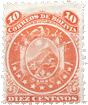
1860 & 1866-67. 7 Grote, black on yellow.

This stamp was issued for postage to Lübeck and Mecklenburg-Schwerin. There is only one type.

Genuine

Lithographed, on yellow wove paper, varieties as above. There are 18 lines of shading on the shield, not counting the thin, inner boundary-line on the right-hand side; and the first and last of these lines are very close to their respective sides of the shield. Most of the lines have been drawn too high, and show above the thick, inner outline of the top of the shield. The top end of the key is cut off square, instead of being a circle. There are 27 vertical lines in the shaded ornament at the center of the top of the stamp, and the central one of these lines is drawn up through the inner boundary-line at the top of the stamp, and joins the thick outline above it. This line is quite vertical. Outside the stamp, at each corner, there is a little three-lobed ornament, with a dot outside it; the dot in the left top corner does not touch the ornament. The fringe of shading to each 7 only touches the outline of the containing-oval in one little spot, at the back of the shoulder of each numeral. There are 29 lines in the fringe of the left-hand 7, and about 28 in that of the right-hand 7. There is one clear line of shading on the shield to the left of the point of the key. The left-hand knob of the handle of the key touches the fifth line of shading on the key, from the left. The right-hand knob touches the inner outline of the shield. Four of the vertical lines of the shield can be seen in the quatrefoil, in the handle of the key, but they are sometimes rather blotched. There is a trefoil-ornament at each end of the FRANCO MARKE label; the top lobe of the left-hand trefoil just touches the inner outline of the stamp to left of it, and two lobes of the right-hand trefoil touch the right-hand, inner outline. There are two of the vertical lines of shading of the top central ornament, which cut through the left top corner of the M of MARKE. The five jewels of the crown are all fairly diamond-shaped, and each diamond has a black dot in it, except the one to the right of the central one, which has two dots. There is a tiny, thin, slanting line or dash, crossing the outline, below the I of SIEBEN, and another similar dash below the B of that word. These are really portions of the wavy lines of the background, which show through. All these wavy lines, by the way, are in tall, sharply-pointed waves. There are nine waves in the lowest line at the bottom of the stamp.

First Forgery

This is extremely good, though the paper is too pale, being of a sulphur-yellow colour. Lithographed, on pale yellow wove paper, thinner, but harder than the genuine, unperforated, or perf. 13. There are only 17 lines of shading in the shield, not counting the thin, inner right- hand outline. The central vertical line of shading in the ornament at the top of the stamp is drawn up too high, as in the genuine, but it slants to the right, instead of going vertically across the border. The barrel of the key has no line joining the wards, though, in the genuine, the right-hand edge of the barrel is outlined. The dot outside the left top corner of the stamp plainly touches the little ornament. There are 29 lines in the fringe of the left-hand 7, and 28 in that of the right-hand 7. The upper lobe of the trefoil, at the left-hand end of the FRANCO label, does not touch the border-line to left of it. The two jewels to right of the center one, on the base of the crown, are more like pearls than diamonds, and have no dot in them. The wavy lines do not trespass across the border, under SIEBEN. It will be understood that, in the other points not mentioned, this forgery agrees with the genuine.

Second Forgery

Lithographed, on thin, yellow wove paper, rather darker than the first forgery, unperforated. There are 16 lines in the shield, not counting the right-hand boundary-line, and the right-hand line is exceedingly close to the said boundary-line, like the genuine, but is very crooked in its center. The left-hand line is not close to the boundary-line. None of these lines show above the thick, top outline of the shield. There are 34 vertical lines of shading in the floral ornament, at the center of the top of the stamp. The central one of these lines does not trespass across the border above it. The dot, outside the left top corner of the stamp, is too large, and it is triangular in shape, instead of nearly circular. It is a good deal farther from the ornament than even in the genuine. The fringe of lines to the left-hand 7 does not touch the oval anywhere, and there are about 27 lines in the said fringe, but some of them are blotched in my specimen, so I cannot be quite sure of the number. The fringe of the right-hand 7 contains 25 lines. The corner of the barrel of the key just touches the first line of shading” in the shield. The left-hand knob of the handle of the key comes between the third and fourth lines of the shield, counting from the left. This ought to be an easy test. The right-hand knob is some distance from the right-hand outline of the shield, so that two of the lines of the shield can be seen between it and the outline. Instead of the four lines of the background, shown in the genuine, there is a little circle in the center of the quatrefoil, in the handle of the key. This is another easy test. The trefoils at the two ends of the FRANCO MARKE label do not touch the borders of the stamp. The top left corner of the M of MARKE is not cut through by any lines of shading. There is a dot in the central diamond on the base of the crown, and a very tiny one in the right-hand diamond, but none in the others. None of the wavy lines cut through the outline under SIEBEN. The lowest line of waves, at the bottom of the stamp, shows waves, instead of 9.

Third Forgery

Lithographed, on fairly stout, yellow wove paper, only a very little lighter than the genuine, unperforated. There are only 13 vertical lines in the shield, not counting the thin, right-hand outline, and the outer ones are not near the sides of the shield. None of them show above the top outline. The top of the key is not cut off square, but ends in a circle. There are either 27 or 28 vertical lines of shading in the floral ornament at the centre of the top of the stamp, and the central one of these lines does not trespass across the outline above it. The dot in the left top corner touches its ornament. In the genuine stamps, all four of the corner-ornaments, outside the frame, are shaded with vertical lines. In this forgery the two top ornaments are shaded with lines which point towards the center of the stamp, the one in the left bottom corner has vertical shading, and the shading of the one in the right bottom corner slopes obliquely down to the left. The fringe of shading of each 7 touches the containing-oval, not only at the top right corner, but also round the bottom; there are only 19 lines in the fringe of the left-hand 7, and 18 in the other. The left-hand knob on the handle of the key comes between the second and third lines in the shield, and the right-hand knob is so far from the right-hand outline of the shield that there is one line of the shield to be seen between the knob and the outline. The trefoil-ornament at the left-hand end of the FRANCO MARKE label does not touch the frame anywhere, and the dark shading of the upper lobe of the right-hand trefoil just touches the right- hand border of the frame. There is no serif to the top left corner of the M of MARKE, and so, of course, there are no lines cutting through it. The three central jewels on the base of the crown are roughly-drawn ovals; the middle one and the one to the right of it have dots in them; the two outside ones are half-diamonds. The wavy lines of the back- ground do not trespass across the border, below SIEBEN. There are 9 1/4 waves in the lowest line, at the bottom of the stamp.

Fourth Forgery

Lithographed, on thickish, yellow wove paper, about the colour of the genuine, perf. 12 1/2. This is a very poor counterfeit, compared with some of the others. There are 19 lines in the shield, with the commencement of a twentieth in the left top corner. These, as before, do not include the thin, right-hand outline. None of these lines show above the thick, top outline of the shield. There are only 26 vertical lines of shading in the ornament at the center of the top of the stamp, and the central one of these lines does not trespass across the boundary-line above it; indeed, the central portion of this ornament, which, in the genuine, is the tallest part of the ornament, and touches the inner outline of the top of the frame, is, in this forgery, not so tall as the portions each side of it, and does not touch the outline above it. The fringe of shading at the back of the top of the left-hand 7 does not touch the outline of the containing-oval, but it almost touches at the bottom. The top line of the fringe of the right-hand 7 touches the outline. In the left-hand 7, there are about 22 lines of fringe; in the right-hand 7 there are about 23. There is no complete line on the shield, to the left of the point of the key; only the commencement of a line. The left-hand knob of the handle of the key comes between the fifth and sixth lines of shading of the shield. The postmark obscures the right-hand knob in my specimen, but I think there is a clear line of shading between it and the right-hand outline of the shield. The two upper lobes of the trefoil to the left of FRANCO touch the border, and the central lobe of the trefoil to the right of MARKE touches the border. There are no lines of shading cutting across the serif of the left top corner of the M of MARKE. There are no dots in the jewels on the crown, and the one to right of the center is an almost perfectly circular pearl. Several of the wavy lines of the back- ground trespass across the border, under the first half of SIEBEN, and some of the lines Can even be traced right through the letters SI. All the lines of the background are low waves, not the tall, sharp peaks of the genuine. There seem to be or 10 waves in the lowest line, at the bottom of the stamp.

Postmarks

Genuine.—As before.

First Forgery. —Uncancelled.

Second Forgery.—71.

Third Forgery.—71.

Fourth Forgery.—71.

Album_Weeds_Bremen11 Album_Weeds_Bremen12
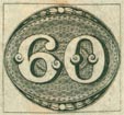
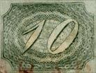
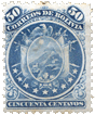
1861 & 1866-67. 10 Grote, black on white.

This stamp was issued for postage to Holland. There is only One type.


Genuine

Lithographed, on fairly stout, greyish-white wove paper, varieties as above. There are 27 lines in the oval shield. The left-hand knob of the handle of the key comes between the ninth and tenth of these lines from the left; the right-hand knob touches the fourth line from the right. A few of the lines have been drawn a little too high, and show above the top outline of the oval, especially the
first and fourth on the right side. The eleventh line from the left can generally be seen through the upper wards of the key. Five vertical lines, and indications of a sixth, are visible in the quatrefoil, in the handle of the key. The bottom knob of the key does not touch the outline of the containing-oval below it, and the line of shading under the center of the bottom of the knob trespasses a little across the outline below it. The wards of the key do not touch the outline of the barrel to left of them. In the lace-work pattern round the outside of the shield, each rosette shows four rows of holes in it. The top and bottom rosettes are joined to their neighbors by two imperfect white links of chain; all the others are joined by three links. The lattice-work lines of the oval which contains BREMEN ZEHN GROTE have been drawn too high above the BR, and go right across both white outlines. One of them also cuts into the right top half of the B, and another into the right top half of the R, making a black dot in the head of each letter. Another of these lines cuts into the upper part of the left-hand end of the E of ZEHN, and two into the top of the G of GROTE. In the left upper 10, the 1 has a white projection in the center of its left-hand edge, and the o is broken at the top. In the right upper 10, the 1 generally shows a tiny black dot near the top, and the 0 has a long curved line of shading inside its left half. In the left bottom 10, the serif at the head of the 1 is divided from the body of the numeral by a thin black line; that is to say, the left outline of the numeral is carried up unbroken to the top, across the serif. The trefoil-ornament, outside the left top corner of the stamp, contains seven radiating black lines, the third from the left being very long; the trefoil in the right top corner has five lines, two of them very short; the trefoil in the left bottom corner has six lines; and that in the right bottom corner also has six. There is a line all round the outside of the stamp, f mm. from the nearest point.

First Forgery

Very nicely lithographed, on fairly thick, extremely white wove paper, perf. 12 1/2, also pin-perf. about 17. The left-hand knob of the shield touches the tenth line from the left. None of the lines of the shield trespass across the outline, and none of them show through the upper wards of the key. The lattice-work lines show across the boundary, above the BR of BREMEN, but they are much fainter than in the genuine. There is no dot either in the B or in the R of this word, or in the E of ZEHN, and only one occasionally visible in the neck of the G of GROTE. There is no white projection in the center of the left-hand outline of the 1 in the left top corner, and the o is not broken at the top. In the right-hand upper 10 there is no dot in the 1, and the 0 is either unshaded, or shows only a short vertical line in the left side, instead of a long line, following the curve of the numeral from top to bottom. The serif of the 1 in the left bottom corner is not cut off from the body of the numeral. The radiating lines in the trefoils, outside the corners of the stamp, are: Left upper trefoil, 6 (the third line from the left being no longer than the fourth or fifth); right upper trefoil, 4, besides a base-line; left lower trefoil, 5; right lower trefoil, 5, and a base-line. There is no line round the outside of the stamp.

Second Forgery

Coarsely lithographed, on medium, yellowish-white wove paper, badly pin-perf. about 12, also badly pin-perf. to a much smaller, but uncountable gauge. The left-hand knob of the key touches the tenth vertical line in the shield. The line opposite the top point of the key generally trespasses across the boundary-line above it, under the center of the top rosette. None of the lines show through the wards of the key. In the quatrefoil of the key, the fourth line from the right is very crooked, instead of vertical. The line of the shield, under the center of the end knob of the key, does not trespass across the boundary-line below it. A prolongation of the T-like, lower wards of the key touches the outline of the barrel to left of it, and, in some specimens, the same is the case with the upper wards. There are only three rows of holes in each rosette. The top rosette seems to be joined to each of its neighbors by a single white link, and the two above the Z of ZEHN are joined together by two links only. The lattice-work lines do not trespass across either of the white outlines, above the BR of BREMEN, and there is no dot in either the B or the R, or in any of the lower letters. The 1 of the 10 in the left top corner has no white projection, and the 0 is not broken at the top. In the right upper 10, the 1 has no dot, and there is no shading in the 0. In the left lower 10, the serif of the 1 has no line, dividing it from the numeral. The radiating lines in the four corner-trefoils are: Left upper trefoil, 4; right upper one, 3 or 4 (they are blotched); left lower one, 3; right lower one, 5. The line round the stamp is a full millimeter from the nearest part of the stamp itself.

Third Forgery

Lithographed, on thin, yellowish-white wove paper, pin-perf. 16. There are only 26 lines in the shield. The left-hand knob of the key touches the ninth line from the left, and the shading of the right-hand knob comes between the third and fourth lines from the right. Nearly all the lines show more or less above the outline of the top of the shield. Two or three of the lines can be seen through the wards of the key. The shadow of the bottom knob of the key touches the outline below it. One line of shading, just below this knob, can be seen, projecting slightly downwards, about as much as in the genuine. The top rosette is joined to its left-hand neighbor by one entire link, instead of two imperfect ones, and the lowest rosette is joined to its right-hand neighbor by one link. The lattice-work lines show faintly across the inner white line, above the BR of BREMEN, but they do not cross the outer one. There is no dot in any of the letters. In the left upper 10, there is no white projection from the center of the left-hand outline, and the top of the o is not broken. In the right upper 10, there is no dot in the 1, and no line of shading in the 0. In the left bottom 10, the serif is not cut off from the rest of the 1. The radiating lines in the four corner-trefoils are: Left upper trefoil, 6; right upper one, 2 and a dot; left lower one, 4; right lower one, 4. There is no line round the stamp.

Fourth Forgery

Lithographed, on fairly stout, very yellowish-white wove paper, very nicely perf. 12 1/2. There are only 24 lines in the shield. The left-hand knob of the handle of the key comes between the eighth and ninth lines from the left. None of the lines project beyond the upper outline, but in my single specimen, the fifteenth line from the left projects obliquely across the boundary-line of the bottom of the shield, slanting down from right to left. None of the lines show through the wards of the key. I can only make out three vertical lines in the quatrefoil of the handle of the key. The bottom knob touches the outline below it, and there is no line to be seen below the center of this knob. A prolongation of each of the wards of the key touches the outline of the barrel, to left of them. The rosette to left of the topmost one only shows three rows of holes. The top rosette is joined to its right-hand neighbor without any link between them, so far as I can see; and the same is the case with the bottom one and its right-hand neighbor. The others have one, two, and parts of three links, respectively, but none of them have three perfect links. There are a few very faint indications of the lattice-work lines across the white boundary-lines above the RE of BREMEN; there is a very slight indentation of the top of the B; the R does not seem to have any dot; and the only mark that I can see in any of the lower letters is a small, oblique scratch, near the lower part of the left side of the E of ZEHN. The I of the left upper 10 shows no white projection, and the top of the 0 is not broken. In the right upper 10, there is no dot in the I, and no shading in the 0. The serif is not cutoff in the left lower X. The radiating lines in the four corner-trefoils are: Left upper trefoil, 4; right upper one, 5; left lower one, 5; right lower one, 3 and a dot. There is no line outside the stamp.

Postmarks

Genuine.—As before.

First Forgery.—Uncancelled, or a blue pencil-line.

Second Forgery.—71.

Third Forgery.—71.

Fourth Forgery.—71.

Album_Weeds_Bremen13 Album_Weeds_Bremen14 Album_Weeds_Bremen15
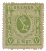
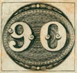
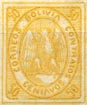
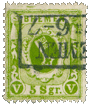
1861, 1863 & 1866-67. 5 Silber Groschen, green on white.

This value was to frank postage to England. There is only one type

Genuine

Lithographed, in olive-green (1861), sea-green and yellow-green (1863), yellow-green, 1866-7; varieties as above. The paper is tolerably thick, white, or yellowish-white wove, and usually with a shiny surface. The top end of the barrel of the key is a circle. The wards of the key are like two E’S, with very long central tongues, placed back to back; but there is only one of the forgeries which does not imitate this. The ornamental border or frame of the shield has many projections from it, and there is a coloured dot in the projection over the 5, and a similar dot in the projection over the R, of 5 SGR. The trefoil at the top of the shield does not touch the outline above it, under the M of BREMEN. There are 59 vertical lines behind the shield, counting along the top. Most of these lines project above the boundary-line under BREMEN; indeed, in good copies, one of them cuts into the bottom of the first E of that word. The top outline of the head of the 5 is only very slightly concave, and the end of the tail of this numeral is a large round ball. There is a line of shading down the center of the right leg of the right-hand V. The sides of the frame, containing the hanging drapery and curly scrolls, are shaded with broad, horizontal green lines, and not solid. The stop after SGR is quite square. The ball in the right top corner of the stamp has a complete green ring in it. The trefoil-ornament at the top of the stamp is included within thirteen of the vertical lines of the back- ground; it touches the first of these, and the thirteenth, on the right, is outside the shadow on the right side, not touching it. The bottom of the G of SGR rests on the line below it. In the unperforated issue, there is a thin line round the stamp, about 1 mm. from the outline. The quatrefoil in the handle of the key is 1 3/4 mm. across in its widest part.

First Forgery

Nicely lithographed, in olive-green, yellowish-green, green, or a green so very yellow as to be almost greenish-yellow, rather than yellow-green, on thin, white wove paper, unperforated, percé en scie, or pin-perf. 12 1/2. The paper is to be found both shiny and dull. The top end of the key is cut off square, or rather, slightly rounded. There are no dots in the projections of the frame of the shield, above the 5 and the R of 5 SGR. The lines of the background do not project above the outline under BREMEN. The top outline of the head of the 5 is extremely concave. There is no line of shading in the right leg of the right-hand V. The shading in the ball, at the right top corner of the stamp, is a green crescent, instead of a ring. In the unperforated stamp, there is no line round the outside of the frame. The ornamental frame of the shield only touches the outline on the right side, though, in the genuine, it touches on the left side as well. This is a capital forgery; the crescent in the ball in the right top corner is the easiest test.

Second Forgery

Lithographed, in yellow-green, or bright green, on thick, non-surfaced white wove paper, unperforated. The two dots are absent in the two projections of the frame of the shield, above the 5 and the R of 5 SGR. The trefoil at the top of the shield touches the outline of the frame above it, under the first stroke of the M of BREMEN. The lines can, therefore, not be counted, but they do not trespass above the boundary-line, under BREMEN. There is no shading along the right limb of the right-hand V. The stop after SGR. is circular. The ball in the right top corner of the stamp contains a badly-formed crescent, instead of a circle. The lower end of the 5 is not a ball. My copies are rather closely cut, so I cannot say whether there is a line round the stamp or not. The quatrefoil in the handle of the key is too small, being only about 1 3/4 mm. across its widest part. The top end of the key is cut off rounded, but shows no circle.

Third Forgery

Lithographed, in rather dark yellow-green, on very thin, rather shiny, white wove paper, unperforated. The end of the barrel of the key is a circle in this forgery, like the genuine. The wards of the key are joined together by a line, along the barrel of the key. The projection of the frame of the shield, over the R of 5 SGR., has a dot in it, as in the genuine; and I think the one over the 5 also has a dot, but I am not sure, as my only two specimens have this particular spot hidden by the postmark. The top of the trefoil very nearly touches the top of the stamp; so nearly, that the lines cannot be counted above it. One or two of the lines project very slightly above the boundary-line, below BREMEN, but this is hardly noticeable. The top of the head of the 5 has a very jaunty, upward curve. There is a line along the right limb of the right-hand V, but it is near the inner edge, instead of along the center. The horizontal green lines in the side-frames are, in some parts, so close together as to appear almost solid. The stop after SGR. is something between an oval and a transverse oblong. The ball in the right top corner of the stamp contains a crescent, instead of a circle. The lower end of the 5 is not a ball. The G of SGR. not only rests on the line beneath it, but goes slightly through the line. There is no line round the stamp. The quatrefoil in the handle of the key is too large, being 2 mm. across at the widest part.

Fourth Forgery

Lithographed, in very yellow-green, on thick, rather hard, unsurfaced, yellowish-white wove paper, unperforated. The top of the barrel of the key is cut off square. There are no dots in the projections of the frame of the shield, above the 5 and R of 5 SGR. There are about 62 vertical lines in the background, behind the shield. Some of them project slightly beyond the outline above them, under the name, but not nearly so much as in the genuine; nor does one of them touch the first E of BREMEN. The top of the 5 slopes slightly down to the right, instead of curving upwards to the right. There is no line of shading in the right-hand V. The upper part of the right-hand frame is quite solid, though the horizontal green lines can be seen lower down. The stop after the SGR. is an oval, which slopes up a little to the right. The ball in the right top corner of the stamp contains a crescent, instead of a circle. The trefoil-ornament at the top of the stamp is contained between eleven lines of the background, touching both. The lower end of the 5 is a ball, like the genuine, only it curls inwards, instead of pointing upwards. The quatrefoil in the handle of the key is too large, being very nearly 2 mm. across.

Fifth Forgery

This is a mere caricature. It is very coarsely lithographed, in black, on thin, very yellowish-white wove paper, unperforated. A very few words will suffice to describe it, in case it should exist in the proper colour. The wards of the key are formed by four small black squares, placed a little distance apart, so as to make a white cross on a black ground. The trefoil-ornament touches the outline above it. The balls in the frames are of solid black.

Postmarks

Genuine.—As before.

First Forgery.—71.

Second Forgery.—Uncancelled.

Third Forgery.—71. Also a long, broad, horizontal bar, with several short, broad, vertical bars each side of it.

Fourth Forgery.—71.

Fifth Forgery.—Uncancelled.

Envelopes

1857. 1 Grote, black on blue; black on white.

These envelopes are hand-stamped; and, like all hand-stamps, are hardly ever seen as absolutely perfect impressions.

Genuine

Hand-stamped in black, on white wove, blue wove, white laid (?), and also on blue ornamental, or fancy paper, with wavy laid lines. I have had but one of the latter, and I got it, in 1869, from a Bremen friend, who was a collector. My only entire specimen, given me by a collector in Berlin, is 149 x 82 mm., with “long gum.” It is struck in the left upper corner of the envelope, and has FRANCO printed in the left lower corner, in Roman capitals, 3 1/2 mm. high. There is a large stop after BREMEN, almost level with the middle of the N, instead of level with its foot, and the edge of the stop is barely 1/4 mm. from the side of the N. The shield measures 6 mm. from side to side, and very nearly 6 mm. vertically, from the top outline to the point at the bottom. The letters TAD of STADT are all joined together at the bottom. The tail of the R of BREMEN curls up, considerably higher than the foot of the following E. STADT POST AMT is in letters 1 3/4 mm. high, and BREMEN is in letters 1 1/2 mm. high. The jewels on the base of the crown are small, circular black dots, to represent pearls. In all my specimens, these are smudged, so that I am not able to count them, but there are at least nine pearls, and possibly more. By reason of the smudging, I cannot give any details of the key in the shield. The top edge of each side-flap of the envelope is cut in a straight line, while the bottom edge of each of the said side-flaps is rounded. In my list of the various papers I have mentioned white laid, with a “?”, as I am not sure that it exists. My present specimens are all on white wove. The bottom point of the shield is over the end of the E of BREMEN.

First Forgery

This is struck in the right top corner of the envelope, and the word FRANCO is absent. I have two entire specimens; one is on thin, white laid paper, 151 1/2 x 80 1/2 mm., and the other on stout, blue wove, 149 1/2 x 81 1/2 mm. In each case, the top edge of each side-flap is rounded, like the bottom edge. Both my specimens have “long gum,” like the genuine. The stop after BREMEN is small, and 3/4 mm. distant from the N. It is quite circular, though the genuine stamps, in both my specimens, show the said stop quite oval, probably from the movement of the hand in stamping. In this forgery, the stop is only a shade above the level of the foot of the N. The shield is 5 3/4 mm. across, and slightly more than mm. from the top outline to the bottom point. The A and D of STADT do not touch at the bottom. There are only five jewels on the base of the crown, three in the center of the band, and one at each edge. A very easy test for this forgery is the position of the bottom point of the shield, which is just above the first vertical stroke of the M, instead of the end of the E of BREMEN. The ornaments on the top of the crown are apparently trefoils; in the genuine they are meant for strawberry- leaves. In anticipation of possible criticism, I may say here that, though for the convenience of non-heraldic readers, I have spoken, throughout my description of the Bremen stamps, of “crown” and “trefoils,” it is really a ducal coronet, with the usual strawberry-leaves.

Second Forgery

I have only cut specimens of this, so cannot say anything as to size of envelope, presence or absence of FRANCO, etc. This is not at all a bad imitation. It is on greyish-white wove paper. The edge of the stop is rather more than J mm. from the N of BREMEN, and it is about the same height as in the genuine. The outline of the shield is very thin; it measures a shade under 6 mm. across, and 5 3/4 mm. from top to point. The point, by the way, hardly projects at all below the bottom outline, and it is a good deal to the left of the center of the bottom of the shield, instead of being central. It comes over the end of the E of BREMEN, as in the genuine. The tail of the R of this word does not curl up at all. The base of the crown is blotched, but among the blotches can be seen three small dots, one at each end of the band, and one in the center. The wards of the key show a white cross, which is not visible in the genuine. My specimen shows a long dash, joining the tops of the M and E of BREMEN.

Third Forgery

I have only cut specimens of this. It is on blue wove, and also on thick, white wove paper, the latter of an exceedingly coarse graining.

There is a small round stop after BREMEN, 3/4 mm. from the N. The shield is barely 5 1/2 mm. across, and 6 mm. from top outline to bottom point. The said point is above the end of the E, as in the genuine. None of the letters of the inscription touch each other anywhere, though the bottoms of the A and D of STADT are very close together. The tail of the R of BREMEN does not curl up at all. The letters of STADT POST AMT are decidedly too small, being only 1 1/4 mm. high, instead of 1 3/4 mm., and those of BREMEN are 1 1/2 mm. high, like the genuine. The band of the crown contains something which looks like 6 1/2 diamonds, joined together.

Postmarks

Genuine.—As before. The only used specimen at present in my possession has BREMEN 5 * 8 in the frame.

First Forgery.—Uncancelled.

Second Forgery.—Uncancelled.

Third Forgery.—5, 98.

Post Office Seal.

A circular stamp, with scalloped edge, containing crowned arms in center, and the legend STADT-POST-AMT BREMEN, is occasionally found in old collections. It is on greenish-blue wove paper, water- marked with wavy lines, and gummed. This is only a seal of the Bremen Post Office, for official correspondence, etc. Such things are very common in Germany, and are called “Oblaten” (wafers). They are used by firms, companies, official bodies, etc., instead of regular wax seals, and even those from post offices, like the one here described, are not stamps in any sense of the word, or even franks.


From: ‘Album Weeds’, 3rd edition by R. B. Eareé. 1906


Album Weeds – Brazil

Album_Weeds_Brazil1 Album_Weeds_Brazil2 Album_Weeds_Brazil31843. 30, 60 & 90 Reis.

These stamps have always been rather uncommon, especially the 90 Reis; but the forgeries are to be seen everywhere, and I suppose there are few of my readers who cannot remember having been taken in by them, before arriving at what I call “years of suspicion”. From the comparative scarcity of the genuine, and the many years which have elapsed since they were issued, it might naturally be supposed that there would be many imitations in circulation; but I have only met with seven varieties, though one of them, as I said, is extremely common. I must confess that it is a task of no common difficulty to describe these forgeries in such a manner as to enable the possessor of one solitary specimen to say at once whether it be genuine or forged; for, as the design is nothing but a couple of figures, or rather a figure and a cypher, on an engine-turned ground, there is really nothing to lay hold of. However, I will do my best, and ask my readers to make all due allowances.

Genuine

Engraved in taille-douce. There are two distinct issues of this set of stamps: the first on thick, yellowish-white paper; and the second on thin, bluish-white paper; both wove. There is a black rectangle, formed of one single line, drawn round each stamp, and touching it in one or more places. There is a white ball in the outline, at the top of the stamp, and a similar one at the bottom of the stamp, each being fairly circular, and measuring about 1 1/4 mm. across. Each side of each ball there are bunches of white leaves, graduated in size, to fit the diminishing border, and arranged 3:3:3:1, in each case, with a pair of white dots, like a colon, separating each bunch from the following one. Immediately inside the border, there is a band of very light-coloured engine-turning (the lightest part of the whole background) showing two long dark dashes, somewhat diamond-shaped and close together, alternately with two long dashes, wide apart, with a black dot between them. This alternate pattern goes, of course, right round the stamp, as do all the interior patterns now to be described. Inside this light band is a broad dark pattern, composed of tiny, diamond-shaped black dots, formed by the intersection of the white lines of the engine-turning; and these black dots are arranged in alternate large and small diamonds, of 9 and 12 dots, respectively. The division between this and the next section of the pattern is a band showing, alternately, five and four parallel dark dashes, but this band does not look at all like a chain. Inside this comes more of the pattern of diamonds of diamond-shaped dots; then another band of the five and four parallel dark dashes; then some more of the dotted pattern; then a very small oval, the outer outline of which is formed by small dashes and colons alternately, and the inner one an unbroken black line. In the center of all, there is some more of the dotted pattern. It will be understood that only portions of all these various oval patterns can be seen; the rest being hidden by the numerals, except the light-coloured band immediately inside the ornamental frame. There is a very thin black outline following the curves of the thick black shading of the numerals, leaving a very narrow light space between shading and outline.

The special points of difference for the different values are the following:

30 Reis. Genuine

The tail of the 3 is split up into two curls, like those in the tail of a black grouse. These two curls are level with each other. There is no line of shading in the white part of the straight, pointed commencement of the 3. The little white ornamental ball at the top of the stamp is round, while the corresponding one at the bottom is generally an upright oval.

60 Reis. Genuine

The top of the figure 6 ends in a curl, which forms an almost perfect white circle. The ornamental white balls, at the top and bottom of the stamp, are rather larger than those on the 30 Reis.

90 Reis. Genuine

The ornamental white balls, at top and bottom, are large and perfectly round. The shading inside the head of the 9 only goes half-way round, and the portion of the background seen through the head has hardly any pattern on it, except plain, crossed lines of white.

First Forgery

Lithographed, on very thick, yellowish-white laid paper. Copies with a wide margin show two black lines round the stamps, 1 mm. apart. The two white balls are too small, being barely 1 mm. in diameter. The bunches of leaves are thin and “scraggy”, as compared with the genuine. The part of the design immediately inside the border is very dark. It is composed of two long parallel dashes, and two dots alternately, all the way round. Next comes a pattern of dots (more or less round) arranged in diamonds, of nine dots each. The division between this and the next section of the pattern is a white chain, on a black ground. The chain is quite distinct and unmistakable. Inside this is a dotted pattern, but the dots are not arranged in groups. Inside this is another chain; then a dotted pattern, not in groups; then a third chain (this can only be seen clearly in the 90 Reis); and then some more dots, very often blotched into one dark mass. There is a distinct, very prominent white outline round the shaded parts of the numerals.

The special points of difference in the three values are:

30 Reis. Forged

The right curl of the tail of the 3 is slightly but sensibly lower than the left one.

60 Reis. Forged

The curl at the top end of the 6 is an oval, instead of a circle. The ornamental balls at the top and bottom of the stamp are smaller than those of the genuine 30, a great deal smaller than those of the genuine 60, and the same size as those of the forged 90.

90 Reis. Forged

The balls are the same size as those in the forged 60 Reis. The chain-pattern is very distinct behind the center of the cipher. The shading inside the head of the 9 goes quite three-quarters of the way round. There are two very distinct links of the chain-pattern in the background, as seen through the head.

Second Forgery

Lithographed, on rather soft, moderately stout, yellowish-white wove paper, and also on thick, hard, yellowish-white, transversely-laid paper. The white balls vary in size, from 1 to 1 1/2 mm. in diameter. The pattern immediately inside the ornamental frame is composed of parallel pairs of long black dashes (the inner one of each pair generally shorter than the outer one) alternating with colons, but the colons are irregular, and cannot be traced all the way round the stamp. The dotted pattern inside this is not divided into diamonds, but rather into oblique strips, three dots broad. Inside this comes a narrow pattern which, in the 30 Reis, is like a very badly-made chain-pattern above the numerals, but below them is composed of sets of four black dashes. In the 60 Reis, this pattern shows the sets of four black dashes, both above and below the numerals. In the 90 Reis, it is a very thin white chain, both above and below the numerals. Inside this is a dotted pattern, not divided into groups in the 30 and 90 Reis, but divided into squares of 16 dots in the 60 Reis. Then comes a narrow band of sets of three black dashes, above and below the numerals in the 60 Reis, sets of three above and two below, in the 30 Reis, and a thin white chain in the 90 Reis. Then there is another dotted pattern, not divided into groups; then an irregular chain; then some more of the dotted pattern ; then a white line in the 30 Reis and 90 Reis, a little more of the chain-pattern, and a central white dot. Most of this last portion is hidden by the numerals in the 60 Reis. The thin black line, outside the shaded portions of the numerals, is hardly to be noticed in this set of forgeries.

The special points of difference for the different values, besides those already mentioned, are the following:

30 Reis. Forged

The left curl of the tail of the 3 is much higher than the right curl. There is a little black line of shading in the white part of the straight, pointed commencement of the 3, which is not visible in the genuine.

60 Reis. Forged

The top curl of the 6 is almost circular. The head bends over so much, that the dark shading on it actually touches the shading of the body, though it does not do so in the genuine.

90 Reis. Forged

The triple bunch of leaves, at the bottom, furthest to the left from the ball, is badly done, the upper leaf of the three being not much more than a white dot.

Third Forgery

Lithographed, on medium, bluish-white wove paper. As all the white spaces between the dots are exaggerated, this gives the whole stamp a grey appearance. The white balls seem to vary in size from 1 to 1 1/2 mm. This forgery may be easily detected by the bunches of leaves in the lower border, as there is an extra single leaf on each side, making them 3:3:3:1:1 each side, instead of 3:3:3:1. The pattern immediately inside the border has diamonds of from 16 to 25 dots each, with very marked and wide spaces between the diamonds; immediately inside the ornamental border, there is a row of dashes; these vary considerably, some being single, some double, and some triple parallel dashes, the inside one of each double or triple dash being generally the shortest. Inside this, there is a pattern of diamonds of dots, each diamond containing from 16 to 25 dots, with very prominent white spaces between the diamonds. In many of the diamonds, some of the rows of dots are blotched into a single black line. As the extra single leaf at each end of the lower wreaths is such a very marked test, I think further description is not necessary. The special variations for the different values are :

30 Reis. Forged

The right curl of the tail of the 3 is slightly lower than the other, and the right curl of the 0 is decidedly smaller than the left curl, though they ought to be about equal in size.

60 Reis. Forged

There is a zigzag, dotted line outside the outermost diamonds of dots at the top of the stamp, inside the border, extending over about ten of the diamonds.

90 Reis. Forged

There are 19 dots, 4 oblique lines, and several blotches to be seen inside the head of the 9. In this set there are two rectangular frame-lines round the stamps, 1 1/2 mm. apart.

Fourth Forgery

Lithographed, in very dark, greasy, black ink, on soft, yellowish-white wove paper, rather thin. Of this forgery I have only the 60 Reis; and I have never met with more than the one copy. There is no line forming a rectangle round the whole stamp, as in the originals, and in all the forgeries hitherto described; at least, if there is a frame-line, it is so far from the design that it is cut off in my copy, which is not clipped very closely. At a short distance, the whole stamp, except the numerals, looks dark black. It can easily be detected by the bunches of leaves in the lower border, which are 4:3:3:1, each side of the white ball, instead of 3:3:3:1.

Fifth Forgery

Lithographed, in dark black, on stout, white laid paper. There are two frame-lines round the stamp, 3/4 mm. apart. The white balls are oval, instead of circular, about 1 mm. across the widest part. The pattern immediately inside the ornamental border is composed of pairs of parallel black dashes, alternating with colons (= : = : ). Then comes a pattern of diamond-shaped black dots, quite uniform, and not grouped into diamonds. Then comes a thin white chain, on a deep black background; then some more of the uniform dotted pattern ; then another white chain, like the first; then some more of the uniform dotted pattern; and the centre of the stamp is nearly all black, without any particular pattern on it. The ornamental border, which, in the genuine stamps, gradually diminishes in width towards the sides, so that it is merely a thin black line at each end of the oval, is, in this forgery, quite A mm. broad at each end of the oval. There is an extra white dot, opposite to the point of the last leaf of each wreath, top and bottom, though, in the right-hand side of the bottom wreath, the dot is below the level of the last leaf. These extra dots are not to be seen in the genuine. The special differences are:

30 Reis. Forged

The arrangement of the wreath to the left of the bottom ball is, in my specimen, 3:3:2:1: the head of the 3 is totally unlike the genuine, or any other forgery, having a small curl at the left end, instead of the long, downward-pointing peak; the tail, also, is a single, large white ball, instead of the two black-grouse curls.

60 Reis. Forged

The right upper wreath, in my specimen, is 3:2:3:1:. The narrowest white part of the head of the 6 is not much more than 1/4 mm. broad; but in the genuine, the narrowest white part is fully 1 mm. across.

90 Reis. Forged

The right upper wreath, in my specimen, is very badly done, and seems to be 1:1:1:1:, with only one white colon, and as before mentioned, a white dot after the outer leaf.

Sixth Forgery

This is very poor, and I have only met with the 90 Reis. Coarsely lithographed, on thick, very yellowish-white wove paper. The top wreaths are an easy test. To the right of the ball they are : 3:3:2:2:1; and, to the left of the ball, 3:3:3:3:1 (an extra bunch of leaves in each case). While the top ball measures 1 1/4 mm., the bottom one is less than 1 mm. The pattern immediately inside the ornamental border consists of pairs of dashes only. The general dotted pattern is not in groups. The separations between the different portions of the dotted pattern are thin white dashes, on a black ground. These tests will, I think, be found quite sufficient.

Seventh Forgery

I have not any of this set before me, but can describe them from memory, sufficiently for their detection. Lithographed, on stout wove paper of a yellowish-white. The design is done in two colours. First of all an oval, the size and shape of the stamp, is printed in a decidedly blue, neutral tint, and then the usual forgery is printed on the top of this. Thus all the parts of the design which ought to show white are blue. I think this will be enough to describe the forgery, without entering into details which I do not now remember.

Postmarks

Genuine.—29, very large; even larger than the stamp. Also a blotchy cancellation, which I have not been able to make out. Also a very large double oval.

First Forgery.—I, size of the illustration; also larger.

Second Forgery.— 1, larger ; also 29, large.

Third Forgery. — 38, very large, without numerals; but very often uncancelled.

Fourth Forgery.—Uncancelled.

Fifth Forgery.—A rectangle, larger than 74, with unreadable lettering.

Sixth Forgery.—29, large.

Seventh Forgery.—I do not remember whether this was cancelled or not.


Spud_Brazil1 Spud_Brazil2 Spud_Brazil3


Spud_Brazil4 Spud_Brazil61844. 10, 30, 60, 90, 180, 300 & 600 Reis.

Two sets of these stamps can be made, one printed on yellowish- white paper, and the other on bluish-white, or greyish-white; both wove. The 180, 300, and 600 Reis have always been scarce; but the lower values are common enough. Those on the bluish paper are scarcer than the other set. There is a very great difference in the way in which different specimens of the genuine are printed; some of them are in a rich black, whilst others, which have had, apparently, not enough ink on the plate, look like skeleton, outline copies of the design; and many a collector would be apt to brand these latter as forgeries.

Genuine

Finely engraved in taille-douce; paper varying as above. The design of these stamps is of bewildering intricacy, and yet I shall be obliged to try to describe it, in order to show where the forgeries are at variance with it. Immediately inside the borderline there is a sort of white chain-pattern, formed by the white lines of the engine-turning; but only parts of the oval made by this chain-pattern can be seen; for the oval, if complete, would be larger than the stamp. In the center of each link of the chain there is a black, diamond-shaped dash, with a black dot each side of it. It must be remembered that, of this chain, only a few links (3 to 4) are visible in the corners of the stamp, the rest being supposed to be cut off by the boundary-lines of the frame. Then comes another chain-pattern, similar in all respects, but nearly complete, being only cut off just at the top and bottom. Then comes a lace-work pattern, and then a very white oval, of wavy outline, which is the whitest part of the design. Then there is some more lace-work ; then a narrow black line; then a broad, greyish band, 1 3/4 mm. broad, ornamented with shadowy-looking crosses. Within this, there is a narrow band of lace-work, then a whitish zigzag pattern, then a black zigzag pattern, then the narrow central oval of engine-turning, and finally a straight black line in the center of this. The whole pattern has the appearance of white lines, scratched out of a black background. The shaded parts of the numerals are very black, and the ink of the said shaded parts stands out in relief from the paper, so that the ridges can be actually felt with the finger.

First Forgery

Lithographed, on thick, hard, yellowish-white wove paper. The whole stamp has a very grey look, like an exaggeration of the faintly-printed specimens of the genuine, and the whole of the design is evidently formed by black lines on a white ground, instead of looking like white lines, scratched out of a black ground. Immediately inside the frame is a pattern of white diamonds, on a dark ground. These diamonds only show at the corners of the stamp, the rest being supposed to be cut off by the frame. Then comes another similar pattern of white diamonds, but running all round the stamp, except at the top and bottom. Then comes a pattern of interlacing, outlined crescents, this pattern being rather more than 1 mm. wide. Then comes a dark band, nearly 1 mm. wide, composed of crossed lines, set so closely together that the band appears to be solid black at a distance. Then comes some more of the interlaced crescent pattern, with the crescents turned the opposite way to the others. Then comes a narrow white line, bounded by fine outlines; then a pattern of plain, crossed lines; then another narrow, white line; then some more of the plain, crossed lines; then another white line, not so distinct as the other two; then some more of the plain, crossed lines; and finally a straight, white line in the center. The shading to the numerals is no darker than the rest of the stamp (though it is much the darkest portion in the genuine), and of course the ink does not stand up from the paper at all.

Second Forgery

This may be only a variation of the one just described. It is lithographed, on thick, hard, very yellowish-white wove paper. The tests are as in the first forgery, except that the outermost portion of the pattern seems to show portions of three or four sets of white diamonds, instead of two, and the narrow white lines of the first forgery are black in this counterfeit.

Third Forgery

Of this set I have only the 300 and 600 Reis, and I have known them only for the last ten years. Apparently engraved in taille-douce, on thin, hard, very grey wove paper. In the top left-hand corner and the bottom right-hand corner there are three rows of coarse, very distinct chain- pattern, with a more or less oblong or diamond-shaped black dot in the center of each link. In the other two corners there are only two rows of this chain-pattern. The pattern reminds one of strings of very short, stumpy sausages. At the top of the stamp, there is only one row of the chain-pattern to be seen, and at the bottom, under the numerals, the rows cannot be traced; but it seems almost as if the chains had been thrown together, in a confused heap. Inside the chain-pattern, above the numerals, there is a thing like a long, arched cloud, or more like the connected puffs of white steam from a locomotive. This cloud is shaded with some light black dots. The cloud has a background of black scratches, crossing each other obliquely. The same scratches are to be seen below the numerals, but there is no cloud there. Behind the numerals there is hardly anything to be seen at all, except one or two portions of lines. It will be seen that, although this forgery is in taille-douce, it is not dangerous. The colour of the paper is almost a neutral tint, not white at all.

Fourth Forgery

Of this I have only the 180 Reis. Apparently engraved in taille-douce, on thick, pale buff wove paper. This is exceedingly like the forgeries just described, and all the tests just given will hold good for this counterfeit, except that the cloud above the numerals is more continuous, instead of being like the connected puffs of a locomotive, and that the background, behind the numerals, is covered with a number of scratches, in no definite pattern. The mark in the centre of each link of the chains is, in many instances, composed of two, or even three, thin black dashes, blotched together.

Fifth Forgery

This is new to me (1902) and the best of the lot. I have only the 300 and 600 Reis. Engraved in taille-douce, on greyish-wove paper, about the same substance as the genuine. The chain-pattern is much too white and prominent, each link containing a dark black, diamond-shaped dash. The inner chain is more complete than in the genuine, being scarcely interfered with by the top and bottom outlines of the stamp. There are markings in the centre of the stamp, reaching nearly as high as the numerals, which look like a sort of skeleton Union Jack. The ink stands out from the paper even more than in the genuine stamps. If it were not for the too-prominent chain-pattern, this forgery would be decidedly good.

Sixth Forgery

These stamps are not nearly so good as any of those already described, but they are very common, and seem to form part of the usual stock-in-trade of every swindler. All the values are found in this set. The characteristics of this counterfeit are, that almost the whole of the design, except the numerals, is formed by black dots, and the said design, including the numerals, looks as though the ink had run, giving it a woolly, misty appearance. Lithographed, on very thin, white wove paper. The outer chain-pattern (3 links in each corner of the stamp) is absolutely white, and each link has a straight dash in the centre of it. The inner chain-pattern is very similar, but most of the dashes in the links on the left side of the stamp have a dot each side of the dash. Between the two chain-patterns there is a dotted groundwork, of no particular design. The white oval of wavy outline which comes next is simply formed by the absence of dots. After this is some more of the dotted groundwork, then a black line, then a broad band, nearly all white, but showing some traces of the shadowy crosses of the genuine. Then comes a black outline, then a few scattered clots, and a straight black line in the center of all. The ink, of course, does not stand out from the paper. In this forgery, the left-hand outlines of the numerals are generally much too thick.

Seventh Forgery

Lithographed, on medium, hard, very yellowish-white wove paper. This need not detain us long. The two rows of chain-work have the links diamond-shaped, instead of oval, and the diamonds have 1 dot, 2 dots, 2 dashes, or 3 dashes, as the case may be, in the center of each. Next, after the chain-work, comes the background of a few dots and scratches, then comes an oval, looking something like a bird’s-nest, outlined, inside and out, by dots. Then a few scattered dots, then another bird’s-nest oval, with some dots in the center. The outlines of the figures of value look ragged in parts.

Besides the above, there appear to be two other counterfeits, which are variants of the sixth forgery (probably later editions), but which are covered by the description of the sixth forgery. Some of them vary considerably in the numerals, but the groundwork is substantially the same.

Postmarks

Genuine.—As before. Also a cancellation something like 42, but square, and without numerals.

First Forgery.—Part of a curved line, which is probably 1, very large.

Second Forgery.—The same as the first forgery. Also uncancelled.

Third Forgery.—A very small copy of 42, without numerals, and always struck in red.

Fourth Forgery.—A very small copy of 38, without central numerals, struck in red.

Fifth Forgery. —29, very large; also uncancelled.

Sixth Forgery.—1, very large; 38, without numerals; 41, 100.

Seventh Forgery.—Uncancelled.

Bogus Stamp

180 Reis, Red-brown.

Of course I need not say that no stamps of this issue were ever printed in colours. The bogus stamp of 180 Reis is the type of the seventh forgery of the 180 Reis, black, but is printed in a sort of red-brown. I have only the one specimen (1902), and it is uncancelled.


Spud_Brazil9 Spud_Brazil11 Spud_Brazil12


Spud_Brazil13 Spud_Brazil141850. 10, 20, 30, 60, 90, 180, 300 & 600 Reis, Black.

These stamps are found both on yellowish and also on greyish paper. There is a great variety of shade in the ink employed; some specimens are in very black ink, and others merely in grey, but I cannot say whether full sets of each can be made.

Genuine

Engraved in taille-douce, on yellowish or on greyish wove paper, as above, thin and soft, as a rule. The background is the same for all the values, and the design or pattern on this background seems to be of white lines, cut or scratched out of a solid black groundwork. Setting aside the figures of value, there is no black line anywhere in the whole design, except the small, straight horizontal line in the very center of the stamp, and the plain outline of the oval immediately surrounding it; and these are hidden by the numerals in the higher values. The design is not sufficiently pronounced for me to describe it piece by piece; so the fact of there being no black lines in the stamps, except those just mentioned, must be remembered as a principal test. Most of the dots formed by the intersection of the white engine-turning are triangular, and all those which are not triangular are diamond-shaped. There are none of any other form but these two.

The following are the special notes for each value:

10 Reis. Genuine

The white part of the foot-stroke of the 1 on the right-hand side does not stick out so far as the outer edge of the thick shading of the body of the figure. The shading inside the O goes straight down, inside the figure, without curling round at all to shade the top and bottom bends.

20 Reis. Genuine

The white part of the upward bend of the tail of the 2 is perfectly vertical, and is cut off quite square at the end. The white part of the O is exactly the same width on both sides.

30 Reis. Genuine

A line drawn down through the two white balls of the head and tail of the 3 would cut well into the projecting, shaded part of the center of the figure, which sticks out like a sort of tongue. This shaded part is cut off obliquely, sloping down to the right. There are two fairly prominent black triangles between the two numerals, one near the top of them, and the other, inverted, near the bottom of them. The dots in the light part of the center of the 0 are irregular, and not disposed in any pattern, not even in rows. Of the two outlines of the stamp, the inner one is only complete at the sides.

60 Reis. Genuine

The white ball at the top of the 6 curls inwards, until it almost touches the thick shading to the left of it. The white parts of the top and bottom of the 0 are very narrow, and both exactly the same width.

90 Reis. Genuine

There is a mass of thick shading, underneath the lowest part of the head of the 9, and the little white ball at the end of the tail comes very close to the shading.

180 Reis. Genuine

The figure 1 is cut off perfectly square at the top, and has a large white foot-stroke. It is as near to the left side of the stamp, as the o is to the right side.

300 Reis. Genuine

The thick shading of the 3 is so very close to the 0 next to it, that they all but touch each other, and in one of my copies they really do touch.

600 Reis. Genuine

The 6 does not touch the 0 adjoining it. The white ball at the top of the 6 curls inwards, in the same manner as that of the 60 described above. The shaded part of the 0 is almost as near to the right side of the stamp as the 6 is to the left-hand side.

First Forgery

Of this set I have only the 10 and 20 Reis. Lithographed, on rather thick, hard paper, not at all like that of the genuine, but very white, with no tinge of either grey or yellow. The design of the background is composed of black dots and lines on a white ground. The dots are of all sorts of shapes, and the scratchy little lines in the design run through some of these dots. The figures are very clearly outlined, almost as well as in the genuine.

10 Reis. First Forgery

The white part of the foot-stroke of the 1 projects considerably beyond the thick shading, running down the right side of the figure. The thick shading inside the 0 is carried round at the top, so that the whole arch of the top is shaded as thickly as the left side.

20 Reis. First Forgery

The white part of the upward bend of the tail of the 2 leans a little inwards, and is somewhat pointed. The white part of the 0 is a good deal broader on the left side than on the right.

Second Forgery

Lithographed, on very thin, soft paper, much like that of the genuine. The design in this forgery is very much blurred, and no sane collector ought to be taken in by any one of the set for an instant. The figures are all ragged round their outlines, which are very much too thick. Those who know this forgery will recognize it at once, when I remind them that the figures look as though they had been drawn whilst the paper was wet, so that their outlines have “run”. The wavy, ornamental oval, close round the figures, is very much too prominent, and is the first thing which strikes the eye in most of the values; whereas, in the genuine, this particular oval is scarcely noticeable. This forgery is exceedingly common at present; and specimens may be seen in the albums of all our schoolboy friends.

10 Reis. Second Forgery

The figures are like those of the last forgery, but not so clear. They are put too low down on the stamp, so that they are nearer the bottom than the top. Of course I need not say that the figures in the genuine are placed in the center, no nearer to the bottom than to the top.

20 Reis. Second Forgery

I do not possess a 20 Reis of this type.

30 Reis. Second Forgery

The central tongue of the 3 hardly projects at all, and a line drawn down through the two little white balls would pass far to the left of this tongue. The figures are placed far too low down, and too much to the right.

60 Reis. Second Forgery

The white ball at the top of the 6 is a bulb rather than a ball, and it does not curl inwards at all, and is not near the thick shading to the left of it. The figures are placed absurdly too much to the right; the o almost touches the side, whilst there is almost room for another figure to the left of the 6.

90 Reis. Second Forgery

The lowest part of the head of the 9 is simply outlined. There is no shading underneath it. The figures are not quite so much blurred as in most of the other values, but they are placed very much too far to the right.

180 Reis. Second Forgery

This is the worst forgery of the set. The top of the 1 is a blunt, rounded point; the bottom of it ends in a similar point, there being no foot-stroke to it at all. The figures are too much to the right as usual, and the 0 almost touches the right side of the stamp.

300 Reis. Second Forgery

The thick shading of the 3 is at a considerable distance from the side of the 0. The figures are placed too low clown, and rather too far to the right.

600 Reis. Second Forgery

The shading of the 6 touches the side of the 0 next to it. The white ball at the top of the 6 is like that of the forged 60 Reis. The figures are too low down, and rather too far to the right.

Third Forgery

This is printed on laid paper. I have no copies by me, and I cannot trust myself to describe the design from memory; but the fact of their being on laid paper will be abundantly sufficient to condemn them; for no Brazilian stamp of any of the issues hitherto described was ever printed on anything but wove paper.

Fourth Forgery

Of this I have only the 30 Reis, and have never seen any other value. It is by far the best of the forgeries of the adhesives. Apparently engraved in taille-douce, on rather thick, yellowish-white wove paper. A line drawn down through the centers of the two white balls of the 3 would hardly touch the black shading of the central tongue, and this shading is cut off almost perpendicular, with only a very small slope to the right. There are no black triangles between the numerals. The dots in the light part of the center of the 0 are all rather lance-head-shaped dashes, except the top one, which looks like a circumflex accent, and they are in regular, slightly curved, horizontal rows. This is a good test. The two outlines of the stamp are both complete, all the way round. All the white lines are wider, and much more distinct than in the genuine, which makes the stamp much lighter in colour, and causes the numerals to stand out from the background, more distinctly than they do in the genuine.

Postmarks

Genuine.—18, 19, 20, 42 (no numerals), 43, 88.

First Forgery.—Generally uncancelled.

Second Forgery. —37 (no numerals), 62, 76, 100.

Third Forgery.—I do not remember whether this was cancelled or not

Fourth Forgery.—Uncancelled.

1850. 300, 600 Reis, faked.

Some ingenious swindlers cut off the right-hand edge of the common 30 and 60 Reis, and join on a 0 from another stamp, making thus the much scarcer 300 and 600 Reis. When carefully done, the fakes might easily deceive a novice; but of course the stamps are too long, and the 3 and 6 of the genuine 300 and 600 Reis are much nearer the edge of the stamp than the corresponding numerals of the 30 and 60 Reis.

1854. 10 Reis, blue.

Genuine

Engraved in taille-douce, exactly the same design as the black stamps just described, on greyish wove paper. The colour varies from a sort of sky-blue to deep Prussian-blue. The foot-stroke to the 1 is just the same as in the genuine 10 Reis, black. The numerals are placed in the center of the stamp.

First Forgery

The design of this counterfeit seems to be the same as that of the first forgery of the black 10 Reis. The groundwork shows hardly any signs of the ornamental, wavy, concentric ovals seen in the genuine. It is lithographed, on soft wove paper, about the same thickness as the genuine. The pattern is made up of blue dots and scratches, on a white ground. The right side of the foot-stroke of the 1 projects too much, just as it does in the corresponding forgery of the 10 Reis, black. The numerals are placed too low down on the stamp, so that there is much more space above than below them.

I have not seen the 10 Reis, blue, of the types of the second, third, and fourth forgeries of the 10 Reis, black; but of course it is possible that they may exist. In that case, the tests given for the black forgeries will be sufficient to detect the blue ones, if they should turn up.

Spud_Brazil171854. 30 Reis, blue.

Genuine

The tests for the genuine 30 Reis, black, will suffice for this. It is engraved in taille-douce, on greyish wove paper, the colour being Prussian-blue, medium to deep, and ultramarine, ditto.

First Forgery

This is the same as the first forgery of the black stamps, and so I should judge that there must certainly exist a black 30 Reis of this type, though I have not seen it. It is lithographed, in dull ultramarine, on thin, hard, yellowish wove paper. The design consists of blue dots and scratches, on a white ground; the dots being of all sorts of shapes, and the scratches run into and through some of the dots. There is no shaded projection in front of the middle tongue of the 3, and a line drawn down through the two balls of the 3 (which, in this case, would have to slope very much to the left, on account of the lower limb projecting too much) would pass far to the left of the projecting tongue. The two large dark triangles between the numerals are absent. Both outlines of the stamp are perfect all round.

Second Forgery

This is uniform with the second set of the black forgeries, and has the same blurred appearance. It is lithographed, on yellowish wove paper, moderately soft, and a little thicker than the genuine. The tongue of the 3 projects a good deal further than in the genuine, so that a line drawn down through the balls would cut into the white part of the tongue. The dark shading of the top ball touches the tongue. The numerals are placed too much to the right, and rather too low down. Both outlines of the stamp are complete, all the way round.

Third Forgery

Lithographed, in blue dots and scratches, on a white ground; design very similar to the second forgery; paper exactly the same. The tongue of the 3 is very short, compared with the second forgery, and it is blunt, and cut off square. A line drawn down through the balls would not go near the tongue. The numerals are very nearly in their proper position, but the bottom of the 3 comes down a good deal lower than the bottom of the 0. Like the last, this forgery is in ultramarine.

Fourth Forgery

I have only seen this lately (1902), but it is evidently a transfer from the design of the fourth forgery of the 30 Reis, black, and the tests for that counterfeit will be abundantly sufficient. It is nicely lithographed, on thick, very hard, yellowish wove paper. The colour is a pale ultramarine.

Postmarks

Genuine.—As before.
First Forgery.—Uncancelled. Also 62.

Second Forgery.—Uncancelled. Also 32 (no numerals).

Third Forgery.—76. Some of these seem to have had this cancellation really stamped upon them, with green ink.

Fourth Forgery.—Uncancelled. Also penstroke.


Spud_Brazil181854. 280 Reis, red.

Genuine

Engraved in taille-douce on thin, greyish wove paper. The ink stands out well from the surface of the paper, especially in the thick shading of the numerals. The central oval is formed of an engine-
turned design, with a very distinct, wavy outline. This outline touches the boundary-line of the stamp in four places; viz., to the left of the 2, above and below the 8, and to the right of the 0. Some copies are so heavily printed that, occasionally, other parts of the wavy outline almost touch the boundary-line, besides the four above-mentioned; but there can be no mistake about the said four. The 8 and the 0 are very deeply shaded. Not counting the outline of the stamp, there are 15 horizontal lines in the left top corner, 16 in the right top corner, 15 in the left bottom corner, and 14 in the right bottom corner. Between the thick outline of the stamp and the stamp itself, an excessively thin line may be traced, all up the left side, and half-way up the right side. The colour is a deep red-vermilion, rather dull.

First Forgery

Lithographed, on very thin, very white wove paper. There is very little attempt at any imitation of the engine-turned central oval; but the said oval is marked by a very prominent chain-pattern, more like a string of sausages than anything else. There is, of course, no indication of the ink standing out from the surface of the paper. The chain-pattern touches the outer border-line, to the left of the 2, and to the right of the o, and two of the scallops touch under the 8, and none at all at the top above the 8. The centers of the 8 and of the o are very lightly shaded. There are only 14 horizontal lines in the left top corner, 15 in the right top corner, 12 in the left bottom corner, and 13 in the right bottom corner, though one of these last is sometimes blotched and hidden.

Second Forgery

I fancy this forgery is not often to be met with; I have only seen two specimens, during all the years I have grubbed among these Album Weeds. I have put it second on my list, because the one just described is so much more common ; but I think it is highly probable that this latter forgery is the older of the two. Lithographed, on rather thick, bluish-white, or on medium, very yellowish wove paper. There is no thickness of ink to be seen on the surface of the paper. The 2 and the 0 are much larger than the 8, and come considerably below it. The center is composed of slightly curved, crossed, radiating lines, surrounded by an oval of very pointed scallops, not a bit like the rounded, wavy outline of the engine-turned oval in the center of the genuine stamps. None of the scallops touch the outer boundary-line, except the one to the right of the 0. There are 26 horizontal lines in the left top corner, about 17 or 18 in the right top corner, 23 in the left bottom corner, and about 27 in the right bottom corner. One of my copies has a red blotch in the left top corner, but this is not visible in my other specimen. The colour of one copy is a dull, dirty orange-vermilion; the other is more a sort of deep brownish-carmine.

Postmarks

Genuine.—As before.

First Forgery.—5, 101.

Second Forgery.—51; also some blotches.


Spud_Brazil191854. 430 Reis, yellow.

Genuine

Engraved in taille-douce, almost exactly like the 280 Reis. outline of the central oval of engine-turning touches the outer borderline in three places only; viz., to the left of the 4, and above and below the 3. There are 15 horizontal lines in the left top corner, 16 in the right top corner, 16 in the left bottom corner, and 16 in the right bottom corner. The engine-turning, as in the 280 Reis, is almost equally dark all over. The colour is what I should call “lemon”, and it becomes almost orange where the ink is very thick, though the hue is given as “yellow” in the catalogues.

Forged

Lithographed, on very thin, very white wove paper. There is a string of sausages, or chain-pattern, as in the first forgery of the 280 Reis, and this pattern only touches the outer boundary-line in two places; viz., to the left of the 4 and below the 3. The ink does not stand out from the surface of the paper. There are about 14 horizontal lines in the left top corner (the two top ones being usually blotched together), 16 in the right top corner, 13 or 14 in the left bottom corner, and 9 or 10 in the right bottom corner. The colour is a dirty yellow-ochre, very pale and chalky, and quite different from the genuine.

Postmarks

Genuine. —As before

Forged.—4, 5, 54 (all without numerals), 101.


1866. The Stamps of 1850-4. Perf. 13 1/2.

Genuine Stamps, with Genuine Perforations

These are the stamps of the two issues just described, but perforated. The gauge is 13 1/2, which must be borne in mind.

I have only a very few specimens of the genuine, so I cannot be sure that the size of the stamps, as cut out by the perforating-machine, is always the same; but my copies, from outside to outside of the whole stamp, measure about 23 1/2 x 18 1/2 mm.

Genuine Stamps, with Forged Perforations

The forgers have taken genuine stamps, both used and unused, and added perforations to make the specimens more valuable. I have the following gauges: 9, 10, 11, 11 1/4, 11 1/2, 11 3/4, 12, 12 1/2, 13, 13 1/2, 14, 16, 18, also some irregular ones, with all the sides varying. The stamps seem to be distinctly smaller than the genuine, as might be expected. The measurements, from outside to outside of the whole stamp, vary from 21 x 15 mm. to 22 x 17 1/2 mm.

Forged Stamp, with Forged Perforations

I have the first forgery of the 10 Reis, black, perf. 12 1/2 x 13; the stamp measuring 21 1/2 x 16 1/2 mm. This is the only perforated forgery that I have ever seen.

Postmarks

Genuine Stamps, with Forged Perforations.—These, of course, bear genuine cancellations.

Forged Stamp.—This is uncancelled.


1867. Envelope Stamps. 100, 200 & 300 Reis.

The forgers seem to have reserved their best efforts for the last, as the counterfeits now to be described are certainly far finer than any of the forgeries above-mentioned. Usually, embossed stamps do not tempt the forgers much, on account of the difficulty attending their production; but the embossing of these counterfeit envelopes is very well done, though I do not know how it has been managed. These stamps strikingly exemplify the advisability of collecting entire envelopes, as the watermark on the genuine cannot be imitated, though it can never, or “hardly ever”, be seen on a cut stamp. With reference to this matter, I think I must say that most of the blame for the mutilation of envelopes must be laid upon the shoulders of the album-makers; for they leave no space in their books for the collection of entire specimens, so that those who are what I call slaves to their albums have no choice but to cut their envelopes, to make them fit the little squares provided for them.

Genuine

Engraved in epargne, on white laid paper, with the lines running obliquely, and watermarked, in large letters, with the words CORREIO BRASILIERO, in two lines, extending almost across the envelope from one side to the other. There is nothing special about the envelopes, except that they are rather large—162 x 92 mm., or thereabouts. The flap is plain and rounded, and is gummed almost from end to end. The emperor’s nose is rather small, pointed, and perfectly straight. The profile of the beard has two waves in it; that is to say, it is rounded outwards from the under lip, then goes in again slightly, and then projects outwards once more. The hair on the top of the head is smooth. The point of the bust in front is almost as sharp as the point at the back. I must take the special variations for each value separately.

100 Reis. Genuine

For the tests now to be given the reader must provide himself with something having a straight and flat edge, such as a sheet of paper, or a flat rule. If the rule be laid exactly along the center of the letter I in REIS, it will just touch the B of BRAZIL. In the figures of value on each side, the 1 of 100 is nicely drawn, with a long up-stroke or side-stroke, and a very distinct foot-stroke showing on each side of the figure.

200 Reis. Genuine

If the rule be laid along the center of the I in REIS, it will pass through the value-label on the left hand, and will just touch the top of the last 0 in 200; and if the rule be laid along the center of the I of BRAZIL, it will cut through the E of DUZENTOS. The O of this latter word is round, which will be found a good test.

300 Reis. Genuine

If the rule be laid along the center of the first stroke of the B in BRAZIL, it will cut into the E of REIS. The 3 of 300, on each side of the head, is at some little distance from the outline of its containing-label.

Forged

There are two sets of forgeries, one of them much more likely to deceive than the other; and I really think that the better one of the two might easily deceive anybody who did not happen to have genuine stamps by him to compare. I will take the inferior forgery first, as it was the first to appear.

First Forgery

Embossed on thin, white wove paper; no watermark. The nose has a sort of drooping point to it, even sharper than the genuine. The hair on the top of the head is very untidy. The curve of the beard beneath the chin is wavy, whereas, in the genuine, it is a smooth curve. The wavy profile of the front of the beard is exaggerated, the middle wave projecting beyond the level of the end of the nose. The point of the bust, in front, is rounded.

100 Reis. First Forgery.

The rule, when laid along the center of the I in REIS, will not touch the B of BRAZIL, but falls to the left of it. In the figures of value on each side, the I has scarcely any side-stroke, and only a very small foot-stroke.

200 Reis. First Forgery.

The rule, laid along the center of the 1 in REIS, will not touch the left-hand value-label, but goes to the right of it; and, if laid along the center of the 1 of BRAZIL, it will hardly touch the E of DUZENTOS. The 0 of this latter word is oval instead of round.

300 Reis. First Forgery

The rule, laid along the center of the first stroke of the B in BRAZIL, will pass through the I of REIS. The 3 of 300, on each side, almost touches the boundary-line of its containing-label. There is a small white dot between the N and T of TREZENTOS, and another between the E and I of REIS. Of course I need not say that these dots do not appear in the genuine stamps.

Second Forgery

Very well embossed, on very thick wove, and on moderately stout, laid paper. The copies on laid paper have the laid lines running vertically, from top to bottom, instead of obliquely. The hair on the top of the head is tidy, as in the genuine. The bust is rather blunt in front, but very sharply pointed behind. The beard, in profile, is composed of two curves only, one smooth curve from the ear to the point of the beard, and another smooth curve from the lip to the point of the beard. The moustache is very highly embossed, and stands out higher than in the genuine. But the chief test of these forgeries is the nose, which is of a thoroughly Jewish type; a regular “beak”, with a rather blunt and rounded point, instead of the straight, Grecian type of the genuine.

100 Reis. Second Forgery

The rule, laid along the I of REIS, runs a long way to the left of the word BRAZIL. The 1 of 100, on the left side of the stamp, has only half of its foot-stroke visible; i.e., the right-hand half.

200 Reis. Second Forgery

I have not seen a 200 reis of this set, but the nose will condemn it, if there should be a forgery of this type.

300 Reis. Second Forgery

Not quite so highly embossed as the 100 reis. The N of TREZENTOS is badly drawn. The lettering and figures are almost exactly the same as in the genuine 300 reis, so that, if it were not for the Jewish nose, this forgery would be very dangerous.

Postmarks

Genuine.—18, 19. Also 29, with name between the circles, and date in the center, with (generally) a small star at the bottom.

Forged.—Uncancelled. I conclude that the manufacturers were so pleased with their handiwork, that they thought it a pity to spoil it with a postmark.

I would certainly recommend my readers to be careful about purchasing these envelopes in a cut state. When entire, the watermark can be seen on the genuine, and that will settle their authenticity at once, without laborious comparison.


From: ‘Album Weeds’, 3rd edition by R. B. Eareé. 1906


LupSee also:


Album Weeds – Bolivia

Album_Weeds_Bolivia11866. 10 Centavos, brown.

I am sorry to say that I have no genuine specimen of this stamp. There is only one plate, which contains 78 varieties of type.


Genuine

Engraved in taille-douce, like the other values hereafter described. If the stamp be held so that the light falls obliquely upon it, the ink will be seen to stand up from the paper in slight ridges. The upper numerals have their tops pointing towards the top corners of the stamp, while the lower numerals have their tops pointing towards the center of the stamp.

First Forgery

Lithographed, in red-brown or purple-brown, on white wove paper. The ink, of course, does not stand in ridges. Inside the outline of the globe there are six curved lines, parallel with the outline, and three or four vertical lines crossing them, above the AV of CENTAVOS, and two or three oblique lines above the OS. The crossed lines of shading in the spandrels, outside the inscribed oval, are very coarse and wide apart.

Second Forgery

I have only seen this lately. Nicely lithographed in brown, on rather thin, hard, white wove paper. The numerals are short and wide, and placed transversely in the containing-ovals, so that the tops of the upper numerals point inwards, towards the top of the stamp, and the lower numerals point outwards, towards the sides of the stamp. The curved lines on the globe follow the outline, as in the first forgery, but are much finer, and there are nine of them, not including the outline of the globe. There are no lines of shading crossing these. The spandrels in the background, behind the eagle, are formed by rows of square dots, instead of lines.

Album_Weeds_Bolivia21866. 50 Centavos, orange-yellow.

There is one plate of this value, with 30 varieties of type on it.


 Genuine

Very coarsely engraved in taille-douce, on thin, yellowish paper. The shoulder of the bird’s wing, near the S of CORREOS, is pointed in all my copies; and the outside of this wing is clear of the inner boundary-line of the name-oval, from the top to about the first O of CORREOS, where the wing and the outline of the oval run together into one line. All my copies have five curved lines of shading on the globe, under the bird. The stamp is somewhat rounded at the corners, and all four corners are rounded alike. The ink stands up a good deal from the surface of the paper, after the manner of all

Forged

Apparently engraved in taille-douce, on tolerably stout, white wove paper. The tint is more orange than that of the genuine. The shoulder of the bird’s wing, near the S of CORREOS, is very blunt and rounded, as is also the shoulder of the other wing. The outside of the right wing is joined to the inner outline of the name-oval, from the very bottom to about level with the last O of CORREOS, just where the shoulder of the wing begins to turn round. There are only four curved lines of shading on the globe, beneath the eagle. The bottom corners of the stamp are rounded, but the top corners are square and pointed. The ink stands out in thick masses and ridges from the surface of the paper, so that it feels ribbed to the touch.

1866. 100 Centavos, greenish-blue.

As in the case of the 50 C., there is only one plate of this value, with 30 varieties of type on it.

Genuine

Engraved in taille-douce, like the 50 centavos, and of a very similar design; same sort of paper. The right wing of the eagle only touches the inner outline of the name-oval, just at the bottom. Each of the little transverse ovals, containing “100”, touches both name-ovals, and also both sides of the outline of the stamp. The figures “100” in each of the lower ovals are in their normal position, with their tops pointing towards the center of the stamp, and this test will serve to detect the forgery very easily.

Forged

Apparently engraved in taille-douce, like the forged 50 centavos, on stout, very white wove paper. The right wing of the eagle touches the inner outline of the name-oval, from the bottom to about level with the first 0 of CORREOS. The ovals containing the figures of value do not touch the name-oval at all; the one at the right-hand top corner touches only the right side of the stamp, and the one in the left bottom corner almost touches the name-oval. The figures of value in the two lower ovals are placed upside-down, with their tops pointing to the bottom corners of the stamp.

My readers will please note that I consider these two stamps decidedly dangerous forgeries, and they will do well to be very careful, especially with the 50 C.

Postmarks

Genuine.—Most of my genuine copies are unused, and all the others bear only a word or figure written in ink upon them, so I am unable to say what is the normal postmark of this set.

Forged.—The forgeries are not cancelled.

Album_Weeds_Bolivia4First Issue of 1867. 5 Centavos, lilac.

This is from the last “state” of the plate of the original 5 C. of 1866, with the colour changed from
green to lilac. I understand that the plate was retouched or re-cut at least six times, and there are 72 
types on the plate. The lilac 5 C. was printed, as I have said, from the last “state” of the plate, showing, upon the globe, only curved lines of shading, following the shape of the globe.

Genuine

Coarsely engraved in taille-douce, on rather thin, white wove paper. I have only a single specimen to describe from, and thus cannot guarantee that all the 72 types are alike in the points now to be mentioned. The outer frame is 1/2 mm. distant from the stamp. The E of CORREOS has its central tongue decidedly longer than either the top or bottom limb. There is no cross-bar to the A of BOLIVIA or the A of CENTAVOS. The letters of the inscription are small, as compared with the width of the oval containing them, so that there is at least 1/2 mm. between the tops of the letters and the outer outline of the oval, and more between the bottoms of the letters and the inner outline. The top of the oval reaches within nearly 1/4 mm. of the top of the stamp, not including the outer line; and the bottom of the oval the same. The two chief things to look at are the slight ridges of ink, standing up from the paper, and the curved horizontal lines on the globe.

Forged

Lithographed, in purple-brown, or brownish-purple, on white wove paper. Being a lithograph, the ink does not stand out from the surface of the paper at all. Besides the curved horizontal lines, the globe shows seven or eight vertical lines of shading above the AV of CENTAVOS, and two oblique lines above the OS of that word. The outer line is not equally distant from the stamp all round; being 1/4 mm. at the top, where it is narrowest, and more than 1/2 mm. down the left side. The right side also is wider than the top. The E of CORREOS has its central tongue much shorter than either the top or bottom limb. Each A of the inscription has a cross-bar. The lettering is tall, and comes within 1/4 mm. of the outer and inner edges of the oval. There is quite 1/2 mm. between the top of the oval and the top of the stamp, and the same at the bottom.

Postmarks

Genuine.—As before

Forged.—98, bars much closer together.

See also –> Carlos Royuela’s exhibition of 5 Cents Lup


Spud_Bolivia8 Spud_Bolivia9Spud_Bolivia10Spud_Bolivia11 Spud_Bolivia12Second Issue of 1867. 5, 10, 50, 100 & 500 Centavos. Nine stars.

The forgeries now to be described are lithographic imitations of a most beautiful taille-douce design. The first forgery is to be found almost everywhere, and I can safely say that I find these wretched things in nine out of ten of the albums sent to me, week by week, for examination and opinion, and occasionally in the books of those who decidedly ought to know better. Indeed, perhaps I may venture just to whisper here that I once found a forgery of the 500 Centavos in the collection of one of our leading amateurs!

But now, in saying all this, I must also say that the mere details of the design have been copied with considerable accuracy. It is the exquisite clearness and fineness of the genuine that the forgers have altogether failed to imitate.

Genuine

Beautifully engraved, in taille-douce, on stout, yellowish-white wove paper, perf. 12. The tail of the llama curls upwards, like that of a rabbit. The butt-end of the flagstaff above the right-hand star is thickened, near the end, something like the butts of the old lances of the Middle Ages, and the butt-end of the staff above the left-hand star is also slightly thickened, but not so much as the other. These butts are not like arrow-heads. The background of the circle, containing the arms, flags, stars, etc., is composed of close, thick, horizontal lines of shading. The snow-cap on the highest peak is a triangular patch of white, running down on the left side to about the level of the place where the lowest flagstaff begins to appear from behind the oval shield. The sun is sometimes rather blurred, but there is no ring of stars round it. The eye of the condor is oblong, and the ring of white feathers is fairly low down on the neck.

The following are the special notes for each value:

  • 5 Centavos.—In the word CLNCO the head and tail of the 1 are both exactly alike; the hanging arm of the T of CENTAVOS does not touch the A.
  • 10 Centavos.—The 1 of the right-hand 10 does not slope very much to the right, not nearly so much as the first I of BOLIVIA below it. The 1 of the left-hand 10 does not slope very much to the left, not nearly so much as the first R of CORREOS below it. The S of CENTAVOS is on the same level as the rest of the word.
  • 50 Centavos. —The value, which is in fat letters, is spelt CINCUENTA.
  • 100 Centavos.—The 1 of each 100 has ornamental curls at the head and foot, and the slope of the numerals is less than that of the R of CORREOS or of the I of BOLIVIA.
  • 500 Centavos.—The value is in fat letters, and is spelt QUINIENTOS.

First Forgery

Lithographed, on stout, white and yellowish-white wove paper, pin-perf. 12 1/2, and also 13 1/2, rather better than usual. The tail of the llama sticks out obliquely to the left, without any curl. The butt-end of the flagstaff, above the left-hand star, is exactly like an arrow-head; and the corresponding butt, over the right-hand star, is very similar. The background of the circle, containing the flags and stars, is of solid colour, instead of lines. The snow-cap on the highest peak does not come down, on the left side, so low as in the genuine. The sun has a circle of small stars round it. The condor’s eye is nearly round, and the ring of feathers encircling the neck is very close to the head.

  • 5 Centavos.—The I of CINCO is like a numeral 1.
  • 10 Centavos.—The numerals slope absurdly, very much more than the lettering below them. The S of CENTAVOS, in some of my specimens, is lower than the level of the rest of the word.
  • 50 Centavos.—The value is in very thin letters, and is spelt CINCOENTA.
  • 100 Centavos.—The 1 of each 100 is a plain numeral, with hardly a sign of any foot-stroke, and without the ornamental curls of the genuine. 500 Centavos.—The value is in very thin letters, and is spelt QUINHENTOS.

Second Forgery

Lithographed, on stout, yellowish-white wove paper, pin-perf. about 11 1/2. The tail of the llama is as in the first forgery, but thicker and clumsier. The butts of the flags are more like the genuine, but too much like lance-heads (not arrow-heads). The background is of horizontal lines, like the genuine, but they are blotchy, and far too fine. The easiest test for this forgery is in the fact that there is only one mountain-peak; the second peak, which ought to show between the high peak in the background and the cottage (or church ?), being absent. The snow-cap runs straight across the peak, instead of running down obliquely to the left. There is no trace of the sun in my specimen (5 C.). The condor’s eye is a triangle; the ring of feathers is absent, and the head is that of a dove.

  • 5 Centavos.—This is the only value that I possess. The right arm of the T of CENTAVOS hangs down so as to touch the A.

Postmarks

Genuine.—1, 29. Also a large numeral.

First Forgery.—1, 5, 10, 100. No. 10 is the most usual.

Second Forgery.—10.

Album_Weeds_Bolivia9 Album_Weeds_Bolivia10Album_Weeds_Bolivia11 Album_Weeds_Bolivia12Issue of 1871. Eleven stars.

I have not yet come across any forgeries of this issue, but the genuine stamps are almost exactly like the issue just described, only with eleven stars instead of nine. Thus, if such forgeries should exist, I think my readers will be able to detect them at once, as the tests for the nine-star issue will serve equally well for this set also.

Essay, 1865. No value. Pale rose, green, greenish-blue.

There is an essay as above, very nicely engraved, in taille-douce, in black ink on coloured paper. I do not know anything of its character, but thought it might be as well to mention it here for those who care about essays, lest they might be taken in by a forgery of it. I cannot afford the space for a full description, but I give a few tests of the places where a forgery would be almost sure to fail.

Genuine

Engraved in taille-douce, in black, on coloured paper, unperforated. First letter of REPUBLICA touches the shading on the ribbon, and last letter touches the cap of liberty. First letter of BOLIVIANA touches cap of liberty, and last letter does not touch shading of ribbon. Llama’s ears very distinct, and directed forwards. Six shaded stars in shield, with white spots in center of each. The ink stands out well from the surface of the paper, as is usual in taille-douce impressions.

Bogus Stamps.

Of the type of the first two issues there are the following bogus values, all lithographed:

  • 2 Centavos, pale yellow
  • 2 C., bright mauve
  • 20 C., brownish-carmine
  • 1 Peso, blue

The 2 C., yellow, is so faint that the design is hardly distinguishable. The 2 C., mauve is rather nicely done. The “1 Peso” resembles the 100 Centavos, but of course the value will instantly condemn it.

The set of so-called “Interior Stamps,” in black, with BOLIVIA at top, CORREOS at bottom, frame like that of the French or Greek stamps, but landscape in center, with value, each side of the mountain—Porte 1/2 (1, 2 & 4) real—is believed to be altogether bogus.

There is a stamp of the same design as these black ones, but without indication of value, and printed in olive-yellow; this also is bogus.

A full set of bogus stamps was issued a few years ago, of a peculiar design, and I believe the dealers accepted them just at first without question. However, their true character soon became known, and I have not seen many of them lately. The stamps are rectangular, on coloured paper, but the design runs obliquely up, from left to right. At each corner is the value in figures, in an oval, then comes, under the value in the top left corner, CORREOS, under this DE BOLIVIA, under this a train running to right, under this IMPRESOS, and under this the value in words. The values and colours are: 1/2 Centavo, red on yellow; 1 C., rose on pale rose; 2 C., mauve on green; 5 C., blue on pale blue; 10 C., orange on pale orange; 20 C., bright green on green; 50 C., rose on pale rose; 1 Boliviano, yellow on pale yellow; 2 Bols., black on lilac; 5 Bols., black on white; 10 Bols., mauve on lilac. There are shades of most of the values. They are poorly lithographed, on fairly thick wove paper, white gum, perf. 11 .


From: ‘Album Weeds’, 3rd edition by R. B. Eareé. 1906


LupFor more information about the classical issues of Bolivia, see —> Carlos Royuela’s exhibition

See also –> Spud Papers – Bolivia

Album Weeds – Bolivar

Album_Weeds_Bolivar11863. 10 Centavos, green.

Genuine

Lithographed, on rather hard, somewhat transparent, yellowish-white wove paper. All the three upper points of the shield are of the same height. There are six horizontal lines of shading in the upper compartment, including the lower boundary-line. The outer ends of the cornucopias are both pointed. In the central compartment there is a cap of liberty, on a pole, moderately distinct. The isthmus in the lower compartment is shaded all over with dark colour; only the seas are white. The bottom of the shield ends in a rounded point, which is just one millimeter from the outline below it. The stars round the shield are all eight-pointed, and the middle star of the three above the shield is the highest, while the two on each side of it are both of them on one level. The lower line of the central compartment of the shield, if prolonged to the left, would pass above the top of the upper star, to the left of the middle of the shield. In the inner inscription, the S at the top of the stamp is a block, or sans-serif letter. The vertical stroke of the L of BOLIVAR, if prolonged upwards, would pass almost clear to the right of the stop after BIA above it. The 1 of BOLIVAR, if similarly prolonged upwards, would pass through the right side of the inverted o of ESTADO above it. The A of BOLIVAR slopes a little to the right. At the bottom of the inner inscription, the o of 10 is slightly to the left of the centre of the star above it: and in the Cs, the top and bottom of the C are alike, and end in clumsy knobs, while there is no stop under the small S. In the outer inscription, the tops of the D and E of DE, at the top of the stamp, touch each other. The E of CORRE has its upper and lower limbs exactly alike. The small stop under the little S of ES is central, but the stop under the S of US is too much to the left; the tail of this latter s almost touches the stop below it. The middle line of the three under DE COLOM, if prolonged to the left, would pass almost centrally through the little S of US in the left outer inscription. The foot-stroke of the A of BIA, in the right outer inscription, very nearly touches the stop after it. The head- and foot-strokes of the E of ESTADO trespass across the fine line under OS DEL, and touch the thick pearled line at the bottom of the stamp. The left outer frame contains 20 pearls, and there are 18 pearls in the top frame. I have not been able to count the others. There is a framework of two thin lines, a quarter of a millimeter apart, running right round the stamp, at exactly half a millimeter from it.

First Forgery

Lithographed, on medium, very white wove paper. The middle and left-hand stars at the top of the stamp are about on the same level, but the one to the right is much too low. The right upper point of the shield is much lower than the others. There are only five horizontal lines of shading in the upper compartment of the shield, including the bottom outline. The outer ends of the cornucopise are very blunt and rounded. In the central compartment there is a thing just like a boy’s peg-top, shaded with vertical lines. The isthmus in the lower compartment is slightly shaded with oblique lines, running down from right to left, with patches of white. The bottom of the shield ends in a very sharp point, which is barely half a millimeter from the outline below it. The eight points are not to be seen on all the stars; the one to the right of the ST of ESTADO, on the left side of the stamp, seems to have only six points, and the one above the C of C has only five. The lower line of the central compartment of the shield, if prolonged to the left, would pass exactly through the centre of the upper star, to the left of the middle of the shield. In the inner inscription, the S at the top of the stamp has head- and foot-strokes like an ordinary Roman capital. The vertical stroke of the L of BOLIVAR, if prolonged upwards, would pass almost centrally through the stop after BIA above it. The I of BOLIVAR, if similarly prolonged upwards, would pass exactly through the centre of the O of the inverted word ESTADO above it. The A of BOLIVAR is upright. At the bottom of the inner inscription, the o of 10 is centrally under the star above it; and in the Cs , the top of the C is more pointed than the bottom, with no knobs to either, and there is a very distinct stop under the small S. In the outer inscription, the tops of the D and E of DE, at the top of the stamp, do not anything like touch each other. The E of CORRE has the two ends of the top and bottom limbs very different from each other. The small stop under the little S of ES is central, and so is the one under the S of US; the latter S has no tail to touch the stop after it. The middle line of the three under DECOLOM, if prolonged to the left, would pass a good distance above the little S of US , not touching it anywhere. The foot-stroke of the A of BIA in the right outer inscription, is not visible; it is a block letter. The E of the right-hand ESTADO has no head- or foot-strokes. The left outer frame contains 21 pearls, the top frame 18, the right frame 22, and the bottom frame 18; they are all perfectly distinct and easy to count. There is no framework of lines round the stamp. The genuine is printed in slightly bluish-green; this forgery is of a very decided blue-green. I understand that this forgery dates from about 1891, and was manufactured by a small dealer in London. As the evidence is only hearsay, I refrain from giving his name.

Second Forgery

Very indistinctly lithographed, in very yellowish-green, on stout, very white wove paper. The right upper point of the shield seems to be blotched into the outline of the frame to right of it. The upper compartment of the shield is a simple blotch. The central compartment is perfectly white, with no cap of liberty at all in it. The bottom of the shield, which is even blunter than the genuine, touches the star to left of it, and it is hardly a millimeter from the outline below it. The stars, as far as they can be made out, are all six-pointed. The lower line of the central compartment of the shield, if prolonged to the left, would cut into the upper part of the star, to the left of the middle of the shield. The vertical stroke of the L of BOLIVAR, if prolonged upwards, would cut well into the stop after BIA above it. The tops of the D and E of DE, at the top of the stamp, do not touch each other. The rest of the stamp is too much blotched for me to give any more details; and I would only say that if my readers meet with a stamp in which every letter and line is blotchy, they can safely take it for a forgery.

Bogus Stamp

1 Peso, orange-yellow.

This stamp is supposed to be the 1 peso of the 1863 issue; but the genuine is in red, and this forgery is in orange-yellow, so it will be enough to note it, without troubling to describe it. I have not seen any proper forgery of the 1 peso. I will only add that the genuine has the value “1 Peso”, whilst this forgery has it “1 Po” or “1 Ps.” It is so blotchy (like the second forgery of the 10 c., green) that I am not sure of the little letter.

1863. 10 Centavos, red.

All my used copies of this stamp are exactly the same colour as that of the 1 peso; that is to say, a pale dull red. But some unused specimens, which may perhaps be reprints, have the red a little inclining to rose. Whether the latter are reprints or not, I must leave to others to say, as I am ignorant in the matter.

Genuine

Lithographed, on rather hard, medium, decidedly yellowish-white wove paper. All the three points at the top of the shield are of the same height; the outline between the points makes two very deep hollows or curves, and the left hollow is deeper than the right one. These deep hollows are a very easy test. There are six horizontal lines of shading in the upper third of the shield, including the lower boundary-line. The lines are blotched together, between the end of the right-hand cornucopia and the outline of the shield, so that the said right-hand one seems to be joined to the outline, but the left-hand one does not touch the left boundary-line of the shield. The ornament between the two cornucopias does not touch the top of the shield, and its shape is a fat oval. The middle compartment bears a thing like a mushroom. In the lowest compartment there is a faint mark in the upper sea, to represent a ship, and a very distinct oblong mark in the lower sea. Round the shield, as before, are arranged nine eight-pointed asterisks, each of them fully as large as the S of S DE above the shield; and the middle asterisk above the shield is exactly above the central point of the shield. The value is written “10 Cs”. I do not think I need carry the description further, as the above will be found ample tests for the forgery now to be dissected.

10 Centavos. Forged.

This stamp looks like a lithograph, but the outside frame is decidedly sunk into the paper, like a typograph. It is on stout, very white wove paper, so thickly gummed that it appears very hard, and is printed in bright rose, not in the least like any of the genuine that I have ever seen. The right-hand upper point of the shield is lower than the others, and the right-hand curve or hollow of the top outline is decidedly deeper than the left, which is extremely shallow; in fact, almost a straight line. The right-hand hollow itself is also very much shallower than the genuine. The background of the uppermost third of the shield is quite white, instead of being filled in with horizontal lines of shading; this is another easy test. Both of the cornucopias touch the sides of the shield very plainly; and the ornament between them, which is shaped like the flame of a candle, touches the top of the shield. The thing in the middle compartment of the shield is exactly like a leg of mutton, placed transversely on a short pole. There is no ship in either of the seas in the lowest compartment. The asterisks round the shield are blotchy, far smaller than the S of S DE above the shield, and most of them seem to have only three points, or rather arms; for they are blunt. The middle asterisk is too much to the left, so that it does not come above the top of the central point, above the shield.

Postmarks

Genuine.—I have never seen any of the stamps above described cancelled with anything but a word or words, written in ink across the face of the specimen.

Forged.—Uncancelled; also a written word; also a small unoutlined oval of bars; also 41.


From: ‘Album Weeds’, 3rd edition by R. B. Eareé. 1906


Album Weeds – Bermuda

Album_Weeds_Bermuda1 Album_Weeds_Bermuda2 Album_Weeds_Bermuda3 Album_Weeds_Bermuda41865-66. 1d., 2d., 6d. & 1s.

The head on these stamps seems to be a favorite with the engravers, and it is to be found on a number of our colonial stamps, such as Dominica, St. Christopher, etc. All the forgeries bearing an imitation of this head, which will be found described in various parts of this work, have a very strong family likeness, even if they are not absolutely identical; and therefore, when my readers have become well acquainted with the forgeries for one of these countries, it will need but an instant’s inspection to enable them to detect a forgery for any of the others.

Genuine

Engraved in epargne, on thin, shiny, rather hard and transparent white wove paper; watermarked crown and CC, and machine-perf. 14, though the is. is also found perforated 14 x 12 1/2. The front pearl of the diadem just touches the seventh of the horizontal lines of shading of the background, counting from the top. There are nine thick lines of shading, below the lowest point of the front of the neck, with indications of a short, tenth line at the bottom. The white ring which surrounds the central medallion is exactly the same width all the way round. The hair completely hides the corner of the eyebrow; and it stops short under the front thistle, not coming up to the front of the forehead at all. There are six thick lines of shading, and one thinner and shorter one, from the top of the eyebrow to the upper eyelid. The front of the portrait, from the top of the forehead to the point of the neck, is not outlined, but simply formed by the stoppage of the horizontal lines of the background. The ornaments on the top of the diadem are: pearl, thistle, pearl, shamrock, pearl, thistle, pearl. All the pearls are taller than the shamrock and thistles. There are three distinct jewels along the base of the diadem – a diamond-shaped one between two oblong ones. The ear is shaded all over, and the lobe hangs down. The shading on the neck does not reach quite to the front, leaving a white space all down the front of the neck and throat. The lower lip is shaded with five oblique lines, and the nose is shaded all over, except a tiny white line just down the front. There are 17 transverse lines of shading on the neck, counting down the front; and most copies show indications of an eighteenth line. The profile of the forehead curves backwards, so that if a perpendicular line were let fall from the place where the forehead goes into the coronet, it would cut almost centrally through the eyeball.

First Forgery

Lithographed, on moderately stout, yellowish-white wove paper, no watermark, badly pin-perforated 12J, in oval holes. The front pearl on the diadem touches the seventh line of shading from the top, as a rule, like the genuine, but there is often an eighth line visible. There are only eight lines of the background to be seen, below the lowest point of the front of the neck. The white ring which surrounds the central medallion is wider on the right side than on the left. The hair is brushed almost entirely clear of the eyebrow, and it can be traced up to the very front of the forehead, below the diadem. There seem to be from five to seven lines of shading from the top of the eyebrow to the upper eyelid, but only two of them are thick, and the rest muddled and faint. The whole of the portrait is outlined. The front thistle on the top of the diadem is much smaller than the back one, and the back one is rather indistinct, and stands up very nearly as high as the pearls each side of it. The shamrock looks like a jietir-de-lys. The diamond-shaped jewel at the base of the diadem is tolerably distinct, but the oblong jewels each side of it are mere blotches in the shading. The rim of the ear is almost entirely white, and there is no lobe. The lines of shading in front of the neck go quite across, for the most part, so that there is no white space down the front of the throat. The lower lip is not shaded. There are about 15 lines of shading on the neck, counting down the front. The lines of shading in the background are ragged, and somewhat blurred; very different from the firm and clear-cut lines of the genuine.

Second Forgery

Lithographed, on stout, very white wove paper, no watermark, pin-perf. 12, in oval holes. The front pearl on the diadem touches the seventh of the horizontal lines of shading, counting from the top ; but this is difficult to see, as, in this forgery, both the first and second pearls are covered over by the horizontal lines of shading, so that they are almost invisible. There are nine clear lines of shading below the lowest point of the front of the base of the neck. The white ring round the medallion is broad in front of the upper part of the face, and narrow below the base of the back of the neck. The hair covers merely the extreme end of the eyebrow, and it can be traced forwards to the very front of the forehead, below the diadem. There are about five lines of shading from the top of the eyebrow to the upper eyelid, three of them very thick. The back of the neck is strongly outlined, and there is a very faint outline round most of the rest of the portrait. The first two pearls on the diadem are, as I said, covered by the horizontal lines of shading, and are thus almost invisible. The front thistle looks like a white pearl, with sometimes a shaded pearl hanging above it. The shamrock is smudgy, and the last thistle is very thin. The jewels appear to be a double diamond, between two single ones. The shading in front of the neck is too short, and leaves an exaggerated, white line down the front of the throat. The lower lip is shaded with two horizontal lines, and the lower part of the nose is not shaded. There are thirteen thick lines of shading down the neck, counting in front, and between every two thick lines there is a very thin one. The profile of the forehead is quite vertical, and a perpendicular line, drawn down from the place where the forehead goes into the coronet, would pass clear to the left of the eyeball.

Third Forgery

This is by far the poorest of the lot. Lithographed, on very thin, very white wove paper, no watermark, unperforated. The front pearl of the diadem appears to touch the sixth line of shading from the top, but the lines are coarse and smudged. There are ten lines of shading below the lowest point of the front of the neck, and the lowest two are blotched together. The white ring surrounding the central medallion is very narrow near the front of the coronet, and opposite the front point of the neck; indeed, in the latter place, some of the lines of shading actually cut across the white ring. It is broadest towards the top of the back of the head. The hair is brushed very nearly clear of the eyebrow. It does not come to the front of the forehead, but resembles the genuine. There are only four lines of shading from the top of the eyebrow to the upper eyelid, and they are blotched together. There is a strong outline all round the portrait. There are three thistles, instead of a shamrock between two thistles, on the top of the diadem, and the first two thistles are much higher than the pearls. The jewels at the base of the diadem look like three diamonds, but the front one is very shapeless. The last one, however, is evidently a diamond, instead of an oblong. The ear is very indistinct, and very badly shaped ; it is shaded all over, like the genuine. The lines of shading across the neck are too short, leaving an exaggerated white line down the front of the throat. The lower lip is unshaded. There are only five very short lines of shading on the nose, so that it is almost entirely white. It is of a bad shape, hooked instead of aquiline. The front of the face is entirely unshaded. There are only eight coarse lines of shading across the neck, counting from the front. It will be seen that some of the points in this forgery agree with the genuine, and yet it is not nearly so good a counterfeit as the two already described. I first met with this forgery in 1891, but I fancy it is considerably older than that.

Postmarks

Genuine.—1, 29, 55 (with three lines, instead of four, at top and bottom).

First Forgery.—54, with blank center.

Second Forgery.—A portion of a very large circle.

Third Forgery.—Uncancelled.


Album_Weeds_Bermuda6Issue of 1874. 3d. on 1d., red; 3d. on 1s., green. Surcharge in fancy capitals.

These are the only two values to be found with this surcharge.


Genuine

The surcharge is in the ornamental, shaded or outlined letters, shown in the illustration. From the left top corner of the T to the right top corner of the final E, the surcharge measures 23 1/2 mm. The letters are 2 mm. high, measured parallel with their slope. The P of PENCE has a top like an ordinary capital P, without any curly line at the back.

First Forgery

I consider this a dangerous counterfeit. The length of the surcharge, measured as before, is 24 mm.; and the height is 1 3/4 mm. I have a 2d. with this surcharge, which is, of course, bogus.

Second Forgery

This is easy to detect. The surcharge measures 23 3/4 by a little over 1 3/4 mm., but the test is the P, which has a curly head, like a script P.

Postmarks

Genuine.—As before.

Forged.—The surcharge only being forged, the stamps bear genuine cancellations.


Album_Weeds_Bermuda71874. 3d. on Is., green. Surcharge in Roman capitals.

Genuine

From the left top corner of the T to the right top corner of the final E, the surcharge measures exactly 24 mm.; and, from the outside edge of the second E of THREE to the edge of the upright stroke of the P, there is a space of a shade over 1 1/2 mm. The serif to the right side of the head of the T hangs down level with the cross-bar to the H. The head and tail of each E come very close together. The space between them is not more than 1/4 mm.

Forged

Measured as before, the surcharge is 231/2 mm. long, and the space between the words a shade over 2 mm. The serif to the right side of the T does not come down so low as the cross-bar of the H. The head and tail of each E are about 1/2 mm. apart. I have this surcharge on the 1d., which is bogus.

Postmarks

Genuine.—As before

Forged.—The postmarks are genuine.

Album_Weeds_Bermuda8Album_Weeds_Bermuda9 Album_Weeds_Bermuda101875. 1d. on 2d., blue; 1d. on 3d., buff; 1d. on Is., green. Surcharge in ordinary capitals and lower case.


Genuine

The E of PENNY is exactly under the centre of the O of ONE. A line drawn down, along the first stroke of the N of ONE, would cut centrally through the first N of PENNY; and a line drawn upwards, along the last stroke of the last N, would cut centrally through the E of ONE. The distance between the two words is 2 1/2 mm.

Forged

The E of PENNY is plainly to the left of the center of the O of ONE. A line drawn down, along the first stroke of the N of ONE, would pass along the second stroke of the first N of PENNY; and a line drawn upwards, along the last stroke of the last N, would cut through the E of ONE, decidedly to the left of its center. The distance between the words is 2 1/2 mm.

It will be seen from the above that the genuine and forged surcharges are practically identical as to type, but, in the forgery, the ONE is not placed in exactly the same position above the PENNY as in the genuine.

Postmarks

Genuine.—As before

Forged.—The forgeries have genuine postmarks.

Bogus Stamps

I have the 1d. and 2d. surcharged in two lines, THREE PENCE. These are altogether bogus.


From: ‘Album Weeds’, 3rd edition by R. B. Eareé. 1906


Album Weeds – Bergedorf

The matrices of all the five values were engraved on one stone, and were reproduced by lithography. In the i schilling, the numerals in the corners vary, as the lithographer obliterated them in his transfer, and put in smaller ones by hand. The matrix of the 1 1/2 Sch. had the value in the plural (“Schillinge”). As strict grammarians objected to this, the lithographer altered it to “schilling” in his transfers. Hence the reprints, taken by transfer from the matrix, have “Schillinge.” Mr. Westoby’s Stamps of Europe, to which I am indebted for all the above information, states that a few unused originals are known, made at Bergedorf, with “Schillinge,” and so, from this, it is evident that the lithographer did not make the alteration until after some impressions had been taken by way of trial. And indeed this might have been expected, for the stamps would evidently have to be made before they could be objected to. We may therefore consider the “Schillinge” (original) to be simply a proof, or, as some people call it, an essay.

1861, November 1st. 1/2 Schilling, black on violet; 3 Schilling, black on rose.

These stamps have always been very rare; and this is not to be wondered at, when we consider the extremely short life which they enjoyed. They are said to have been suppressed on the 10th of the same month, making way for the 1/2 Schilling, black on blue, and the 3 Schilling, blue on rose. But though the originals are so rare, the reprints are more common; and I fancy that they have often been passed off on the unsuspecting as real originals. However, col- lectors need not be taken in by them, if they will remember that the originals are very nicely done, and all the design is very clear; whereas these reprints show signs of wear in the matrix. Besides this, the originals are in soft colours, whilst the reprints are on paper which is too highly coloured, and they look altogether too new.

Album_Weeds_Bergedorf11/2 Schilling, black on violet.

Genuine

Lithographed, in greyish-black, on rather dull, violet wove paper. Surrounding the central design there is a circle of little rings, all linked together, and all very regular; these rings are 55 in
number. Both in this and all the other values of both issues the central design is formed by “climidiation”, as the heralds call it, of half the triple-turreted castle of Lübeck, joined to half of
Hamburg; showing, I suppose, that Bergedorf was under the joint protection of these two places. The left-hand turret is very slightly lower than the right-hand one. The half of a tail which the heralds have left to the unfortunate eagle is almost entirely of solid colour; but the shading, when it can be made out, is composed of two wavy, or rather curved, vertical lines, strongly bent towards the left, in the center. The eight shaded balls in the spandrels, outside the linked rings, all touch both the rings and the outer frame; though, in lightly-printed copies, the ball near the E of HALBER does not touch the center frame, and the one near the N of SCHILLING does not touch the linked rings. The horizontal black lines on the body of the castle (representing the courses of brickwork) divide it into ten coloured horizontal strips (I have counted the spaces, instead of the black lines, as there is less likelihood of making a mistake). The left-hand turret on the castle shows ten similar horizontal coloured spaces above the battlements, with parts of two others at the bottom; and the right-hand tower has nine spaces, with parts of two others at the bottom. The tail of each R of BERGEDORF is suddenly pinched off to a sort of point. The tail of the K of POSTMARKE is joined to the center of the oblique stroke. The fractions in the corners are composed of very fat figures; each little

1 being nearly as fat or thick as the upright stroke of the B of BERGEDORF. The I in the left top corner is not set in the center of the containing-square, but far too much to the right; and the little 1 of the fraction in the right top corner is not set above the 2, but far too much to the right, and the whole fraction is somewhat to the right of the center of the containing-square. The upper half of the shield on the breast of the eagle shows parts of four thin, broken vertical lines; and the lower half shows four thick, vertical lines, not counting the vertical outline of the castle. The eagle’s beak is very strongly hooked. There is a curly line of the background, which joins the point of the beak, and curves inwards, towards the lower part of the neck; and, in the space thus enclosed, under the chin, there are two other curly or wavy lines—a long and a short one. The topmost ring, under the second E of BERGEDORF, has a small black dot in the center. The ring of the post-horn is darkly shaded all over with vertical lines. The lines of the background are extremely wavy.

First Forgery

Nicely lithographed, in jet-black, on paper of a very cold violet. There are 55 linked rings, as in the genuine; but they are irregular, and some of them hardly overlap their neighbours at all. The left-hand turret is decidedly lower than the other. The eagle’s tail shows three thick, perfectly straight, vertical lines of shading, the right-hand one being the outline of the castle. The ball immediately to the left of the c of SCHILLING does not touch the rings. There are only seven coloured, horizontal bands across the body of the castle. The turrets both show seven similar, horizontal bands. Each R of BERGEDORF has its tail cut off perfectly square. The tail of the K of POSTMARKE joins the oblique stroke rather high up, but not so far as the center of the said stroke. The fractions are in thin figures, each 1 being much thinner than the upright stroke of the B of BERGEDORF. The I in the left top corner is set very slightly to the right of the center of the containing-square ; the one in the right top corner is in the center of the square, and the 1 is almost centrally over the 2, though not quite. The upper half of the shield on the breast of the eagle shows three rather coarse, vertical lines: and the lower half also has three vertical lines, the middle one being not quite parallel with the other two. The eagle’s beak is very slightly hooked: and the wavy line of shading, proceeding from near the base of the neck, does not go near the point of the beak. There is no dot in the top ring. The post-horn has very little shading on it.

Second Forgery

Lithographed, in jet-black, on almost neutral-tinted wove paper. There are only 46 linked rings (instead of 55) round the central circle, and they are irregular. I think it will not be necessary to give any further test, as the rings are easy to count.

Postmarks

Genuine.—98. Occasionally it is struck twice, the second time at a different angle, making the whole into a zigzag. The distance between any two of the bars is 3 1/2 mm.

First Forgery.—98. Same distance apart as the genuine.

Second Forgery.—98. Lines very thin, and 3 3/4 mm. apart.


 3 Schilling, black on claret-red.

Genuine

Lithographed, in greyish-black, on rose, or rather pale claret-red paper. There are, as usual, 55 linked rings, encircling the central design. is a black dot in the ring on the right side, opposite
the head of the second L of SCHILLING. The lower half of the B, in the word BERGEDORF, is a good deal larger than the upper one. This may be very easily seen by turning the stamp upside down. The tail of the first R in this word is thickest in the middle, and gets narrower towards each extremity. The last R in the same word has the tail smallest at the point of insertion, and widest (square) at the outer end; and the D is rather tall and narrow, but it is plainly a D, and nothing else. The post-horn has a very large and badly-shaped mouthpiece; but the tube is very much smaller, or rather thinner, than the mouthpiece, till it begins to turn round. The 3 in the left top corner goes very close to the upper outline of the containing-square; but the others evidently do not touch any of their respective containing-squares. The lower half of the shield contains four distinct, straight, vertical lines, not counting the vertical outline of the castle; and the other half shows the commencements of three thin, vertical lines.

First Forgery

Lithographed, in jet-black, on violet wove paper. There are only 50 linked rings round the central circle.

Second Forgery

Lithographed, in jet-black, on pale red wove paper. There are only 51 linked rings.

Third Forgery

Lithographed, on pale red wove paper, very like the colour of the genuine. There are only 52 linked rings.

Fourth Forgery

Lithographed, in jet-black, on very hard, very pale, almost buff paper. There are only 54 linked rings. The eagle’s head, in this forgery, is much more like that of a donkey than of a bird 1

Fifth Forgery

This is an extremely poor production. It is lithographed, in jet-black, on yellowish, or pale buff wove paper. My specimen has been painted Prussian blue, all over the face, by hand. There are only 42 linked rings.

Postmarks

Genuine.—98.

First Forgery.—98. Space between bars 3 3/4 mm

Second Forgery.—Ditto.

Third Forgery.—Ditto. Nearly 4 mm. space between bars.

Fourth Forgery.—Ditto. Thick bars; spaced 3 1/4 mm. apart.

Fifth Forgery.—Ditto, but there are only three bars, and they are 4 mm. apart.


Album_Weeds_Bergedorf1-21861, November 10th. 1/2 Schilling’, black on blue.

Genuine

Lithographed, in rather dull black, on somewhat pale, Prussian-blue wove paper. The tests are the same as for the 1/2 schilling of the first issue.

First Forgery

Lithographed, in intense black, on very dark blue paper, though still of a Prussian-blue tint. This forgery is dangerous, for there are 55 linked rings, as in the genuine; but they are uneven, some of the rings being larger than the rest. There is no dot in the top ring. The left- hand turret is much lower than the right-hand one. The eagle’s tail shows three perfectly straight, vertical lines of shading. The ball to the left of the C of SCHILLING does not touch the rings. There are 7 horizontal blue bars across the body of the castle, 8 across the left-hand turret, and 7 across the right-hand one. Each R of BERGEDORF has its tail widest at the end, and cut off almost square. The tail of the K of POSTMARKE joins the bottom of the oblique stroke, instead of its center. The fractions are in the centers of the containing-squares, and the figures of the said fractions are too thin. The upper half of the shield on the breast of the eagle shows three very short, thick, vertical lines; and the lower half has three thick and long vertical lines. The eagle’s beak is not hooked; it looks something like the lips of a camel. There is a clear line of shading, running between the beak and the nearest part of the wing, which is not in the genuine. There is no dot in the top ring. The post-horn has very little shading on it. The curly lines of the background, especially to the right of the castle, are far straighter than the genuine.

Second Forgery

This is by Engelhardt Fohl, of Leipzig. Lithographed, in dull, greasy black, on dull Prussian-blue wove paper, showing an extremely coarse grain, when held up to the light. There are only 47 linked rings.

Third Forgery

Lithographed, in jet black, on dark blue wove paper. There are only 45 rings, and they are very irregular.

Fourth Forgery

Lithographed, on pale, greenish-blue wove paper. There are only 45 rings. The two rings over R of POSTMARKE are linked; the rest only touch each other, instead of being linked.

Postmarks

Genuine.—98. As before.

First Forgery.—98. Very thick bars, 4 mm. apart. I have also seen three bars, in red, only 1 1/4 mm. apart.

Second Forgery.—I have never seen this cancelled.

Third Forgery.—Uncancelled.

Fourth Forgery.—Uncancelled.


Album_Weeds_Bergedorf21 Schilling, black on white.

Genuine

Lithographed, in very dull black, on yellowish-white wove paper. There are 55 linked rings, as before; and there is a black dot in the top ring, under the second E of BERGEDORF; another in
the ring at the middle of the right side, opposite the head of the first L of SCHILLING, and a third on the left side, opposite the 1 of EIN. The tail of the eagle is the same as in the genuine 1/2 schilling. The ball below ER of BERGEDORF hardly touches the rings, and the one to the left of the N of SCHILLING does not touch the rings, and hardly touches the frame; but all the other balls touch both frame and rings. There are eight white bars across the body of the castle, the first and last being very thin and ragged. The turrets each show eight white bars, from the battlements of the castle to the beginning of their roofs, but they are not very distinct. Each R of BERGEDORF is the same as in the genuine i schilling. The lower half of the shield on the breast of the eagle bears four thick, vertical lines, as in the i schilling. The eagle’s beak is strongly hooked; and there is one line of the background between the point of the beak and the nearest part of the wing; the beak touches this line. The post-horn is the same as in the genuine 1/2 schilling.

First Forgery

Nicely lithographed, in jet black, on greyish-white wove paper. There are 55 linked rings, as in the genuine, but the three dots in the rings are absent. The tail of the eagle shows five almost straight, vertical lines All the eight balls touch both rings and frame, except the one under OR of BERGEDORF, which touches neither, and the one to the left of the N of SCHILLING, which does not touch the rings. The white lines across the body of the castle are the same as in the genuine; as are also those on the turrets, though the latter are much more difficult to make out than they are in the genuine. The lower half of the shield on the breast of the eagle shows five vertical lines, but the outer ones are very often

blotched into the outlines of the shield. The eagle’s beak almost touches the wing; and there is no line to be seen between the points of the beak and the nearest part of the wing. The ring under the beginning of the D of BERGEDORF is very badly shaped; indeed, all the rings on the right side of the circle are not nearly so regular as those on the left side.

Second Forgery

This is Fohl’s. Poorly lithographed, in smudgy, greyish-black, on very greyish-white wove paper. There are only 51 linked rings, and they are irregular.

Third Forgery

Rather well lithographed, on grey wove paper. There are 55 linked rings, as in the genuine, but no dots in the rings. The tail of the eagle is shaded by thin, straight, vertical lines. The ball below ER of BERGEDORF does not touch the rings; the one opposite the N of SCHILLING does not touch either rings or frame ; all the others touch both rings and frame. There are eight white lines across the body of the castle; the top one is very thin, but the others are rather better than the genuine. The postmark covers the upper part of the shield on the eagle’s breast in my specimen, but there do not seem to be any lines on it. The lower half of the shield shows four thick, vertical lines, not counting the outline of the castle. The eagle’s beak is like a parrot’s, and wide open. The postmark covers the space between the beak and the wing; but I can see that there is no line running from the point of the beak to the base of the neck, and all the lines of the background are very faint. The T and M of POSTMARKE have their tops joined together, though they are a good distance apart in the genuine. This is not a bad-looking forgery.

Fourth Forgery

Lithographed, in deep black, on stout, yellowish-white wove paper. There are only 47 linked rings, and they are irregular on the right side.

Fifth Forgery

Lithographed, on greyish-white wove paper. There are only 50 rings, and the outlines of some of them are strangely thickened, near the HILL of SCHILLING, the RGE of BERGEDORF, and the EL of EIN.

Sixth Forgery

Lithographed, in deep black, on yellowish-white wove paper, rather soft. There are only 49 rings; they are very irregular, and most of them only touch each other, instead of being linked. The lettering of BERGEDORF and POSTMARKE is absurdly thin.

Postmarks

Genuine.—As before.

First Forgery.—Generally uncancelled, but also to be found with 98; the bars are thick, and 35 mm. apart.

Second Forgery.—Uncancelled.

Third Forgery.—98. There are five thick bars, only 1 1/2 mm. apart.

Fourth Forgery.—Uncancelled.

Fifth Forgery.—Uncancelled.

Sixth Forgery.—Uncancelled.

Album_Weeds_Bergedorf3-21 1/2 Schilling, black on yellow.

Genuine

Lithographed, on pale yellow wove paper. There are 55 linked, rings, as before, with a black dot in the topmost ring, just under the second E of BERGEDORF, as in the I schilling, and another in the ring to the left of the first L of SCHILLING. The right-hand turret has a very distinct ball on the top of it. The eagle’s tail is the same as in the genuine 1/2 schilling. The eye is large and round, and is placed most absurdly far down. All the balls touch both rings and frame. There are eight yellow horizontal bands across the body of the castle, between the base and the battlements, the top one being very thin. They are not so plain as in the genuine 1/2 and 1 schilling, as there are several thin black lines between the regular courses of brickwork, thus confusing them. The left turret shows eight yellow bars, and the right turret nine. None of the figures of the fractions in the corners touch any part of their respective containing-squares; though the fraction-line of the 1 1/2 in the right top corner, and the similar line in the left bottom corner, both touch the right side of the square. The lower half of the shield shows five thick, vertical lines. The eagle’s beak does not touch the wing; and there is no line of shading touching the very point of the beak. The serif to the head of the little 1 of the left bottom 1/2 is double, i.e., there are two projections to the left of the head of the figure, instead of one. The wide end of the post-horn does not touch the base of the castle above it. The ring of the post-horn is lightly shaded, with short lines, just crossing the tube; and, if they were prolonged, they would all meet in the center of the ring of the horn.

First Forgery

This is poor. Lithographed, in jet-black, on orange-yellow wove paper. There are only 48 rings in the circle, and they merely touch each other, instead of being linked together. There are no dots in the rings. The word SCHILLING is replaced by POSTMARKE, i.e., there is POSTMARK E both at the left side, and at the bottom as well.

Second Forgery

Lithographed, in deep black, on pale yellow wove paper. There are 55 rings, as in the genuine. The eagle’s tail has two perfectly straight vertical lines in it, not counting the outline of the gate of the castle. The eye is small, of 110 particular shape, and placed in a normal position. The ball to the left of the C of SCHILLING does not touch the rings. There are eight distinct, thick lines across the body of the castle, with no thin lines to confuse them. There are about seven lines across each of the turrets, but my single specimen is blotched by the postmark just there, so that I cannot be certain as to the exact number. The tops of the large and small 1, and the tail of the small 2 in the 1 1/2 in the left top corner, all touch the outline of the containing-square; and the fraction-line of the 1 1/2 in the right top corner does not touch the outline of the square. The lower half of the shield bears four vertical lines, as in the genuine; but they are not all exactly parallel with each other. The stop after the small U of EIN U. EIN HALB, which is large and distinct in the genuine, is barely visible in this forgery. The eagle’s beak touches the wing. There is a very tiny dot in the ring to the left of the 1, and another in the one to the left of the first L, and another in the one to the left of the second L of SCHILLING, besides one in the ring under the O of BERGEDORF, which touches the black ball; but whether these four dots are accidental or not I cannot say. The topmost ring has no dot in it.

Third Forgery

Lithographed, in jet-black, on dull yellow wove paper. There are only 43 rings, and some of them are twice the size of others.

Fourth Forgery

Lithographed, in jet-black, on bright yellow wove paper. There are only 46 rings. They are fairly regular.

Fifth Forgery

Lithographed, in jet-black, on stout, hard, bright orange-yellow wove paper. There are only 43 rings. They are fairly regular.

Postmarks

Genuine.—As before.

First Forgery.—Uncancelled.

Second Forgery.—98. The bars are thick, and 3 1/4 mm. apart.

Third Forgery.—Uncancelled, or a blotch of writing-ink.

Fourth Forgery.—Uncancelled.

Fifth Forgery.—Uncancelled.


Album_Weeds_Bergedorf31 1/2 “Schillinge”, black on yellow.

Genuine

I have already spoken of the status of this stamp. It is lithographed, on the same paper as the 1 1/2 Schilling, and the design is exactly the same, except for the addition of the final E to SCHILLING.

First Forgery

This is Fohl’s production. Lithographed, in dull black, on orange-yellow wove paper. There are 55 rings, as in the genuine, but no dots in the rings. The eagle’s tail is solid, or nearly so. The stamp is always heavily printed, so that most of the balls are solid, instead of showing shading-lines. The courses of brickwork across the castle cannot be made out with any certainty; and it is the same with the turrets; indeed, the left-hand turret is practically solid. The serif of the large 1 of the 1 Jr in the left top corner touches the outline to left of it, though it does not do so in the genuine. The fraction-line in the left lower corner does not touch the right outline of the square. The lower half of the shield is solid black. The serif to the head of the little 1 of the fraction in the left lower corner is single, instead of double. The wide end of the post-horn touches the base of the castle. The ring of the post-horn is shaded almost solid. There is a tiny black dot, outside the stamp, above the G of BERGEDORF. The lettering of all the inscriptions is very thin and ragged; and there is no cross-bar to the H or the A of HALBER, and only a mutilated one to the A of POSTMARKE.

Second Forgery

Lithographed, in jet-black, on stout, bright orange-yellow wove paper. There are only 43 rings.

Postmarks

Genuine.—Being only a trial stamp, or essay, genuinely used specimens are unknown.

First Forgery.—Uncancelled.

Second Forgery.—Uncancelled.


Album_Weeds_Bergedorf43 Schillinge, blue on rose.

Genuine

Lithographed, in a sort of chalky, ultramarine blue, on pale pink or rose paper. The tests are the same as for the 3 schilling of the first issue.

First Forgery

Lithographed, in brilliant, dark ultramarine, on very shiny, rose-coloured wove paper. There are only 50 linked rings. This is not the same type as the first forgery of the 3 Schillinge, of the first issue.

Second Forgery

This is Fohl’s. Lithographed, in bright ultramarine, on rather dark rose wove paper. There are only 52 linked rings.

Third Forgery

This seems to be the commonest of all. Lithographed, in rather pale Prussian-blue, on very pale pink wove paper, thick and hard. There are only 54 linked rings.

Fourth Forgery

Nicely lithographed, in deep blue, on very dark rose (almost magenta) wove paper, thick and hard. There are only 43 linked rings ; but otherwise the stamp looks very nice.

Fifth Forgery

Poorly lithographed, in dull ultramarine, on very thick, very hard, dull rose paper. There are only 47 rings ; and they merely touch each other, instead of being linked together. I think this is the poorest of the forgeries of this value.

Sixth Forgery

Lithographed, in dull blue, on very pale rose wove paper. It has 50 rings, like the first forgery, but may be distinguished from it, by having the numerals very thin, and by the fact that the wide end of the post- horn touches the base of the castle. It is a poor-looking counterfeit.

Seventh Forgery

Lithographed, in pale ultramarine, on pale rose wove paper. There are only 45 rings. The balls are very lightly shaded with vertical lines, and are hardly visible at a first glance.

Postmarks

Genuine.—As before.
First Forgery.—98. The bars are 3 1/4 mm. apart.

Second Forgery.—Uncancelled.

Third Forgery.—98. I have this with thin bars, 9 mm. apart (!), and with thicker bars, 3 1/2 mm. apart.

Fourth Forgery.—Uncancelled.

Fifth Forgery.—Uncancelled.

Sixth Forgery.—98. The bars are thin, and nearly 3 1/2 mm. apart.

Seventh Forgery.—Uncancelled.


Album_Weeds_Bergedorf54 Schillinge, black on brown.

Genuine

Lithographed, the best executed of the set, in dull black, on wove paper of a sort of dirty Indian-red, or Sienna-red colour, which the catalogues generally agree to denominate “brown.” There are 55 linked rings, as before. There is a very tiny dot in the ring on the left side, near the bases of the IE of VIER. This dot is not in the center of the ring, but close to the left-hand edge of it. In the ring on the right side of the stamp, between the tops of the LL of SCHILLING, there is another tiny dot, not in the
 center of the ring, but at its extreme right-hand edge. These dots could certainly not be seen, unless specially looked for, with the microscope. The eagle’s tail is the same as in the genuine 1/2 Schilling. All the balls touch both frame and rings. The upper half of the shield on the breast of the eagle shows parts of four thin, vertical lines ; and the lower half shows four thick ones. The beak is nearly closed, and has a sort of Roman-nosed outline. The eye is a small, distinct outlined circle, not shaded. The spiral part of the post-horn is shaded with vertical lines. Eleven feathers in the wing are tolerably easy to see, and the tip of the wing touches the junction between two rings. The end of the tail hangs down very distinctly, a good distance below the base of the castle. The figures in the corners are exactly alike, except that the left-hand point of the 4 in the left top corner is a little sharper than the points of the others. The middle v-part of the M of POSTMARKE is sharply pointed. The foot of the eagle shows two claws, pointing to the left side of the stamp, one directly downwards, and the fourth obliquely down towards the post-horn. The tail of each R of BERGEDORF is, as it were, pinched off to a point, which is directed obliquely downwards to the right.

First Forgery

Lithographed, in jet-black, on pale buff wove paper. There are only 53 linked rings.

Second Forgery

This is Fohl’s. Lithographed, in dull black, on wove paper, very similar to that of the genuine in colour. There are 55 linked rings, as in the genuine, but without the dots. They are fairly regular. The eagle’s tail is a black mass of solid colour. The upper half of the shield is perfectly blank, and the lower half is almost solid black. The eagle has a head like a greyhound, with a rather blunt nose; and there is no eye to be seen. The shading on the spiral part of the post-horn follows the outline, instead of being vertical. No more than eight feathers, large and small, can be made out, in the wing of the eagle; and the tip of it touches almost the middle of a ring instead of the junction between two rings. The end of the tail is very little lower than the base-line of the castle. All the figures differ slightly, either in shape or position: the point of the one in the left top corner goes too near to the left outline of the containing-square; that in the right top corner has its point too blunt and drooping; that in the left bottom corner has its oblique outline somewhat curved, instead of straight; and that in the right bottom corner has its transverse tail longer than the tails of the other three. The large end of the post-horn comes very close to the base of the castle. The middle v-part of the M of POSTMARKE is cut off square, instead of being pointed. Two of the claws of the eagle point to the left, as in the genuine; but both the others point downwards. The tail of the first R of BERGEDORF is like the genuine; while the tail of the second R is cut off square.

Third Forgery

Lithographed, in jet-black, on pinkish-grey wove paper, which looks a sort of lilac at a distance. There are 55 rings, as in the genuine, but without the dots, and they are not very regular, some of them not over-lapping so far as the others. The eagle’s tail, in my specimen, is a solid mass of colour. The ball below the H in the right upper spandrel is at some distance from the rings; and the ball above the A, in the right lower spandrel, does not actually touch the rings, though it is very near. The upper half of the shield shows one transverse line, with (generally) a v-shaped mark standing on the transverse line; the lower half of the shield is nearly solid, but four thick vertical lines can usually be made out, by the aid of the microscope. The upper mandible of the beak is very little curved, and it is not like the beak of an eagle at all. The eye seems to have a crescent-shaped line of shading across it. The spiral part of the post-horn is shaded with irregular dots. There seem to be only six feathers in the wing, but my specimen is partly covered by the postmark just there, so there may be more than six, but certainly not more than about eight. The foot of the eagle is very indistinct in my specimen; but, as far as I can make out, one claw points upwards, one obliquely down to the left, one to the right, and one directly downwards. The tip of the wing does not touch the rings.

Fourth Forgery

This counterfeit is no longer in my possession, so I reproduce the description from the second edition. Lithographed, in intense black, on almost salmon-coloured wove paper. There are 55 linked rings, as in the genuine. The ball under the H in the right-hand top spandrel does not touch the rings, the ball above the A in the right-hand bottom spandrel does not touch the rings, and the ball above the L in the left-hand top spandrel does not touch the rings. All the lettering of the stamp is very long and thin, not half as broad as in the genuine. All the lines of the background, on the right of the castle, are almost straight, and very wide apart. The tip of the eagle’s wing does not touch the rings. The tube of the post-horn is far too thick, and is almost the same thickness all the way, except just at the “bell” end. Between the wing and neck of the eagle there are four almost straight lines of background. The E of the word SCHILLINGE is at a considerable distance from the side of the frame.

Fifth Forgery

Lithographed, in jet-black, on pale salmon-coloured wove paper. There are only 42 rings, irregularly linked, and without dots.

Sixth Forgery

This is a frightful thing, and would hardly deceive the veriest tyro. Very coarsely lithographed, in dull black, on very thick, dull buff wove paper. The rings are represented by 42 white pearls, on a black, circular band. I have seldom seen a worse counterfeit of any stamp.

Seventh Forgery

Rather nicely lithographed, in jet-black, on stout, dark brown wove paper, very nearly the colour of the old Brunswick 1/4 Sgr. There are only 39 rings.

In all these forgeries of the 4 Schillinge, No. 2 is the only one in which the colour of the paper comes anything near that of the genuine stamps; and even this said No. 2 is far too red, being almost exactly the colour of the second reprint.

Postmarks

Genuine.—As before.

First Forgery.—Uncancelled.

Second Forgery.—Uncancelled.

Third Forgery.—98. The bars are rather more than 3 1/4 mm. apart.

Fourth Forgery.—98. Five thick bars, a little over 3 mm. apart.

Fifth Forgery.—Uncancelled.

Sixth Forgery.—Uncancelled.

Seventh Forgery.—Uncancelled.


From: ‘Album Weeds’, 3rd edition by R. B. Eareé. 1906


Album Weeds – Benin

Album_Weeds_Benin1Issue of 1892.

These are the “Commerce” type of the French Colonies, perf. 14 x 13 1/2, surcharged BENIN, in sans-serif capitals. The genuine stamps are scarce, and the forgeries are decidedly dangerous.

Genuine

The surcharge is printed in shiny ink. My specimens, furnished by my publishers, have all been examined and passed by experts in Paris, so I conclude there is no doubt about them; but, singularly, the surcharges are not all alike, varying from 3 mm. to over 3 1/4 mm. in height, and from 14 3/4 mm. to 15 mm. in length. Usually, the letters are not broken anywhere, but I have one specimen with the left lower corner of the B broken, and another with a break in the center of the bottom of the B. There is a space of exactly 1 mm. between the last two letters, IN. In several of my specimens, the right top corner of the last N is bent inwards very slightly, as though the type had had a knock. The lettering is so dark and prominent that it catches the eye at once.

Forged

The surcharge appears to be lithographed, and the ink is very dull and spotty. It is exactly alike in all the numerous specimens in my possession, i.e., fully mm. high and 15 mm. long. There is always a very distinct break in the centre of the bottom of the B; another near the top of the first stroke of the first N; and another about three parts of the way up the I. The space between the letters IN measures nearly 11 mm. On many of the stamps, the surcharge is so faint that it would hardly be noticed under the postmark, unless specially looked for. All my specimens are postmarked. These forgeries were made by M. Battifort, of Marseilles.

Postmarks

Genuine.—Like 29, but the hyphens composing the inner circle are shorter. The outer circle is fairly thick.

I have “GRAND POPO BENIN,” “PORTO NOVO BENIN,” “CORRESPONDENCE” . . . (unreadable) “PORTO NOVO,” “(BI)IDAH BENIN,” and one specimen is marked “AG . . . BENIN,”. This latter postmark has a five-pointed star before (and after?) the name; but all the others have nothing whatever to separate the words.

Forged.—Similar to the genuine postmarks, but the outline is thinner.

Album_Weeds_Benin2 Album_Weeds_Benin4Issue of 1894. Provisionals.

Genuine

The same surcharge as for the issue just described, with the addition of 01 in red, on the 5c.; 40 on the 15c.; 75 on the 15c.; and 75 in black, on the 15 c.

Forged

I have only seen the 75 in red and in black, on the 15c., but probably the other varieties exist. As the BENIN surcharge is just the same as in the first issue, I need not further describe them.

Postmarks

Genuine.—Same as in the first issue. Forged.—Same as in the forgeries of the first issue.

Issues of 1892 and 1894.

Forged Postmarks

The genuine stamps have been offered in great abundance, with forged postmarks. The forged cancellations are the same as on the issues already described. Readers will please reject any with the Maltese cross before and after the name. For a fuller account of these forged postmarks see French Colonies.


From: ‘Album Weeds’, 3rd edition by R. B. Eareé. 1906

Album Weeds – Belgium

Album_Weeds_Belgium1Issue of 1861. 1 Centime, green. Unperforated.


Album_Weeds_Belgium10 Album_Weeds_Belgium11 Album_Weeds_Belgium12 Album_Weeds_Belgium13Issue of 1863. Perforated 12 1/2 x 13 1/2, and 14 x 14 1/2.


Genuine

Engraved in taille-douce, on thin, white, wove paper; varieties as above. The background of the central medallion is formed of fine, crossed, vertical and horizontal lines. The letters of POSTES have distinct, dark outlines round them, and are very nicely formed. The ornamental leaf to the left of the P passes distinctly behind that letter. The face of the King is shaded all over, except the center of the fore- head and under each eye. His head is turned towards the right of the stamp, but his eyes are looking very decidedly to the left of it. Three of the horizontal lines of the background can be seen, between the top of his head and the top of the oval under ST of POSTES. The letters of UN CENTIME stand out well from the leafage behind them, being so very much darker. The ink of all the thick lines stands up above the surface of the paper, as is usual in a taille-douce engraving.

Forged

Coarsely lithographed, in mauve, on thin, yellowish-white wove paper; unperforated. The color, of course, instantly condemns the present counterfeit; but I dare say it exists in green also, though I have not seen it. The background of the central medallion is composed of a sort of grained pattern, apparently produced by thick, horizontal lines, crossed by oblique lines, running down from left to right. The letters of POSTES do not show any outlines round them, being simply white, on an almost solid, dark background; they are very poorly shaped, especially the E. The ornamental leaf to the left of the P does not go behind that letter at all, or even touch it. The forehead has no shading at all on it, and there is a very large, unshaded space under the right eye. The eyes seem to be looking almost straight towards the spectator, and the expression of the face is heavy and stupid. There are no lines of the background to be seen, between the top of the head and the top of the oval. The letters of UN CENTIME are almost invisible, as they are too faint, and the background is too dark. The ink, as is usual in a lithograph, is all perfectly flat on the paper. Even if printed in the proper color, I do not think this forgery would be at all likely to deceive any but a mere tyro.

Postmarks

Genuine.—38, 76 (with numerals in the center). Forged. —29.

Bogus Stamp

The 10c. of 1869 is occasionally to be met with in a pale sky-blue, a rather pretty shade. This is simply the ordinary green stamp, changed from green to blue by means of chemicals.


From: ‘Album Weeds’, 3rd edition by R. B. Eareé. 1906


Album Weeds – Bayern (Bavaria)

Album_Weeds_Bavaria1Issue of 1849. 1 Kreuzer, black.

There are two plates of this stamp. In the first plate the blocks were made of type-metal, in ten rows of nine blocks (Nov., 1849), but this material wore away rapidly; so in September, 1850, a new plate was made, which was in two panes, of 45 brass blocks in each pane. Specimens from this latter plate may be distinguished from plate 1 by the greater sharpness of the impression and clearness of the design. Westoby says that only 2,000 sheets were printed from plate 2. In the catalogs this stamp used to be listed with and without a silk thread in the substance of the paper; but those with the thread are simply proofs, and were not issued to the public.

Genuine

Engraved in épargne, in grayish-black and black, on stout, yellowish- white wove paper. The stamp measures 20 x 20 mm. from outside to outside ; and the central square 12 1/2 x 12 1/2 mm., measuring from black label to black label. The word EIN is 4 1/2 mm. long, and the top and middle tongues of the E are of equal length, while the lowest limb is decidedly longer. The BAYERN label is 12 mm. wide, and the bottom limb of the E is very much longer than the others, the central tongue being the shortest. The word KREUZER is 11 1/2 mm. long, and the two E’s are exactly alike. The word FRANCO is 10J mm. long, the tongue of the F is much shorter than the top limb, and the distance between the head and tail of the C is decidedly less than 1/2 mm. The little numerals in the corner-squares are nicely done; the one in the right top corner has not the strong vertical line of shading at the back that the others have. These numerals are placed on a ground of alternate white and black lozenges, running obliquely down from the left top to the right bottom corner of the little containing-squares. This pattern is part of the arms of Bavaria, being a reproduction of the “shield of pretense,” or little shield, in the center of the large shield of Bavaria. There is no straight outline round any portion of the central square of maze-work, except just at the bottom of the left side. The large central numeral is equidistant between the BAYERN and FRANCO labels, and some of the maze- work can be seen both above and below the numeral. The numeral itself is filled, not with maze work like the background, but with a floriated pattern of conventional leafage, with two distinct, eight-petalled white flowers near the base, to right and left of the branch which bears them. This numeral is not at all prominent, showing more white than black. The white lines separating the various labels from each other are all of the same width.

First Forgery

Lithographed, on thick, hard, yellowish-white wove paper. The stamp is too small; from outside to outside it measures 19 1/2 x 19 1/2 mm., and the central square 12 1/8 x 12 1/8 mm. The word EIN is almost 5 mm. long, the central tongue is shorter than the upper limb, and the said upper limb is decidedly thinner than the others. The BAYERN label is mm. long, and the B is too thin, while the central tongue of the E is very nearly the same length as the top limb. The word KREUZER is 10 1/2 mm. long long, being a good deal too short. The word FRANCO is the same size as the genuine, but the tongue of the F is the same length as the top limb, instead of being much shorter ; the head and tail of the C are more than 1/2 mm. apart. The corner-numerals, in the genuine, are as wide as the width of the I of EIN; but in this forgery they are thinner, especially the one in the right top corner. The one in the left top corner is not in the center of the square. A few of the lozenges in the squares are dark, but they are very badly done, and irregular, instead of being alternately black and white. There is a thin outline along the top and bottom of the maze-work square, and two outlines are visible down the right side of it. The central numeral is much nearer to BAYERN than to FRANCO. The numeral itself is very dark, much darker than either the genuine or any other forgery. There seems to be an attempt at a six-pointed flower, but it is extremely indistinct. The white lines separating the various labels, are very faulty. Those before and after KREUZER are most like the genuine; but those before and after BAYERN are far too thick; the one before EIN is slanting down to the left; the one before FRANCO is too wide; the one after FRANCO slants to the right, and is broader at the top than the bottom. The maze-work, in this forgery is very much too coarse. The dark, central figure is the easiest test for this counterfeit.

Second Forgery

Lithographed, on thick, hard, yellowish-white wove paper. The stamp measures 20 x 20 mm., like the genuine, but the central square, between the EIN label and the KREUZER label, is only a shade over 12 mm. In the word EIN, the top and bottom tongues are equal, and the centre one shorter. The BAYERN label is only 11 1/2 mm. wide, and the top and bottom tongues are also equal. The word KREUZER is 11 mm. long; P’RANCO is just a shade over 10 mm. long; the tongue of the F is very nearly as long as the top limb, and the two ends of the C are nearly 1 mm. apart. The small numerals in the corner-squares are better done than in the first forgery, but the one in the left top corner is not in the center of the square, and the groundwork of the squares is of white lozenges, instead of alternately black and white ones. There is an irregular outline down the left side of the central square of maze-work, and it is also partly outlined along the bottom. The central numeral is nearer to the BAYERN label than to the FRANCO label; none of the maze-work shows above the numeral, and only a sort of double, wavy line below it. There are no flowers in the numeral, and it is a good deal blacker than the genuine, though not so much as the first forgery. The white line before EIN is much broader than any of the others.

Third Forgery

Lithographed, on stout, yellowish-white wove paper. The stamp is distinctly smaller than the genuine, measuring 19 3/4 x 19 3/4 and 12 1/8 x 12 1/8 mm. The middle tongue of the E of EIN is much shorter than the top or bottom limb. The BAYERN label is a little over 11 3/4 mm. wide; the top and bottom limbs of the E of that word are equal, and the central tongue very short. The word KREUZER is 11 1/4 mm. long. The distance between the head and tail of the C is more than 1/2 mm. The small numerals in the corner-squares, on the left side of the stamp, are not truly in the centers of the squares, being placed too much to the right. The background to each of the four squares is of white lozenges. The large central numeral is nearer to the BAYERN label than to FRANCO. The left-hand flower in the numeral may be partly made out, but not the other.

Fourth Forgery

Lithographed, on fairly stout, yellowish-white wove paper. The word EIN is only about 4 1/4 mm. long. The E, in my single specimen, is heavily postmarked, so that I cannot say whether the top and central tongues are of equal length. The BAYERN label is 11 3/4 mm. wide. KREUZER is 11 1/4 mm. long. The distance between the head and tail of the C of FRANCO is rather more than 1/2 mm. The numeral in the left top corner has its base and right side more heavily shaded even than the genuine; but the left side has hardly any outline. The numeral in the left bottom corner leans slightly over to the left, instead of being upright. The groundwork of these corner squares shows parts of one or two of the diamonds dark. The two flowers in the large central numeral are fairly well done. I am sorry that the postmark prevents my giving a more accurate description of this forgery.

Fifth Forgery

In some respects, this is decidedly the best of all the counterfeits. Lithographed, on medium, yellowish-white wove paper. My specimen has “COUNTERFEIT” stamped diagonally across the back, in tall, sans-serif, green letters. The stamp measures 19 1/2 x 19 1/2 mm. The bottom limb of the E of EIN is hardly any longer than the top limb. The bottom half of the B of BAYERN is very little larger than the top half, though it is sensibly larger in the genuine. The shaft of the Y has got a twist to the left at the bottom, instead of being perfectly straight. The word KREUZER is 11 1/4 mm. long, and the lower limb of the first E is longer than that of the second E. A good test for this forgery is the z of KREUZER, the head of the letter being absurdly short. In the genuine, the top of the Z is very nearly 1 1/2 mm. wide; in this forgery it is about 1 1/4 mm. The groundwork of the corner-squares has the black parts exaggerated. In the genuine, the square in the right top corner shows parts of 13 white lozenges; and the square in the right bottom corner also shows parts of 13. In this forgery, the upper square shows parts of 9 white lozenges, and the lower square shows parts of 4 long lozenges. Thus the general appearance of the left lower square is that of white marks on a black ground, instead of alternately white and black. The large central numeral is about 1 1/4 mm. from the BAYERN label, and 1 mm. from the FRANCO label. The two flowers in the numeral are very well imitated.

Sixth Forgery

Lithographed, on thick, yellowish-white wove paper. The stamp measures 20 X 19 3/4 mm., and the central square 12 1/8 x 12 1/8 mm. The word EIN is hardly 4 1/2 mm. long : the bottom limb of the E is the same length as the top limb; the central tongue is covered by the postmark, so that I cannot say anything about its length. The BAYERN label is nearly 12 mm. long, and the E of that word (an easy test) has all three limbs exactly the same length, KREUZER is 11 1/4 mm. long. The ends of the C of FRANCO are 3/4 mm. apart. The small numeral in the left lower corner is set a little too low, and a little too far to the right. There are portions of 10 white lozenges, instead of 13, in the left top square; portions of 9 white lozenges, instead of 13, in the left lower square; and portions of 8, instead of about 12, in the right lower square. The flowers in the central numeral are well copied.

Postmarks

Genuine.—14, 15, 29 (rare). I have also seen something like 1, but with very much larger letters.

First Forgery.—Uncancelled.

Second Forgery.—Apparently a portion of 54.

Third Forgery.—14. The numeral in the center of my specimen is 317.

Fourth Forgery.—14, with numeral 295 in the center.

Fifth Forgery.—Uncancelled ; also 15 with B. P. in the center.

Sixth Forgery—14, with numeral 20 or 40 in the center.

Album_Weeds_Bavaria6 Album_Weeds_Bavaria7Issue of 1854-58. 12 Kreuzer, red; 18 Kreuzer, yellow.


Album_Weeds_Bavaria12 Album_Weeds_Bavaria13Issue of 1862. 12 Kreuzer, green; 18 Kreuzer, red.

Genuine

Engraved in épargne, on moderately stout, and on much thinner, very rough, white wove paper, with a silk thread in the substance of the paper, running vertically downwards. The lettering is very clear and square-cut.

Forged

Poorly lithographed, on rather thin, smooth, white wove paper; no silk thread. The lettering is ragged and blotchy, the ends of most of the letters being’ rounded, instead of cut off squarely. The absence of the silk thread is such an easy test that I have not troubled to dissect the design. The 18 kreuzer of 1854 is, in this forgery, a sort of brownish ochre, instead of yellow.

Postmarks

Genuine.—14, 15, 29.

Forged.—14; also a blotch. Also 29, with name spelt “Munich.” The German name is, of course, ” Munchen.”

Postage Due.

Album_Weeds_PostageDue1Issue of 1862. 3 Kreuzer, black.

Genuine

I have only two specimens from which to make my description, but the reader will bear in mind that, as the stamps are tvpe-set, there will doubtless be many small variations in the setting. They are typographed, in black, on medium, very rough, white, or more generally, yellowish- white wove paper, with a silk thread horizontally in the substance of the paper. The Y of BAYER. has a distinct tail, and there is a round stop after that word, and a similar one after POSTTAXE. The G of EMPFANGER is the usual small (or “lower-case”) German G. The L of ZAHLBAR is almost under the first stroke of the M of EMPFANGER (just a shade to the left), and the left top corner of the R is under the F. The middle tongue of the large central “3,” sticks out level with the centers of the balls which form the head and tail of the numeral. The top horizontal line of the frame round the said “3,” if prolonged to the left, would pass far above the R of the left-hand KREUZER; and if prolonged to the right, it would cut into the ball of the tail of the right-hand “3.” The vertical, right outline of this frame, if prolonged upwards, would cut exactly centrally through the X of POSTTAXE; and if prolonged downwards, it would cut centrally through the G of EMPFANGER. The vertical, left side of this frame, if prolonged upwards, would touch the left side of the A of BAYER.; and if prolonged downwards, it would just touch the right side of the O of VOM. Each Z of the various inscriptions has a loop for its tail, which comes up and joins the centre of the body of the letter. At the outer corners of the stamp, outside everything, are four black diamonds, of equal size and shape.

First Forgery

Lithographed, on rather stout, very hard, somewhat rough, very white wove paper; no silk thread. In my single specimen, which is the only one I have ever met with, the Y of BAYER. has no tail, so that it reads BANER. There is a black blotch just over the head of the P of POSTTAXE , and the stop after that word is exceedingly small and faint, almost invisible, and very much smaller than the stop after BAYER. The G of EMPFANGER is a very distinct numeral “9.” The middle tongue of the large central “3” is too short, and does not reach out level with the centres of the balls which form the head and tail. In the frame round this central “3” the top line, if prolonged to the left, would just graze the R of the left-hand KREUZER. The right side of the said frame, if prolonged upwards, would pass between the letters AX of POSTTAXE, and, if prolonged downwards, it would pass between the letters NG of EMPFANGER. The left side of the said frame, if prolonged upwards, would cut centrally through the A of BAYER, and, if prolonged downwards, it would cut centrally through the O of VOM. The outside corner-ornaments are all of different shapes and sizes, the one in the right top corner being most like the diamond of the genuine.

Second Forgery

This is new to me (1902). Apparently typographed, on white wove paper; no silk thread. The L of ZAHLBAR is exactly under the middle stroke of the M of EMPFANGER, and the R is under the A. The top line of the central frame, if prolonged to the left, would pass very close to the R of KREUZER, and if prolonged to the right, it would pass clear above the right-hand “3.” The right side of this inner frame, if pro- longed upwards, would pass very nearly clear to the left of the x of POSTTAXE; and if prolonged downwards, it would just graze the left side of the G of EMPFANGER. The left side of the frame, if prolonged upwards, would cut almost centrally through the A of BAYER; and if prolonged downwards, it would cut through the centre of the O of VOM. The z of each KREUZER looks somewhat like an elongated “3,” as there is no loop to the tail; while the Z of ZAHLBAR has a loop, which does not merely join the center of the letter, but passes through it, and sticks out at the back. This is a very much better forgery than the first, and is likely to deceive; though, of course, the absence of the silk thread is an easy test.

Third Forgery

This is the best counterfeit that I have seen of this particular stamp. Typographed, on rough, yellowish-white wove paper, rather hard; no silk thread. The stops after BAYER. and POSTTAXE are not round, but of a sort of diamond-shape. The G of EMPFANGER is not a German G, but is like a numeral “9.” One L of ZAHLBAR is exactly under the first stroke of the M of EMPFANGER, and the F of this latter word, if prolonged downwards, would pass to the right of the centre of the R of ZAHLBAR. The bottom of the F is very blunt, though it is very sharply pointed in the genuine. The tongue of the large central “3” has a smoothly rounded point, while it is cut off nearly square in the genuine. The top line of the central frame, if prolonged to the left, would just graze the R of the left-hand KREUZER; and if prolonged to the right, it would pass high above the right-hand “3.” The right outline of the frame, if prolonged upwards, would just graze the left bottom corner of the x of POSTTAXE: and if prolonged downwards, it would graze the left side of the G of EMPFANGER. The left side of this inner frame, if prolonged upwards, would cut centrally through the A of BAYER; and if prolonged downwards, it would cut centrally through the O of VOM. The letters HLB of ZAHLBAR are all of the same height in the genuine, but, in this forgery, the H is the shortest, and the B is the longest. The central frame is in one piece; but in the genuine it is evidently broken at all the four corners. The four thin, inner outlines of the outer frame of the stamp touch the corner- ornaments, but none of them touch in the genuine.

Fourth Forgery

Typographed, on yellowish-white wove paper, smoother than the genuine; no silk thread. The type of which the inscriptions are made is battered, and has evidently seen much service. The Y of BAYER has a very long tail, which reaches to below the end of the A. In the genuine, the tail ends below the middle of the Y itself. The stop after the word is very shapeless. The accent on the A of EMPFANGER consists of two dots in the genuine ; but in this forgery it is like two grave accents (“). The word ZAHLBAR is spelt ZABLBAR, and the first B is much shorter than the second. The R of this word is under the A. The frame round the central “3” is not square, as the top piece slopes down to the right. If prolonged to the left, this top piece would cut well into the tail of the R of the left-hand KREUZER ; and if prolonged to the right, it would cut almost into the centre of the right-hand “3.” The right side of this frame, if prolonged upwards, would just graze the left side of the X of POSTTAXE. The left side of the frame, if prolonged down- wards, would pass between the letters OM of VOM. There is no loop to the tail of the z in either KREUZER. The tail of the z of ZAHLBAR curls up, but does not form a closed loop. There is a distinct hyphen, instead of a stop, after this word. The thin, inner outlines of the outer frame of the stamp all touch the inner corner-ornaments, except in the right top corner. The black diamond in the right top corner, outside the stamp, is not like the rest, as half of it has apparently been cut away.

Postmarks

Genuine.—I have never seen this stamp cancelled.

First Forgery.—14, apparently lithographed at the same time as the stamp, instead of being hand-struck.

Second Forgery.—14.

Third Forgery.—My specimen is uncancelled.

Fourth Forgery.—My specimen of this also is uncancelled.

NOTE.—I have seen no forgeries of the issue of 1870, perforated 11 1/2, but my readers will please recollect that the genuine 1 kreuzer and 3 kreuzer of this issue are on paper watermarked with lozenges.

Returned Letter Labels.

I have met with some counterfeits of these; but, as the originals are not postage stamps in any sense of the word, they are not worth describing, although specimens, genuine or otherwise, from the various offices of Augsburg, Bamberg, München, Nürnburg, Regensburg, Speyer, and Wiirzburg may be found in many collections. These “stamps” were simply used to seal up returned letters, after they had been opened to ascertain the name and address of the writer. I fancy the reason why these labels got into the old albums was from a mistaken idea that the legend on them, “Commission für Retourbriefe,” signified a commission (or tax) on returned letters, whereas the “Commission” simply referred to the officials or department charged with the duty of opening and returning dead letters.

Specimen Stamps.

Of these I must say a few words, as the stamps are so very often found in albums, and various legends are related concerning them. They are the stamps of the numeral series, of the same design as the postals, but printed in black, on colored paper. When the stamps were distributed to the post offices, each packet of 50 sheets had a wrapper round it, and on the wrapper (which was colored like the particular value on the sheets) was struck in black a copy of the stamp. There would therefore be no need for any official to open a packet, to see what was the value of the sheets, and doubtless the stamps saved a good deal of trouble. I fancy many collectors believe that these stamps were used in the same way as the “specimens,” sent to post offices in England by the authorities, whenever new types were issued; but, as will be seen from what I have said, this was not the case, although I have called them “specimen stamps ” for convenience’ sake.


From: ‘Album Weeds’, 3rd edition by R. B. Eareé. 1906


LupFor more information about the issues of Bayern, see —> Emil Minaar’s exhibition

See also –> Spud Papers – Bayern (Bavaria)

Album Weeds – Barbados

English people have a very peculiar habit of insisting upon adding an E to the name of this island. I really do not remember ever having seen the name written in book, newspaper, or pamphlet, except of course, in the various philatelic publications, otherwise than “Barbadoes”; and even Mr. Pemberton’s Handbook will be found to have this same defect. However, my task is to describe stamp forgeries, and not English peculiarities, and I merely mention this en passant.

The Barbados stamps are rather difficult to arrange, and the varieties of paper, watermark, perforation, etc., are decidedly puzzling. There appear to me to have been several types, but I fancy that some of them are simply due to the wear and tear of the plates. Originally there was a cord or line round the center of the smaller chest or package beside Britannia, but after a time this disappears altogether bit by bit. Another type or “state” has the lines of engine-turning in the background set very much closer together, so that the vertical line of diamond-shaped dots to the left of the spear is not visible. These two types or “states” are found only on the stamps without value indicated. All those with BARBADOS at the top, and value at the bottom, even from the first unperforated Sixpence and One Shilling, are from the second state of the die, with the lines close together. The head-dress of Britannia is a helmet, with some animal (a lion?) couchant on the top of it, and two five-pointed stars below the animal. This is in the first state of the plate. The second state, with fine lines of engine-turning, shows only one of the stars (the one immediately over the right eye of Britannia), the other being obliterated. I have given this slight description of the types or states, as I do not remember having noticed any mention of them elsewhere.

Album_Weeds_Barbados1Album_Weeds_Barbados2 Album_Weeds_Barbados4Issue of 1852. Value not indicated. Green, blue, red; on blued paper; unperforated.
Issue of 1856-57. Same type, on white paper; unperforated; green, blue.

Genuine

Engraved in taille-douce, paper as above, no watermark, unperforated. Size of stamp, 21 3/4 x 18 1/2 mm. Britannia wears a helmet, as above described, with a lion on the top of it, and two five-pointed stars, or one star, according to the state of the plate, below the lion. The bordering at the top and sides of the stamp looks rather intricate at first sight; but it is not really so, being merely formed of little crescents, in white outline, intersecting each other. At the top there are eleven entire crescents, with a half- crescent at each end to fill up. On the left side there are fourteen entire crescents, with a three-quarter crescent to fill up, at the top and at the bottom. The right side is exactly the same as the left. The head of the spear is diamond-shaped, and one-half of the diamond is shaded. The eyebrows are very distinct, and so is the outline of the side of the nose. From the brooch on the shell-collar, down almost to the waist, there are several vertical lines of shading on the front of the dress, indicating folds. The ship is very nicely done, and represents a three-master, square-rigged, with a long pennant, which streams out so as almost to touch the arm of Britannia. The hair on the right side of the face is dark all over. The first finger of the left hand is a little shorter than the others, and is rather apart from them. All four fingers or knuckles can be seen on the hand holding the spear.

First Forgery

Poorly lithographed, on thick, white wove paper, unperforated, the white parts being generally a little smeared with the ink, so as just to give the surface a greenish or bluish tinge, according to the color of the stamp. Size of stamp, 21 x 18 mm. The helmet of Britannia appeal’s to be a cap of Liberty, with a white knob on the top. There is a blotch on it, above the right eye, which, I suppose, is intended to represent one of the five pointed stars; but it is a failure. The top bordering consists of ten perfect or entire crescents, with almost a whole one to fill up at the left end, and a very little bit of one to fill up at the right end of it. The bordering down the left side of the stamp has fourteen whole crescents, with a half-crescent to fill up at each end. The bordering down the right side also has fourteen whole crescents, but with a three-quarter crescent to fill up at the top and bottom. These crescents are bluntly pointed, and very much more clumsy and coarse than those of the genuine. The head of the spear is of a long, pointed shape, just like the flame of a candle, and it is not shaded. There are no eyebrows, and the nose is represented by a dot, without any side-line. There are no vertical lines down the front of the breast of the dress. I do not think even a sailor would be able to tell what vessel, or rather what sort of vessel, the design is intended to represent, as the sails seem to be all in one line, as though there were three sails on each yard. The pennant or streamer is very short, and does not go near the arm. The hair on the right side of the face has a white patch in the center of it. The first and fourth fingers are much too short, and the second and third are much too long. There is no particular separation between the first and the other fingers. Two of the knuckles of the hand holding the spear can be made out, but the other two are jumbled together.

Second Forgery

Poorly lithographed, on very yellowish, white wove paper, moderately stout, and very rough at the back. The size of the stamp is 21 1/2 x 18 1/2 mm. It will thus be seen that neither of the forgeries is exactly the size of the genuine. The sides of the helmet, which, in the genuine and in the first forgery, form a sort of nimbus round the face, are not visible in this forgery, so that Britannia appears to have her hair done up in a conical form, with a large white knob on the top, and a large white blotch on the hair, above the right eye. There are eleven entire crescents along the top border, with a three-quarter crescent at each end to fill up. On the left side there are fourteen entire crescents, with a half-crescent at the top, and a quarter-crescent at the bottom to fill up. The right side is the same as the left, except that there is a three-quarter crescent at the bottom. The top point of the spear is slightly below the level of the top of the ball or knob on the head; but in the genuine, the point of the spear reaches high above the level of the said ball or knob. This is a very easily-seen test. The shading on the head of the spear consists of a little dark diamond, exactly in the centre of the head. The eyes and eyebrows are blotched together. Only eight vertical lines can be made out, in the broadest part of the shield, though there are fourteen in the genuine. Both genuine and first forgery show traces of the Union Jack on the shield, but they are absent in this forgery. There are many other points of difference, but the above will be found amply sufficient for the detection of this counterfeit.

Third Forgery

At a first glance this looks rather fine, but it will not bear a close inspection. Engraved in taille-douce, with the colored lines standing in ridges above the surface, on pale blue wove paper, unperforated. The helmet is a sort of tall cap of Liberty, with no indication of the lion or stars. Size of stamp, 21 3/4x 18 1/2 mm., as in the genuine. An easy test is that there is a thin frame-line round the top and sides of the stamp, with a blank between this frame and the bordering of crescents. The said crescents, by the way, have their points outwards, instead of inwards, and there are ten and three-quarter crescents at the top, the three-quarter crescent being at the left-hand end, thirteen crescents and a very small portion of the fourteenth down the left side, and thirteen down the right side. The head of the spear was intended to be a large diamond, but some of the wavy lines of the background have been drawn over part of it, making it shapeless. The vertical lines of shading on the center of the bosom of the dress are very thin and scratchy, and only one of them touches the shell-collar, though in the genuine there are four strong lines, that run quite up to the lion’s-head brooch, or fastening of the collar. There is no pennant to the ship. There are only two fingers and the stump of a third on the left hand, and only four toes, instead of five, on the foot. There are only seven points to the star in the right bottom corner, instead of eight, and the lower right point is much too long. There is no indication of the Union Jack on the shield, though early specimens of the genuine show it distinctly. The background, behind the figure, is very different from the genuine, being composed of a coarse, uniform, vertical chain- work pattern, with thin, vertical lines, showing between the links. In the genuine stamps the background is all engine-turned, showing many hundreds of interlacing fine and coarse lines. In this forgery the sea on the right side runs into the crescents to right of it. Only the lower part of the sea (about to the level of the bottom of the shield) touches the crescents on the right; and above that, up to the ship, there is a distinct space between the sea and the crescents. Altogether, though a taille-douce engraving, this forgery is decidedly not a success. I first met with it in 1902, and there is a Mauritius forgery, to be herein- after described, which is exceedingly like it, and evidently by the same engraver.

Postmarks

Genuine.—1, 2, 7, 8, 54; also something similar to 55; also one like 65, with shorter and thicker bars, with and without central numeral.

First Forgery.—Uncancelled or penstroked; also 54, without central numerals.

Second Forgery.—Uncancelled or penstroked; also 54, without central numerals.

Third Forgery.—Uncancelled, or more generally with a mark some- thing like 54, but much larger, and with three curved lines each side, and a large numeral 1 in the center.

Album_Weeds_Barbados3Album_Weeds_Barbados5Issue of 1859. Sixpence, One Shilling.

These stamps are only found on what I have called the second state of the plate, with the back- ground of fine lines set close together. The only thing different in this set is that the name has been cut in a curve over the head of Britannia, and the value added at the bottom, where BARBADOS used to be.

Genuine

Engraved in taille-douce, on very thick, white wove paper, unperforated. In the SIXPENCE, the name is in ordinary capitals, and the value in sans serif, or block letters. In the ONE SHILLING, the name is in block letters, and the value is in ordinary capitals. All the other tests are exactly the same as in the genuine stamps just described.

Forged

Very poorly lithographed, on rather thin, yellowish wove paper; unperforated. In both values the name is in ordinary capitals, and the value in block letters. In the SIXPENCE, the value is in letters which are very much smaller than the genuine, and they do not fill up the label. All the other tests for both these forgeries are exactly the same as in the counterfeits just described. The imitations of the earlier issue are much better executed than these, which are very much smudged.

Postmarks

Forged.—The forgeries are cancelled with 1 and 51; also 54 without central numerals. Of course it will be understood that I have not attempted to make a catalogue of the genuine stamps, but simply to mention those stamps, or those variations, which were necessary for the proper detection of the forgeries now exposed.

Bogus surcharge

I have lately seen (1902) the id., carmine, of the 1882 issue, surcharged obliquely with the word REVENUE, in script type. This surcharge, making a fiscal out of a postal, is, I am informed, entirely bogus. The stamp is postmarked with No. 78, the postmark being apparently forged.


From: ‘Album Weeds’, 3rd edition by R. B. Eareé. 1906