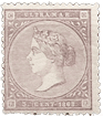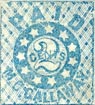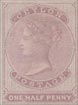
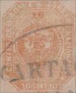
 1859. 5, 10 and 20 Centavos.
These are the stamps with a white diamond at the top of the stamp, and a four-pointed, white star before CONFED., and another after NACIONALES.
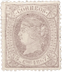
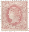
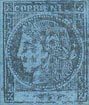
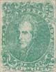
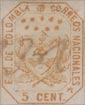
5 c. Genuine
Lithographed, in rosy-lilac and in grey-lilac, on fairly stout, white wove paper. Also on laid paper. The white diamond at the top of the stamp, between GRANADINA and CORREOS, is exactly above the center of the 5. There is a sort of four-pointed white star, with two rays much longer than the other two, before the C of CONFED.; and a similar one, but more like a star, after NACIONALES. In the word CONFED., the tail of the C is thin and pointed, and the O is round. The letters AD of GRANADINA are opposite the cut-off corner of the inner octagon; i.e., the flat, white line of
the corner is under both letters. The C of CORREOS is squeezed rather flat, vertically. The center of the first R of this word is exactly above a corner of the inner frame; and the next R seems to follow on naturally, although the two letters are at different angles, to suit the corner. Each O of this word is of the same shape, i.e., a compressed oval. There is a wide space of rather more than 1 mm. between the two words CORREOS and NACIONALES. The tail of the C of this latter word is thick, making it look very like a G. The space between 5 and CENTS, at the bottom, is about 3/4 mm. The white line which goes round the stamp, inside the lettered band, is about the same width all round, except under the AD of GRANADINA, where it is decidedly broader. There are 46 white pearls in the central circle, and the said circle, in which the shield is placed, is of solid colour. The shield does not touch any of the pearls, and all its points are sharp. The top compartment of the shield contains what looks like a closed tulip, between two cornucopias. The central compartment is separated from the upper compartment by a white line, and from the lower compartment by a similar white line. This central compartment contains a cap of liberty, with one oblique line of shading on it. The cap is on a ground of horizontal lines. The tassel curls over and downwards, till
it touches the bottom line of shading,—the same line on which the pole stands, that supports the cap. The lower compartment contains two semicircular, shaded seas, each containing a very indistinct, oblong object. The isthmus, separating the seas, has only a very little faint shading upon it. The 5 above the shield is of just the same shape as the 5 below the shield.
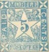
5 c. Forged
Lithographed, in red-lilac, on thin, white wove paper. The white diamond at the top of the stamp is twice as large as the genuine, and it stands above the right-hand side of the 5, instead of above its center. There is a similar, but longer, diamond before and after 5 CENT. 5. These diamonds are not in the least like four-pointed stars. In the word CONFED., the tail of the C is as fat as the head, and the O is oval, but cut rather square at the bottom. Only the letter A of GRANADINA is opposite the center of the flat corner of the inner octagon, while the D is to the right of the flat place. The said D does not join naturally with the letters INA, but is too far above them. The C of CORREOS is not squeezed up flat, and the tail is as thick as the head. The front edge of the first R of this word stands above the corner of the inner frame, and the tail of this R does not go near the foot of the second R, round the corner, but is much too high up. The first O of this word is oval, while the second 0 is square, and there is no extra space between the final s of the word and the N of NACIONALES. The tail of the C of NACIONALES is hardly like a G. The space between 5 and CENT, at the bottom of the stamp, is only about 1/4 mm. The white line round the stamp, between the lettered band and the inside of the stamp, is widest down the left side, very narrow at the bottom, and extremely narrow at the left top corner, under the AD of GRANADINA, just where it is broadest in the genuine. There are 56 pearls round the shield, the bottom one being about the largest. The shield touches the pearled circle at three points. The ground on which the shield is placed is entirely white, instead of colored. All four points of the shield are blunt. The thing in the top compartment of the shield rather resembles the head and shoulders of an Alley Sloper-like individual, languidly trying to put his arms through the sleeves of a limp shirt. There is a slight, dark outline dividing the top compartment from the central one; the said central compartment is white, instead of shaded; the pole on which the cap of liberty stands is hardly visible; the tassel only hangs down as far as the center of the cap. The center compartment is separated from the bottom one by a thin, dark line. This bottom compartment has its design reversed, i.e., the seas are white, and the isthmus is darkly shaded, besides being broken in the center. The lower sea bears a fairly distinct mark, like a ship; the upper sea is blank. The 5 above the shield touches the line above it. Its tail sticks forward, instead of curling in, almost to touch the head, and there is a small stop after it, which does not exist in the genuine. The lower 5 touches the line below it, though the genuine does not; and it is of a different shape from the upper one.
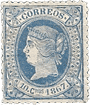
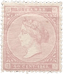
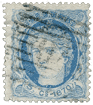
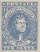
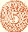
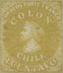
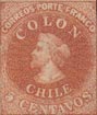
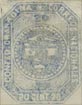
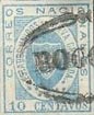
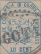
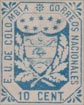
10 c. Genuine
Lithographed, as before, on rather thin, white wove paper. The colour is a dull yellow. There is a white diamond at the top of the stamp, and a four-pointed white star each side of 10 CENT. 10. The C of CONFED. is like a G, and the stop after the word is large and prominent. The D of GRANADINA is just above one of the corners of the stamp. The C of CORREOS is squeezed rather flat, just as in the genuine 5 c. The C of NACIONALES is like a G, and the S and the white star after it are both opposite the flat, where the right bottom corner of the design is cut off. The value at the bottom is 10 CENT. 10, and this is a very easy test for the forgery which I am going to describe. There are 46 pearls round the shield; very few of them are round, and some are more like short dashes. The shield is on a ground of solid colour, as before; all the points of it are equally sharp, and none of them touch the pearls. The design in the shield is much the same as in the genuine 5 c.
10 c. First Forgery
Lithographed, on rather stout, hard, white wove paper. My single specimen has portions of a couple of large, double-lined letters by way of watermark,—evidently the paper-maker’s name. The colour is a golden yellow, approaching orange. At the top of the stamp there is a small white cross, and there is a similar, but larger cross, each side of the value at the bottom. The C of CONFED. is an ordinary C, and the stop after the word is so very tiny, as to be almost invisible. The D of GRANADINA is exactly above the center of the flat made by the cut-off left top corner of the stamp, instead of at the corner of the flat. The C of CORREOS is an ordinary c, and not squeezed flat. The C of NACIONALES is not like a G. The s of that word is on the same line as the E before it, instead of going round the corner, as the genuine does; and the cross (which should be a four-pointed star) is almost opposite the center of the flat where the right bottom corner is cut off. The value at the bottom is 10 CENTS, instead of 10 CENT. 10, and this is an instant test for this counterfeit. There are only 43 pearls round the shield, and they are much rounder and more regular than the genuine. The shield is on a ground of solid colour, like the genuine; its right point is very blunt, and almost touches one of the pearls. The lowest point comes in between two pearls, instead of going near to one pearl. The three compartments of the shield are unshaded; the upper one contains what looks like the upper half of a young lady, with a high top-knot; and dressed in a loose garment, with her arms widely stretched out. The cap of liberty in the central compartment looks rather like a ham, and it is squeezed-in and crushed by the compartment-lines above and below it. In the lower compartment, the seas are white, instead of shaded, and the isthmus is shaded, instead of white. There is a small, almost invisible object in the lower sea.
10 c. Second Forgery
I do not think an elaborate description of this is necessary, as it is evidently from the same matrix as the first forgery, but with the numerals above and below the shield much smaller; thus all the tests are the same, except as now noted. Lithographed, in vermilion, on medium, very rough, white wove paper. The stop after CONFED. is of good size and prominent. The top point of the shield is absurdly sharp. The impression is much clearer than that of the first forgery.
10 c. Third Forgery
Badly lithographed, in scarlet-vermilion, on thin, white wove paper. This is exactly the same as the forgery of the 5 c., except in the points now to be noted, and therefore I need not repeat the part of the description common to both. The white diamond at the top of the stamp is not so very much larger than the genuine, but it stands over the beginning of the o of 10, instead of above the center of the space between the two numerals. The 10 below the shield touches the outline below it, though the genuine does not do so. In this forgery, the lower inscription is correct, 10 CENT. 10. The shield is on a white ground, like the forged 5 c.
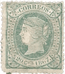
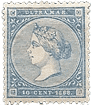
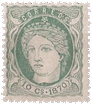
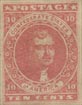
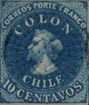
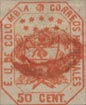
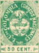
20 c. Genuine
Lithographed, in dull, slate-blue, on rather thin, white wove paper. This is the same as the genuine 5 c., except that there are 51 pearls round the shield. The white diamond at the top of the stamp is above the center of 20. The lower inscription is 20 CENT. 20.
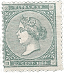
20 c. Forged
Lithographed, on rather hard, rough, white wove paper. The colour is a greenish-grey. This is exactly the same as the second forgery of the 10 c. The cross at the top of the stamp is not quite above the space between the figures 20, but nearer to the 2. The lower inscription is 20 CENTS.
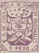
Bogus Stamps. 2 1/2 c., green; 1 Peso, rose.
These values do not exist in the first issue, but in that of 1860, to be hereafter described, which shows an eight-pointed white asterisk at the top of the stamp, and a similar one before the value, instead of the diamond and four-pointed star. The bogus stamps are just the same as the forged 5 c. already described, except for the change of value, and need not be further mentioned. Of course the easiest instant test of the 5 c. is the white ground on which the shield is placed, and these two bogus stamps show the same.
1860. 20 c.
This can be easily distinguished from the very similar design of the issue just described, as the stamps bear, as already stated, an eight-pointed asterisk at the top, and another before the value, and sometimes another after the value.
Genuine
Lithographed, generally in shades of dark ultramarine, on greyish- white wove paper, thin, and rather hard. The lowest compartment of the shield contains an isthmus, darkly shaded with wavy, horizontal lines. The portion of sea above the isthmus is very nearly as large as the some-what similar portion below it; and the dark object in the centre of the lower sea is shaped like the hull of a boat, without masts or sails. The object in the top compartment of the shield is shaded with irregular oblique lines. There are 44 large, round, and uniform pearls in the circle, round the shield. The plain white circle, outside the pearls, is very wide, almost as wide as the diameter of one of the pearls, and wider than the width of the white strokes of any of the letters of the inscription. The figures of value above the top of the shield are very nearly the same size as the corresponding figures below the base of the shield; perhaps they may be just the least trifle bigger. There are 40 wavy lines of shading in the background, above the shield, and 41 below it; though they are not very easy to count. The outline of the white circle, outside the pearls, is broken at the sides, and runs into the inner side-frames just by the D of CONFED., and by the CIO of NACIONALES. The stop between CENT. 20 is midway between the T and the 2, and almost touches both. The s of NACIONALES is just level with the angle of the inner frame to the left of it.
First Forgery
Lithographed, in more or less slaty-blue, and also in pale rose (bogus), on white wove paper, thicker and softer than the genuine. The isthmus in’ the lowest compartment of the shield is dotted with several irregular blotches, and has no lines of shading on it anywhere. The portion of sea above the isthmus is not more than a quarter of the size of the corresponding portion below it. The dark object in the lower sea is a transverse oblong. The object in the top compartment is shaded with about 16 vertical lines. There are 45 pearls in the circle round the shield; most of them are oblong, instead of round, and they are all much too small. The plain white circle, outside the pearls, is narrow, even narrower than the white strokes of the letters of the inscription. The figures of value above the top of the shield are a good deal larger than the corresponding figures below the shield. There are 44 wavy lines of shading above the shield, and 38 below it; and many of them are blotched, and run together, so that they are even more difficult to count than the genuine. The outline of the plain white circle, outside the pearls, is broken on the left side, and does not run into the frame to the left of it, but appears to go under it. The outline of this circle is complete on the right side, and does not even touch the frame to the right of it. The stop between CENT. 20 does not touch either of the letters, but is very much nearer to the 2 than to the T. The letters of the lower inscription are tall and thin, reaching almost from top to bottom of the frame; but in the genuine they are stumpy, and do not nearly reach from top to bottom of the frame. The S of NACIONALES is lower than the level of the corner of the inner frame to the left of it.
Second Forgery
Lithographed, in dull ultramarine, on thin, hard, white laid paper. The laid lines are vertical, and not very distinct. The lower sea, in the isthmus, has a sort of diamond-shaped object in it. The cornucopias in the upper compartment of the shield have blotchy shading. There are 61 very small pearls round the shield, of different shapes and sizes. The figures 20 at the top of the stamp are more squeezed together than those at the bottom, and there is a flaw from the tail of the upper 2, in my specimen, which crosses the white ring below it. There are about 35 straight vertical lines above the shield, and about 34 below it, but they are irregular, and difficult to count. The white ring, outside the pearls, breaks right through the frame both sides, by the ED of CON FED., and the CIO of NACIONALES, actually touching the foot of the I. The stop between CENT. 20 is nearer to the 2 than to the T. The I of GRANADINA, in my specimen, is not nearly so tall as the following N. The angle of the frame by the S of NALES is almost rounded, and the S is higher than the angle.
Postmarks
Genuine.—Frequently a word in pen-and-ink; but I have seen two rather large, concentric ovals, with an ornamental line in the center, and name, in thick capitals, between the ovals.
Forged.—1, 29, 98. Also a written word.

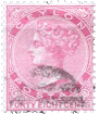
 1861. 2 1/2, 5, 10, 20 c. and 1 Peso.
Genuine
Lithographed, on very thin, yellowish-white wove paper. The shield, as in the issue just described, is divided into three portions, the central one only being white. The upper portion of the shield contains two cornucopias, their mouths turned towards each other, and an unknown thing between them, which is of an oval shape, with an oblique line in the center of it. This upper portion is shaded with nine horizontal lines on the left side, and eight on the right side, counting the bottom line in each case. The central portion contains a cap of Liberty, on a pole. The lower portion shows an isthmus, with a ship on each side of the isthmus, though the said ships are represented merely by blotches. The left top comer of the shield is a good deal higher and more pointed than the right top corner. The portion of sea above the isthmus extends rather farther to the right than to the left of the shield; and the portion of sea below the isthmus entirely fills up the lower point of the shield. The oval band, outside the shield, contains, at the bottom, nine eight-pointed asterisks or stars, the points being tolerably easy to count. The cross-stroke of the T of ESTADOS is very short, and is of equal length each side of the perpendicular stroke. The word DE, at the top of the oval, is in very small block capitals, and is placed in the center of the top. The lines in the shaded ground, outside this oval, are rather inclined to be blotchy, and are difficult to count. There ought to be 15 in the right-hand top corner, 16 in the left-hand top corner, 14 in the right-hand bottom corner, and 16 in the left-hand bottom corner, counting the outer line in each case. I am almost afraid that these lines do not form a very reliable test; because, as I have said, they are inclined to be blotchy, and the two top lines and two bottom lines often run together; however, I give them as they will be found on good specimens of the genuine. The second O of CORREOS is a transverse oval, but not so markedly so as the O of NACIONALES. This second O of CORREOS is too large, and it is very close to the angle of the inner frame. The top-, and side-lines of this inner frame, if prolonged, would cut into the side and bottom of the O, respectively. The letters of the outer inscription are tall and thin, and moderately regular; those of the inner inscription are thinner, and somewhat taller, besides being more regular. The lowest value is labelled 2 i 1/2 CENTAVOS, and the highest value is lettered UN PESO.
First Forgery
I have never seen this forgery, but, from Mr. Pemberton’s description of it, I fancy that there will be no difficulty in at once deciding on its worthlessness. All three divisions of the shield are white. There are no stars at all at the bottom of the oval. The letters of the outer inscription are thick and unequal.
Second Forgery
Of this I have only seen the 2 1/2 and 20 centavos. It is lithographed, on paper which is thicker and a good deal harder than that of the genuine. The upper portion of the shield is so much blotched, that the design upon it is quite undecipherable. The pole upon which the cap of Liberty is placed is very short, so that the cap seems almost to rest upon the line below it. The ship in the sea above the isthmus is represented by a very small projection from the land, below the centre of this upper sea. The left top corner of the shield is very slightly higher and more pointed than the right top corner, but it would hardly be noticed. The portion of sea above the isthmus is set equally distant from each side of the shield, and is too short. The lower sea is too small, and the ship in it is represented by a large blotch, hanging from the land above this lower sea. The oval band outside the shield contains nine asterisks, as in the genuine; but they are extremely blotchy, and it is impossible to count the eight points which ought to appear. The easiest test for this forgery is in the word at the top of the oval band, which is “be”, in Roman lower-case letters, instead of DE, in small block capitals. The lines in the shaded ground, outside this oval, are so blotched that I have not been able to count them; indeed, in the right-hand bottom corner, they are all merged into one solid piece. The second O of CORREOS is larger than the O of NACIONALES, and almost round. The letters of the inner inscription are far too thick and blotchy. The lowest value is correctly lettered, 2 i 1/2 centavos. This forgery is sufficiently like the genuine to be deceptive, supposing it were printed more carefully.
Third Forgery
This is the common one, and seems to be in universal request among young collectors. It is lithographed, on white wove paper, a little thicker and harder than the genuine. The left top corner of the shield is very little higher than the right. The upper portion of the shield contains an extraordinary thing, like the head and wings of a young owl. This upper portion is shaded with nine lines on the left-hand side, and seven on the right-hand side, counting the bottom line in each case. The central portion contains an ornamental flower-vase, with a plant growing out of it. There is a small projection from the isthmus, into the top sea, to represent the upper ship. The lower sea is represented simply by a very distinct, white comma, which does not go near the bottom of the shield. There are only eight asterisks, or stars, in the bottom of the oval band, and the points on them cannot be counted. The cross-stroke of the T of ESTADOS is long, and the side towards the A is a good deal longer than the side towards the S. The word DE, at the top of the oval, is like the genuine. The lines in the shaded portion, outside the oval, are too distinct, and very easily counted. There are 14 in the right-hand top corner, 16 in the left-hand top corner, 11 in the right-hand bottom corner, and 14 in the left-hand bottom corner, counting the out-line of the frame in each case. The second O of CORREOS is about the same size as the O of NACIONALES, but not so oval in shape. The letters of the inner inscription are nearly as thick as those of the outer one. The lowest value is lettered 2 I 2 centavos, and the highest value is 1 PESO.
Fourth Forgery
This appears to be the third forgery, with the lower part of the shield re-drawn. All the tests are exactly the same as for the third forgery, except that the lower sea is of good shape, instead of being a white comma, and there is an oblong mark in this bottom sea, to represent a ship. I have only the 20 c. of this counterfeit.
Fifth Forgery
Lithographed, on thin, white wove paper. This is a poor affair, and need not detain us long. The left top corner of the shield is no higher than the right. The upper portion of the shield contains the head and wings of the young owl, as in the third forgery, with seven lines of shading to the left of it, and the same number to the right of it. The thing in the central portion of the shield is a glass or tumbler, containing a blotchy plant. The sea above the isthmus is like two small basins, side by side; for the thing projecting from the land below it, to represent the upper ship, is so large as to divide this upper sea into two portions. The lower sea is represented by a small, curved white line. There are only eight asterisks at the bottom of the oval band; the eight points of two of them can be counted. The cross-stroke of the T of ESTADOS is of normal length—longer than that of the genuine—and is of equal length on each side of the perpendicular stroke. The word DE, at the top of the oval band, is a good test for this counterfeit, as it is placed far too much to the right, instead of being at the very top. Out-side the oval band there are 12 lines of shading in the right-hand top corner, 17 in the left-hand top corner, 11 in the right-hand bottom corner, and 17 in the left-hand bottom corner. The O of NACIONALES is perfectly round, and much larger and thicker than the second O of CORREOS, the latter O being too oval. I only possess the 2 1/2 c. of this set, and it is lettered 2 1 2 centavos, as in the third forgery.
Sixth Forgery
This is very like the genuine, and likely to deceive. There are nine stars, as in the genuine. The second O of CORREOS is the same size as the other letters; it is far away from the corner of the inner frame. If the top and side-lines of this inner frame were prolonged, they would not touch the O anywhere.
Seventh Forgery
Of this forgery I cannot give any description, as it was lent to me for a day, at a time when I had none of the genuine stamps by me; and I was thus unable to take any useful notes of the points of difference. Lithographed, on paper a little thicker than that of the genuine, but a marvelously correct copy in all other respects, as far as my memory will serve me. It was produced, I believe, by photo-lithography, and varies very little from the genuine. However, any reader possessing specimens of this set will, very probably, be able to detect them by the tests for the genuine given above.
Eighth Forgery
This looks very old, but I first saw it in 1902. Lithographed, on fairly thick, rather hard, white wove paper, the face of which has been colored with a pale brown (25 c.) or a yellowish (10 c., 20 c.) wash, to give age. The lines in the upper part of the shield are very blotchy, and cannot be counted with any certainty; there seem to be eight on the left side, and seven on the right. Both of the top corners of the shield are of the same height, though the left corner is rather more pointed than the right. The sea above the isthmus extends equally towards both sides of the shield. There are nine asterisks at the bottom of the oval band, as in the genuine, but they are blotchy, and their points vary in number, from four to eight, instead of being all 8-pointed. The cross-stroke of the T of ESTADOS is too sloping, and is longer towards the A than towards the S. The lines in the shaded ground, outside the oval, are: right top corner, 13 and a blotch; left top corner, 14; right bottom corner, 15 and a blotch; left bottom corner, also 15 and a blotch. The second 0 of CORREOS is smaller than the other letters, and some distance from the corner of the inner frame. If the top and side-lines of the said inner frame were prolonged, they would both pass quite clear of the O. The lowest value is correctly labelled 2 i 1/2 centavos. I have not seen the Un peso of this counterfeit.
Postmarks
Genuine.—The genuine stamps usually have the name of a town, in medium-sized capitals.
First Forgery.—I do not know the cancellation.
Second Forgery.—Uncancelled.
Third Forgery.—A word, or words. I have seen STA. CA , in very large Roman capitals; also . . . O G A T . . . , in still larger, italic capitals (probably Bogota, mis-spelt); also BOGOTA, in stumpy Roman capitals; also ANTIOQUIA, in thin Roman capitals; also a square of dots, after the style of 37, without numerals; also 1 (large); also 73.
Fourth Forgery.—St. Alarta, in ordinary capitals and lower-case.
Fifth Forgery.—1. Also what appears to be a portion of 100.
Sixth and Seventh Forgeries.—I have not got these now, and do not remember the cancellations.
Eighth Forgery.—A very large O, in red or in black.
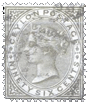
 1863. 5 c., yellow, orange-buff; 10 c., blue; 20 c., red and 50 c., green.
Genuine
Lithographed, on thin, yellowish-white wove paper, rather hard rather hard, and usually with a very slight surface-tint, the colour of the stamp; also (10 c. and 50 c.) on bluish
wove paper. The curled-over, outer ends of the cornucopia, in the top compartment of the shield are blunt and rounded, and very nearly touch the sides of the shield. Neither of them curls down more than the other. They are disgorging pieces of money, which are tolerably distinct. The flower, standing up between them, and separating them from each other, looks like a tulip, almost closed, and leaning over to the right. The cap of Liberty in the central compartment is large and distinct, and is shaded nearly all over with oblique lines, running from the right, downwards, to the left. The tassel or top of the cap bends over to the left, and hangs down level with the bottom of the part which is supposed to go on the head. The pole which bears the cap gets suddenly wider towards the top. If prolonged downwards, it would pass almost centrally through the bottom point of the shield. The bend of the cap just touches the transverse lines above it. Two parallel lines, close together. separate the top compartment of the shield from the second; and two similar lines, equally close together, separate the second compartment from the bottom one. The peaked part at the center of the top of the shield is a good deal higher than the corners; the left top corner being level with the middle of the first O of COLOMBIA, while the central peak is level with the beginning of the L of that word. The bottom point of the shield is level with the end of the L of NACIONALES. At the top of the stamp there is an eight-pointed asterisk, separating COLOMBIA and CORREOS; and below this there are nine six-pointed stars, arranged in two rows, the upper row curving upwards in the center, the lower row curving downwards in the center, so that the whole looks like a narrow, transverse, oval ring of stars. The leaves in the two branches of the wreath are unmistakable oak-leaves, and they are all shaded more or less all over with oblique lines, running from the left, downwards towards the right. The point of the lowest leaf on the left-hand side touches the corner of the inner frame, just under the letter E of E. U. DE, etc. The side of the top leaf but one in the right-hand branch touches the frame very distinctly beside the CI of NACIONALES. A horizontal line, drawn across the stamp, along the beginning (outer edge) of the E of E. U. DE, etc., would cut into the S of NACIONALES. The bottom ends of the branches point to the lowest two corners of the inner octagonal frame, and the bottom end of the right-hand branch passes very distinctly over the end of the left-hand branch, and is thinner than the said left-hand branch. As regards the lettering, the I of COLOMBIA, if prolonged downwards, would cut exactly into the left top corner of the inner octagonal frame, the first O of CORREOS is considerably taller than the c, and the first stroke of the first N of NACIONALES is level with the right top corner of the shield.
First Forgery
Lithographed, on stout, white or greyish-white wove paper. Of this counterfeit I have only the 20 c., soi-disant error, in dull carmine, bright carmine, and a sort of lilac-rose. The cornucopias are very different from the genuine. They are apparently joined together, with no money coming out of them, and the two together might be likened to a fat-bellied snake, with a blunt tail, pointing down to the right bottom corner of the containing-compartment, and. its head level with the center of the left-hand outline of the compartment. It does not touch either side of the shield. The thing standing above the cornucopia is something like an ivy-leaf, but not in the least like a tulip, and it stands straight up, without any stem. The cap of Liberty in the central compartment is rather like a chemist’s retort, and the tassel-end points obliquely to the left, almost towards the left bottom corner of the compartment. It is too white, not having so much shading on it as the genuine. The pole which supports it is the same thickness throughout, and the said pole, if prolonged downwards, would pass far to the right of the bottom point of the shield. This is an easy test. The bend of the cap does not touch the transverse lines above it, and these two parallel lines above the cap are much closer together than the similar pair below the cap. The left top corner of the shield is considerably higher than the right one, and is above the level of the first 0 of COLOMBIA. At the top of the stamp there is a nine-pointed asterisk, and the nine stars below it are five-pointed instead of having six points. The oak-leaves are very lightly and irregularly shaded, and none of them touch the frame. A horizontal line, drawn across the stamp, along the beginning of the E of E. U. DE, etc., would pass between the ES of NACIONALES. The lower ends of the branches are almost equal in thickness; the lower end of the right-hand branch points to the left bottom corner of the containing-octagon, but the end of the left-hand branch is of a different shape, and does not point to the right-hand lower corner of the octagon. The first O of CORREOS is no taller than the C, and the first N of NACIONALES slopes, so that a straight-edge, laid along the beginning of it, would cut into the L of COLOMBIA, while, in the genuine, it would cut into the first O of that word. In the genuine stamps, there is a transverse oblong stroke in the sea above the isthmus, and a similar, but larger stroke in the sea below the isthmus, to represent ships. In this forgery, there is nothing in the upper sea, and the lower sea contains a regular ship, with a distinct mast. There is a large, seven-pointed star, with a white spot in the centre, before the E. of E. U. DE, etc.
Second Forgery
This is not nearly so good as the first forgery. It is lithographed, on fairly thick, yellowish-white, and on thick, greyish-white wove paper. I have the 5 c., yellow; 10 c., blue; 50 c., green; and a bogus value, 1 peso, dull lilac-rose. The cornucopias in the top compartment of the shield are joined into one, and the outer ends are curled over, spirally, into two sharp points, the whole looking like a pair of ram’s-horns. They do not go near the sides of the shield. There is, of course, 110 money to be seen. Above the center of them is a perfectly round ball, shaded nearly all over, and standing on a short, thick support. This top compartment is separated from the middle one by one thin line, instead of two. The cap of Liberty in the middle compartment is very like the ball above the cornucopias, only it has a tail coming out of the top and hanging over to the left, ending in a sharp point, instead of a blunt tassel. This point does not come down anything like level with the base of the cap. The pole is very short and thick, and is exactly above the bottom point of the shield. There is no line separating the second compartment from the lower one, except just across the top sea of the isthmus, where there is a short, single line, to support the pole. The peaked part, at the center of the top of the shield, is level with the corners. The leaves in the two branches are of some unknown species of tree (possibly laurel); at any rate, they are not oak-leaves, and they are principally shaded with blotches of colour, instead of lines. None of the leaves touch the frame, as a rule, though the large leaf at the bottom, on the right-hand side, sometimes goes very near the frame, near the ES of NACIONALES. The bottom point of the shield is level with the beginning of the E of NACIONALES. The shield itself is quite a different shape from that of the genuine. The genuine measures 7 mm. across the top, and 9 mm. from the middle peak at the top to the bottom point; while in this forgery it measures nearly 8 mm. across, and 10 mm. from top to bottom. At the top of the stamp there is a ten-pointed asterisk, and below this there are nine eight-pointed, blotchy asterisks (instead of six-pointed stars), in two rows, both rows curving upwards in the center. A horizontal line, drawn across the stamp, along the beginning of the E. of E. U. DE, etc., would pass between the ES of NACIONALES. The bottom stems of the branches are not splayed widely out, as they are in the genuine, but point downwards, respectively towards the C, and the space between EN of CENT., and it is not possible to say which crosses over the other. They are both of equal thickness. The O of CORREOS is no taller than the C, and the first N of NACIONALES is far below the level of the right top corner of the shield. The sea above the isthmus is exceedingly small, with no ship in it. The isthmus itself is of solid colour, instead of being shaded with oblique lines, running down from right to left; and the ship in the lower sea is a shapeless dash, too small, and set too high up. There is a small, colored dot before the numeral of value.
Third Forgery
This is not bad-looking, as a whole, though the shield of arms is almost a caricature of the original. Clearly lithographed, on thin, grey- white wove paper. I have only the 10 c., and it is the only specimen that I have ever seen, so that this counterfeit cannot be at all common. The cornucopias are only separated from each other by a small blotch, and look like a pair of very blunt buffalo-horns. The outer ends do not curl down much, and the left one is rather near the side of the shield, while the right one is at some distance from the side. There is no money to be seen. Above the center of the cornucopias is a thing some- thing like a U, with an I in the center of it, leaning a little to the right. Below the cornucopias are about five graduated, horizontal lines of shading, none of them extending to the sides of the shield. The lowest of these lines touches the cap of Liberty, which is, apparently, a leg of mutton, lying on a strongly-outlined white table, shaped like a T, with a very short stem. It will be understood that the pair of parallel, horizontal lines, which ought to separate the top compartment of the shield from the second compartment, are absent in this forgery. The stem or leg of the table, if prolonged downwards, would pass to the left of the bottom point of the shield. There are two parallel, horizontal lines, separating the central compartment from the bottom one, as in the genuine; but there is no upper sea, the isthmus extending uniformly across, under the two parallel lines. The left upper corner of the shield is level with the space between OL of COLOMBIA, the central peak is level with the middle of the L, and the right top corner is level with the space between the words CORREOS NACIONALES. In the genuine, the top peak of the shield points slightly to the right of the center of the asterisk at the top of the stamp; in this forgery, the said peak points quite to the right-hand edge of the asterisk. The bottom point of the shield is level with the space between ES of NACIONALB’S. The asterisk at the top of the stamp has eight points, like the genuine, but they are more spread out, making it larger than it ought to be. As regards the ring of six-pointed stars, the five in the top line are in one straight line, instead of curving upwards in the center; and the four in the lower line are very deeply curved downwards in the center, so that the two inner ones almost touch the shield. The leaves on the right-hand branch are more like oak-leaves than those on the left-hand branch; they have very little shading on them; the point of the lowest leaf on the left side is very blunt, and it does not go anywhere near the frame. None of the leaves on the right side touch the frame to right of them. A horizontal line drawn across the stamp, along the outer edge of the E. of E. U. DE, etc., would pass clear below the s of NACIONALES. The bottom end of the right-hand branch is very sharp, and it points to the numerals of value, instead of to the left lowest corner of the octagonal frame; the bottom end of the left-hand branch is considerably blunter, and it points very nearly to the right lowest corner of the octagon. There is a wide separation between the OR of CORREOS, though they are fairly close together in the genuine, and the 0 is, if anything, shorter, instead of taller, than the c. A line drawn across the stamp, along the beginning of the first N of NACIONALES, would pass between OL of COLOMBIA. As there is no upper sea, there is, of course, no upper ship. The lower sea is very much too large, and the dash in it, to represent a ship, is too long, and too high up. The shield is 7 mm. wide, by 10 mm. high.
Fourth Forgery
This is very like the third forgery in many details, but is clearer, and with the lines and lettering thinner. I have only the 10 c., blue, of this counterfeit. It is nicely lithographed, in indigo-blue, on thick, greyish-white wove paper, brownish gum. The cornucopias are joined together, without showing any money, and they are something like a very blunt pair of buffalo-horns, though the ends curl down much more than in the third forgery. Neither horn touches the side of the shield. The thing above them is a crescent, with an 1, or straight, vertical stroke, standing up in the middle of it. The cap of Liberty is like a chemist’s retort, but with a flat bottom, resting on a T-shaped table, as in the third forgery, but, in this case, the tube of the retort (tassel of the cap) hangs down to the level of the bottom of the table, and the foot of the table is joined to the horizontal lines below it by a continuation of its left-hand outline; where-as, in the third forgery, both outlines of the foot or pedestal of the table run down to join the line below them. There are four graduated lines, separating the upper compartment of the shield from the central compartment, and the first of these lines goes right across the shield, from side to side. The bend at the top of the cap does not touch this upper-most line, but only reaches to about the third line. There are, as in the genuine, two horizontal lines, separating the middle compartment from the bottom one. The left top corner of the shield is level with the space between OL of COLOMBIA; the central peak is level with the space between LO of that word, and the right top corner is slightly higher than the level of the middle of the first N of NACIONALES. A horizontal line, drawn through the first stroke of this N, would pass along the stem of the L of COLOMBIA, though, in the genuine, it would cut through the first O of that word. The bottom point of the shield is level with the end of the E of NACIONALES. At the top of the stamp, there is an eight-pointed asterisk, but the points stand further apart from each other than in the genuine. The nine, six-pointed stars above the shield are better done than in the third forgery, though they are not placed exactly in the same position as in the genuine. Thus, in the genuine, if a line were drawn up, from the center of the left-hand star of the bottom row, through the center of the left-hand star of the top row, it would pass through the right lower corner of the B of COLOMBIA; whereas, in this forgery, a line so drawn would pass between the IA of that word. Most of the leaves on the branches are oak-leaves, but not one of them touches the frame anywhere. The bottom hook of the S of NACIONALES is larger, thinner, and more pointed than the top hook, but both are alike in the genuine. The stem of the right-hand branch points to the 0 of 10, and the stem of the left-hand branch points to the stop after CENT. Both stems are of about the same thickness. If the I of COLOMBIA were prolonged down- wards, it would just miss the corner of the frame below it. The letters CO of CORREOS slant slightly to the left, instead of being upright, and the O is no taller than the C, though it is wider. There is a white patch at the top of the isthmus, that may be intended to represent the upper sea, but it is too much to the right, and has no ship in it. There is also another white patch, at the left side of the isthmus, which does not exist in the genuine. The lower sea, with its conspicuous dash, is exactly the same as in the third forgery.
Fifth Forgery
I think this seems to be the most usual counterfeit of this issue, and it is more like the genuine than any of the others. I have the 20 c., red; 50 c., green; and the soi-disant error, 50 c., red, of this set. Lithographed, the impression being usually very slightly blurred, on hard, thinnish, very white wove, and also on softer, yellowish-white wove, and on thin, hard, bluish-grey wove paper, the unused ones backed with very crinkly, yellowish-white gum. The cornucopias are fairly like the genuine, but the right-hand end curls over lower than the left, and is firmly joined to the side of the shield, while the left-hand one touches the top outline of the shield, which is not the case with the genuine. The money cannot be seen. The flower is too pointed, and too upright. There is one thick, blotchy line separating the top compartment of the shield from the middle one, and one similar line separating the middle compartment from the bottom one. This ought to be an easy test. The cap of Liberty is fairly copied, but the shading is very blotchy. The pole widens out, as in the genuine. The left top corner of the shield is level with the top of the first O of COLOMBIA, and the right-hand corner is a little higher than the first N of NACIONALES, instead of being level with the edge of its first stroke. There is an eight-pointed asterisk at the top of the stamp, as in the genuine, but the points are all blotched together, except the two to the left of the top, which are separated from each other. The nine, six-pointed stars are like the genuine. The leaves are plainly oak-leaves, but they all touch the frame except one, and the shading is irregular. The stem of the right-hand branch is sharply pointed, as in the genuine, but it is of solid colour, and points to the o of the figures of value ; the stem of the left-hand branch is split at the end. Both stems are of about equal thickness. The first O of CORREOS is no taller than the C. The isthmus is tolerably like the genuine in shape, but it is shaded with blotches, instead of the oblique lines. The dash to represent the ship in the lower sea is a little too short, and there is no dash in the upper sea, but there is a small projection into the upper sea, from the line below it, probably to do duty for the ship. This projection would hardly be noticed unless specially looked for.
Sixth Forgery
Of this I have only the 10 c., dull ultramarine, and it is the only specimen that I have ever seen, so it cannot be very common. It may possibly be from a cliche used, to illustrate some catalog.
Typographed, (an electrotype cliche?) in dull ultramarine, on thick, pale blue wove paper. Being a typograph, the outer frame is plainly sunk into the paper. The cornucopia; are of solid colour, except a small white patch in the centre, the right-hand end does not touch the shield, and the left-hand end runs right into the outline of the shield. The object above them is very shapeless, and is a little like a very full-blown rose. The cap of Liberty is one solid, uniform mass of colour; the tassel is big and circular, and does not hang down to the level of the bottom of the cap. The pole is very short, and does not get suddenly wider at the top. There is one thick line, separating the top compartment from the middle, and one similar line, separating the middle compartment from the bottom one. The upper sea is quite as wide as the lower one, though not so deep; there is no ship in it, but there is one in the lower sea, like the genuine. The upper, left-hand corner of the shield is level with the space between OL of COLOMBIA; the central peak is level with the very tip of the tail of the L of that word, and the right-hand corner is level with the first stroke of the first N of NACIONALES. There is an eight-pointed asterisk at the top of the stamp, as in the genuine, but it is very much blotched. The nine, six-pointed stars are much more like asterisks than stars. The oak-leaves on the left side are one solid mass of colour, and all of them touch the frame, while all but one of the leaves on the right side also touch the frame. A horizontal line, drawn across the stamp, along the beginning of the E. of E. U. DE, etc., would barely touch the S of NACIONALES. The bottom ends of the branches point, respectively, to the o of 10, and to the N of CENT; they are of solid colour, and it is impossible to say which of them crosses over the other. Several of the letters touch each other; viz., IA of COLOMBIA, CO and OS of CORREOS, and LES of NACIONALES. The first O of CORREOS is no taller than the C, and it slopes more to the left than the C does.
Seventh Forgery
As with the last, I have only one specimen, 10 c., pale ultramarine, and have never seen another copy. Both these counterfeits came to me in 1902. Typographed, (an electrotype cliche?) in pale ultramarine, on stout, hard, pale blue wove paper. The impression is deeply sunk into the paper. It is, in many respects, very like the sixth forgery. The cornucopias touch the shield both sides; there are some marks to represent the money, and the flower is like a full-blown rose. There is a thick, deeply-sunk single line, separating the top compartment from the central one, and a similar, single line, separating the central compartment from the bottom one. The tassel of the cap of Liberty is a circular knob, and it does not hang down level with the bottom of the cap. The lower out-line of the cap is not horizontal, but slopes down to the left, and the pole is so very short as to be practically invisible. The upper sea is as wide as the lower, though not so deep, and contains no ship, but there is a ship in the lower sea, as in the genuine. The upper left-hand corner of the shield is level with the end of the first O of COLOMBIA; the middle peak is level with the tip of the tail of the L of that word, and the right-hand corner is level with the first stroke of the first N of NACIONALES. The shield measures 7 1/2 mm. across, by 9 1/4 mm. from top to bottom. At the top of the stamp there is an eight-pointed asterisk, as in the genuine, but it is very coarse, with much too large a dot in the centre, and it is oval, instead of circular. The nine stars below this are six-pointed asterisks, much too large. The one at the right-hand end of the top row is a good deal lower than the one at the other end. The leaves are oak-leaves; none of them really touch the frame to the left, though the bottom one is very close to it. A horizontal line, drawn across the stamp, along the outer edge of the E. of E. U. DE, etc., would pass almost close between ES of NACIONALES. The ends of the branches, as in the last- described counterfeit, point, respectively, to the 0 of 10, and the N of CENT. There is a stop after the 10 in this forgery. The letters ES of NACIONALES are joined. The o of CORREOS is no taller than the C.
Postmarks
Genuine.—Generally the name of the town, in large capitals, within an ornamental oval. Also a very large letter, generally an O, which may be part of a word. Also the name in pen-and-ink.
First Forgery.—1 (generally struck at the intersection of four stamps); also two concentric ovals, with lettering between and in the center; also a rather small oval, formed by straight lines at the top and bottom, and curved lines at the sides.
Second Forgery.—Part of a large, thick oval; also part of a very thin oval; (I have not been able to make out any lettering on these); also 10, and one something like 54; also 100.
Third Forgery.—Uncancelled.
Fourth Forgery.—Two concentric ovals, with lettering.
Fifth Forgery.—Uncancelled.
Sixth Forgery.—Uncancelled.
Seventh Forgery.—Pen-cancelled.


 1864. 5 c., orange, yellow; 10 c., blue; 20 c., red; 50 c., green and 1 peso, mauve.
These stamps are very similar to the set just described, except that the background to the shield and branches is of solid colour, instead of white, and floral ornaments have been added, outside each corner of the frame. There are two varieties of each value, but I trust the following description will enable my readers to detect any forgery.
Genuine
Lithographed, on thin, white or yellowish-white wove paper. The shield, and the arms on it, are the same as in the genuine stamps of the last issue; and, as before, there are two distinct, thin parallel lines, separating the top compartment from the middle one, and two similar lines, separating the middle compartment from the bottom one. The shield measures 7×9 mm.; its left top corner is level with the top of the first O of COLOMBIA; the middle peak is level with the first stroke of the L of that word; and the right top corner is level with the first stroke of the first N of NACIONALES. The bottom point of the shield is level with the end of the L of NACIONALES. The eight-pointed asterisk at the top of the stamp is usually clearer than in the last issue; and the nine, six-pointed stars are the same as before. The oak-leaves are all white, with no veining on them. The lettering is considerably thinner than in the last issue. A straight line, drawn across the stamp, along the beginning of the E. of E. U. DE, etc., would cut through the middle of the S of NACIONALES. The bottom ends of the branches are the same as before, but white. There is a stop after CENT. The ornament outside each corner of the stamp is composed of five pieces, viz., a thing like a lance-head, with two comma-shaped strokes each side of it. In the left top corner, three (and sometimes four) of them are prolonged, to touch the frame below them; in the right top corner, three of them touch the frame; in the left bottom corner, none of them touch the frame; and, in the right bottom corner, two of them touch the frame. There is, as before, an oblong dash in each sea, to represent a ship, the one in the upper sea being fainter and smaller than the other.
First Forgery
Lithographed, on thick, hard, white wove paper. This is really an excellent counterfeit. The mouths of the two cornucopias are open, and show the money tumbling out, as in the genuine; but the outer ends decidedly touch the sides of the shield, instead of almost doing so, and the outer end of the left-hand one curls downwards and inwards upon itself, considerably more than the outer end of the other one. The part of the cap of Liberty which is supposed to go on to the head is too tall and narrow, like half a cocoa-nut, instead of being somewhat like an inverted bird’s nest, and the pole does not get any wider towards the top. There is no mark in the upper sea, but, in the lower one, there is, instead of the plain dash, a tiny, but distinct vessel, with mast, etc. The shield is 6 1/2 mm. across, and 9 mm. high; its left top corner is level with the middle of the first O of CORREOS; the top peak is level with the beginning of the L of that word, as in the genuine, and the right top corner is not quite level with the N of NACIONALES. The bottom point is level with the end of the L of this word, like the genuine. A horizontal line, drawn across the stamp, along the beginning of the E. of E. U. DE, etc., would only just graze the S of NACIONALES. Of the ornaments outside the corners of the stamp, none of the strokes of the one in the left top corner touch the frame; in the right top corner, only the central stroke touches the frame; in the left bottom corner, usually none touch the frame, though sometimes one does; in the right bottom corner, none of them touch the frame. There is no stop after CENT. I have the 20 c., bright vermilion; 50 c., green; and 1 peso, bright mauve, of this set.
Second Forgery
This is not so good as the last, in some respects, though tolerably deceptive. I have only the 5 c., orange-yellow, and 10 c., blue. Lithographed, on medium to thickish, yellowish-white, and also on very thin, white wove paper. The two cornucopia; in the shield are drawn as one, with no mouths or money showing; and the outer end of the left-hand one is rather more sharply pointed than the other: the outer ends of both are at some distance from the sides of the shield. The flower on a stalk, in the center, between the cornucopias, looks like half a broken egg-shell, and points almost directly upwards. The top compartment of the shield is divided from the second by one thick line, and the second is divided from the bottom one also by one thick line. The cap of Liberty is drawn too high up, so that it appears to be quite jammed up against the line under the cornucopias, instead of just merely touching it. The pole also is much too tall, and does not get wider at the top. The sea above the isthmus is made very small, and has no mark on it to represent a ship. The shield measures 7 1/4 x 9 1/4 mm., being thus slightly larger than the genuine, each way; its left top corner is almost level with the middle of the 0 of COLOMBIA; the middle peak is level with the beginning of the L of that word, and the right top corner is above the level of the first N of NACIONALES. The bottom point of the shield is level with the center of the L of that word. The eight-pointed asterisk at the top of the stamp is a good test in this forgery, as the bottom ray runs up to join the central dot; though none of the rays touch the central dot in the genuine. The star under the first O of CORREOS is much lower down than the corresponding star at the other end of the line. The stem of the left-hand branch, which crosses to the right, under the stem of the right-hand branch, is bent up, in a slightly concave form, and points almost up to the S of NACIONALES. The stem of the right-hand branch points to the middle of the 5, in the lower value, and to the o of 10 in the other value. There is a stop after the numeral or numerals. The stop after the E. of E. U. DE, etc., is a dash in this counterfeit; and the letters ES of NACIONALES are much squeezed together, so that they touch both top and bottom. Four of the ornamental strokes in the left top corner touch the frame; four in the right top corner; three in the left bottom corner, and four in the right bottom corner. There is a bogus variety of this forgery, the 5 centavos, printed in blue.
Third Forgery
This is a very poor attempt, and ought not to deceive anybody. The 20 c. is the only value that I possess, and it is very common. Lithographed, in scarlet-vermilion, on thick, hard, yellowish-white and greyish-white wove paper. The cornucopias are represented by a pair of buffalo-horns, acutely pointed, the points touching the sides of the shield, and almost resting on the line below the compartment. Standing up from behind them is a ball, on a stout pole, pointing directly upwards, instead of leaning to the right. This compartment is divided from the second by one thick line, and the second is divided from the third also by one thick line. The easiest test for this forgery is the cap of Liberty in the second compartment of the shield, which is represented by an unmistakable ace of clubs, with a sort of hook hanging from the top of it, over to the left. The isthmus is very faint, so that the upper sea seems to extend right across the shield. There is no ship in this sea; but there is one in the lower sea, or rather a mark to represent one, as in the genuine. The lowest leaf in each branch has a dark vein in its center. The shield measures 7 1/4 x 9 mm.; its left top corner is level with the top of the first O of COLOMBIA; the central peak is level with the space between the OL of that word, and the right top corner is decidedly above the level of the first N of NACIONALES. The bottom point is level with the end of the E of NACIONALES. The lowest oak-leaf in each branch has a dark vein in the center. The stems of the branches both point very much down-wards, towards the figure or figures of value, and the N of CENT, respectively; they are thin, and it cannot be seen which of them crosses over the other. The asterisk at the top of the stamp has twelve rays, instead of eight; and some of the stars below have eight rays, and some seven, instead of six. The B of COLOMBIA is a reversed S (2). None of the ornamental strokes in the left top corner of the stamp touch the frame; one touches in the right top corner; and none touch in either of the bottom corners.
Fourth Forgery
In the matter of accurate copying of the details of the design, this counterfeit is the best of the lot, yet the general appearance of it is not very good, as it has a slightly blotched or ragged appearance, as though the paper had been too wet. I have only the 20 c., carmine-vermilion. It is lithographed, on medium, white wove paper. The cap of Liberty is shaded with blotches of colour, instead of oblique lines. The horizontal lines, separating the shield into three parts, are double, as in the genuine, but somewhat blotched together in parts. The ship in the lower sea is also like the genuine, and there is a very faint ship in the upper sea. The shield measures 6 3/4 x 8 3/4 mm. Its left top corner is level with the middle of the first O of COLOMBIA; the central peak is level with the middle of the space between the OL of that word; and the right top corner is level with the inner edge of the first stroke of the first N of NACIONALES, while the bottom point is level with the middle of the L of NACIONALES. In my specimen, the bottom ray of the asterisk at the top of the stamp is joined to the central dot, but I am not sure that this is always the case. A distinctive mark of this forgery is the oak-leaf, to the right of the E C of DE COLOMBIA, which is entirely separate from the branch. The stop after CENT touches the frame to the right of it, though it does not touch in the genuine. Of the ornament outside the left bottom corner of the stamp, three of the strokes touch the frame; the rest correspond with the genuine. In my specimen, the lowest, comma-shaped stroke of this ornament in the left bottom corner is joined to the frame for its whole length, so that is a mere, semicircular projection of solid colour from the outline of the frame; but of course I cannot say whether this is always the case.
Fifth Forgery
This is very like the last. I have only the 50 c., green. It is lithographed, on thick, greyish-white wove paper. The divisions of the shield are formed by thick, single horizontal lines, instead of thin, double ones. The cap of Liberty is shaded with blotches of colour, in place of the oblique lines. The dash, representing a ship, in the lower sea is very slightly oblique, instead of horizontal, and the ship in the upper sea is almost invisible. The shield measures 6 1/2 x 8 3/4 mm., and is thus decidedly smaller than the genuine. Its left top corner is level with the middle of the first O of COLOMBIA; its central peak is slightly lower than the level of the L of that word; and its right top corner is slightly higher than the level of the first stroke of the first N of NACIONALES. The bottom point is level with the middle of the L of that word. The top ray of the asterisk at the top of the stamp just touches the frame above it, but the genuine does not touch. Like the forgery just described, this counterfeit shows the single, independent oak-leaf, opposite the E and C of DE COLOMBIA. The letters of CENT are not all of the same height; the C is the shortest, and the T the longest. A very good test for this counterfeit is the 1 of COLOMBIA. In the genuine, it is a plain, block letter; but, in this forgery, it has a short, horizontal serif, projecting from the left side of the top, making it look like an inverted “L”, with a very short tail. Another good test is the E of NACIONALES, the central tongue being represented by a dot (E), which does not touch the letter. As to the corner-ornaments:—in the left top corner, two strokes touch the frame; in the right top corner, two also; in the left bottom corner, one; in the right bottom corner, two.
Sixth Forgery
Of this I have only the bogus variety of 1 peso, lilac-rose, and it is so exceedingly blotchy and indistinct that I cannot give any very reliable details. It is poorly lithographed, in lilac-rose, on thick, yellowish-white wove paper. The divisions of the shield are thick, single lines, as in the last forgery. The flower above the cornucopias appears to be a partly-shaded ball, quite upright, and, as far as I can make out, the outer ends of both cornucopias touch the sides of the shield. The whole of the cap of Liberty is covered with blotched shading, except a portion of the tassel. The shield seems to measure about 7 1/2 x 8 1/2 mm., but the upper corners are merged into the background. There is no ship in the upper sea; the lower ship is like the genuine. The top peak of the shield is level with the beginning of the L of COLOMBIA. The asterisk seems to have eight points, but they are all blotched together, and one or two of the stars below appear to have only five rays. The single, independent oak-leaf is the same as in the last two forgeries. The lettering is very uneven. The M of COLOMBIA is a shapeless blotch, the first R of CORREOS is a B, the last 0 is very shapeless and touches the s, and the upper tongue of the E of NACIONALES is splayed upwards, instead of being horizontal. The stop after PESO is shapeless, and touches the frame. With regard to the ornaments, outside the corners of the stamp:—none of those in the left top comer touch the frame; all of them are joined to the frame in the right top corner; none of them touch in the left bottom corner; and I think only one touches in the right bottom corner, but they are partly hidden by the postmark, so that I cannot be certain.
Postmarks
Genuine.—As in the last issue.
First Forgery.—Part of a large, pointed, transverse oval, containing one line of large letters. Also uncancelled.
Second Forgery.—Uncancelled.
Third Forgery.—Uncancelled. Also part of 1, very large.
Fourth Forgery.—Uncancelled.
Fifth Forgery.—Uncancelled.
Sixth Forgery.—A number of small dots, not enclosed in a frame.
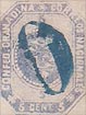
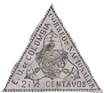 1865. 2 1/2 Centavos, triangular.
This stamp is said to have been used for unpaid letters, but I cannot say whether this was really the case. The shape is extremely awkward, for it is evidently intended to stand with the value at the bottom; and as the upper angle is not a right angle, it is impossible to make it fit, in any way, into the corner of an envelope, in the way that the old Cape stamps used to do. The arms are tripled, owing, I suppose, to the difficulty of making any ordinary shield, broadest at the top, fit nicely into the said triangle, broadest at the bottom; and so the engraver has put three shields instead of one.
Genuine
Very clearly printed, in pale black, on very thin, lilac wove paper. All the details of each shield are perfectly distinct, with cornucopia; and flower in the top compartments, cap of Liberty in the center compartments, and isthmus and ships in the lower compartments. The Y-shaped line dividing the three shields from each other is very thin, and the ends come in the following positions: After the first O of COLOMBIA, under the first stroke of the first N of NACIONALES, and above the first stroke of the E of CENTAVOS. There is a stop after the E. and a dash after the U. of the inscription E. U. DE COLOMBIA, and the letters of this inscription, with the exception of the DE, are larger than the letters of either CENTAVOS or CORREOS NACIONALES. The “i” of 2 i 1/2 is a great deal shorter than the 2, even including the dot. The 1 of 1/2 has a very distinct, oblique side-stroke, and the fraction-line dividing the 1/2 is thick —thicker than the little figures themselves. This is very well marked, and will be a good test. The C of CENTAVOS is perfectly square at the shoulders, and the O is like a D. The outline of the whole stamp is com- posed of spikes, teeth, thorns, or little triangles, whichever my readers may like to call them; and there are a hundred and sixteen round the whole stamp. The insides of both the first and second O of COLOMBIA are very square, and the second O is too near the M, and too far from the L. The I of NACIONALES is very much too tall, compared with the C and the O each side of it.
First Forgery
Badly lithographed, in dark black, on pale violet paper, a good deal thicker than the genuine. The shields are very coarsely done, and all the details are more or less smudged. The flowers, which, in the genuine, rise on stalks from between the two cornucopias, are here represented by disconnected balls, very near the top points of the shields. The caps of Liberty and the isthmuses are mere blotches. The Y-shaped line, dividing the three shields, is far too thick, and yet indistinct. The ends come, respectively, opposite the middle of the first O of COLOMBIA, slightly before the N of NACIONALES, and after the E of CENTAVOS. There is a plain full-stop after both the E. and the u. of E. U. DE COLOMBIA. All three inscriptions are in letters of exactly the same size, except that the letters of DE are smaller than the rest. The ” i” of 2 i 1/2 is level with the bottom of the preceding 2, and the dot of it is level with the top of the 2. The 1 of 1/2 has hardly any visible side-stroke, and the fraction-line is exceedingly thin—far thinner than the fraction-figures themselves. The C of CENTAVOS is round at the shoulders, as in an ordinary C, and the O is round, or rather oval. There are only eighty-six spikes round the outline of the whole stamp, and they are irregular, and not uniform like the genuine ones are. The insides of both the first and second O of COLOMBIA are oval, and the second O is placed midway between the L and the M. The second o of CORREOS is absurdly small, and is at too great a distance from the R and the S on each side of it. The I of NACIONALES is of proper size.
Second Forgery
This is a ridiculous thing, and hardly worth chronicling. It came to me first in 1902. Lithographed, in black, on dull red wove paper. The flowers in the joined top compartments of the three shields are like widely-open tulips, instead of closed ones; and each of the caps of Liberty looks very like a Noah’s-ark tree. The ends of the Y-shaped line, dividing the three shields, point, respectively, to the center of the first O of COLOMBIA, the center of the N of NACIONALES, and the beginning of the E of CENTAVOS. There is a stop, instead of a dash, after the U of E. U. DE COLOMBIA. The “i” of 2 i 1/2 is a 1, and it reaches lower than the 2; it has no dot. The C of CENTAVOS has a rounded top. The stamp has two thick outlines, and shows no trace of the spikes, or teeth. The first two letters of NACIONALES are joined together at the bottom, and the I is of normal height.
Third Forgery
Lithographed, in black, on thick, grey-faced, white wove paper. The flower, between the two cornucopias, in the inverted, upper shield, is something like a rough fleur-de-lys; the corresponding flowers in the other shields are like tridents, with curly prongs. The caps of Liberty, in the central compartments of the three shields, are shaded by horizontal lines, instead of oblique ones. The lowest compartment of each shield contains some straggling marks, but it is not possible to say what they mean. The ends of the Y-shaped line, dividing the three shields, point, respectively, to the right-hand edge of the first O of COLOMBIA, between the first N and A of NACIONALES, and to the first stroke of the N of CENTAVOS. There is a large, diamond-shaped stop after the E, and a round stop after the U, of E. U. DE COLOMBIA. These words are in thick, block letters, very different from the thin lettering of the genuine. There is a very clumsy dot to the letter “i” of 2 i 1/2; and the little 1 of the fraction is very thick, and almost wedge-shaped; it has no serif. CENTAVOS is in thick, block capitals; the N is considerably taller than the C, and the v is far nearer to the A than to the O; the O itself is narrow and oval, and not like a D. The outline of the stamp is very thick, and looks like a printed representation of the perforation round a stamp. There are only seventy teeth round the whole label, including the corner-points. The inside of the first O of COLOMBIA is very small and oval; the inside of the second 0 is a mere dot, and this last letter is rather like a D. There is no space between the words CORREOSNACIONALES; the 1 and the O extend lower than the level of the C and N, each side of them.
Postmarks
Genuine.—Usually uncancelled, but I have seen the large oval, already mentioned, with lettering in the center.
First Forgery.—Uncancelled.
Second Forgery.—1 (with thick outline)
Third Forgery.—38, without numerals.
 1865. 5 c., orange, brown; 10 c., violet, mauve, lilac; 20 c„ blue; 50 c., green; 1 peso, rose, vermilion.
Genuine
Lithographed, on medium, white wove paper. The shield measures 4 mm. across, by mm. from the top of the central peak to the bottom. There are six horizontal lines in the top compartment of the shield, reckoning only those that go right across. The cap of Liberty, though small, is very distinct, and shaded with oblique lines, going from right to left. The ends of the cornucopias curl over, as in the former issues. The two seas in the bottom compartment are both larger than the isthmus which separates them. There is a dash in the upper sea, and a mark something like a ship with a thick, stumpy mast, in the lower one. The label or ribbon above the top of the shield is bent down in the middle, so as to touch the top point of the shield; and the forked ends of the ribbon do not touch the oval outside them. The neck of the condor is very much narrower than the width of the ribbon. The eye is very small and round, and there is a distinct ring of white feathers round the base of the neck. The condor holds an oval wreath in its beak. There are eighty-nine little pearls round the white oval. They are all distinct, and moderately uniform in size and shape. Between these pearls and the inscription there are nine eight-pointed asterisks or stars, placed in the following positions: The first is exactly above the head of the bird, and one of its points touches the stop after COLOMBIA; the second comes below the space between RE of CORREOS; the third below NA of NACIONALES; the fourth below ON of NACIONALES; the fifth below S of NACIONALES; the sixth under E; the seventh under the E of DE; the eighth under the L of COLOMBIA; and the ninth below MB of COLOMBIA. There is a stop after the words E. U. COLOMBIA and CENT or PESO, but none after the other words. At the bottom of the coloured oval there are two little white branches, very easily seen, and with their bottom ends crossing. All the lettering is distinct, and the letters nicely formed. The A of COLOMBIA is pointed at the top.
First Forgery
Lithographed, on soft, thin, and also on medium, white wove paper. The shield measures 4 1/2 x 4 1/2 mm. There are about four lines of shading in the top compartment, going right across, but they are so blotched that they are very difficult to make out. The cap of Liberty in the middle compartment is an utterly shapeless blotch. The base of the shield is hardly to be distinguished from the flags on each side of it. The isthmus is larger than either of the seas. The upper sea is blank, and the lower sea shows a coarse, shapeless dash, instead of a ship. The ribbon above the shield is bent, like the genuine, in the middle; but the right-hand end touches the oval outside it, and the left-hand end very nearly touches the oval also. The neck of the condor is quite as broad as the width of the ribbon, and there is no ring of feathers at the base of the neck. The eye is large, blotchy, and of a sort of triangular shape.
There is a dark line down the center of the neck, which is not visible in the genuine. The beak is very like that of a flamingo, and there is no wreath hanging from it. In some copies, the oval of pearls is almost invisible, in others many of the pearls are missing, and in the clearest copies there are only about seventy-three pearls to be seen. The stars or asterisks are very blotchy. Most of them are six-pointed, and they are placed as follows: The first is over the head of the bird; the second under RE of CORREOS; the third under N of NACIONALES; the fourth under O of that word; the fifth under ES of that word; the sixth under the stop after E.; the seventh under C of COLOMBIA ; the eighth under the beginning of the O of that word; and the ninth under the beginning
of the B of that word. There is a stop after the E. which commences the inscription, and another stop under the S. of NACIONALES; but there is no stop after any of the other words, except the word of value. The little white branches at the bottom of the coloured oval are so blotched and indistinct, that it is quite impossible to make out what they are. The letters of the inscription are irregular in size and shape. The top of the A of COLOMBIA is broken off.
Second Forgery
Lithographed, on white wove paper, a good deal thicker than that of the genuine. The lines in the top compartment of the shield are very close together, so that it is difficult to see them. The cap of Liberty in the second compartment is of a better shape than that in the genuine; the end leaning over to the left is quite blunt, instead of terminating in a very sharp point. The lower compartment is a failure; for the upper sea is a mere white dot, with no mark in it. The lower sea has a thing like a sirloin of beef, instead of a ship; and the isthmus is white, instead of being shaded. The middle of the label or ribbon above the shield is not bent downwards, and it touches the right-hand corner of the shield, as well as the middle point: both ends touch the oval outside it. The neck of the condor is the same width as the ribbon, the eye is oblong, there is a dark crest at the back of the head, and the ring of feathers at the base of the neck is dark instead of white. There are eighty pearls round the oval, more distinct than in the first forgery; but some of them, especially at the bottom of the oval, are mere specks of white. The stars or asterisks outside the pearls are all six-pointed, and not much blotched. They are placed as follows: The first is at the top, over the head of the bird; the second is under RE of CORREOS; the third is under the end of the first N of NACIONALES; the fourth is exactly under the second N of that word; the fifth is quite beyond the S of that word; the sixth is under E.; the seventh is under the E of DE; the eighth is under the L of COLOMBIA; the ninth is under the beginning of the B of that word. There is a stop after the E and after the U, but none after any of the other words, and none after the word of value. The letters of the inscription are much better and more regular than in the first forgery; but the A of COLOMBIA is blunt at the point.
Third Forgery
This is not very common, and I have seen very few specimens, all of them being the 50 c., yellow-green. It is lithographed, on thick, hard, very yellowish-white, or even pale buff, wove paper. The shield measures 6 x 4 1/2 mm. This shield forms a very easy test, as there are only five lines which run right across the top compartment, the lowest line being enormously thick. There is no trace of the cornucopias and flower in this upper compartment. The next compartment is absolutely blank ; then comes a thin, horizontal line; then another blank compartment; then another thin, horizontal line; and, below this, at the bottom of the shield, there are two lines, forming an inverted A. The bend in the center of the ribbon does not coincide with the central peak of the shield, but is too much to the left, and the ends of the said ribbon are not forked. The head and neck of the condor are not in the least like the genuine—the head is rather like that of a dove, and the neck is about the same thickness as the width of the ribbon. There is no ring of feathers round the base of the neck, and there is no wreath hanging from the beak. There are about fifty-seven pearls round the central oval, and the stars are among the pearls, instead of being between the pearls and the lettering. The said stars are exceedingly small, hardly any larger than the pearls, and would not be noticed unless specially looked for. There is no stop anywhere, except after CENT. The two crossed branches below the shield are very large and prominent, almost touching the F, and S, to left and right of them, respectively. The above tests will abundantly suffice for the detection of this forgery, which ought not to deceive anybody.
Postmarks
Genuine.—The thick oval, with name, already described. Also a pen- stroke or a written word.
First Forgery. —10, 98. Also a plain, thin oval, containing the name, BOGOTA , in very thick and clumsy capitals.
Second Forgery.—Uncancelled.
Third Forgery.—Uncancelled; also 62, with or without numerals in the center.
NOTE.—The genuine 50 c. of this issue, with small figures of value, is of a different type from the others. The asterisks are placed as follows: Above the head of the bird, under RE of CORREOS, under N of NACIONALES, under 0 of that word,’under E of that word, under the space between the letters E U, under the C of COLOMBIA, under the space between LO of that word, and under the B of that word. All the forgeries which I have seen of the 50 c. of the first and second forgery are copied from the one with large figures of value, but the third forgery is imitated from the small type.
 1867. 10 c., lilac.
Genuine
Lithographed, in bluish and in reddish lilac, on stout, white wove paper. The outer end of the left-hand cornucopia does not touch the side of the shield, but the right-hand one does. The cap of Liberty is like a slightly conical, Turkish fez, with falling tassel, all shaded with vertical lines. The ship in the lower sea is nicely drawn, and fairly distinct. The isthmus is shaded with horizontal lines. The lowest point of the shield does not touch the outline of the containing-circle. There is a stop after COLOMBIA, and a small stop under the s of 10 Cs, but none after the C. Above the contracted word, NALES, from the last stroke of the N, to the end of the E, there is a horizontal stroke, formed by a thickening of the line of shading in that place. There are 84 colored dots running round the stamp, from the left top corner to the right top corner of the 10 c; label.
Forged
I do not possess this, but it is sure to exist, as I have the (bogus) 20 c. and 50 c. of the same type, and I give the details of the design from them. Lithographed, on medium, hard, white wove paper. The left-hand cornucopia touches the shield, but the right-hand one does not; thus reversing the tests of the genuine. The cap of Liberty is very like a military pith helmet, with puggaree and chin-strap; it is shaded with blotches, instead of vertical lines. The ship in the lower sea is a shape- less blotch. The lower part of the isthmus shows some vertical lines of shading, crossing the horizontal ones. The lowest point of the shield touches the outline of the containing-circle, but the lowest horizontal line of shading in the circle has been drawn across the point, so that, unless closely examined, it does not seem to touch. There is no stop after COLOMBIA, a small stop after the c, and a rather large stop under the s of Cs. There is no thickened line above NALES. The colored dots are far too numerous, as there are 98, instead of 84.
 1867. 50 c., green.
Genuine
Lithographed, in yellow-green, on fairly stout, white wove paper, white gum. The upper part of the shield contains the usual design of two cornucopia;, with a flower between them. The outer ends
of the central compartment are shaded with horizontal lines, 5 each side. The ship in the lower sea is fairly well drawn, and not like a triangle. The isthmus is shaded with oblique lines, running down from left to right. The bottom point of the shield shows distinctly below the outline of the flags. The beak of the condor is tightly closed upon the ribbon which he is holding, and his wings do not trespass beyond the heads of the spears, but are drawn just across them. The motto, LIBERTAD ORDEN in the scroll, is quite readable. The 9 asterisks above the condor have from 8 to 10 points each. There is a little, curly ornament in the inside edge of the body of the large 5, above the condor, which looks something like part of a small comma, and it points up towards the s of the left-hand CENTS. The VO of CENTAVOS touch at the top, and the EN and. the TA of that word touch at the bottom. The 5 of each 50, in the two side-frames, has a tail which projects very much too far to the left, making the figure look quite ridiculous. The O of NACIONALES, in the bottom frame, is exceedingly close to the N after it. The outer colored line, surrounding the stamp, is fairly thick, and runs clear round, without being blotched into the inner line anywhere.
Forged
Lithographed, in carmine-vermilion (making a bogus variety), on stout, white wove paper. The upper part of the shield is one uniform blotch of colour, so that it cannot be distinguished from the flags each side of it. There are no lines of shading in the central compartment. The ship in the lower sea is a solid, colored triangle. The isthmus is shaded with blotches of colour. The bottom point of the shield does not project below the outline of the flags. The condor’s beak is open, and the tips of both wings project considerably below the outlines of the spear-heads; indeed the tip of the left wing (right side of the stamp) runs into the stop after DE. By the way, in the genuine, there is no stop after DE, but the little tassel hanging from the head of the spear ends in a ball, which the forgers have taken for a stop, and the similar tassel to the head of the left-hand spear has been made by the forgers into a tip to the condor’s right wing. The motto in the scroll is quite unreadable. There are 9 stars, instead of asterisks, above the condor, with from four to five rays each. The center of the inside edge of the hollow of the large 5 of 50, above the condor, comes out into a triangular peak, instead of the curly ornament, and the peak is level with the centre of the space between TS of the left-hand CENTS. In the word CENTAVOS, the letters VO do not touch at the top, and the EN do not touch at the bottom; the TA touch, like the genuine. The tail of the 5 of the right-hand 50 projects a good deal, though not so much as in the genuine, but the tail of the 5 of the left-hand 50 hardly projects at all. The 0 of NACIONALES in the bottom frame does not go particularly near to the N after it. The outer, colored line round the stamp is very thin; it is broken to the left of the NT of the left-hand CENTS, and is blotched into the frame in several places.
Postmarks
Genuine.—As before.
Forged. —My specimen, which is the only one I have ever seen, bears part of three lines of lettering in violet,
… RD & CO.
LATE
. . ES, WHITE & CO.
1867. 5 pesos, black on green.
The 5 and 10 pesos are said to have been used to frank packages of coin, but I am not certain whether this is correct or not. Both values are fairly scarce, but they seem cheaper than they used to be.
Genuine
Lithographed (?), in black, on thick, white wove paper, the face of which is surface-colored a bright green, and highly glazed. The condor has a head just like a goose, and the eye is placed
absurdly far back—quite at the back of the head, in fact. The backgrounds, both inside and outside the oval, are extremely dark, so that the oval shows up very prominently. Most of the curly lines round the oval are separate from each other; indeed, on the right-hand side, towards the bottom, every curl is distinctly separate from its neighbors. There is a stop after E., another after U., another after COLOMBIA., and a very faint, cross-shaped blotch after NACIONALES. The right-hand branch crosses distinctly over the left one, and has ten leaves on it. The left-hand branch has nine leaves.
Forged
Lithographed, on very similar paper to the genuine; but the value, 5 PESOS, is printed, instead of being lithographed. The condor has a rounded head, like a pigeon, and the eye is in its proper place. The whole stamp is very faintly printed, so that no part of the design is more conspicuous than the rest. The curly lines in the oval are all joined together, except under the first O of CORREOS, and beside the last A of NACIONALES. There is no stop after any of the words or letters, nor is there any cross-shaped blotch after NACIONALES. The left-hand branch seems to cross over the right-hand one; but the stems are very indistinct. The right-hand branch bears eleven leaves, and the left-hand branch has eight; but both lots are exceedingly difficult to count.
Postmarks
Genuine.—The genuine stamps appear to be most frequently cancelled with a written word; but they are occasionally found bearing a large oval, with capital letters inside it, as in the older issues.
Forged.—The forgeries which I have seen were all unobliterated.
1867. 10 Pesos, black on vermilion.
Genuine
Lithographed, on thick, white wove paper, surface-colored a deep vermilion, and very highly glazed. The condor’s head and neck are shaded all over, with horizontal lines. The eye is very small, and placed far back, almost in the neck. The right wing almost touches the frame, near the L of COLOMBIA; but the rest of the wing is not near the frame. There are nine eight-pointed asterisks below the shield. There is a stop after E., after U., after COLOMBIA., after NLES., and after PESOS.
Forged
Lithographed, on paper very like that of the genuine. There is no shading on the head and neck of the condor. The eye is very large and blotchy, and placed in the proper position, or perhaps a little too much forward. The right wing is actually partly obliterated by the frame, beside LU of “COLUMBIA”, which is spelt with a U instead of with an O. This, of course, is a very easy test. There are twelve asterisks below the shield, the outside ones being mere dots, and the largest of them having only six points. There is a stop after U., and another after PESOS.; but none after any of the other words or letters.
Postmarks
Genuine.—The only cancellations I have seen on the genuine have been the oval, or the written word, as in the 5 pesos.
Forged.—The forgeries are not obliterated.
It will be seen that this 10 pesos is not nearly so good an imitation as the 5 pesos just described.
 1868-70. 5 Pesos, black on green.
The 5 and 10 pesos of this set were used for the same purpose as the similar high values of the 1867 issue.
Genuine
Lithographed (?) in black, on soft, rather thin, white wove paper, colored yellowish-green on the surface, and highly glazed. There are two types. In Type I., the ornament on the left of the C of CINCO impinges on the C. In Type II., it only touches it. The principal test for the genuine is in the condor, which has a very short beak. The two bands hanging from the beak to the top of the shield are very distinct, and can be seen at a glance. The scroll upon which the condor stands contains
the motto, LIBERTAD, ORDEN, and the latter word can be read with tolerable ease, though the other is very difficult to decipher. The ships above and below the isthmus are very much alike, and the upper one does not touch the cap of Liberty in the compartment above it, in Type I., though it appears to run into the pole, supporting the cap, in Type II. There are nine five-pointed stars above the condor, in Type I., but, in Type II., they are more like asterisks than stars, and the left-hand star almost touches the wing of the condor. In Type I., the shading on the flags is wholly composed of lines; in Type II., it shows some dots, as well as lines. The point of the lower spear on the right side does not touch the scroll-work to right of it. The letters EE., of the inscription, EE. UU., etc., are at some distance from the outline of the flags about them. The bottom stroke of the L of NACIONALES is very short, but not ridiculously so. The C of CINCO is as large as the other letters of that word, and a little curl of the scroll-work above it breaks into the outline of the said C about the shoulder. There are small black dots almost all the way round the outline of the frame, along the center of each of the curved bands or scrolls, just above CORREOS and NACIONALES, and just below CINCO and PESOS.
Forged
Apparently typographed; the paper is a good deal thicker and harder than that of the genuine, and the green is darker and bluer; otherwise the whole is very like the original. The condor has a particularly long beak, and its eye is far more prominent than in the genuine. There is some confused marking from the beak to the top of the shield, but it cannot be resolved into the two distinct bands of the genuine. The scroll upon which the condor stands contains some marks, but totally illegible. The ship above the isthmus is very much darker than the one below it, and of a different shape; the upper ship joins the cap of Liberty in the compartment above it. There are nine asterisks above the condor, as in Type II. of the genuine; they seem to have about eight points
each, but are rather blotchy, and the lowest one on the left side is at a considerable distance from the outline of the condor’s wing. The flags are shaded with lines only, as in Type I. of the genuine, and the ends of the central compartment show some lines of shading, as in Type I. The point of the lower spear-head on the right-hand side touches the scroll- work to right of it. The letters EE. almost touch the outline of the flags. The bottom stroke of the L of NACIONALES is so ridiculously short as to be almost invisible, making that letter look like an 1. The C of CLNCO is much smaller than the other letters of that word, and it is not even touched by the scroll-work, which ought to break in upon the outline of it. The green lines above CORREOS and NACIONALES and below CLNCO and PESOS have no dots in them.
Postmarks
Genuine.— The only cancelled copies of the genuine which I have seen were obliterated by being written on.
Forged.—The forgeries are not cancelled. I think the counterfeit just described is quite good enough to deceive an average collector; indeed, it is printed more carefully than the originals.
 1868-70. 10 Pesos, black on vermilion, black on magenta.
Genuine
Lithographed(P) in black, on glazed white wove paper, colored vermilion or magenta on the face. There are two types; Type 1 has the 9 stars above the condor shaped something like asterisks;
the letters of CORREOS are all separate; the final S of PESOS does not touch any part of the outline of the label. In Type 2, the stars are neatly drawn, five-pointed stars, instead of asterisks; the CO and the EOS of CORREOS touch each other; the head of the last s of PESOS touches the containing-label. The condor has a longer beak in this type.
I take the differences between the genuine and the forged, which are common to both types of the
genuine, unless otherwise stated. The words LIBERTAD, ORDEN, in the scrolls, are perfectly readable. There is a rope, with tassel, hanging down from the head of each of the lower spears. The tip of the condor’s wing passes underneath the two spear-points on the left side, and touches the corner of the E of ESTADOS. The O of UNIDOS slants slightly over to the left (more so in Type 1 than in Type 2), so that a line drawn down through its center would cut into the very centre of the 0 of 10, below it. The C of COLOMBIA is not very well shaped, being squeezed in, and the lower tip badly formed. The tail of the 1, in the circle at the bottom of the stamp, trespasses across the outline of the 0, and the circle itself contains 23 vertical lines of shading, counting below the numerals, in Type 1, and 25 in Type 2, though two of them are faulty in my specimen of Type 2, at the right-hand side. In the word NACIONALES, the bottom limb of the L is shaped just like the bottom limb of the E. There is a slanting X in the scroll, below NA of this word, and another in the similar scroll below ES. Each of these is plainly a letter X, with one wide limb, and one narrow limb, and cannot be mistaken for a cross. The curled-in end of the scroll, after PESOS, does not touch the top of the S of that word. In Type 1, there are dots all along the bottom edge of the NACIONALES label; in Type 2, they are short dashes, rather than dots.
Forged
Lithographed, in dull black, on very thick, moderately shiny, vermilion-faced, white wove paper. It is imitated from Type 1, with asterisks; but the asterisks are mostly six-pointed; whereas the genuine Type 1 has them with seven and eight points, mostly eight. I have only one specimen, and the postmark completely covers the center of it, so that I cannot say anything about the condor and shield. The left-hand end of the scroll above the shield, however, has escaped the postmark, and it bears some faint lettering, looking like CIDUA. There are no ropes hanging down from, either of the spear-heads. The tip of the condor’s wing does not touch the E of ESTADOS. The O of UNIDOS is upright, and a line drawn down its center would cut into the left side, instead of the centre, of the 0 of 10, below it. The C of COLOMBIA is well shaped, and nicely rounded. The tail of the 1, in the circle at the bottom of the stamp, does not trespass across the outline of the 0 beside it; and the circle is shaded with nineteen vertical lines, and one or two broken ones, counting as before. The bottom limb of the L of NACIONALES is not like the bottom limb of the E, as it lacks the large, triangular end. There is an upright cross, instead of a slanting X, in each of the scrolls, below NA and ES of NACIONALES, with limbs of equal width. The curled-in end of the scroll after PESOS just touches the front point of the head of the S of that word. There are hardly any clots to be seen along the bottom edge of the NACIONALES scroll, except just at the right-hand end.
Postmarks
Genuine.—A written word. Also a large oval, with lettering in a straight line in the center.
Forged.—A very large block-letter A. Except for a very slightly smudgy appearance (as though the stone had not been quite clean) this forgery looks fairly deceptive. I have only had it a few years.
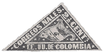 1869-70. 2 1/2 Centavos, violet.
This triangular stamp, though of some-what peculiar appearance and shape, fits better into the corner of an envelope than the lilac one of 1865, as it has a right angle.
Genuine
Nicely lithographed, in black, on rather thin, colored wove paper. The large 2 of 2 1/2 has a solid top, with a clot in the center. The solid band or label, bearing the inscriptions, is divided into three points by faint lines. One of these lines is under co of CORREOS, another is under S of NALES, and the third is under the s of CENTS. Both limbs of each u of UU are of equal thickness.
Forged
Lithographed, in an exceedingly careless and blotchy way, on wove paper, rather thicker than the genuine. The colour of the paper is a dark violet—many shades darker than that of the genuine, which approaches more to a lilac hue. The whole impression is so much blotched, that the details of the stamp are almost illegible. There is no line under the co of CORREOS, and the other two lines are almost invisible. The large 2 of 2 1/2 has a curled head. The right-hand limb of each u of UU is a hair-stroke. This forgery is ungummed.
Postmarks
Genuine.—The genuine stamps usually bear the ornamental oval as before.
Forged.—A sort of very large O, by way of imitation of the ornamental oval, containing the word BOGOTA in large, thick capitals. I think this forgery need not deceive anybody, it is so badly executed.
1871. 1 Centavo, green.
Genuine
There is a great variety in the stamps of this issue, both as regards colour and mode of printing. The earliest copies are well executed, in a dark olive-green; the later impressions are in a sort of
dull apple-green, and not so distinct. The earlier impressions also show some short lines of shading at the sides of the central compartment of the shield, which are not visible in the later ones. Lithographed, colors as above described, on thin, very soft wove paper. The top compartment of the shield is divided from the second by a very thick and prominent dark line, and the second compartment is divided from the bottom one by two very thin lines, placed close together, but not blotched, or touching each other at all. The object in the centre of the top compartment of the shield looks like a pomegranate, and is nicely drawn. The cornucopias are quite distinct from the background. The cap of Liberty in the middle compartment is placed upon a short pole, which can be seen even through the cap itself. The vessel above the isthmus is very distinct; it is a three-master, sailing to the left. The vessel below the isthmus is not so clear; it looks like a rowing-boat, in front of a light-house, which is standing upon a rock; but I am not sure what it is really intended for. The letters UU in the inscription touch each other at the top, and the stop after them does not touch either the U before it or the D after it. There is a thin, curved line just under the D of DE. The S of NACIONALES is not joined to the frame by any white flaw.
Forged
Very poorly lithographed, on similar paper to that of the genuine, apparently always in dull olive, varying from light to dark. The line dividing the top compartment of the shield from the second is not at all prominent, and very little thicker than the lines of shading in the upper compartment. The two lines separating the second compartment from the third are always blotched and joined together for the greater part of their length. The object in the center of the top compartment of the shield is very blotchy, though the genuine is not blotched at all, but only shows two clear, semicircular lines of shading in it. The cornucopias are so indistinct, that they have to be looked for. The cap of Liberty in the central compartment is not upon any pole at all, and, in most copies, the top of the cap touches the outline above it, which is seldom the case with the genuine. The vessel above the isthmus is very different from the original; it looks like an omnibus, with horse, passengers, etc., more than anything else, and is not in the least like a three-masted vessel. The thing below the isthmus is simply a roundish blotch, with a short line projecting from it at the top, and another from the right-hand side. The letters UU in the inscription are some distance from each other. The second U is smaller than the first, and the stop after them touches both the U before it and the D after it. There is a thick, wedge-shaped blotch just under the D of DE, in some copies. The S of NACIONALES is joined to the frame by a white flaw, like an accent.
Postmarks
Genuine.—I have never seen a cancelled specimen.
Forged.—100, with thinner lines.
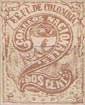 1871. 2 c., brown.
Genuine
Lithographed on paper very similar to that of the 1 centavo just described.
There are two small scrolls in the top corners of the stamp, containing the motto; the left-hand scroll bears the word LIBERTAD, the right-hand one has ORDEN. These words are very distinct, and will be found a very easy test for the genuine. In each of the bottom corners there is a figure 2, with a dot before it, another after it, and a third beneath it (‘ * ‘). The spears bearing the flags are very distinct. Quite a third of the left-hand flag—the third nearest to the spear or flag-staff—is covered all over with little dark dots. The letters MB of COLOMBIA are only joined at the bottom, and the head- stroke of the 1 of that word is so very wide, that it might be mistaken for a T. The stop after NACIONALES is circular.
Forged
Lithographed, on thickish, white wove paper, rather harder than the genuine. The word LIBERTAD in the left-hand top corner is totally illegible, and the word ORDEN in the right-hand top corner seems to be “ORGIA.” There is no dot after the 2 in the left-hand bottom corner, and none either before or after the 2 in the right-hand bottom corner. The inscription reads EF . UU., instead of F.E. UU. Each flagstaff is formed by one single line, instead of two. The part of the left-hand flag nearest to the staff is quite white, instead of being dotted. The letters MB of COLOMBIA are joined both top and bottom, and the head-stroke of the I is not at all abnormally wide, so that it could not possibly be mistaken for a T. The stop after NACIONALES is oval and misshapen.
Postmarks
Genuine.—I have never seen a cancelled specimen.
Forged.—The forgeries bear 10; also a rectangle of rough blotches, which, if more distinct, would probably resolve themselves into larger, diamond-shaped dots.
1871. 25 c., black on blue.
Genuine
Lithographed, in black, on rather thick, hard wove paper, of a pale, dull blue tint. The condor’s beak is very short, so that the whole head is hardly much wider than the S of UNIDOS just above
it. The said S is rather over the back of the condor’s head, and slopes over decidedly to the left. Neither of the cornucopias touches the side of the shield. The cap of Liberty is tall, and reaches quite to the top of the central compartment. The right-hand end of this central compartment shows four thin, horizontal lines of shading. The left-hand end shows five similar lines. The cap of Liberty is tall, and reaches quite to the top of the central compartment of the shield which contains it. The isthmus is not touched by the ship below it. The middle of the right-hand flag has not much shading upon it. The motto LIBERTAD, ORDEN, on the scroll below the condor, is easily decipherable. There are nine asterisks below the shield, etc.; they are mostly six-pointed, and are set far apart. There is a large white stop after CORREOS NALES, and the black band upon which these letters are inscribed is perfectly solid. The inscription above the shield reads ESTADOS UNIDOS DE COLOMBIA, and the stop after it is small and round, and near the A. The 2 and 5 of the 25 in the lowest band are close together, nicely shaped, and the tail of the 2 is not too long. The letters of the word CENTAVOS in this lower band are very fat. A cord with tassel hangs down from each spear-head. There is a fringe of forty-eight wavy lines, hanging down from below the CORREOS NALES label, and a similar fringe of forty-five lines, standing up from the 25 CENTAVOS label.
First Forgery
Coarsely lithographed, on very thin wove paper, of a much more intense and darker blue than the genuine. The condor’s beak is long, and the head is as wide as the S and half the D above it. The cap of Liberty in the central compartment of the shield is short, and does not nearly reach to the top of the central compartment. The ship below the isthmus touches the said isthmus very distinctly. There are some short lines of shading at the sides of the central compartment of the shield, but my notes do not say how many. The middle of the right-hand flag is very darkly shaded. The motto on the scroll is utterly illegible. There seem to be eleven stars below the shield, but they are so strangely blotched, and so confusedly placed, that it is difficult to count them. This will serve as a very ready test, for the said stars in the genuine are very far apart. There is no stop after CORREOS NALES, and the ground behind the latter word is blotchy, instead of being solid. The inscription above the shield reads ESTADOSUNIDOSDECOLOMBIA, as there is not the slightest division between the words. The stop after this wonderful word is large and clumsy, and too far from the A. The 2 and 5 of the 25 in the lowest label are far apart; the 2 is much shorter than the 5, and has an absurdly long tail. The letters of the word CENTAVOS in this lower band are thin and ragged, and the C is a good deal smaller than the rest. There is a broad, thick, and ragged line round the whole of the stamp, in the forgeries, which does not appear in the genuine. I do not think this forgery likely to deceive.
Second Forgery
This is very good. It is nicely lithographed, in dark black, on wove paper, softer than that of the genuine, and rather a darker blue. The condor’s head is fairly like the genuine, but too upright. The S of UNIDOS is above the center of it, and perfectly upright, instead of sloping to the left. The cornucopias both touch the sides of the shield. The tassel of the cap of Liberty hangs over to the left, instead of to the right. This ought to be a very easy test. In the right-hand end of the central compartment there are seven horizontal lines of shading; and, in the left-hand end, there are also seven lines. The vessel in the lower sea touches the left side of the isthmus with its bowsprit, but the cancellation hides most of the ship, so that I cannot see whether it runs up to the cap of Liberty or not. In the motto, ORDEN is very plain, and LIBERTAD fairly so. The asterisks are better done than in the genuine; they are eight-pointed. The stop after CORREOS NALES is a good deal too small. There is no stop after COLOMBIA. The letters of CENTAVOS are plainly thinner than in the genuine. The cords and tassels that ought to hang from the spear-heads are absent. There are fifty-one wavy lines in the fringe hanging down from the CORREOS NALES label, and fifty-three or fifty-four standing up from the 25 CENTAVOS label.
Postmarks
Genuine.—Usually part of a written word; but I have seen a thick oval, with lettering in a curve inside it.
First Forgery.—All the specimens I have seen were cancelled with a shapeless blotch.
Second Forgery.—My single specimen bears a pen-and-ink cross.
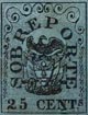 1865. Unpaid. 25 c., black on blue.
Genuine
Lithographed (?), in black, on dull blue wove paper, rather thin. All the lettering is very thick and coarse. The frame is damaged under the N of CENTS. The 5 is a good deal taller than the 2. The condor is very black, with a white patch on the cheek; the eye can usually be seen, and the left wing goes right under the R of PORTE. The cannons are thick, black smudges, with sometimes a very faint bit of white about the center of each, and the wheel on the carriage of the one on the right hand is not so distinct as the wheel of the left-hand one. Slight breaks can be observed in the horizontal lines of shading in the background; that is to say, many of them do not go right across from one side to the other in one continuous line, but are broken here and there, where the ink has missed. Outside the frame of the stamp, in all copies which have any margin, a little spot or round stop can be seen, exactly under the stop after the T of CENTS.
Forged
Lithographed, on darkish blue wove paper, rather thinner than the genuine. The lettering is very thin, and much more elegant than in the genuine stamps. There is no blotch or break in the outline of the frame, under the N of CENTS. The 2 is as tall as the 5. The condor is not very darkly shaded, there is no white patch on the cheek, the eye is not visible, the head and neck are equally shaded all over, there is a broad white ring round the base of the neck, and the left wing is cut short off, just before it reaches the R of PORTE. The cannons are very lightly shaded, and both wheels are equally distinct. Almost all the horizontal lines of shading, in the background, run across from one side to the other without any break. There is no spot outside the outline of the frame. I think, on the whole, the forgery has a better appearance than the genuine.
Registration Stamps
 1865. “Anotacion”: 5 c., black.
Genuine
Apparently typographed, on thin wove paper, of a very grey tint. There is a stop after the E and U, and the stop of CENTs is not exactly under the s, but much nearer to the T. There are eight very distinct berries on the left-hand branch, at varying distances. The point of one of the leaves touches the C of CORREOS, and the side of another leaf almost touches the first R of that word. The E of BE is distinctly over the middle of the top leaf on the left-hand side. The top leaf on the right-hand side is blunter than the corresponding one on the left, but not very much so. There are eight oblique lines of shading in the triangular hollow of the A, twenty fringing-lines below the cross-bar, seventeen down the right-hand side, eighteen on the left foot, and twenty-four on the right foot. The base of the 5 is at some distance from the leaf to the left of it.
First Forgery
Lithographed, on greyish-white wove paper, moderately thick. There is no stop anywhere, except to the word CENTS; and this stop is placed exactly under the S. By a close inspection, three berries can be discerned in the left-hand branch, but they are very small and would hardly be noticed. None of the leaves touch any part of the word CORREOS. The E of DE is over the point of the top leaf in the left-hand branch. The top leaf in the right-hand branch is very blunt and rounded, being as broad as the very widest part of the corresponding leaf in the left-hand branch. There are four oblique lines of shading in the triangular hollow of the A, eleven below the cross-bar, eleven down the right-hand side, sixteen on the left foot, and sixteen on the right foot. The base of the 5 almost touches the leaf to the left of it.
Second Forgery
Lithographed, in greasy-looking, grey-black ink, on medium, yellowish-white wove paper. The wreath is extremely dark and heavy, as compared with the genuine, and the first forgery. The stop after the E. touches the wreath. The point of one of the leaves not only touches the C of CORREOS, but seems actually to go through, into the hollow of the letter. Another leaf is firmly joined to the first R of that word. There seem to be eight oblique lines of shading in the triangular centre of the large A, but all the fringing-lines are blended into solid masses of shading, so that there is no possibility of counting them. This is the easiest test; for this counterfeit corresponds to the genuine in most of the other tests. In this second forgery, two leaves of the oak-wreath, on the right side of the stamp, touch the I and the second N, respectively, of NACIONALES. If it had not been so very heavily printed, this forgery would be dangerous. As it is, its blurred, dark look condemns it instantly.
Postmarks
Genuine.—My cancelled specimens all bear a written word, or part of a word.
First Forgery.—Uncancelled; also 62; also four concentric circles, thick and large.
Second Forgery.—Uncancelled.
1865. “Rejistro”, 5 c., black.
Genuine
Tolerably well printed, on very thin, grey-white, wove paper. In the inscription there is a dash after the E, about as long as the central tongue of that letter, a very short clash, almost like a full-stop, after the U, and no other stops. The C of COLOMBIA is a C, and does not touch the outline of
the star below it. The S of NACIONALES is very near the outline of the star, but does not actually
touch it. The center of the star has a pattern in black and white, behind the R, like horizontal
courses of brickwork; and there are thirty-two of these horizontal courses. The R has been drawn
too big for the circle which ought to contain it, and therefore the part of the brickwork behind the tail of the R is bulged out very considerably, so far, indeed, that it cuts into the bottom of the 5 in in the right-hand lower corner, and thus destroys the shape of that letter. There is a very thin line running all round the inside of the white outline of the large R, and this line goes almost to the very end of the tail of the R. This said line makes a square bend, where it runs round, inside the left top corner of the R, to correspond with the square shape of the serif at that place. All the letters of the inscription are thin, and none of them are blotched. There is a white numeral “5” in each ray of the star, and each 5 is fat, white, and distinct. The black line, forming the outline of the whole stamp, is exceedingly thin.
First Forgery
Lithographed, in a greasy-looking black, on very yellowish-white wove paper, very thick. There is a thick dash after the E of the inscription, a more or less triangular-shaped full-stop after the U; the c of COLOMBIA is a G, and it touches the outline of the star below it; the s of NACIONALES touches the outline also. There are thirty-one horizontal lines of brick-work in the central circle. This circle has a slight bulge under the tail of the large R, but it is not at all conspicuous, and does not touch the 5 to the right of it. This is the easiest test for this forgery. The line running round the R, just inside the outline of it, is thick and coarse. It is so much broken, that it looks as though it were intended for a dotted line, instead of a continuous one, and it does not go anything like to the end of the tail of the letter, though it follows the square outline of the serif to the left top corner of the R, as in the genuine. All the letters of the inscription are thick and clumsy, and many of them are blotched.
Second Forgery
Lithographed, on medium, greyish-white wove paper. There is a dash after the E, longer than the central tongue, but not so long as the lower limb of that letter, and a somewhat longer dash after the U. The C of COLOMBIA is firmly joined to the outline of the star; the B is too large, and the I is too short; the foot of the first N of NACIONALES cuts into the outline of the star, the C of that word is a G, the L is taller than the other letters, and the E seems to have fallen below its proper level. There are only twenty-three courses of brickwork behind the central R. The small bulge in the brickwork does not come near the foot of the 5, in the right lower ray of the star. The thin line, inside the R, is some- what broken and ragged; it comes to an acute point inside the serif, at the left top corner of the letter.
Third Forgery
Nicely lithographed, on very thin, greyish-white wove paper. There is a thin dash after the E, nearly as long as the lower limb of that letter, and a more or less wedge-shaped stop after the u. The word NACIONALES appears to be in three syllables, NA CIO NALES, as the divisions between the letters are wider at the places indicated. The S of that word touches the outline of the star. There are thirty-three courses of brickwork behind the R; the tail of the R does not go into the bulge in the brickwork, and the bulge does not touch the bottom of the 5, in the right lower corner. The thin line, inside the outline of the R, is very like the genuine. The lettering is nicely done, but the V of CENTAVOS is barred, making it an inverted V.
Fourth Forgery
Lithographed, in very dark black, on thick, yellowish-white wove paper. There is a long, slightly curved dash after the E, quite as long as the lower limb of that letter, and a small, nearly round stop, after the U. There are twenty-nine courses of brickwork behind the R, and the tail of the R does not go into the bulge in the brickwork, while the bulge just grazes the bottom of the 5. The line running round, inside the out-line of the R, is too thick; it comes to a blunt point inside the serif, at the top of the R. The lettering is nicely clone, but the letters MB of COLOMBIA look slightly larger than the rest.
Fifth Forgery
Coarsely lithographed, in greasy black ink, on fairly thick, very yellowish-white wove paper. There is a rather large, round stop after the E., and a similar one after the U. The C of COLOMBIA very nearly touches the outline of the star, and the S of NACIONALES does touch. There seem to be about thirty-two courses of brickwork behind the R, as in the genuine, but they are indistinct, and extremely difficult to make out. There is no particular bulge in the brickwork, and the tail of the R, which is most acutely pointed, is directed towards the 5 to right of it, instead of being blunt, and pointing towards the 5, in the right upper ray. This ought to be an easy test. The line running round the inside of the R can hardly be distinguished from the outline of the letter. The lettering is thick and coarse, and the letters LE of NACIONALES are joined together. The numerals in the rays of the star are almost in- visible, and very thin, though they are very prominent in the genuine and in all the other forgeries.
Postmarks
Genuine.—I have never seen anything but a written word.
First Forgery.—Uncancelled; also 62.
Second Forgery.—29, thick and large.
Third Forgery.—Uncancelled.
Fourth Forgery.—Uncancelled; also 62.
Fifth Forgery.—Uncancelled; also a number of large, round dots.
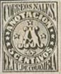 1870. “Anotacion”, 5 c., black.
This stamp, with the corresponding “Rejistro”, is in two types, (1) with vertical lines in the center (1870), and (2) with horizontal lines in the center (1877) The latter is on white and on bluish. I have not met with any forgery with horizontal lines; though I have one “Anotacion” with crossed lines, and one “Rejistro” without any lines at all.
Genuine
Printed in black, on medium, greyish-white wove paper, rather soft. The little, outward-pointing teeth of the frame of the stamp are sharp, triangular, and tolerably regular and uniform. The
tail of the c of CORREOS curls up, so as to be level with the very highest part of the first O of ANOTACION; the letters RE of CORREOS touch each other at the bottom; the letters AL of NALES also touch at the bottom, and there is no black dot inside the lower hook of the S of this latter word. In the inscription at the bottom of the stamp, the left upper corner of the first E just touches the frame to left of it; the stops after EE. and UU. do not touch the letters on either side of them, except in very heavily-printed specimens; and, in the word COLOMBIA, the MB and the IA touch each other at the bottom, but none of the other letters touch. In the word ANOTACION, the C is not very like a G. The right-hand end of the top-stroke of the 5 of 5 CENTAVOS is a sharp point, and the tail of the said 5, although rounded, finishes off with a sharp, inward hook. The two little balls or knobs, projecting from the label containing the black 5, under the large A, stick out horizontally, one to the left, and one to the right, and are level with each other. The top star, above the said A, does not itself touch the outline of the circular frame, but the black shadow of the star touches it. There are twenty-eight vertical lines in the background, counting from the left side of the central circle to where the shadow of the top star touches the outline; but, in heavily-printed copies, the short, left-hand line is joined to the outline of the circle, making twenty-seven, instead of twenty-eight. Portions of the three broken lines of the background can be seen in the upper hollow of the A; the left foot of the A touches the ninth vertical line from the left in normal specimens, and the eighth, in heavily-printed ones; while the right foot of that letter comes between the fifth and sixth lines from the right. The shaded part of the right foot of the A just touches the boundary-line, above the space between OS of CENTAVOS.
First Forgery
Lithographed, on very thick, hard, very yellowish-white wove paper. The little, outward-pointing teeth of the frame are irregular, and mostly blunt and rounded. The tail of the C of CORREOS is too short, and only comes up to a little above the level of the middle of the first O of ANOTACION; and there is a small black dot inside the lower hook of the S of NALES, near the end of the tail of the letter. The top of the first E of EE., at the bottom of the stamp, does not touch the frame to left of it; the stop after UU. touches the U, and the LOMB of COLOMBIA are all joined together at the bottom, while the A touches the right side of the frame, which it does not do in the genuine. The C of ANOTACION is an evident G. The right-hand end of the top-stroke of the white 5 of 5 CENTAVOS is blunt, and the tail of this 5 is a ball. The two small projections from the frame of the black 5, under the central A, point slightly upwards, instead of being horizontal. The shading of the top star, above this central A, does not touch the boundary-line above it, though the central line (not thickened) of the background joins the star to the boundary. There are only twenty-four vertical lines in the background, from the left-hand edge of the central circle, up to, but not including, the line which joins the point of the top star to the boundary above it. Only two vertical lines can be seen through the top hollow of the A; the left foot of this letter touches the seventh vertical line from the left, and the right foot touches the sixth line from the right. The shaded part of the right foot of the A does not go near the boundary-line.
Second Forgery
Lithographed, on rather thin, hard, very bluish-grey wove paper. The little teeth of the frame are better done than in the first forgery, though still too blunt. The tail of the C of CORREOS is much too short, and hardly comes up to the level of the middle of the first O of ANOTACION. None of the letters of CORREOS NALES touch each other anywhere. In the bottom inscription, the stop after EE is like a comma, and touches the E. The E of CENTAVOS is a very decided G. The top star, above the central A, does not go near the outline of the frame above it. The background is the great test for this forgery. Instead of being made of vertical lines, it appears to consist of crossed, white lines, scratched out of a black ground, leaving a field of tiny, square dots, as in the background of the old Parma stamps. The upper hollow of the central A is solid black, and the right foot of this letter touches the outline more distinctly than the genuine does. If it were not for the background, this would be a much better forgery than the first; but the background, and the bluish-grey paper condemn it at once. I first saw it in 1902.
Postmarks
Genuine.—The oval already described.
First Forgery.—A small, thick oval, with lettering; also 1, very thick and large.
Second Forgery.—A large oval, very like the genuine.
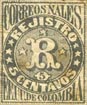 1870. “Rejistro”, 5 c., black.
Like the “Anotacion,” the 1870 issue is on a ground of vertical lines, on white paper, and the 1877 issue with horizontal lines, on white, and on bluish. I have not seen any forgery of the 1877 type.
Genuine
Printed in black, on greyish-white or white wove paper, fairly thick, but somewhat soft. The toothed frame is like that of the genuine “Anotacion.” The tail of the C of CORREOS is long—2 1/2 mm. high, measuring vertically from the bottom of the letter; the top of the first O of that word is level with the top of the first R ; the RE touch at the foot, and the second O is level with the E and S, each side of it. The NA of NALES touch, and I should imagine that the AL would also touch, in heavily-printed specimens. In the lower inscription, the left top and bottom corners of the first E almost touch the frame; the stops after EE. and UU. touch the letters each side of them. The MB of COLOMBIA touch at the bottom, but not at the top, and the serif at the top of the I, though sloping, extends to right, as well as to left, so that it is not like a 1. The 0 of REJISTRO is nicely shaped, and not flat at the top. The white 5 of 5 CENTAVOS is exactly like that of the genuine “Anotacion”, just described. The shading of the top star, above the R, touches the frame above it, as before. There are twenty-eight vertical lines in the background, from the left-hand side, up to the place where the shading of the top star touches the boundary above it. There are four nice, straight vertical lines to be seen in the top hollow of the R, and four similar ones in the lower hollow of that letter. The left foot of the R comes between the ninth and tenth vertical lines, counting from the left; and the right foot touches the seventh line from the light. The curl at the left top corner of the R just touches the tenth line from the left, and the black shading at the right side of the head of that letter touches the thirteenth line from the right. The second O of COLOMBIA comes down a good deal below the level of the L and M, each side of it.
First Forgery
Lithographed, in deep black, on thick, hard, white wove paper. The toothed frame is somewhat irregular, and the teeth are mostly blunt and rounded. There are only forty-six downward-pointing teeth along the bottom frame, instead of forty-seven. The tail of the c of CORREOS is only 2 mm. high; the first O of that word is distinctly taller than the following R; there is a blotch, joining the RE, but it does not look like the tail of the R, and the second O is very slightly taller than the E before it. The NAL of NALES are all joined together at the feet. In the lower inscription, the stops are very large, and firmly join together the EU, and the UD, respectively. In the word COLOMBIA, the CO touch at the foot, and the MB at the top, but not at the foot. The serif at the top of the 1 extends only to the left, so that it looks like a 1. The O of REGISTRO is cut off quite flat at the top. The tail of the white 5 of 5 CENTAVOS ends in a round ball. There are twenty-three vertical lines, from the left side, to where the shadow of the top star joins the outline above it. The top hollow of the R shows four vertical lines in it, like the genuine; but the bottom hollow has only three lines. The left foot of the R touches the eighth line from the left; the shadow of the right foot touches the seventh line from the right, as in the genuine. The curl at the left top corner of the R comes between the eighth and ninth lines from the left; and the black shading at the right side of the head of the letter comes between the thirteenth and fourteenth lines from the right. All these lines are very thin and broken, and difficult to count. The O of COLOMBIA is level with the letters each side of it.
Second Forgery
Lithographed, on fairly thick, hard, greyish-white wove paper. The teeth in the frame are too small, and too blunt, and there are only forty-five in the bottom frame, instead of forty-seven. The tail of the C of CORREOS is only 1 3/4 mm. high. The top of the first o is like the genuine, also the joining of the RE; the E and the O touch the outline below them. The AL of NALES touch, while the NA do not touch. The first E of the lower inscription does not touch the frame; the stop after EE only touches the following U, and the stop after UU only touches the following D. The MB of COLOMBIA are joined both top and bottom. The O of REJISTRO is flat at the top, but not so flat as in the first forgery. The top star, above the R, does not touch the outline above it. There are only sixteen lines from the left side of the central circle to the top point of the top star. Three vertical lines can be seen, in the top hollow of the R, and three in the lower hollow. The left foot of that letter touches the seventh vertical line from the left; the right foot touches the fourth line from the right; while the left top curl of it touches the seventh line from the left, and the black shading to the head of it touches the eighth line from the right. From all these measurements, it will be gathered that the vertical lines of shading are much fewer, and farther apart, than the genuine. As a matter of fact, there are about fifty-six lines in the genuine, while this forgery has only thirty-six. The second O of COLOMBIA is level with the bottoms of the adjacent letters.
Third Forgery
Lithographed, on medium, very yellowish-white wove paper. The toothed frame is fairly like the genuine. The tail of the c of CORREOS is as tall as in the genuine. My single specimen is torn in the left top corner, so that I am unable to say whether the top of the first O is level with the top of the first R. The RRE are all joined at the foot, and the NA of NALES are similarly joined. In the lower inscription, the EE are joined at top and bottom. There are fifty-seven vertical lines in the background, instead of fifty-six, and all the other tests are the same as in the genuine, so that it is rather a dangerous forgery.
Fourth Forgery
Very nicely lithographed, on thin, hard, white wove paper. The toothed frame is fairly good, but there are only forty-six teeth at the bottom, instead of forty-seven. The tail of the E of CORREOS is only 2 mm. high, and curls inwards, instead of almost straight upwards; and the R and E do not touch at the foot. The LE of NALES seem to touch at the foot, but none of the other letters of that word touch each other. In the lower inscription, the first E docs not touch the side frame with either lop or bottom; the stops do not touch the letters each side of them, though the first stop is very close to the E before it; and none of the letters of COLOMBIA touch each other anywhere. The right-hand end of the top stroke of the white 5 of 5 CENTAVOS is very blunt, instead of pointed. The easiest test for this forgery is, that the central circle is while, instead of filled in with lines. From a close inspection, it would seem that there had, originally, been a background of fine, horizontal lines (issue of 1877), but I put it here, to save unnecessary descriptions.
Postmarks
Genuine.—The oval, before described.
First Forgery.—Uncancelled; also part of a very large oval, with lettering.
Second Forgery.—Uncancelled.
Third Forgery.—Uncancelled.
Fourth Forgery.—Uncancelled.
From: ‘Album Weeds’, 3rd edition by R. B. Eareé. 1906
 1860, 1867 & 1873. 3 Cents, carmine
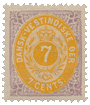
 1874. 1, 3, 4, 7 & 14 Cents.

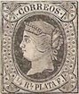
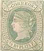
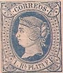
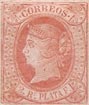
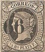 1866. Provisional. 1/4 Real, black on buff. Surcharged “66.”
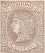
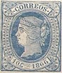
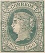
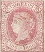 1866. 5, 10, 20 & 40 Centimos.