Album Weeds – Bangkok

Album_Weeds_Bangkok5 Album_Weeds_Bangkok4 Album_Weeds_Bangkok3 Album_Weeds_Bangkok2 Album_Weeds_Bangkok1Issue of 1868-82, CC. Issue of 1883, CA.

These are the stamps of the Straits Settlements, surcharged with a large B. They ceased to be employed after Jan. 1st, 1886; and therefore, when possible, the postmark should always be looked at; for are not particular, and stamps which happen to have a dated postmark may sometimes show a date years after the issue ceased!

Genuine

The B, in all my specimens, is 6 mm. high, and the upright stroke from 3/4 mm. to 1 mm. broad. The serifs are quite horizontal. The upper one projects 3/4 mm. from the body of the letter, and the lower one 1 mm. (nearly).

First Forgery

The B is 5 3/4 mm. high, and the upright stroke rather less than 3/4 mm. broad. The serifs are not always horizontal; in some of my specimens the upper one is bent slightly upwards, and the lower one slightly down- wards, so that they splay out, but this is not always the case. I have this forgery on the 2 c., brown, CC, the 2 c., rose, CA, the 4 c., rose, CA, and the 4 c., brown, CA.

Second Forgery

The B is 5 1/2 mm. high, and the upright stroke barely 3/4 mm. high. The serifs are very short, projecting hardly 1/2 mm. I have this forgery only on the 32c., CA, which value does not exist in the genuine, so that this stamp is bogus.

Postmarks

Genuine.—1, 2, 29 ; also one something like 32, but octagonal, and with four concentric octagons.

Forged.—It will be understood that the forged surcharge is applied to genuine stamps, and therefore the forgeries bear genuine postmarks of the Straits Settlements. Some of my specimens are dated as late as 1891, five years after the Bangkok stamps ceased to be employed.


From: ‘Album Weeds’, 3rd edition by R. B. Eareé. 1906

Album Weeds – Bahamas

Album_Weeds_Bahamas1One Penny, red, carmine, etc.

The varieties of the 1d. are: 1859, no watermark, imperf., lake. 1861, no watermark, clean-cut perf. 14 to 16; also rough perf. 14 to 16, lake. Perf. 11 1/2 to 12, no watermark, carmine-lake. Perf. 13, no watermark, brown-lake, carmine-lake. 1863-75, CC, perf. 12 1/2, brown-lake, carmine-lake, rose-red, vermilion. CC, perf. 14, vermilion. 1882, CA, perf. 12, vermilion. C A, perf. 14, vermilion.

I have given the above list of the different issues of the penny stamp, so as to assist in the detection of any future forgeries which may appear; but the originals are so very pretty, and so nicely executed, that there is not much fear of any of the forgeries being dangerous. Before I say anything about the counterfeit now to be described, perhaps I had better mention a fact which some of my readers have, no doubt, by this time, found out for themselves; and that is, that these penny stamps will not stand the application of water. I have seen some most doleful-looking specimens occasionally, in the albums of amateurs who were not aware of this peculiarity.

I would recommend, therefore, that, to remove any backing off these stamps, they should be floated on water with the face uppermost, care being taken that no single drop touches the face; and when they are thoroughly moist, the back will come off without difficulty. This is the way I always treat my own stamps, and I never get the faces wet, and thus do not damage them.

Genuine

Engraved in taille-douce, perforation and watermark as above, according to the issue. The shading of the oval behind the head is composed of crossed lines; but the vertical lines
are slightly more prominent than the horizontal ones. The face is shaded all over, except just along
the ridge of the nose, and on the forehead, between the eyebrows; the neck is also shaded all over.
The highest leaf of the top tuft of the pine-apple touches the top of its containing-oval. The top of
the conch-shell in the oval on the other side of the stamp also touches the top of its containing-oval.
 There are two lines of shading on the ribbon, immediately before the first letter of INTERINSULAR, and two similar lines immediately after the last letter of POSTAGE. The border of the stamp is a dark strip of engine-turning; and immediately inside this is more engine-turning, but of a lighter and more lace-like pattern, not so heavily colored. There are twenty-seven jewels in the lowest row of the crown, resting upon the hair.

Forged

Lithographed, on stout, yellowish-white wove paper, pin-perforated 13, no watermark. The shading of the oval behind the head is of vertical lines only. All the central portion of the face is unshaded ; and the centre of the bottom of the neck is also white. The highest leaf of the tuft of the pine-apple does not touch the top of the little oval; nor does the top of the conch-shell touch the top of its oval either. There are no lines of shading on the ribbon, either immediately before or after the inscription. My readers must please understand that I do not refer to the folded part of the ribbon, as this is shaded on the right side in both genuine and forged; but I simply speak of the flat portion of it, which contains the words INTERINSULAR POSTAGE. The border of the stamp is pretty fairly imitated ; but the beautiful lace-work just inside the border is, in these forgeries, represented by heavy and clumsy blotches and masses of color. It is usually impossible to count the lowest row of jewels of the crown, resting upon the hair; as, on the right side of the head (i.e., on the left side of the stamp), they run together into a white line; but a good copy of this forgery shows about thirty or thirty-one jewels in the lowest row.

Album_Weeds_Bahamas2 Album_Weeds_Bahamas3Issue of 1861. Fourpence, rose; Sixpence, grey, mauve.
 No watermark. Perforated 14, 13, 12.

Issue of 1862-3. Watermark Crown and CO. Perforated 12 1/2, 14.
Issue of 1882. (The Fourpence.) Watermark Crown and CA. Perforated 14.

Genuine

Engraved in taille-douce, on stout, white wove paper; both values from the same die. The background, outside the central oval, is composed of strips of engine-turning, in two patterns, placed alternately; and each alternate strip, beginning with the outer one on each side, has a row of diamond-shaped dots running down the center of it. None of the stars in the four corners of the stamp touch their containing squares anywhere, and they are all exactly alike. The central oval, behind the bust, is formed of very fine crossed, vertical and horizontal lines; but I ought to mention here that I have a copy of the 6d. of 1861 which certainly appears to have a solid background However, it is possible that the paper may have been too damp, causing the fine lines to run into each other. There are eighteen or nineteen pearls in the necklace ; and the central one, which has a dark spot in the middle of it, is very much larger than any of the others. The base of the crown has two rows of pearls, with a row of diamonds or some other jewels between them. The upper outline of the value-label does not encroach upon the ribbon which contains the word POSTAGE. The whole stamp is very delicately engraved. The Queen’s lips are parted slightly, as though she were just going to speak.

First Forgery

Lithographed, on stout, very yellowish-white wove paper, no water- mark, unperforated, and perforated 11 1/2 and 12, better than usual. The dots on the alternate strips of engine-turning are of various shapes, but most of them are round, and none of them diamond-shaped. One point of each of the lower stars usually touches the outline of its containing- square somewhere; and the lower stars are generally badly done, and not like the upper ones. The central oval behind the bust is composed of crossed lines, like the genuine ; but they are blotchy, coarse, and indistinct, very different from the genuine. There are thirteen pearls in the necklace. These pearls are not nicely graduated in size, as the genuine are ; and the one with the dark spot in the center of it is not so large as the one immediately to the left of it. The base of the crown is formed of three rows of pearls, the central row being just the same as those above and below it. The bottom of the ribbon containing the word POSTAGE is cut into by the straight value-label below it, so that the S and T of that word (especially in the Fourpence) have to be made a little smaller than the rest of the letters. The whole stamp has a coarse look; and the Queen’s lips are far too wide open, so that she looks as though about to scream, rather than speak.

Second Forgery

Lithographed, on very yellowish-white wove paper, rather stout, badly pin-perforated 12 1/2 no watermark. I never saw this forgery before about 1890. The dots in the vertical strips of engine-turning are diamond- shaped, as in the genuine ; but each of the dark diamonds is placed in the center of a white diamond. The corner-squares, with their stars, are not alike in shape and size, the star and square in the left top corner, especially, being much smaller than those in the right top corner. The Fourpence has the background behind the bust apparently solid, but the Sixpence has the crossed, vertical and horizontal lines very distinct, though they lack the beautiful regularity of the genuine. There are fifteen pearls in the necklace, and nine of them contain spots; the four large ones in front having apparently two in each, though they require the microscope to make them out distinctly. The easiest test for this forgery is, I think, the second vertical strip of engine-turning on each side. In the genuine, these two strips are a fine and beautiful lace-work, and in each strip there is a horizontal row of very tiny, diamond-shaped dots (five in each, where the central oval does not encroach upon them) level with the larger, single, diamond-shaped dots in the first and third strips, as described above. In this forgery, the second strip from the outside, on each side of the stamp, is a mere meaningless jumble of blotches and scratches, spoiling the effect of the stamp completely. The outline of the lower jaw, on the right side of the stamp, forms almost a straight line from the chin to the ear; in the genuine, this is a nice and well modeled curve. Thus the Queen seems to have an altogether unnaturally hollow cheek. The lettering in this second forgery is a good deal thinner than in the genuine or in the first forgery.

Album_Weeds_Bahamas4One Shilling, green. 
Issue of 1862-3 and 1882.

The design, paper, and manner of printing of this stamp are all considerably different from those of the stamps just described; and I think that, on the whole, the forgers have not been quite so successful in this as in the lower values. However, my readers must judge for themselves.

Genuine

Engraved in épargne, perforation and watermark as above, on slightly glacé paper. The stamp, though not particularly striking, is very carefully engraved. The face is shaded almost all over, though there is a small, unshaded portion at the corner of the nose, and another at the top of the forehead. The ear is all shaded, except the tip, which hangs down a little. Just under the middle A of BAHAMAS, there is a small circle or ring, with another circle in the center of it. The conch- shell in the right lower corner has a sharp spike projecting from the right-hand side, about the center, and another from the left-hand side, at the bottom. There are five leaves at the base of the pine-apple, and five more in the bunch at the top. If a straight line were drawn down through the center of the pine-apple, it would cut into the 0 of ONE, considerably to the right of its center. The white space round the central medallion is equally broad all round, and the outline of the portrait does not trespass upon this white space anywhere. There is a tiny full-stop after the Etruscan bordering to the right, above the G of SHILLING; and the upper horizontal stroke of the last key in this pattern is wanting, as the border cuts it off.

Forged

Lithographed, on ordinary, white wove paper, unperforated, or pin-perforated 13, no watermark, ungummed. The front of the face, from the forehead to the chin, has hardly any shading upon it. The rim of the ear is white, and the lobe of it inclines forward instead of downward. The letters of the name BAHAMAS are clumsily copied, and the circle under the middle A has a dot in the center of it. The spikes on the conch-shell are absent. There are only four leaves at the base of the pine-apple, and the leaves on the top cannot be counted. A line drawn down through the center of the pine-apple would cut exactly through the center of the O of ONE. The white space round the inside of the central medallion is much broader in some parts than others; notably under the MA of BAHAMAS, and below the base of the neck. The chignon, and the pointed front of the neck, project slightly into this white space. There is no stop at the right-hand end of the Etruscan or key-pattern, and the last key over the G of SHILLING is only a straight line. The base of the defective key over the S of SHILLING is much longer than the bases of the others; whereas, in the genuine, it is of the same length as the rest.

Album_Weeds_Bahamas5Issue of 1883. Fourpence (Provisional), mauve and black.
 Watermark Crown and CC. Perforated 12 1/2 and 14.

This is the Sixpence before described, with the value FOURPENCE, as here illustrated, surcharged on it in black. It will be understood that the forgers have taken the genuine Sixpence, only the surcharge being counterfeited.

Genuine

The lettering is in thick, rather clumsy and blotchy Roman capitals, 2 1/4 mm. high. It is all in one word—FOURPENCE—and so wide that there is scarcely room for it on the stamp. From the center of the upright stroke of the F to the center of the upright stroke of the last E, the distance is 17 1/2 mm. The lettering is deeply sunk into the paper. From the center of the upright stroke of the R to the center of the upright stroke of the P, the distance is just a shade over 2 mm.

Forged

The lettering is not nearly so thick and clumsy as in the genuine, and the letters are exactly 2 mm. high. The surcharge is in two distinct words—FOUR PENCE—and there is a stop after PENCE. There is room for the surcharge and the stop on the stamp. From the center of the upright stroke of the F to the center of the upright stroke of the last E, the distance is 16 1/4 mm. The lettering is hardly, if at all, sunk into the paper. From the center of the upright stroke of the R to the center of the upright stroke of the P, the distance is 3 1/2 mm. I think the above measurements will suffice for the detection of this forgery.

Postmarks

Genuine.—1, 54 ; also the same, with a large B in the center; also pen-strokes; also the date written in pen-and-ink, like the cancellation on an English receipt stamp. (This last is probably a fiscal cancellation.)

Forged.—6 (no numerals), 22, 33, 54, 62. As to the surcharged Four-pence, this, of course, bears the genuine cancellations, but under, not over, the surcharge.


From: ‘Album Weeds’, 3rd edition by R. B. Eareé. 1906


LupSee also —> Spud Papers – Bahamas

Album Weeds – Baden

Album_Weeds_Baden1 Album_Weeds_Baden1-11 Kreuzer, black on buff, 1851; black on white, 1853.

 Genuine

Engraved in épargne, on buff (1851) or white wove paper (1853); imperf. The “F” of “Freimarke” does not touch the line above it. The right-hand inscription is “Vertrag v. 6. April 1850.” The oblique side- stroke, at the top left-hand side of the central numeral, is thin, tapering, slightly curved outwards, and appears naturally to belong to the numeral. There are six horizontal rows of small, pear-shaped ovals in the back- ground of the central circle, formed by and among the wavy lines. These pear-shaped ovals have the small ends uppermost. The stop after the I is not abnormally large ; it does not touch the numeral, and lies between two of the horizontal rows of ovals.

In all the stamps of this design, the engraver has introduced a secret mark, in the shape of a little dot. The position is rather difficult to describe without a diagram. The inner border of the circle round the central numeral is a set of crescent-shaped lines, and, outside these crescents, there is a circle of black triangles, joined at their points, forming black scallops. The secret mark in this 1 kr. is a white dot in the inner edge of the black triangle which is opposite to the left lower corner, i.e., the third from the bottom. Nobody would take this for anything but a flaw.

Forged

Lithographed, in black, on brown, or on white wove paper. The “F” of “Freimarke” touches the line above it. The right-hand inscription is “Vertrag d. 6 April 1850.” The oblique side-stroke to the left-hand of the top of the central numeral is straight, much too thick, not tapered, and does not seem to belong to the numeral. There are seven rows of (not pear-shaped) ovals in the background of the central circle. The stop after the numeral is abnormally large ; it touches the numeral, and exactly obliterates one of the little ovals. There is no secret mark.

Album_Weeds_Baden2 Album_Weeds_Baden36 kr., black on green, 1851; 6 kr., black on yellow, 1853.

Genuine

Engraved as before, on green (1851) or yellow wove paper (1853); moderately stout The thin line of the frame above BADEN is as thin as the line below that word, and is not ragged. The “F” of
”Freimarke” does not touch the line above it. The left-hand inscription reads “Deutsch = Oestr. Postverein,” with a sort of very short double hyphen, close to the “Deutsch,” a full-stop after “Oestr,” and another after “Postverein” ; the latter stop almost touches the “n” before it. The right-hand inscription is “Vertrag v. 6. April 1850.” In each corner of the stamp there is an heraldic rose, the centre of which forms a sort of star of four points, with blank centre. Most of the points of these four stars are long enough to touch the turned-over edges of the petals of the roses. The stop after the “6” is round. The background of the central circle is composed of pairs of interlaced or crossing’, wavy horizontal lines. The light scalloped line round the central circle is much thinner than the light ring surrounding it.

The secret mark, in this value, is a dot, the color of the paper, in the edge of the black triangle opposite to the right lower corner, i.e., the third from the bottom to the right.

Forged

Lithographed, on rather thin, green or yellow wove paper. The green is decidedly blue-green ; very different from the yellow-green of the genuine. The inner line of the frame above BADEN is considerably thicker than the line immediately below that word, and it is very ragged. The ” F ” of ” Freimarke” touches the line above it. The dot to the “i” of “Freimarke” is like a comma, instead of being diamond-shaped, and it touches the “i.” The left-hand inscription is “Deutsch: Oestr Postverern,” with a very small colon, nearer to ” Oestr” than to ” Deutsch,” and the stop after “Postverern” is at a considerable distance from the “n.” The right-hand inscription is, “Vertrag v 6 April 1850” (sometimes “1350”), with no stops except after “1850.” The black stars in the center of the four heraldic roses in the corners of the stamp have very blunt points, very short, and hardly any of them long enough to touch the turned-over rims of the petals of the roses. The stop after the “6” is very shapeless. The background of the central circle is composed of pairs of straight, oblique lines in a sort of lattice-work, running down from left to right, and from right to left. The scalloped line round the central numeral is much thicker than the ring outside it.

There is no secret mark. I have no forgeries of the 3 and 9 kr., but I might mention that the secret mark of the 3 kr. is a light dot in the edge of the top triangle, under the D of BADEN ; and, in the 9 kr., it is the same as in the 6 kr.

Postmarks

Genuine.—5

Forged.—Four concentric circles of equal thickness, and without numeral in the centre.

Most of the unused copies of this issue now to be had are reprints; unused originals are not common.

1861. 1, 3, 6, 9 kr. Perf. 13 1/2.

Album_Weeds_Baden5Album_Weeds_Baden6Album_Weeds_Baden7Album_Weeds_Baden8These are the first perforated set, with the central square shaded with horizontal lines. I have the 9 kr. of one type of forgery and the 1 kr. of another type. It is very possible that a full set exists of each type.

Genuine

Engraved in épargne, on thin, white wove paper ; perforated 13 1/2. The band which passes obliquely across the shield contains eighteen vertical, colored lines. The upper outline of this band is distinctly darker and somewhat thicker than the corresponding lower outline. All the dots of color on the shield are of a good size, very distinct, and regularly placed. The space each side of the central arch of the crown is dark and solid, so that none of the lines of the background can be seen through either. The cross at the top of the crown reaches up to the third of the horizontal lines of the background, counting from the top. The central leaf below the shield has its end-lobe hardly at all projecting beyond the side-lobes, and this end-lobe touches the third of the horizontal lines of the background, counting from the bottom. In the word BADEN, all the different strokes of the letters of the word are of the same width, and the lower limb of the E is only very slightly longer than the upper limb.

First Forgery

Rather well lithographed, on stout, white wove paper; perforated 13 1/2, like the genuine, but not so cleanly cut. The band which passes obliquely across the shield contains seventeen vertical dark lines. The upper outline of this band is not more prominent than the lower one. The colored dots on the shield are very faint, inconspicuous, small, and irregularly placed. The space each side of the central arch of the crown is light in color, and allows several of the horizontal lines of the background to be seen through it. The cross at the top of the crown reaches up to the second horizontal line of the background, counting from the top. The central leaf, below the bottom of the shield, has its lower lobe projecting far below the side-lobes ; it reaches to the second horizontal line of the background, counting from the bottom. In the word BADEN, the left-hand stroke of the A, the horizontal strokes of the E, and the first stroke of the N are all palpably narrower than the rest; this is very easily seen in the A, both of whose limbs ought to be of the same width. The lower limb of the E of this word is abnormally longer than the upper one. The ornaments in the corners are very different from those of the genuine, but it would be impossible to explain the differences without an illustration.

Second Forgery

I have only the 1 kr., black on yellow. This is a hideous thing, and not at all likely to deceive. Coarsely lithographed in black, on yellow wove paper, unperforated. There are twenty scratchy, crooked, and imperfect vertical lines on the oblique band across the shield. The upper outline of this band is very much thicker than the lower one in parts, but is very irregular. The dots of black on the shield are placed fairly regularly, but some of them are much smaller than others. The crown is covered by the postmark, but, as far as I can discern, it is of a quite different design from that of the genuine. As far as I can make out, the central lobe of the leaf, below the shield, touches the outline of the bottom label, above the end of the E of KREUZER. The top and bottom limbs of the E of BADEN are of equal length.

Third Forgery

This is, if possible, worse than the last. I have only the 1 kr., vermilion on yellow. Badly lithographed, on very rough, pale dull yellow wove paper, unperforated. There are only twelve vertical lines on the oblique band across the shield. Both outlines of the band are of equal thickness. The black dots on the shield are irregular, and, in my specimen, many of those in the lower half of the shield are missing. The crown is covered by the postmark, so I am unable to describe it, but there seems to be a ball on the top of it, instead of a cross. The background at the top is composed of very wavy horizontal lines, and at the bottom it is formed by rows of long black diamonds. The center-lobe of the leaf, below the shield, projects below the side-lobes, so as to very nearly touch the outline of the label below it. The bottom limb of the E of BADEN is too thin. The corner-ornaments in this counterfeit are exceedingly unlike the genuine ; and the one in the left top corner is a mere caricature of the original design.

Postmarks

Genuine.—5 ; the outer and inner circles are usually a little thicker than the others; also 1, 29, 71.

Forged.—Five concentric circles, the outer and inner ones very much thicker than the rest, and without numeral in center.

1862-64. 3 kr. Perf. 13 1/2. 1, 3, 6, 9, 18, 30 kr. Perf. 10.

Album_Weeds_Baden10Album_Weeds_Baden9 Album_Weeds_Baden11Album_Weeds_Baden12


Album_Weeds_Baden13Album_Weeds_Baden14Album_Weeds_Baden15


These stamps are of the same design as those just described, except that the central square behind the arms is plain white, instead of being filled in with horizontal lines. The 3 kr., perforated 13 1/2, is rare, as only 2,000 sheets were printed, before the gauge of the perforation was altered to 10.

Genuine

Engraved in épargne, on white wove paper ; perforated 13 1/2 or 10, as above. The right-hand griffin, supporting the shield, has eleven feathers in its wings, but there are only ten feathers in the
wings of the left-hand griffin. The crown has five arches, containing pearls ; and, beginning from the left outer arch, the pearls are 7, 5, 3, 7, 8. They are tolerably easy to count. The dark space, each side of the central arch of the crown, is filled with closely-set horizontal lines, which look solid in some copies. There are eighteen vertical lines in the oblique band across the shield. The dots on the shield are very distinct, and placed in regular rows. The cross on the top of the crown is very nearly under the centre of the D of BADEN. The two spiral curls, on the inner ends of the two ribbons on which the two griffins stand, are exactly alike; except, of course, that they curl different ways. In the word POSTVEREIN, the top and bottom limbs of each E are of equal length; and, if a line be drawn along the center of the tongue of the first E, through the centre of the tongue of the second E, it will cut exactly through the center of the R between them. The centers of the RKE of FREIMARKE are all exactly in one line; and the upright stroke of the K only just touches the joined oblique strokes.

First Forgery

Of this I have the 3, 18, and 30 kr. Lithographed, on white wove paper; badly perforated 11 1/2 or sometimes 12. There are twelve feathers in the wings of the right-hand griffin and ten” in the wings of the left hand one. The arches on the crown are confused and uncountable; only the two each side of the central one have pearls. These pearls are in the places occupied by the dark spaces of the genuine. There are only fourteen vertical lines in the oblique band across the shield. The dots on the shield are indistinct, and irregularly placed. The cross on the top of the crown is a good deal to the right of the center of the D of BADEN.

Second Forgery

Of this I have only the 3 kr. Lithographed, on thin, white wove paper, perforated 13 1/2, very nicely. There are eleven feathers in the wing of the right-hand griffin, and eleven also in the wing of the left- hand one. There are five arches with pearls on the crown, as in the genuine ; but the numbers of the pearls, beginning with the left-hand arch of the crown, are 9, 7, 3, 5, and 7; and the spaces each side of the central arches are quite solid, instead of being filled with horizontal lines. The cross on the top of the crown is quite under the right-hand stroke of the D of BADEN. There are seventeen vertical lines in the oblique band across the shield. The dots on the shield are very faint, but placed pretty regularly.

Third Forgery

This is the worst of the lot, and hardly worthy of a place in this book. Typographed in black, on rough, rather thin grey paper, unperforated, and colored on the face by hand. (My copy is colored bright Prussian blue !) I have only the 18 kr. The wings of the right-hand griffin show only nine feathers and a stump, and I fancy there are only eight in the wings of the left-hand griffin, but the postmark covers this part, so I am not sure. The heads of these animals are not in the least like eagles’ heads, and their crowns are exactly like the small crown watermark of the first English id. and 2d. stamps. The crown on the shield has six arches, formed of solid black lines without any pearls, and with blank spaces between. There are only eleven vertical lines in the oblique band across the shield, and nearly all the dots on the shield are absent. I do not think any further tests are needed ; though I may add that the corner-ornaments are four-petalled flowers, containing a black upright cross, with a white dot in the center of each cross.

Fourth Forgery. 18 Kreuzer.

This is a very excellent production ; and quite new, I believe. Nicely engraved, in épargne, on yellowish-white wove paper, somewhat thicker and smoother than that of the genuine; perf. 10. The spiral curl on the right side is not exactly like that on the left; having, apparently, half a twist more. The upper limb of each E of POSTVEREIN is decidedly longer than the lower limb ; and a straight line joining the tongues of the two letters would cut through the R a little above its center. The center of the K of FREIMARKE is somewhat lower than the centers of the R and E each side of it; and the oblique strokes of the said K are firmly joined to the vertical stroke, instead of just touching it. Beyond these slight differences, the stamp seems to be a facsimile of the genuine ; though the postmark may possibly hide a few others. The lines and dots on the shield are exactly copied.

Postmarks

Genuine.—5, 6.

Forged.—1, 5.

Album_Weeds_Baden16Album_Weeds_Baden17 Album_Weeds_Baden18Issue of 1862. “Land-post.”

1, 3, 12 Kreuzer, black on yellow.

These were rural stamps, for a messenger service, to connect the rural villages that had no post office with the nearest State post office, something like the Russian locals. The Land-post also conveyed letters and parcels between the villages, and was used to collect the delivery-charges on parcels, etc. The post was established in 1859, but stamps were first issued in 1862. The stamps were not sold to the public, but used only by the officials. When the Baden stamps were sold in 1872, Goldner, of Hamburg, bought nearly a million of these Land-post labels. I give these details from Mr. Westoby’s book, as so many collectors have the very vaguest ideas as to the use and meaning of these stamps.

1 Kreuzer. Genuine

Typographed, in black, on orange-yellow wove paper ; machine-perforated 10. The N of LAND is nicely shaped. The O of POST and each 0 of PORTO are block letters; i.e., with the black outline the same thickness all the way round. The S of POST is nicely shaped. The M of MARKE is almost perfectly upright. It is a block letter, with thefirst and last upright strokes of equal thickness. The letters of MARKE do not follow a perfect curve; i.e., suppose a perfect arc of a circle to be drawn from the left lower corner of the M to the right lower corner of the E, then the right lower corner of the M would come too low, and the left lower corner of the E would be too high. There is a horizontal line in the ornamental border, above the D-P of LAND-POST, and a similar one under the O-M of PORTO-MARKE. These lines are only very slightly wavy. The two little leaves, to the right and left of the middle of the numeral of value, do not touch the horizontal, pyramid-shaped stalks from which they are supposed to spring, although each leaf has a tiny bit of stalk projecting from its base. The horizontal stroke at the foot of the numeral extends from very nearly the left top corner of the T of PORTO to nearly the middle of the R of MARKE.

1 Kreuzer. Forged

Nicely typographed, on pale, primrose-yellow wove paper, cleanly machine-perforated 9. The right-hand upstroke of the N of LAND stands out too far from the oblique stroke. The black outline of each o is thinner at the top and bottom than at the sides, as is usual in Roman type. The M of MARKE slopes over to the left, and its first stroke is much thinner than the last stroke. The bottoms of the letters of MARKE follow a perfect curve. The horizontal lines, respectively above D – P of LAND-POST and below O-M of PORTO-MARKE, are very wavy. The leaves to the right and left of the numeral are joined to the horizontal, pyramid-shaped stalks issuing from the border. The horizontal foot-stroke of the numeral extends from the middle of the T of PORTO to the beginning of the R of MARKE.

3 Kreuzer. Genuine

Typographed, the paper and perforation the same as in the genuine 1 kr. The N of LAND somewhat squeezed up, and a little taller than the letters each side of it. The S is nicely shaped. Each 0 is a block letter. The M of MARKE has its first and last strokes of equal thickness. The horizontal lines at the top and bottom of the stamp are very slightly wavy. The two leaves do not touch the pyramid-shaped stalks. The bottom limb of the 3 is not much larger than the top limb. There are nice, square-ended head- and foot-strokes to the letters of the inscription. The black frame round the stamp is barely half a millimeter broad. Nearly all the different curls of the ornaments inside the frame all round are separated more or less distinctly from each other.

3 Kreuzer. First Forgery

Nicely typographed, on pale, primrose-yellow wove paper, cleanly machine-perforated 9. The bottom limb of the 3 is decidedly larger than the top limb. The other tests are the same as those for the forgery of the 1 kr. just described. I have not seen the 12 kr. of this type of forgery, but it doubtless exists; and the tests for the 1 kr. will be sufficient to identify it, should any of my readers possess it.

3 Kreuzer. Second Forgery

Lithographed, on yellow wove paper, which is not such an orange-yellow as the genuine, but not such a pale primrose-yellow as that of the forgery last described; and badly pin-perforated 12. The N of LAND is a wide or “extended” letter, and exactly the same height as the letters each side of it. The top tongue or kern of the S of POST is wanting, and the letter is not a nice shape. Each O of the inscription is a Roman letter. The first stroke of the M of MARKE is much thinner than the last stroke. The horizontal lines at the top and bottom of the stamp are coarsely wavy. The leaves are joined to the pyramids. The bottom limb of the 3 is much larger than the top limb; this may best be seen by holding the stamp upside-down. The head-stroke of the P of PORTO is nice and square, but none of the others are, although they ought to be. The frame of the stamp is more than three-quarters of a millimeter broad; i.e., very nearly double the breadth of the genuine. Most of the ornamental curls round the stamp are joined together. This is a poor forgery, compared with that of the 1 kr., the latter being dangerous.

12 Kreuzer. Genuine

Typographed, the paper and perforation the same as in the genuine 1 and 3 kr. There is a short, thick hyphen between the D and P of LAND-POST, and it is nearer to the D than to the P. The bottom-stroke of the 1 of 12 extends from the middle of the O of PORTO to the middle of the hyphen after that word. The horizontal wavy stroke below O-M of PORTO-MARKE touches the curls each side of it, and extends from the end of the O to beyond the middle of the M. All the other tests are the same as in the genuine 3 kr.

12 Kreuzer. Forged

Lithographed, the paper the same as in the forged 3 kr. My only copy is cut close, but is probably badly pin-perforated 12, like the forged 3 kr. There is a longish hyphen between the words LAND-POST, and this hyphen is nearer to the P than to the D. The bottom-stroke of the 1 of 12 extends from the top left corner of the R of PORTO to the beginning of the hyphen after that word. The horizontal, wavy stroke under the O-M does not touch either of the curly ornaments each side of it, and extends from the beginning of the hyphen to the middle of the M of MARKE.

Postmarks

Genuine.—Postmarked stamps of this issue are decidedly rare, though they are common enough unused. The most usual cancellation is something like 14; there is also to be found an oval postmark, bearing the names of the local receiving-office and the State office with which it was connected.

Forged.—1, 5. Also one similar to 29.


From: ‘Album Weeds’, 3rd edition by R. B. Eareé. 1906


Album Weeds – Azores

The reader will understand that the forgeries now to be described are counterfeits of the Azores surcharges, on genuine Portuguese stamps.

Album_Weeds_Azores1Issue of 1868-70. Surcharge, Type 1; 14×3 mm. Imperf., or perf. 12 1/2

The surcharge is in black, except the 5 reis of 1870, perf. 12%, which has it in carmine. Values up to 100 reis, imperf.; up to 240 reis, perf.


Surcharge, Type 2; 94 x 2J mm. This is only found on the 25 reis, rose; perf. 12 1/2.

Surcharge, Type 3; 12×3 mm.

This is another scarce one, cataloged only for the 5, 10, 25, and 80 reis.

Genuine

TYPE I.—This measures 14x3mm. The C, O and R are narrow, and the head and tail of the S are fairly close to the body of the letter. The white inside of the o measures only 3/4 mm. across its widest part. The ends of the C are cut off quite square, and the cedilla under that letter is fat, and nearly touches the c. The top of the A is rounded, and both side-strokes are of equal thickness; the cross-stroke is nearly as wide as the side-strokes, thus leaving a very tiny, uncolored triangle inside the top half of the letter. The bottom limb of the E is slightly longer than the other two limbs, which are of equal length.

TYPE 2.—This is a much smaller surcharge, measuring only 9 1/2 x 2 1/2 mm. As mentioned above, there is but one stamp—the 25 reis, perf. 12 1/2— on which it is found.

TYPE 3.—This measures 12×3 mm., and is only found on the 5, 10, 25, and 80 reis, perf. 12 1/2, as already stated.

The surcharge, in all cases, is indented into the paper.

First Forgery

Surcharge 14 x 3 mm., as in Type 1 of the genuine. The top of the A is very broad, and cut off square. The C is narrow, as in the genuine, but the head is cut off obliquely, instead of being square, like the end of the tail. The cedilla is more clumsy than in the genuine, as its tail is too thick. The feet of the R seem to be on a slightly lower level than the rest of the letters. The E is taller than any of the other letters, and all three limbs are of equal length. The S looks much smaller than the E. The cross-bar to the A is thinner than the side-strokes, and the triangle in the upper part of it is too large.

Second Forgery

Surcharge 14 x nearly 3 mm. This is in very intense black; the ink looking dull and rough, as compared with the smoothness of the genuine. The top of the A is cut off square, and the cross-bar is considerably thinner than the side-strokes. The uncolored triangle in the top half of this letter is a mere dot, as the top is blotched. The cedilla is of a fairly good shape, but it is firmly joined to the C. All three limbs of the E are of exactly equal width. The S is not at all squeezed together, and the line forming that letter is decidedly thinner than the rest of the surcharge.

Third Forgery

Surcharge 14 1/4 x a little more than 3 mm. The A has the large, uncolored triangle in its top half, as in Type 4, hereafter described, but the surcharge is intended to imitate Type T. The c looks slightly top-heavy, as the lower part is not so fully rounded as the top part, and the top end is cut off very slightly obliquely. The cedilla is a long way from the c; quite twice as far off as the genuine. The O is exceedingly narrow, the uncolored center is not more than about 1/2 mm. across, in its widest part. The central tongue of the E is slightly shorter than the other two limbs. The S seems to lean a little to the right, and the slope of its center is much more upright than in the genuine. The ink is patchy, and shows many white places. The surcharge is not at all indented into the paper.

Fourth Forgery

This looks very thick and clumsy. Surcharge 14 x nearly 3 mm. The A is cut off square ; the ends of the C are rounded ; the cedilla is firmly joined to the c; the center of the 0 is hardly 1/2 mm. across, in its widest part. The center limb of the E is shorter than the others. The impression is greasy.

Fifth Forgery

Surcharge 14 X 3 1/2 mm. The A is quite square at the top. The cedilla to the C is a sort of oblique dash, equally thick all its length. The lower limb is a little larger than the upper one. All three limbs of the E are of equal length. The s is thick, and the top and bottom parts squeezed together, so as almost to touch the body of the letter. Half a millimeter too tall does not sound much, but it makes the surcharge look almost double the size of the genuine. It is not indented into the paper.

Sixth Forgery

Surcharge 13 3/4 x nearly 3 mm. The A is rounded, like the genuine, but the central tongue is too thin, and the triangle in the top of the letter is too large. The top end of the C seems to be rounded, and the bottom end cut off square. The cedilla does not touch the C, but it is too thick at the bottom. The center of the 0 measures nearly a millimeter across. All three limbs of the E are of equal length. The surcharge shows white patches, where the ink has not taken. I cannot give further details, as my specimen (50 reis, imperf.) is rather heavily postmarked; but it will be noted that the surcharge is too small each way, though not very much.

Seventh Forgery

The surcharge is rather more than 14 x nearly 3 mm. The A is square at the top, and the uncoloured triangle in the top half is represented by an upright oval dot. The C is of a peculiar shape. If the blank space between the ends were filled up, it would form, not an O, as in the genuine, but a thing more like a D; i.e., the ends point slightly outwards. The three limbs of the E are of equal length. The s is thicker than the other letters, and the bottom end is rounded, instead of being cut off square.

Eighth Forgery

Surcharge 12×3, i.e., an imitation of Type 3 of the genuine. I have no genuine copy of this surcharge, which, it will be remembered, only exists on the 5, 10, 25, and 80 reis, perf. 12 1/2; so my notes will not be very reliable. My only specimen is on the 240 reis, i.e., a bogus variety. The A is square at the top, and crossed very low down, so that the triangle is large. The top and bottom of the E are very wide apart, and the cedilla, which is joined to the C, is curved up, so as to be like a miniature J. The center of the 0 measures 1/2 mm. across. The lowest limb of the E is decidedly longer than the others.

Issues of 1871-80. Surcharge, Type 1, as above described. Surcharge, Type 4; 13 1/2 x 2 1/2 mm.

Type 1 was employed from 1871 to 1875; Type 4 from 1875 to 1880

Genuine

Type 1 has been already described ; I need not, therefore, repeat the details. In Type 4, the surcharge measures 13 1/2 X 2 1/2 mm., as stated.

The lettering is very slightly, but perceptibly thinner than Type i. The C, O, and R are wide and square- looking. The cross-bar to the A is thinner than in Type i, and the uncolored triangle is decidedly large. It is slightly rounded at the top, as before. The cedilla is further from the C, and points more vertically downwards than Type I. The center of the O measures nearly a millimeter across. The S is more open than in the first type. The bottom limb of the E is longer than the other two, which are of equal length. Ten wide, square O will enable the amateur to distinguish this type from Type I very readily. The surcharge is indented into the paper.

First Forgery

The surcharge measures 13 1/2 x 2 1/2 mm., as in Type 4 of the genuine, but some of the details are from Type 1. The cross-bar to the A is thin, but the triangle in the letter is small. The bottoms of the A and R are rounded, instead of being cut off square. The cedilla is very thin, and is joined to the C; it is longer than the genuine. The white center of the O is very narrow, only about 1/2 mm. across, in the widest part. The surcharge is not at all indented into the paper, and there are (as in almost all the forgeries) white parts, where the letters have failed to print completely.

Second Forgery

The surcharge measures 13 1/2 x 3 mm. The white center of the O is nearly 1 mm. across, in its broadest part. There are two easy tests for this forgery, that will render further description unnecessary; i.e., the cedilla is shaped exactly like a tiny balloon, without a car. It is firmly joined to the C, and points straight downwards, instead of sloping to the left. The other test is the E, which has its top limb even longer than the bottom, and the central tongue is a short, round lump. In both types of the genuine, the top limb and the central tongue are both exactly the same length, while the lower limb is distinctly longer. The lettering is all thicker than either type of the genuine.

Third Forgery

The surcharge measures 13 3/4 x 2 1/2 mm. All the letters are wide, and much thinner than the genuine. The inside of the O measures fully 1 mm. across, in its widest part. The cedilla is wedge-shaped, and slants to the left. There is a large triangle in the top of the A. This forgery is evidently imitated from Type 2 of the genuine. The s is wide, as in Type 2. In some respects it looks better than the second forgery, but, of course, the shortness of the lettering condemns it instantly. It is not at all indented into the paper.

Fourth Forgery

The surcharge is 14 1/2 x 2 1/2 mm. The A is rather squeezed up, but all the other letters are wide, and the type is very thin. My specimen is heavily postmarked, but the cedilla seems to be a large, transverse oval ball. The C is much too wide open, the two ends being more than 1 mm. apart, though they are only about 1/4 mm. apart in the genuine types. The inside of the O measures 1 1/2 mm. in its widest part. The middle tongue of the E is much shorter than the top limb, and the S is not so tall as the E. The lettering, in this case, is indented into the paper.

Fifth Forgery

The surcharge is 14 x 3 mm. This is an imitation of Type 1. All the letters are narrow. The cross-bar to the A is thicker than the left-hand stroke. The cedilla is an oblique stroke, the same thickness for its whole length, instead of being like a clumsy comma. The white inside of the o is very narrow, being barely 1/2 mm. across in its widest part. All three limbs of the E are of equal length, and it looks taller than the S. The top limb of the s points vertically downwards, instead of to the right. The surcharge shows through very plainly at the back, in my specimen (oily ink ?), but it is not indented into the paper.

Issue of 1880-82.

Genuine

Surcharge, Type 4; 13 1/2 x 2 1/2, as described above.

First Forgery

Surcharge, 13 1/2 x 2 3/4 mm. The A is square at the top, with a thin cross-bar, and a very large triangle in the top half. The feet of the letter are both rounded, instead of being cut square. Both ends of the c are rounded, and the cedilla is pear-shaped, and points directly downwards. The inside of the o is badly shaped, being wider at the top than at the bottom, measuring 1 1/4 mm. across the widest part. All three limbs of the E are of different lengths, the top one being the longest, and the central one the shortest. The tail of the S curves inwards, towards the body of the letter, much more than the head does. The whole surcharge is very much thinner than either Type i or Type 4; the E, especially, being barely half the thickness of the E of Type 4. It is very slightly indented into the paper.

Second Forgery

Surcharge 13 1/2 x 3 mm. The A is nearly square at the top, with both feet rounded. The triangle is large. The top of the C is rounded; there is a dent in the outline, at the top left corner, where it joins the vertical stroke. The cedilla is firmly joined to the C; it is pear-shaped, and points directly downwards. The center of the 0 is badly shaped, as in the first forgery, and measures just 1 mm. across, in the widest part. The inside of the top of the R, which is like a rather square O in the genuine, is, in this forgery, a rather rounded triangle. The top and bottom of the E are of equal length, while the middle tongue is very much shorter. The S is of the same shape as the first forgery, both ends being rounded. The surcharge is not indented into the paper. One peculiarity of this forgery is, that, when looked at under the microscope, all the letters appear to have a thin black outline, all the way round, inside and outside, with the body of each letter filled up in lighter ink.


From: ‘Album Weeds’, 3rd edition by R. B. Eareé. 1906


Album Weeds – Austria

Album_Weeds_Austria1
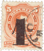
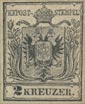
Issue of 1850. 2 kr., black.

This is the only value of which I possess forgeries, though I have seen a coarse imitation of the 9 kr., of which I did not take any notes at the time.


Genuine

Engraved in épargne, on hand-made, grayish-white wove paper, thin or thick. There is a hyphen after K K POST, and the word to the right of the crown is STEMPEL. The little cross on the top of the crown can be seen between the two outlines of the top of the stamp. The tail of the eagle ends in a very distinct black trefoil, which points down a little to the right of the center of the first E of KREUZER. In each wing there are seven distinct black feathers, with a thin hair-line between every two feathers. The seventh feather on the left side of the stamp does not show beyond the sword. The dark vertical band in the center of the small shield on the eagle’s breast reaches quite down to the bottom of the shield. The 2 goes very close to the outline above it, but does not actually touch, except in very heavily-printed copies. The little point projecting down from the said outline is before the 2.

First Forgery

Poorly lithographed, on thin card. There is no hyphen after POST , and the next word is TEMPEL. The absence of the S is, of course, a very easy test. The orb on the top of the crown can be made out, but not the cross above it. There is no black trefoil at the end of the eagle’s tail, and the tail points almost to the center of the U of KREUZER. The feathers in the wings are very indistinct, and cannot be counted with any certainty. The dark vertical band in the little shield does not reach either the top or bottom of the shield. The 2 is placed just under the projecting point in the outline of the label above it, and touches the said point.

Second Forgery

Lithographed, on medium, white wove paper. My single specimen is printed in apple-green, but I have no doubt it also exists in the proper color. The two wedge-shaped openings in the top of the crown are absent in this counterfeit, and the top of the crown seems to bear two orbs, instead of an orb and a cross. There are five broad feathers in the wing on the left side of the stamp, and six on the right side. The easiest test for this forgery is that the large shield is in plain white, whereas, in the genuine, and in the first forgery, it is covered all over with dots. The 2 is closely jammed against the outline above it.

Postmarks

Genuine.—I, 29; also one something like 81, and one composed of large letters and figures in two lines, without any outline.

First Forgery.—52, much smaller, with a single row of dots in the centre of the oblong.

Second Forgery.—29. The only part of the inscription that shows in my specimen is ” Vienne, 13.” I do not know whether this points to a French origin for this forgery. Of course, the Austrians spell the name ” Wien.”

Journal Stamps.

Album_Weeds_AustriaNewspaper8Album_Weeds_AustriaNewspaper9Album_Weeds_AustriaNewspaper10
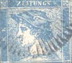
Issue of 1851-6. No value indicated.
Blue (1 kr.), yellow (10 kr.), rose (50 kr.), red (10 kr.).

I give the values on Mr. Westoby’s authority, not knowing any- thing about the matter myself; but Mr. Bacon’s book on Reprints gives them as—blue, o.6 kr.; yellow, 6 kr.; rose, 30 kr.; red, 6 kr. The difference is chiefly a nominal one, as the blue stamp was issued at the nominal price of 1 kr. when the florin was worth 60 kr., but really sold at 100 to the florin. Thus it was actually worth 0.6 kr. until the florin was divided into 100 kr. There are three types of the blue stamps. Type I. has an ordinary, well-shaped s in the word STAMPEL, and the G of ZEITUNGS is a G, i.e., it has a cross-bar. In Type II., which also has a cross-bar to the G, the s has a long head, and the top of the letter looks like the head and neck of a swan. In Type III. the s has no terminating point and looks like a worm,

while the G of ZEITUNGS is like a c, i.e., it has no cross-bar.

Genuine

Engraved in épargne, on grayish-white wove paper, thick to thin, and also on ribbed paper (1 kr.). There is a most peculiar long curly line attached to the base of the P of POST, pointing to the left, and a similar line attached to the first K, on the opposite side of the stamp. In Type I. these curly lines are strong and broad; in Type II. they are not quite so strong ; and in Type III. they are mere hair-lines. There is a hyphen after ZEITUNGS, just about 1 mm. distant from the S, and level with the centers of the letters. The corner-ornaments are like heraldic roses, with four large petals, and four small ones peeping out from behind them, but this is not always very clear. The lips stick out a good deal, and the upper one projects beyond the lower. There is a very strong line of shading at the corner of the nose. The shading of the central square is very much closer and darker at the bottom than at the top. The diaeresis over the Ä of STÄMPEL does not touch the white line above it. In Types I. and III. it is exactly above the center of the A, but in Type II. it is very slightly too much to the left. The nose has a slightly Roman outline. From the brooch on the shoulder some oblique dark lines of shading radiate to right and left on the tunic. One line ends exactly above the S of STAMPEL, another between TA, the third between AM, and the fourth above the beginning of the M. The front (white) outline of the tunic reaches the bottom some distance before the s. The horizontal limb of the L is of normal length. The first dark line, running from the brooch to the right, ends exactly above the L. The letters K. K. in the left-hand label are placed to read upwards; i.e., with their feet towards the centre of the stamp. The lettering is all in Roman type.

First Forgery

Lithographed, on thin, hard, white wove paper. There is no curly line either to the P or the K, and many of the letters are in block type; notably the P of POST. There is a stop after the word ZEITUNGS, level with the bottom of the S. There is no cross-bar to the G, but it has a little lump, which seems to distinguish it from a C. The flowers in the four corners have four petals only, with a dark ring in the center of each flower, and four dark lines projecting from the dark ring towards the corners of the little containing-square (x). In the genuine, these lines point vertically and horizontally (+) instead of obliquely. The lips are somewhat pressed together, the upper one not projecting, and the line of the mouth points very slightly upwards towards the ear, instead of being level. The line of shading at the corner of the nose does not touch the curl of the nostril. The diaeresis over the Ä of STÄMPEL is placed too much to the right and too high, so that it very frequently merges into the line above it. The nose is decidedly hooked, with a sharp point; the shading at the front of the point is too heavy, making it look as though part of the point had been shaved off. The front outline of the tunic ends above the middle of the T of STÄMPEL; the first line ends between TA; the second line does not reach the boundary of the square at all, being much too short; the third line ends over the first stroke of the M ; and the fourth line ends over the last stroke of the M. The horizontal limb of the L is, if anything, a shade too long.

N.B.—The above description really covers two forgeries, but they are so very much alike that I have not deemed it necessary to separate them.

Second Forgery

Lithographed, on rather thick, hard, white wove paper. This counterfeit has the G with cross-bar, as in Type I. of the genuine, but the tail to the P of POST is that of Type III., i.e., very thin, and oblique, rather than bowed. The hyphen after ZEITUNGS is only about F mm. from the S, which is a sans-serif letter. In this counterfeit there is a hyphen before the first K, and often (though not always) a long dash after the second K, and another hyphen before ZEITUNGS. The upper corner ornaments are fairly like the genuine, but the lower ones are more like the first forgery. The lips are very like the genuine. The line of shading at the corner of the nose is, in most copies, very short and weak. The front outline of the tunic ends between the ST of STÄMPEL, the first line ends above the middle of the T, the second line ends above TA, the third line ends between AM, and the fourth line, when visible, ends above the M. The horizontal limb of the L is curiously short, enough so to serve as an easy test for this forgery. The first dark line running to the right from the brooch ends above the end of the E. The diaeresis is exactly above the center of the Ä.

Third Forgery

I think this is the least common of all the counterfeits. It is lithographed, on coarsely-wove, white paper. There is no curly line to the K or the P, and no hyphen after POST. The hyphen after ZEITUNGS is only just about 1/2 mm. from the S, and slightly above the centers of the letters. The G has a very small cross-bar. The corner-ornaments show only four petals, but the shading in them is like the genuine. The curve of the mouth runs down into a very decided sneer. The line at the corner of the nose is thin, and rarely seems to touch the nose. One of the easiest tests for this forgery is the shading of the central square, which is composed of uniform parallel wavy lines, of equal depth (or rather faintness) of colour all over, except just in the right bottom corner, where it is very slightly darker. In the genuine, and all the other forgeries, these lines are not only wavy but curly. There is no diaeresis over the Ä of STÄMPEL. The front outline of the tunic ends above the right-hand end of the S, the first line ends above the middle of the T, the second over the A, the third over AM, the fourth over the beginning of the M, and a fifth over the end of the M. The letters K.K. are placed to read downwards, i.e., their heads point towards the center of the square. The lines which ought to run obliquely backward from the brooch are absent.

Fourth Forgery

Lithographed, on thin wove paper. The specimens of this forgery are always very faint and blurred. I have it in yellowish-green, as well as in the normal colors. There is a curly line to the P of POST, but I have not been able to make out one to the K. The hyphen after ZEITUNGS is only j mm. from the S, and a shade lower than the centers of the letters. The corner-ornaments are four-leaved, but otherwise like the genuine. The upper lip goes in a little, so that the lower one projects. The line of the mouth is horizontal. The shading at the corner of the nose is not so strong as in the genuine. The diaeresis over the Ä, when visible, touches the white line above it. The front (dark) outline of the tunic ends before the s, the first line ends over the middle of the S, the second line over the end of the T, the third line over the A, as far as I can make out, and the fourth line over the beginning of the M. The G of ZEITUNGS has not only a large cross-stroke, but also a tail, like an ordinary Roman G.

Fifth Forgery

Lithographed, on rather thin, hard, white wove paper. The specimens are very much blurred, apparently not from bad printing, as in the fourth forgery, but from a weak and poor matrix. I have specimens in sage-green, olive-yellow, and salmon. The curly line at the base of the P of POST is almost invisible, and the one at the base of the K, when it can be seen at all, seems to be straight, like a hyphen. There is a dim blotch after the s of ZEITUNGS, to represent the hyphen. The flowers in the corners are very similar to those in the first forgery. The expression of the face is bad-tempered. The bottom part of the central square, both right and left, is solid dark colour. There is no diaeresis over the Ä of STÄMPEL. The nose is slightly hooked. The L of STÄMPEL generally lacks the lower limb, and thus looks like an I. The front (white) outline of the tunic ends above the middle of the S, the first line ends above the end of the S, the third line over the end of the T, the fourth over the beginning of the M. The letters K.K. read upwards, as in the genuine.

Sixth Forgery

An elaborate description of this is not necessary. Lithographed, on very thick, yellowish-white wove paper. The corner-flowers have only four petals ; there is no hyphen after ZEITUNGS, and the G is an ordinary Roman G. There is no curly line to the K or the P, and the word at the bottom is STEMPEL, instead of STÄMPEL; this, of course, being an easy instant test.

Seventh Forgery

Lithographed, on stout wove paper, colored yellow on the face, presumably to give “age.” The lettering of ZEITUNGS is very thin, and the hyphen is only 1/2 mm. from the S. The G is not like any of the genuine types, having an extremely short cross-stroke. The corner-flowers have four petals. The upper lip is nearly twice as long as the genuine; the outline of the nose is rather wavy; the outline of the forehead is almost perfectly vertical, though it is decidedly curved in the genuine and most of the other forgeries. There is no dieresis over the Ä of STÄMPEL. The first dark line of shading on the tunic ends above the beginning of the S of STÄMPEL, the second over the center of the T, the third over the center of the A, the fourth over the right side of the A. There are two blotchy stops after the L in my specimen. Perhaps the easiest tests for this counterfeit are the nearness of the hyphen to the S of ZEITUNGS, and the absence of the diaeresis over the A.

Eighth Forgery

Lithographed, on thick, grayish-white wove paper. There is only a very tiny curly line to the K, almost invisible, and the line to the P seems to be bent and broken, but it is very faint. The G and S of ZEITUNGS are like Type III. of the genuine. The corner-flowers are more like the genuine than in most of the forgeries hitherto described. There is a dark line of shading in the side of the upper lip, that looks almost like a cut. The nose is too large, and somewhat Jewish in type. The shading of the central square is more a sort of mottling than actual curly lines. The diaeresis to the A touches the outline above it, and the A itself, in my single specimen, has only very faint indications of a cross-bar. The front (white) outline of the tunic ends above the beginning of the s; the first dark line of shading ends above the middle of the S; the second line ends above the right side of the T, and the third line over AM. There is a blotch, intended for the fourth line, but it does not touch the outline of the square. The stop after STÄMPEL is a short hyphen, instead of a round dot.

Ninth Forgery

Lithographed, on stout, yellowish-white wove paper. An easy test for this counterfeit is that the curly lines are tiot attached to the K or the P, but look like curly hyphens before those letters. The said lines are thicker than in any type of the genuine. The hyphen after ZEITUNGS is much nearer to the side of the frame than it is to the S, though it ought to be equidistant between the two. The corner-flowers are fairly imitated. The upper lip has a straight outline, and is long. The nose is long and sharp, and the outline is slightly hollow between the bridge and the point, giving it a very unclassical appearance. The lines of shading in the central square are all too straight, except just in the right top corner. The serifs of the letters of STAMPEL are exaggerated; the feet of the TA and of the MP touch each other ; and the stop after the word is a good deal too large. In the upper inscription the G is like Type I., with a big cross-bar, but the s has a large serif to its foot, which is not in the genuine. The diaeresis to the A of STÄMPEL is placed rather obliquely. The front outline of the tunic is above the centre of the S of this word; the first dark line is above the centre of the left arm of the T; the second is above the very tip of the right arm of the T; the third is above the Ä; and the fourth above ÄM. Of the similar lines which run from the brooch to the back, the first is very short, not touching the bottom of the square, and ends above the beginning of the E, instead of above the L. The front outline of the neck is over the Ä, and almost vertical, while in the genuine it is over ÄM, and slants upwards to the left. I have this counterfeit in blue and in olive-yellow.

Tenth Forgery

Typographed, on very thick, hard, yellowish-white wove paper, usually with deep yellow gum. The curly tails to the K and P are thin, as in the genuine Type III. The G of ZEITUNGS is a clumsy G, not like any type of the genuine; the S is rather squeezed together,and has a distinct serif at the bottom, as well as at the top. The hyphen is short, and rather nearer to the s than to the end of the label. The flowers are fairly imitated. The upper lip is exceedingly short, and the mouth curves strongly down, with a very disagreeable expression. The nose is straight, with a very thick outline. The front outline of the tunic is above the beginning of the S of STÄMPEL ; the four dark lines of shading are too regular, and too thick; the first is over the middle of the S; the second above the middle of the right arm of the T; the third above the right side of the Ä, and the fourth above the beginning of the M. The first line running to the right ends above the middle of the E. The line of shading at the corner of the nostril is very strong, and turns up at the end, in a thin, upward curl. The stops after the K.K. are too large. The shading on the brooch in the genuine is a sort of hook; but in this forgery it is almost a ball. Perhaps the best test for this counterfeit is in the four thick, regular lines of shading on the front of the tunic.

Eleventh Forgery

I can only give a few meager details of this, as my single specimen is much damaged. The u of ZEITUNGS is very much squeezed together, and both limbs are of equal thickness, though the right limb is much thinner than the left in the genuine. The G has a lump instead of a cross-bar, and there is a serif to the foot of the S. The hyphen is only about ^ mm. from the S, and a long way from the end of the label. The nose is long, straight, and pointed, and there does not seem to be any line of shading at the corner of the nose. The front outline of the tunic is above the beginning of the S; the first dark line of shading gets broad at the bottom, and is above the middle of the S; the second is above the TÄ; the third is above the right side of the Ä, and the fourth is above the beginning of the M. There does not appear to be any stop after either K, but the postmark hides this part of the stamp, so that I cannot be certain.

Twelfth Forgery

I first met with this in 1902, and my single specimen is in grey-lavender. Lithographed, on stout, rather soft, white wove paper. The curly lines to the K and P are like Type III. of the genuine. The upright stroke of the E of ZEITUNGS is very thick—much broader than any of the other letters of that word; the G is an ordinary G, and the S has a serif both top and bottom. The corner-ornaments are not alike, the one in the right top corner differing most from the genuine, while the one in the right bottom corner is most like the genuine. The outline of the forehead is very much curved, instead of being nearly straight; and whereas, in the genuine, if the said outline were produced upwards, it would point somewhere about the right bottom corner of the z of ZEITUNGS; in this forgery it would point towards the E or I of that word. The front (white) outline of the tunic ends above the beginning of the s of STÄMPEL; the first dark line ends above the middle of the s; the second line ends over the right arm of the T; the third line over the right side of the Ä; and the fourth over the beginning of the M. The first dark line, running from the brooch to the right, ends above the E, instead of above the L. The chief test, however, for this particular forgery is in the cap, which differs from both genuine and all the rest of the counterfeits. In the genuine, the cap has no turned-up brim, but there is a thick crop of short curls, showing from the forehead to the ear, under the cap. In this forgery, the curls are hardly visible ; so that the dark shadow, intended to represent them, looks like part of the cap, and the original white outline of the bottom rim of the cap appears to be the edge of a broad, turned-up brim.

Postmarks

Genuine.—Usually two concentric circles, with lettering between the circles, and date in the center, like 96, but larger. Also a large single circle, with “Zeitungs-Expedition” following the curve, and date in the center.

First Forgery.—37, 41, 42, all without numerals.

Second Forgery.—I ; also some illegible letters ; also pen-and-ink cancellation.

Third Forgery.—22, 29.

Fourth Forgery.—1.

Fifth Forgery.—1.

Sixth Forgery.—A large rectangle, much too large for the stamp. In the first line I can read, in script letters,”… e Gazzett…,” and in the second line, in large capitals,…” ezia.”

Seventh Forgery. 1, with WIEN, in large capitals ; also 29.

Eighth Forgery.—Uncancelled.

Ninth Forgery.—Uncancelled; also a pen-stroke.

Tenth Forgery.—Uncancelled ; also 1, with “MILANO 12/2” in large capitals.

Eleventh Forgery.—I.
Twelfth Forgery.—Uncancelled.

Newspaper-Tax Stamps.

Album_Weeds_AustriaNewspaper1
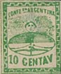
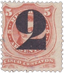
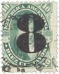
Issue of 1850. 2 Kreuzer, green.

Of this stamp I have as yet seen no forgery, but I have thought it better to mention it, should any counterfeits eventually turn up. It differs from the later type in having the corner-ornaments composed of four-petalled flowers, with trefoils issuing from them; and in having one outer line round the stamp instead of two, and a stop after ZEITUNGS, instead of a hyphen. For the rest, if forgeries should exist, they may be detected by means of the description now to be given of the next type, bearing in mind the differences which I have here noted.

Album_Weeds_AustriaNewspaper2Album_Weeds_AustriaNewspaper3Album_Weeds_AustriaNewspaper5Album_Weeds_AustriaNewspaper4Album_Weeds_AustriaNewspaper6Issues of March and November, 1858.


1 kr., blue; 1 kr., black; 2 kr., brown; 2 kr., red; 4 kr., brown; 4 kr., red.

The stamps in italics were issued for Austrian Italy and for the Austrian post-offices in foreign countries. A tax is levied on all foreign newspapers entering the country, and it was and is collected by means of these and similar stamps, which are simply fiscals, as the word STÄMPEL or STEMPEL denotes.

Genuine

Typographed, on rather stout, white wove paper, unperforated. The frame of the stamp is composed of a double line, the outer one not much thicker than the inner one. There is an upright oblong
stop after the words KAIS., KÖN., and STÄMPEL; a round stop after KREUZER, and a hyphen after ZEITUNGS, placed very close to the S. The ornaments in the corners are balls, with spear-heads pointing from them. Each ball is formed by two concentric circles, with a semicircular short line, by way of shading, in the center of all. The outer circle is thin all the way round; the inner circle is thick near the little semicircle, but thin all the rest of the way round. This is fairly shown in the ornament in the right top corner of our illustration. The points of the semicircles in the upper balls are turned downwards, while those of the semicircles in the lower balls are turned upwards. The spear-head, pointing down from the top corner of the left-hand ball, goes very close to the stop after KON, and if the point were a little longer, it would pass just to the left of the stop. All the spear-heads are of the same shape and length. The diaeresis over the ö of KöN. is set very slightly too much to the left of the center of the O. A line drawn vertically down through the second stroke of the u of ZEITUNGS would pass through the center of the cross on the top of the crown, between the eagles’ heads. The left head has the beak open, and the tongue projecting to fully the length of the upper mandible; the lower mandible is very much shorter. The eye in the left head is distinct; it is a colored dot in an outlined, oval white space, and the dot just touches the base of the crown. Each head is crowned, and each of the crowns has a small, but very distinct cross on the top of it, and a ribbon coming from the crown, and hanging over the beak. The left-hand ribbon has a fringed end, the right-hand one is cut off rather obliquely; the former seems to come from the left side of the top of the crown, the latter issues from the base of the right-hand crown. There is a distinct cross on the orb in the eagle’s claw. The diaeresis over the Ä of STÄMPEL is placed a very little too much to the right. The whole impression is distinctly sunk into the paper, so much so that, in an unused specimen, the frame-lines, stops, etc., can be seen as embossed marks on the back of the stamp. The oblique upper line of the K of KREUZER joins the vertical line, level with the center of the other letters of that word. The K is exactly 1 1/2 mm. high, and the other letters are exactly 1 mm. high. The eagle’s wing on the left side of the stamp contains five broad feathers, alternating with four very narrow ones, but the third broad feather is somewhat split up.

First Forgery

Lithographed, on hard, white wove paper and also on laid ; the whole impression has a greasy appearance. The set includes the 2 kreuzer, green, which was not issued in this type. The outer line of the frame of the stamp is much thicker than the inner one, and it is broken in the left top corner. There is no stop after KAIS. or KÖN.; and there is a shapeless, blotched stop, instead of a hyphen, after ZEITUNGS, which touches the S. The two concentric circles forming the balls in the corners are blotched together most of the way round. The spear-heads are of different shapes and sizes, the one near the N of KÖN. being especially defective, and the one near the S of STÄMPEL abnormally long at the point. The diaeresis over the o of KoN. is placed exactly centrally above the letter. There is no diaeresis over the Ä of STÄMPEL. The cross on the large crown is slightly to the left of the first stroke of the U of ZEITUNGS. Both the eagles’ beaks are closed, and of course there is no tongue issuing from the left beak. The eye in the left head is a long hyphen, and it does not go near the crown on the top of the head. The eye in the right head is very similar to the other, but shorter. The right eagle’s head has a ribbon coming from the base of the little crown, as in the genuine; but the left head has no ribbon at all. The cross on the orb in the eagle’s claw appears to have been driven in with a blow, so that only the top and side-arms are visible. The impression is not at all sunk into the paper. The oblique line of the K of KREUZER joins the vertical line, somewhat above the level of the center of the other letters. The K is very nearly 2 mm. high, and the rest of the letters are 3/4 mm. high. I consider this to be the poorest and worst of the forgeries.

Second Forgery

Lithographed, on rather thin, white wove paper. The outer frame of the stamp is very like that of the genuine. The hyphen after ZEITUNGS is too far from the S, and there is a hyphen instead of a stop after STAMPEL. The balls in the corners are slightly oval instead of circular; and all the four semicircles (i.e., one in each ball) have their concave parts upwards, The circles are thin all the way round in each ball. The spear-heads are simply diamond-shaped, instead of having one long sharp point and three short blunt ones ; the one pointing to KON. is not near the stop, and, if prolonged, it would pass far to the left of the stop. The left eagle’s beak seems to be closed, though there is a trace of a small tongue projecting beyond it ; the right beak is wide open, with a long tongue hanging out. This is just the reverse of the genuine. The eye in the left head is oblong; it does not touch the crown above it, and there is no outlined oval round it. The crosses on the crowns on the eagles’ heads are indistinct lumps. The ribbons both issue from the tops of the crowns; the fringe of the right-hand one having a nick in it and the left-hand one being cut off obliquely, without fringe. The cross on the orb in the eagle’s claw is the same as in the first forgery. The impression is not sunk into the paper. There is a hyphen before the z of ZEITUNGS, which does not exist in the genuine. The K of KREUZER is about the same height as the genuine, but the rest of the letters are slightly less than I mm. high. The eagle’s wing on the left side has seven broad feathers in it, and only about three of the alternating thin feathers can be made out. This is not a bad-looking forgery; I have only the i kr., blue, and 4 kr., brown, of this type.

Third Forgery

Lithographed, on very thin, white laid paper. The outer line of the frame is too thick, especially down the right side of the stamp. The stops after KAIS . and KÖN. are much too small, and oval instead of oblong. The corner-balls are fairly imitated, except that the crescents in the lower ones point rather to the left, instead of directly upwards. The spear-head in the right lower corner is simply a diamond. There is a colored dot over the S of KAIS, which does not exist in the genuine. The diaeresis over the ö of KÖN. is a good deal too much to the left. A line drawn vertically down through the last stroke of the U of ZEITUNGS would pass almost clear to the left of the cross on the large crown below it. The left eagle’s beak is nearly closed, and the right beak is open. There is no tongue to be seen in either beak. The eye in each head is in the center of a very narrow, sharply-pointed oval. The crosses on the crowns on the eagles’ heads are mere lumps, and the ribbon hanging from the right crown is broader than the other. Both ribbons seem to be cut off obliquely, but the left one has indications of a fringe. The cross on the orb in the eagle’s claw is a lump. The impression is not sunk into the paper. The oblique stroke of the K of KREUZER joins the vertical stroke too high up. The K is rather more than 1 3/4 mm. high, and the other letters are more than 1 mm. high. The wing on the left side of the stamp is so blotched that the feathers cannot be counted. I think the detached diamond, in place of a spear-head, in the right lower corner is the easiest test for this forgery, and I suppose I need hardly say that the genuine stamps are never found on laid paper.

Fourth Forgery

Lithographed, on thick, white wove paper. The outer line of the frame is too thick, and is broken at the left top corner. The stops after KAIS. and KoN. are small and round, and there is no stop after STAMPEL, and no hyphen after ZEITUNGS. The inner circles of the balls in the corners appear to be thick all the way round. The spear-heads are all blunt, like aces of diamonds. The one pointing to KöN. does not go anywhere near the stop after that word, and, if prolonged, it would pass far to the left of the stop. Both eagles’ beaks are open, with tongues sticking out; and both mandibles of each beak are of equal length. The crowns with their crosses are good, but the ribbon from each crown issues from the upper part, and each ribbon looks like a drooping plume instead of a ribbon. The end of the left-hand ribbon is cut off obliquely without fringe, and that of the right-hand ribbon is rounded. The impression is not sunk into the paper. The oblique line of the K of KREUZER joins the vertical line too high up. The K is only about 1 1/4 mm. high, and the other letters are decidedly more than I mm. high. Six large feathers can be made out, in the wing on the left side of the stamp, and there is no thin feather between the fifth and sixth. I think the absence of the hyphen after ZEITUNGS, and of the stop after STÄMPEL, are the easiest tests for this counterfeit.

Fifth Forgery

Lithographed, on thinnish, white wove paper. The outer line of the frame is a little too thick, and the inner line close to it is blotchy and also too thick. There is no hyphen after ZEITUNGS. The balls in the corners are very badly done, of different shapes (the one in the left lower corner is oval!), and the two concentric circles for the most part blotched into one ; while the little semicircle in the center of the left bottom ball has been made into a complete circle, thick and blotchy. The spear-head pointing to KoN. is, in some copies, merely a blunt v, and the others are diamonds of different shapes. The dieresis over the ö of KÖN. is sloping, and a good deal too much to the left. Both eagles’ beaks are open, with straight tongues sticking out; and the left beak seems to be deformed, as though the points of the mandibles had been broken off. The crosses on the little crowns are very indistinct, and both of the ribbons issue from the upper part of the crowns. The right-hand ribbon is an unmistakable plume; the left-hand one is bent at an angle, like a knee-joint. Both are rounded at the ends. The cross on the orb is very thin, though that of the genuine is rather fat and clumsy. The impression is not sunk into the paper, and looks rather weak and misty. The K of KREUZER is only about 1 1/4 mm. high, and the other letters are not equal in height, the z being the tallest. The stop after KAIS is somewhat diamond-shaped, and that after KöN. is circular. In my solitary specimen (2 kreuzer, red) the u of ZEITUNGS is an N. The eye in each head is placed very far back, and the feathers in the wing on the left side are too much blotched to be counted.

Sixth Forgery

Lithographed, on rather stout, yellowish-white wove paper. The outer line of the frame is very much thicker than the inner one, and they are blotched together in several places. The right-hand end of the hyphen after ZEITUNGS is pointed. The spear-heads mostly have their centers filled up with blotches of color, and the one in the left lower corner of my specimens has its point broken off. The balls in the corners are very smudgy, and it is almost impossible to make out the details, as the two concentric circles and the semicircular lines are generally all blotched together. The eagles’ heads are mutilated, so that there are no beaks visible. Both ribbons issue from the tops of the crowns. The stops after KAIS. and KÖN. are circular. The large feathers on the wing on the left side are difficult to distinguish from the alternate thin ones; but there are ten feathers in all, thick and thin. The stamp is, of course, not sunk into the paper, and the whole impression is very coarse, greasy-looking, and smudgy, so that it is not a dangerous forgery. I only possess the 4 kr., brown, in this type.

Seventh Forgery

Lithographed, on thin, rather hard, pinkish-white wove paper. There is an oval stop after ZEITUNGS, and a distinct hyphen after STÄMPEL. The balls in the right corners are more oval than circular, and the inner circles are thick almost all the way round; while the semicircles are all different in length, and the one in the right lower corner is very bad and blotchy. The spear-head pointing to the N of KÖN. is not at all close to the stop after the N; it is merely diamond-shaped, and if the point were prolonged, it would pass very decidedly to the left of the stop. No two of the spear-heads are of exactly the same shape. Both ribbons issue from the front of the top of the crowns, and they look just like little flags. The end of the left-hand ribbon has a nick in it. The bottom limb of the S of STÄMPEL is malformed, and the T is of a very bad shape, looking like a small c. There is too much white on the central shield. The eagles’ eyes are set far back, the one on the right side being placed in the center of a white triangle. The wing on the left side shows the points of about thirteen feathers, and the distinction between large and small feathers cannot be made out. The small letters of KREUZER are rather less than 1 mm. high. This forgery, though not particularly good, might deceive juvenile collectors.

Eighth Forgery

Typographed, on moderately stout, hard, white wove paper. The outer line of the frame of the stamp is, in some parts, not parallel with the inner one, notably towards the right top corner, where the two approach each other very closely. The stop after STÄMPEL is very faint, and there is also a very faint stop (instead of a hyphen) after ZEITUNGS. The inner circles of the balls on the right side are further from the outer circles than in the balls on the left side, and the semicircular lines in the right- hand balls are absent. The spear-head pointing to the N of KÖN. is very blunt, and almost all the other spear-heads touch the balls, though they do not do so in the genuine. The eagles’ beaks are very unlike the genuine; the left one is closed, and the right one has a sort of nick in it, not at all like a beak; there is no tongue to be seen in either beak. Both ribbons issue from the upper part of the crowns, and look like little flags. The left ribbon is cut off obliquely, and the right one is cut off horizontally. The diaeresis over the Ä of STÄMPEL is not level, one of the dots being higher than the other. Being typographed, the stamp is somewhat sunk into the paper, but not so deeply as in the genuine. I suppose that the impression is from an electrotype cliche. The oblique line of the K of KREUZER runs down too low into the vertical line, and it is barely 1 1/4 mm. high. The very faint stops after KAIS. and KÖN. appear to be circular, and much too small. I have only one specimen of this forgery, (2 kreuzer, green), but it has, as will be seen from the above description, the balls and spear-heads instead of the trefoils, etc., and it has evidently done service in several albums, and has become so indistinct that I have had difficulty in making out the above details. In a perfect condition, I should take this to be better than most of the forgeries hitherto described.

Ninth Forgery

Typographed, on rough, white wove paper. The outer frame is a good deal thicker than the inner one, and they are much farther apart down the left side than down the right. There are faint circular stops after KAIS. and KÖN., and a circular stop, rather larger, after STÄMPEL. There is no hyphen after ZEITUNGS, but in my single specimen (4 kreuzer, red) there is an indentation in the paper, as though there were a circular stop which had failed to print. The little semicircle in the right top ball is blotched into the ring round it, and the one in the right bottom ball is simply a dot. There is a wide space between the two circles of this latter ball. The semicircle in the left upper ball looks like a hyphen, and the one in the left lower ball is a dot. The spear-head pointing to KON. is simply a v, and, if prolonged, it would pass far to the left of the stop after that word. The spear-head in the left lower corner is merely a diamond, which touches the ball below it; and the three on the right side are all of different shapes, the one after ZEITUNGS being a diamond, and the one after STAMPEL looking like the flame of a candle. The diaeresis over the ö of KöN. is extremely faint, but as far as I can make out, it is centrally over the o. Both beaks are open; the tongue on the left side being very short, while that on the right side is longer than the beak. There is a circular white space in the left head, but there is no dot to represent an eye in it. The ribbons both issue from the tops of the crowns. They are without fringes; the left one is cut off obliquely, and the right one comes to a blunt point. The K of KREUZER is barely 1 1/4 mm. high, and some of the other letters are only about 3/4 mm. high. The wing on the left side shows five broad feathers, alternating with five narrow ones, and the third broad feather is not split. Being typographed, the impression is more or less sunk into the paper.

Tenth Forgery

Lithographed, on stout, white wove paper. Of this forgery I have only the 4 kr., brown. The two lines forming the frame down the right side are very nearly the same thickness, and the outer line is a good deal thicker than the inner line round the three sides. There are faint circular stops after KAIS. and KoN., and the stop after STÄMPEL looks like a tiny inverted v. The hyphen after ZEITUNGS is pointed on its left side, and the point very nearly touches the S. The letters UNG of this word all touch each other at the bottom, though they are quite separate in the genuine. The spear-heads are all joined to the balls. The inner circles of the balls are all incomplete; the semicircle in the left upper ball points obliquely towards the center of the top of the stamp. The semicircle in the left lower ball points towards the right top corner of the stamp; the one in the right upper ball is like a short, slightly-curved vertical hyphen; the one in the right lower ball is a shapeless dot. All the spear-heads are firmly joined to the balls. The left head has an enormous, hooked upper mandible, the lower one being short and straight, and there is no tongue. The right head has a drooping beak, which touches the wing. This is the only forgery in which the beak touches the wing. The ribbons both issue from the tops of the little crowns; they have dark fringes. The diaeresis over the Ä of STÄMPEL is above the center of the letter. The K of KREUZER is 1 3/4 mm. high. The feathers of the wing on the left side are all blotched together, so that only the two top ones can be seen; the upper one comes to an acute point, though the tip is very broad and rounded in the genuine.

Postmarks

Genuine.—A large, single-lined circle, like I, but much larger, with date in the center, and name inside the circle; also a small, double-lined circle, something like 96, with name between the lines, and date in the center; also 81 and 89.

First Forgery.—Uncancelled, also pen-strokes, also a set of five concentric circles.

Second Forgery.—All the genuine cancellations.

Third Forgery.—A blotchy circle, with unreadable letters.

Fourth Forgery.—The first genuine cancellation.

Fifth Forgery.—Ditto.

Sixth Forgery.—Lettering in an enormous circle.

Seventh Forgery.—The first genuine cancellation.

Eighth Forgery.—Like the second genuine cancellation, but too large.

Ninth Forgery.—Like the first genuine cancellation.

Tenth Forgery.—My specimen is uncancelled.

Album_Weeds_Austria36
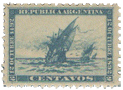
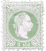
Issue of 1867. Foreign Offices. 3 Soldi, green.

The original of this stamp is so common that it is a wonder the forgers have thought it worth imitation. I am unable to say whether the whole set of this issue exists, as till now I have only seen the 3 soldi.

Genuine

Engraved in épargne, on thick, white wove paper, perf. 9 1/2. The hair upon the back of the head is perfectly distinct; and, in an unused copy, the whole of the colored portion of the stamp is plainly
sunk into the paper, so that the ornamental spandrels and some other parts seem to be slightly in relief. This does not show so much in those copies which have passed the post, as they get flattened by being wetted. There are 90 pearls in the circle round the head, and these pearls are all tolerably even, and of uniform size. The perforation is very cleanly cut, and it is so close to the stamp that it almost encroaches upon the border. Thus, if the sheet has not been made to “register” with the greatest exactness in the perforating-machine, the border on the one side or the other is frequently cut off altogether.

Forged

Lithographed, perf. 9. Being lithographed, there is, of course, not the slightest sign of the design being sunk into the paper. The perforation is applied in such a way as to leave a considerable margin round the stamp, so that the border of the design is never encroached upon. There is hardly any shading to be seen on the back of the head, which looks almost white. There are only So pearls, or thereabouts, round the head. These pearls, instead of being uniform, regular, and of good size, as in the originals, are very small and uneven, and a very superficial examination of them will be quite enough to enable the collector to detect this forgery without any other test.

Postmarks

Genuine.—1, 29, 71.
Forged.—My specimens are uncancelled.

Austrian Italy.

Album_Weeds_AustriaLombardei1
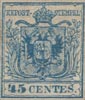
Issue of 1850. 45 centesimi, blue.

Genuine

The type is just the same as that of the corresponding issue for Austria, but with value in centesimi instead of kreuzer. Engraved in épargne, on hand-made, grayish-white wove paper. There is a hyphen after K.K.POST. The little cross on the top of the crown touches the outer line of the frame at the top. The tail of the eagle ends in a very distinct dark trefoil. In each wing there are seven broad feathers, with a thin hair-line between every two feathers. The seventh feather on the left side does not show beyond the sword. The leg holding the sword slants down a little to the left, at the same angle as the leg holding the orb slants down to the right. In the value-label there is a little reentering angle of the inner frame, which is exactly above the center of the 4, and the said 4 has an open top. There is a stop after CENTES. , and the S just touches the re-entering angle of the frame above it.

Forged

This is a miserable production, but would look better if printed in the proper color. Typographed in black, on rather thin, very coarsely-wove white paper, which has been colored 011 the face with a blue wash. There is no hyphen after K. K. POST. The cross on the top of the crown only reaches as far as the inner outline of the frame above it. The tail of the eagle is blotched and shapeless. In the wing on the right side there are only six broad feathers, and some of the hair-lines are absent. The other wing appears to have only five broad feathers, but the post- mark covers this part in my single specimen, so I cannot be sure. The leg holding the sword slants slightly upwards, instead of downwards. The re-entering angle of the frame of the value-label is some distance to the left of the top of the 4, and the said 4 has a closed top. There is no stop after CENTES., and the S does not touch the outline of the frame above it. I do not think this forgery is likely to deceive, and it is the only counterfeit of this issue that has ever come under my notice.

Postmarks

Genuine.—-I, 81 ; also large lettering in a frame, something like 71;

also a couple of straight lines of lettering and figures, in various types, without outline. I have them in script letters, in ordinary Roman capitals, 3 mm. high, and in very large Roman capitals, 8 mm. high. This latter cancellation is so large that five letters of the name would go right across the stamp.

Forged.—1.

Complementary Labels

These are a great puzzle to some of our youthful friends, so I had better mention them here. Those of the first issue of Austria and Austrian Italy have a colored St. Andrew’s Cross in relief, on a white ground; and those of the second issue have a white St. Andrew’s Cross, on a colored ground. There is a set of each, with the colors corresponding with those of the stamps. The type-metal blocks for printing the regular stamps were clamped together in a printer’s chase that would have held 64 of them, in eight rows of eight; but as the sheet only contained 60 stamps, there were four blanks in the lower row, and these four blanks were filled up by four blocks, each with a St. Andrew’s Cross cut in it. Thus, in every sheet of every value of both issues, there were four of these complementary labels, of the same color as the stamps.

Considering that, in the issues of which I have been speaking, the complementary labels comprised something like a sixteenth of the whole issue, it is rather surprising to find these labels so rarely; but I conclude that the public never got any of them, unless they purchased entire sheets; and, after all, they are only curiosities, with little more philatelic interest than the “Jubilee lines” round the panes of current English.

Official Stamps. (Bogus Essays.)
3 Kreuzer, carmine.

I have a pair of these, apparently an adhesive and an envelope, but I know nothing about them. They are slightly embossed, the one with brownish gum, on yellowish-white wove paper, and the other without gum, on pale drab wove paper, The design shows the Austrian eagle in an oval, on a dotted ground, the spandrels filled with arabesque ornaments; F. M. C. W. in the four corners in white; COM. FREI- in the left-hand frame, MARKE in the top frame, D. ST. WIEN in the right-hand frame, and 3 KR. at the bottom. The inscription in full is probably “Communal-Freimarke der Stadt Wien,” which would point to its intended use by the Burgomaster and officials of the capital.

Reprints.

The reprints of Austria and Austrian Italy are legion. I must refer my readers to Mr. Bacon’s book.


From: ‘Album Weeds’, 3rd edition by R. B. Eareé. 1906


LupSee also —> Spud Papers – Austria
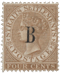
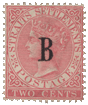
Album Weeds – Argentina

Album_Weeds_Argentina4Album_Weeds_Argentina2Album_Weeds_Argentina3Issue of 1858. 5, 10, 15 Centavos.

From the coarse design of the originals, it might be thought that the forgers would turn out a good imitation of them; but, as will be seen by the following description, it would appear that even badly-made stamps are not always easy to counterfeit, though some of the forgeries which I have seen are much better than others.

Genuine

Lithographed, on white wove paper ; unperforated. In each corner there is a little upright oblong, by way of ornament. The key-pattern down the right side looks the same way as that down the left side; but it has a long piece sticking out at the bottom, and several times longer than the projection at the bottom of the left-hand key-pattern. The first letter of the word CONFEon is much nearer the left border of the stamp than the last letter of the word ARGENTINA is to the right; in fact, there is almost room for another letter to be added on the right side. There are two lines under the last two letters of CONFEon. They are very distinct in all my copies. The oval seems to be a shade more rounded on the right side than on the left, and it touches the border on both sides. In clear copies, there are twelve horizontal lines to be seen in the upper part of the oval, counting to the left of the cap of liberty, right up to the neck of the sun. The sun’s face is a little like the portraits of the Tichborne claimant. It has a pointed chin ; the mouth is slightly oblique, inclining downwards to the right; the hair is parted on one side, though this cannot always be seen; and the whole face is exactly above the center of the oval. The cap of liberty extends from the very bottom line of the shaded half of the oval, up to just touching the eleventh line. It is not very well drawn, but one can see what it is intended for. It does not come to a point like our illustration, but the upper end is quite blunt and rounded. There are two white marks upon it, a horizontal white patch, running nearly across, about the middle of it; and a sort of badly-made white diamond, with a dark mark in it, in the upper part of the cap. The point of the first A of ARGENTINA is 3/4 mm. from the inner outline of the frame above it, while the base of the E of CENTAV. is hardly mm. from the outline of the frame below it. The rays of the sun are composed of dots, except just at their outer ends, where they merge into lines, as though the dots had run into each other. The pole upon which the cap of liberty is placed is solid in heavily-printed copies, i.e., it is a thick line of color, and not merely outlined; but, in clearly printed specimens, it is composed of two separate lines. The pole shows up to above the level of the third line of shading in the oval, as though a piece had been cut out of the cap to show it. There is a stop, and sometimes two, after the 5, in the lowest value ; the other values have no stop after the numerals, and there is no stop after ARGENTINA in any of the values. The numerals are all upright.

First Forgery

Lithographed, on white wove paper, about the same substance as the genuine. The key-pattern on the left side looks the opposite way from that down the left side, and the little piece sticking out at the bottom of the left side is slightly longer than the piece sticking out at the bottom of the right-hand key-pattern. The c of C O N F E on and the last A of ARGENTINA are at about equal distances from their respective sides of the stamp. The two lines under the ON of CONFEon, which are of equal length in the genuine, are not alike in this forgery, the upper one being too short; they are also much too far apart. The central oval is too short, and does not touch the frame on either side. There are fifteen lines of shading in the upper half of the oval ;,they are quite distinct, and easy to count. The sun’s left eye and eyebrow (right side of the stamp) are blotched into one solid mass of color. The other eye appears to be squinting inwards. The cheeks are not so full as in the genuine, and the left cheek (right side of the stamp) is heavily shaded. The mouth turns up at both corners, and there is a perpendicular line joining the mouth and nose together, which is not found in the genuine. I cannot make out any parting in the hair. The cap of liberty is very like the one in our illustration ; it resembles a cow’s horn, is sharply pointed at the top, and is white, with two almost horizontal dark bands of shading across it, and a dark tip. This is a very easy instant test. The cap begins at the third line from the bottom, and reaches to the thirteenth line. The point of the first A of ARGENTINA is only I mm. from the frame above it, and the base of the E of CENTAV. is barely 1/2 mm from the frame below it. The pole on which the cap of liberty is placed is composed of three perpendicular lines, and the upper part of it can be seen to above the level of the fourth horizontal line in the oval. There is a stop after the numeral in the 5 and 15c., and none in the 10c. All the numerals are sloped very much to the right.

Second Forgery

Lithographed on stout, white wove paper, usually imperf., but some- times perf. 12 1/2. There is a different design for each value, the 5c. being the worst, and the 10c. the best. I shall have to describe each separately.

5 c. Forged

The four white corner-oblongs are as follows in this forgery : Left top corner, a sort of badly-shaped transverse diamond; left bottom corner, a transverse white blotch ; right top corner, a small white L ; right bottom corner, an oblique hyphen. One easy instant test for this forgery is the key-pattern, as the piece down the right side is joined to the top and bottom pieces. There is only one line under the ON of CONFEon, and the G of ARGENTINA is an unmistakable c, being quite destitute of the very marked cross-bar of the genuine. The oval is much more pointed on the right side than on the left. There are ten horizontal lines in the upper half of the oval. The sun has an extremely self-satisfied expression; the mouth is a perfectly straight line; the left eye (right side of the stamp) is round instead of long, and the dark mark forming the nose is shaped like an L, with its tail turned the wrong way, whereas the nose in the genuine is exactly like a J. The face does not seem to be exactly above the centre of the oval, but rather too much to the right. The cap of liberty is a roughly circular object, with a dark blotch in the middle, and with two colored lines coming from it into the unshaded half of the oval, and converging together where the pole meets the top of the hands. The pole is solid, and the cap extends from the first shaded line to the ninth. The point of the first A of ARGENTINA is fully 3/4 mm. from the frame above it, while the E of CENTAV. is very close to the frame below it (hardly 1/4 mm. from it), even closer than the genuine. No portion of the pole can be seen above the first line of the shading in the oval. There is a stop after the 5, as in the genuine. The portion of the key pattern under the 5, in the bottom label, points away from the 5; but in the genuine it points to the 5.

10 c. Forged

Lithographed, paper as before. The corner-ornaments are squares, instead of upright oblongs. The piece sticking out at the bottom of the key-pattern at the right side is like the genuine, but there is no similar projection at the bottom of the piece down the left side. There is only one line under the ON of CONFEon, and the cross-bar of the first A of ARGENTINA extends inwards only, instead of right across the lower end of the letter. The oval does not touch the frame either side. There are eleven horizontal lines in the upper half of the oval. The sun’s face has rather a Jewish look, with long, sleepy, closed eyes ; the mouth is nearly straight, and much thicker than in the genuine ; the hair has a very distinct white parting on the right side (left side of stamp) ; the chin does not touch the outline of the oval below it. The face seems to be set a little too much to the right. The cap of liberty is a shapeless blotch. It reaches from the first line of shading to about the ninth. I cannot describe it, as there is nothing on earth to which to liken it. The chief part of it is white. The point of the first A of ARGENTINA is a little more than J mm. from the frame above it, and the base of the E is nearly I mm. from the frame below it. The rows of dots forming the sun’s rays are arranged in such a way as to leave concentric semicircles of white all round the sun, and just above the sun’s head there are a number of short lines, though, in the genuine, there are neither dots nor lines close to the sun’s head. I have one specimen of this forgery which shows most of the rays as lines, instead of dots. The pole is composed of two lines below the hands, and a solid line above them. It seems to reach, as far as I can make out, to the second line of the shading of the oval. There is a stop after CENTAV. in this forgery.

15 c. Forged

Lithographed; paper as before. The white corner-ornaments are squares, except the one in the right top corner, which is a transverse oblong, or sometimes a round dot. There is no piece projecting vertically downwards from the key-pattern, either on the right side or on the left. There is only one line under the ON of CONFEon, and the G of ARGENTINA is similar to that in the 10c. just described. The oval barely touches the border on the right side, but it touches plainly on the left. There are twelve horizontal lines of shading in the top half of the oval, but the third and fourth from the bottom are so blotched together that they might easily be mistaken for a single line. The sun’s face does not touch the outline of the oval below it, except in heavily-printed copies; each eye is a horizontal dash ; the mouth is more of a human mouth than in the genuine ; the hair is parted almost in the middle, and the whole face is placed considerably too far to the right of the center of the oval. The cap of liberty is a shapeless object, reaching from about the fourth line to the tenth ; it is all white. The point of the first A of ARGENTINA is nearly 1/2 mm. from the frame above it, and the E of CENTAV. is about the same distance from the frame below it. Most of the rays of the sun are lines, instead of dots ; and one variety of this forgery shows some of these rays cutting right into the hair on the sun’s head. The pole is formed by two lines all the way ; it can be seen up to the fifth line of shading, and the lines of shading cut across it. There is a stop after CENTAV.

Third Forgery

I have only the 5 c. of this, but I dare say the whole set exists. Lithographed, on white wove paper, slightly thinner than the genuine. In each corner there is a small white square. The key-pattern is well imitated in this counterfeit. The two lines under the ON of CONFEon are too long; 1 1/2mm., instead of just a shade over 1 mm. There are ten horizontal lines of shading in the upper half of the oval. The sun has a rounded chin, partly cut off by the outline of the oval; the mouth is a straight line, with a sudden droop at the left-hand end (right side of stamp). The cap of liberty reaches from the bottom line of shading to the top one. It is of a sort of sloping oblong shape, with a very notice- able gap on the left side, between the third and fourth horizontal lines. Except for this wedge-shaped gap, there is no white in it at all. The pole cannot be seen above the beginning of the shading. If prolonged downwards, it would graze the beginning of the N of CENTAV.; though, in the genuine, it would pass clear to the left of the N.

Fourth Forgery

Of this I have only the 15 c. Lithographed (?), in dark blue, on thick, hard, white wove paper. The upright oblongs in the corners are only about half as wide as the genuine. The oval touches the frame on the right side, but not on the left. There are thirteen horizontal lines of shading in the upper half of the oval. The mouth is small and thick, the left eye seems to be shut, but the right one (left side of stamp) is like the genuine ; the hair is curly. The cap of liberty is exceedingly like that of the first forgery; it reaches from the bottom line of shading to the eleventh line. The point is even sharper than that of the first forgery. The rays round the sun are much too irregular, showing con- centric arches of white lines, formed by the breaks in the rays. In the genuine, these breaks do not form any pattern. The pole is darkly shaded, but shows two triangular patches of white above the hands, and one below them ; it is visible to level with the fourth line of shading. There is no stop after the 15, and a smaller one after CENTAV. The numerals slope strongly to the right. The G of ARGENTINA is not like the genuine, or any other forgery; it has no cross-bar, but a downward- pointing tongue (G).

Fifth Forgery

I have only seen the 5 c. of this, which came to me in 1902. Lithographed, on thick, very hard, white wove paper. There is a square in each corner. The key-pattern down the left side looks the opposite way from the one down the right side. The key-pattern at the top shows only two upward-pointing “keys,” with portions of two others; while the genuine shows four upward-pointing “keys.” The pattern at the bottom shows three upward-pointing “keys,” instead of four. There are no lines under the ON of CONFEon; the G of ARGENTINA is a C; and there is a stop after the word. The oval does not really touch the frame either side, but there is a small blotch, making a join between the oval and the frame, on the left side. There are eleven horizontal lines in the oval. The sun’s face is partly hidden by the postmark in my specimen ; but it seems to have wide-open eyes, a broad nose, with a perpendicular line joining it to the mouth, which is like a real mouth. The hair is parted very nearly in the center. The cap of liberty is like a cocked hat at the base, but terminates like a cap of liberty. It is all white, except a little shading at the center, and reaches from the second to the eleventh line of shading. The point of the first A of ARGENTINA is just 1/2 mm. from the frame above it, and the E of CENTAV. is 1/4 mm. from the frame below it. Many of the rays of the sun are very faint, so that there is a large patch which is almost white, to left of the sun. The pole is of solid color, and it shows up to the third line of shading. The tail of the 5 is a large, nearly round ball.

Sixth Forgery

Lithographed, in black ink, on green-faced paper. The 5 c. is the only value I possess of this forgery. Of course the green color instantly condemns it; but I had better give some details of the design. The oval touches the border on the left side only. There are seven very coarse lines of shading in the upper part of it, and a blotch, which is probably an eighth line, at the top. The hands are very large, and the lowest line of shading touches them. There is a black dot under the hands, indicating the commencement of the pole ; but the rest of the pole is invisible. The cap of liberty rests immediately upon the hands, and runs up to the top of the oval; it looks rather like a crooked claret-jug, but not in the least like a cap of liberty. The c of CONFER almost touches the border, and there are two lines under the ON. The halo round the sun is formed of dots, irregularly distributed, bounded by a number of thick strokes. Two of these strokes, on the right-hand side, touch the boundary-line. There is a stop after both 5 and CENTAV.

Postmarks

Genuine.—The usual postmark on the genuine stamps of this issue is a large, transverse oval, with name, etc., inside the curve, and FRANCO in large letters, in the centre.

First Forgery.—42, 100. Also an unoutlined oval, formed by very tiny dots. I have one specimen which bears two lines of print, without frame ; the upper word is FRANCO, but the lower one is illegible.

Second Forgery.—21, without the heads to the arrows, also something like 26, also 51, 98.

Third Forgery.—An unoutlined oval or circle, composed of very small diamond-shaped dots. Also a number of large oval dots, each one of them being the size of the C of CENTAV.

Fourth Forgery.—My specimen is not cancelled. Fifth Forgery.—Something similar to 26.
Sixth Forgery. —Uncancelled.

Album_Weeds_Argentina1Album_Weeds_Argentina2Issue of 1861. 5 (10, 15) Centavos.

I have seen no forgery of this issue as yet, but I would remind my readers that the 10c. and 15c. of this set were never issued to the public. They were distinguished from the first issue by having the key-pattern border very much smaller, with six pieces at top and bottom, and the lowest value
has the 5 very large; whereas the stamps of the first issue have a larger border, containing four
pieces at top and bottom in the same space as the six of this issue; and the figures of value on
each of the first set are a good deal smaller than the 5 of this issue.

Issue of 1861-2. 5 Centavos, rose.

There are two types of this stamp, and I think it better to describe both, so as to avoid the possibility of misconception or error. They are both lithographed, on soft, slightly surfaced, white wove paper. The unused copies in bright rose, red, and vermilion-red, now sold, are reprints of Type I., and the 10c. and 15c. sold with them are from the stone of the 5c., and are thus little better than forgeries, as the two genuine types of the latter values have not been reprinted, so far as I know.

Genuine. Type I., 1861.

There are 11 straight lines in the shield, and 72 pearls round the central circle. The 5 is large, with its head projecting almost as far to the right as the width of the body. The C of CENTAVOS is very small. The first A of ARGENTINA is much more pointed than the A of REPUBLICA. The little cross, separating the words of name, is formed by five almost circular, white dots. The branches of the wreath are very white ; and it is almost impossible to count the separate leaves. The top of the right- hand branch ends in two leaves, which point almost directly upwards. The top of the left-hand branch is rather sharp, and it points straight towards the sun. The arms and hands, supporting the pole which bears the cap of liberty, are represented by two parallel lines, very wavy, and passing in front of the pole. The cap of liberty rests on the second line of shading, and touches the tenth, counting from the bottom. The pole does not touch the outline of the oval beneath it.

Genuine. Type II., 1862.

There are 14. curved lines in the shield ; the lowest being much thicker than the rest. There are 74 pearls round the circle. The 5 is small, with a very short head, which projects to the right only about half as far as the width of the body. The C is a good deal larger than in the first type, and matches the rest of the letters. The A of REPUBLICA and the first A of ARGENTINA are both cut off very broad and square at the top. The little cross, separating the two words of name, is composed of four pear-shaped dots, surrounding one circular one. The branches of the wreath are nicely shaded, with almost every individual leaf distinct. There is one very small, darkish leaf at the top of the right-hand branch, which points decidedly to the left. The top leaf of the left-hand branch is very small, rounded like a white ball, and points above the sun. The arms and hands, supporting the pole which bears the cap of liberty, are represented by two almost straight lines, which pass behind the pole. The cap of liberty rests on the second line of shading, and comes a shade beyond the twelfth, counting from the bottom. The pole does not touch the outline of the oval beneath it. Stamps printed from the worn stone of this type show the spandrels almost white, as the radiating lines outside the circular part have almost disappeared.

First Forgery

Lithographed, on wove paper, very similar to that of the genuine. There are 10 straight lines in the shield, and 76 pearls round the circle. The 5 and c are imitated from Type II. of the genuine. The A of REPUBLICA is wider than the first A of ARGENTINA, like Type I. The letters AR of ARGENTINA, touch each other at the bottom in this forgery, but not in either type of the genuine. The side and bottom arms of the little cross which separates the words of name are pear-shaped ; the top one is round. In many copies the two side-arms run into the central dot. The wreath is very similar to that in Type II. of the genuine; while the coarse lines in the shield are more like those of Type I. The top leaf on the right-hand branch of the wreath is single, as in Type II.; and there are two very small leaves at the top of the left-hand branch, not like either of the genuine types. The easiest test for this forgery is the pole, which reaches right down to the very bottom of the oval shield; whereas, in both types of the genuine, it reaches only half-way between the arms and the bottom of the shield. The arms are represented by two parallel lines, passing in front of the pole ; the upper line on the left side does not touch the side of the shield, but is turned somewhat upwards, making the left side wedge-shaped. The cap of liberty rests on the bottom line of shading, and reaches up to the top line but one. In both types of the genuine, the rays of the sun make five zigzags below ICAAR. In this forgery, the ends of the rays are cut off in a curve, following the curve of the lettering above them, without any zig-zags. The pole goes down to the bottom outline of the containing-oval.

Second Forgery

Lithographed, on very white wove paper. This is, at first sight, very like the specimens from the worn stone of Type II.; that is to say, there are absolutely no radiating fine lines outside the circular portion of the stamp; indeed, no lines at all, except the two curved lines in each corner. There are no lines in the shield behind the cap of liberty, and there are 79 pearls round the central circle. The 5 is the small 5 of Type II. The tops of the A of REPUBLICA and the first A of ARGENTINA are about equally broad, both being cut off square. The A and R of this latter word are joined at their bases. Four out of the five dots, composing the little cross between the words of name, are blotched together; the one on the left side does not touch the rest. The wreath is something like that of Type II., but the two sides are much too short; the top of the right-hand wreath does not touch the rays of the sun at all, and the top of the left-hand wreath only touches the very last ray to the left; but, in both types of the genuine, the upper ends of the wreath cover over a great many of the rays. The arms are represented by two perfectly straight parallel lines, very wide apart; and it is difficult to say whether they pass in front of the pole or behind it, as the outlines of pole and arms are both visible where they cross.

Third Forgery

Lithographed, on thin, grayish-white wove paper. There are 11 straight lines in the shield, as in Type 1. of the genuine, but the third and fourth from the bottom are too far apart. There are 81 pearls round the central circle. The little cross between the words of name is formed by four large round dots, surrounding a small round dot. The wreath resembles that of Type I. The top of the right-hand branch appears to have three leaves on it; and two of them only just touch the very first ray of the sun, while the third does not touch the ray at all. The top leaf of the left branch, if prolonged, would pass far above the face of the sun. The arms and pole are very similar to those in Type I., of which this forgery is evidently an imitation ; but the cap of liberty is exactly like a leg of mutton ; it rests very nearly on the first line of shading on the shield, and reaches up to the same height as in the genuine Type I. There is a very strong, second upper outline to the shield in this forgery, hiding the mouth of the sun, which is not visible in the genuine Type I.

Postmarks

Genuine.—A long, pointed oval, containing name of town between two branches, all in three straight lines ; also CORREOS DEL arranged in a circle without any outline, and with date in three lines in the center ; also what appears to be a very large star of diamond-shaped dots; also a transverse oval, composed of a thick and a thin line very close together, and the ends of the oval concave instead of pointed, with three lines of inscription in the center; also a small postmark, something like 96 ; also an enormous pair of concentric circles, which would cover about four stamps at once, with name in very large letters in between the circles, and an inscription in a broad band across the middle ; also what appears to be a small, pointed oval of diamond-shaped dots ; also a very large oval of the said dots; also something like 13, but much larger, with CORDOBA FRANCA. None of these postmarks are outlined unless mentioned. They are nearly all struck in blue. Out of twelve cancelled stamps at this moment before me, only two are in black.

First Forgery.—Some enormous diamond-shaped dots, each almost as large as the shield ; also two large concentric ovals, the outer one blunter than the inner, with inscription between the ovals and in the centre ; also an imitation of a colonial postmark, similar to 54, without numerals.

Second Forgery.—A single curved line, which may be a portion of an enormous circle or oval. I have never seen any cancellation but this in the second forgery.

Third Forgery.—A set of five long parallel bars, like 98 ; also 37, without numerals. All these forged cancellations are in black.

Same Issue. 10 Centavos, green.

There are, as before, two types, but not identical with the two types of the 5 c. One has a very distinct white accent over the u of REPUBLICA; the other has no accent.

Genuine

Printing and paper as in the genuine 5 c. There are 14 straight lines in the shield, the lowest but one being crooked and badly drawn. There are 78 pearls round the circle. The cap of liberty extends from the second to the twelfth line, counting from the bottom. The left-hand branch of the wreath ends in a single leaf, which points towards the foot of the A of REPUBLICA.

Same Issue. 15 Centavos, blue.

There are two types of this stamp, as of the other values. I possess only the second type.

Genuine. Type II., 1862.

The paper and printing are the same as in the other genuine ones. There are 71 pearls round the circle and 15 lines in the oval shield.

Album_Weeds_Argentina8Album_Weeds_Argentina9Album_Weeds_Argentina10Issue of 1864. Unperforated; wmk. R. A.


Issue of 1864-66. Perf. 11 1/2; wmk. R.A.

Issue of 1867. Thinnish paper; unperforated; no wmk. Ditto. Perf. 11.

Evans states that the two stamps of 1867 were re-issued in 1872.

Genuine

Engraved in taille-douce, on thick and on thinnish paper, as above. The watermark is in script letters. The unwatermarked and the unperforated ones are scarce. Although engraved in taille-douce, the impression, not only in the 5 c., but also in the higher values, is very unsatisfactory; the thick, hard paper apparently not lending itself to the requirements of this mode of printing. There is a 5 in each corner of the stamp, and each of them has a line of shading in the center of its white part; i.e., a line following the contour of the numeral. This is not very plain in the left lower 5, but very distinct in all the others. The value is written CENTAVOS, though the c and the S are not very plain, being blotchy, and somewhat hidden by the shading. The whole of the light part of the face, except the point of the nose, appears to be shaded all over with fine dots ; the nose is of a good shape, and stands out well from the face ; the bow of the cravat is distinct ; and the shirt-front is shaded all over with oblique lines, running down from right to left. In my specimens, the background, behind the bust, is perfectly solid, and it is quite impossible to see where the back of the head ends and the background begins, the latter is so very dark. The little crosses before and after CINCO are very indistinct, in con- sequence of the lines of shading being drawn over them ; and there are three lines to be seen between the left-hand cross and the C, and the same number between the right-hand cross and the O, one of the three lines in each case, touching the cross. The ink stands out sensibly from the paper.

Forged

Poorly lithographed, in a pale brownish-pink, on thick, hard, smooth, grayish-white wove paper, no watermark, unperforated. The surface of the stamp is very shiny, so that it feels quite greasy to the touch. None of the corner-numerals have any line of shading in them. The value is written SENTAVOS, the S being exceedingly like an 8. The final S is very distinct, having no shading on it. The whole of the face is quite white. The nose is very ugly and drooping, and does not stand out from the face. The bow of the cravat is almost invisible, and the shirt-front has no shading on it. The background, behind the bust, consists of a coarse lattice-work of crossed oblique lines, showing diamond-shaped interstices. This is a very easy test. As the background is so much lighter than in the genuine, the back of the head is tolerably plain. The cross before CINCO is very distinct, as there is very little shading on it; and there seems to be no shading between it and the C. The other cross is more like the genuine; but the three lines of shading do not reach from top to bottom of the label. The impression is perfectly flat to the paper.

Same Issue. 15 Centavos, blue.

Genuine

Paper, watermark, etc., the same as in the various issues of the 5 c. The c of REPUBLICA is not like a G, neither is the c of CENTAVOS. The 1 of 15 on each side goes a very little higher than the head of the 5. There is a three-lobed ornament in each corner of the stamp, and each of these ornaments has five triangular white patches, with dark dots in them, surrounding it—i.e., one near each point, and one between each two lobes ; but the one near the first N of ARGENTINA is not always very plain. The background of the central oval is very dark, so that the outline of the head and hair is very difficult to trace. The whole of the light part of the face is shaded with lines of oblong dots, with the exception of the point of the nose; and the darker parts of the forehead, where the dots run into lines, have the said lines very faint. The lips are rather thick, and the red parts are shaded with vertical lines, very little darker than the rest of the face. The outline of the red part is very nearly straight. Of course, when 1 speak of the “red part,” I refer to the part which would be red in a living person. The ornamental stop before QUINCE is exactly the same as the one after CENTAVOS; i.e., a colored ring, with a large round dot in its very center, and a small white dot in the center of the large colored one. The bow of the cravat is very lightly shaded. The plate never seems to be wiped clean; and consequently, the whole of the white parts of the stamp are invariably tinted more or less with the color of the impression.

Forged

Lithographed, on stout, very white wove paper, unwatermarked, badly pin-perf. i2j. The c of REPUBLICA is very like a G, and so is the C of CENTAVOS. The 1 of 15 on each side is, if anything, very slightly lower than the head of the 5. Each of the three-lobed ornaments in the corners of the stamp has only four triangular white patches, with dotted centers, surrounding it; that is to say, the four triangles which ought to be seen above the u of REPUBLICA, above the first N of ARGENTINA, below the I of QUINCE, and below the v of CENTAVOS are entirely absent. The outline of the head can be seen quite distinctly, as the background is too light, owing to the fact that the little pointed upright oblongs, with dark centers, in the said background, are not smeared with the color of the impression, as they invariably are in the genuine. Several parts of the face are perfectly white, without any dots or lines whatever; and the lines across the lower part of the forehead are too thick and prominent. The red part of the lower lip is nearly all white; that of the upper lip is of thick solid color, and absurdly bowed down in the center. In the ornamental stop before QUINCE, the outer ring is irregularly drawn, and the large dark dot is not in the center of it, but touches the lower part of the ring. The stop after CENTAVOS is better drawn, but the ring touches the outline of the label to the left of it, which is not the case in the genuine. The bow of the cravat is much too distinct, having very thick and heavy shading on it. There is not the slightest trace of smeared color over the white parts of the stamp, which are thus made too white and too prominent. The ink does not stand out from the paper, though it does very markedly in the genuine.

Postmarks

Genuine.—CERTIF in very large letters, probably part of the word CERTIFICADO; also 1, 29, 42 (without numerals), 59; also the large, transverse oval of the first issue.

Forged.—80 (bars thinner); also the large, transverse oval of the first issue.

Issue of 1867. 5 Centavos.

There are two types of this stamp. Type I. has the head on a background of horizontal lines; Type II. has the horizontal lines crossed by oblique ones. In addition, the head is re-drawn in Type II., and shows the outline of the collar above the AR of ARGENTINA almost straight, whereas it is rounded in Type I.

Genuine

Finely engraved in taille-douce, on rather thick, yellowish-white wove paper; perf. 12. If the stamp
be held obliquely towards the light, it will be seen that the ink of the impression stands out decidedly from the surface of the paper. Each A in the inscriptions is pointed—not a very acute point, but still not at all square. There are two white dots before and after REPUBLICA, and two similar ones before and after ARGENTINA—eight in all. In each case, the one dot is large and oval, and the other small and round. Between the shield and the CINCO CENTAVOS label, at the bottom of the stamp, there are two branches ; they appear to be olive-branches, with leaves and berries. The point of the shield is exactly above the center of the E of CENTAVOS.

Forged

Poorly lithographed, on stout, very white wove paper, showing a more regular grain than the genuine; perf. i2j. The forgers have imitated Type II., but the crossed lines of the background are very coarse. The ink does not stand out from the paper. In the words REPUBLICA ARGENTINA, each A has a wide, square top. The postmark, in my single specimen, covers the A of CENTAVOS, so I cannot say whether this is also square. The dots in the circular label are all round, except one of the two before REPUBLICA, which is merely a tiny white wedge. The branch above the vos of CENTAVOS is a bunch of wheat-ears (or it may be a bunch of bulrushes) ; the one over the CIN of CINCO is some unknown plant with a knobby head. The point of the shield is above the beginning of the space between the EN of CENTAVOS. I do not think this counterfeit is likely to deceive. My young readers must not confound this forgery with the genuine lithographed 5 c. of 1888-90, which is of almost exactly the same design, but is lettered CORREOS ARGENTINOS, instead of REPUBLICA ARGENTINA, and has no white dots before or after the words.

Same Issue. 10 c., green.

Genuine

This is only found with the background of crossed lines. It is engraved in taille-douce, like the 5c., on stout, hard, white wove paper; perf. 12. The face is shaded all over, except a small white patch above the right eyebrow (left side of stamp). There are four distinct, dotted horizontal lines of shading on the lower lip. There is a long lock of hair coming down to the center of the forehead, below the first A of ARGENTINA, and a much shorter, rounder lock, coming down a little way, above the right eye, and below the A of REPUBLICA. The small shields, right and left of the oval, show the arms perfectly distinctly, including cap of liberty, pole, clasped hands etc. There is a white, clearly-cut oval each side of D I E Z In consequence of the shape of the letters of the upper CENTAVOS. and lower inscriptions, many of them touch each other, either at the top or the bottom. For instance, in REPUBLICA ARGENTINA, the letters RE touch at the bottom; UB at the top; LI and CA at the bottom; TL at the top; IN at the bottom. In the lower inscription, the NT touch at the top, and TA at the bottom.

Forged

Poorly lithographed, on soft, medium, very white wove paper; perf. 13. The groundwork is of horizontal lines, though about three oblique crossing-lines may be made out to left of the head, but they cross the wrong way—down from left to right—whereas, in the genuine, they cross down from right to left. (I ought to mention that these crossing-lines in the genuine, hardly show at all on the right side of the stamp.) A large part of the face is entirely unshaded. There are no horizontal lines of shading on the lower lip, but only a blotch. The two curls on the forehead are very nearly the same size and shape—one is under the space between the two words of name, and the other is under the R of ARGENTINA. The arms in the two small shields are very indistinct. The lower half of the left shield is white, with dotted lines ; but in the genuine it is shaded with perpendicular lines—the gules of the herald. The white oval before DIEZ is very shapeless; the one after CENTAVOS is better. The CE of CENTAVOS appear to touch each other at the top, but none of the other letters of either inscription touch.

Same Issue. 15 c., blue.

Genuine

Engraved in taille-douce; paper and perforation as before. There are two types—one with horizontal lines only behind the head, and the other with crossed, horizontal and diagonal lines. The forgers have imitated the latter. The face bears a short mustache, clipped close at the corners of the mouth. The (very Gladstonian) collar shows on both sides of the face, and the vertical lines of shading on the collar are long and faint. The corner-numerals are on a ground of distinct, thick horizontal lines, partly crossed by perpendicular ones. The unshaded part of the nose is not very prominent. There are eight curiously-shaped leaves in the spandrels; and with regard to the four larger ones, if stems had to be added, they would run naturally to the nearest point of the circle containing the 15.

Forged

Lithographed, on soft, medium, very white wove paper; perf. 12 1/2, 13. The end of the mustache is long and drooping, and reaches nearly to the corner of the collar. The side of the lip looks as though a large slice had been taken out of it. The collar only shows on the left side of the face (right side of stamp). N.B.—Both genuine and forged show a dark end of necktie, sticking out on the left side, and this must not be mistaken for the collar. In the genuine the collar is white, and comes very near to the corner of the mouth, but this is absent in the forgery. The shading on the collar is composed of five very short, thick, dark perpendicular lines, and traces of two others. The numerals in the upper corners appear to be on a solid, or almost solid ground; in the lower corners the ground is of crossed lines. There is a very strong white patch running down the front of the nose, which is so prominent as to be almost the first thing to catch the eye. If stems were to be drawn to the three-pointed leaves near the numeral-circles, the stem of the one in the right lower corner would be drawn towards the o of CENTAVOS; the one in the right top corner towards the space between IN of ARGENTINA ; the one in the left top corner towards the P of REPUBLIC; and the one in the left bottom corner towards the numeral circle below it.

Postmarks

Genuine.—1 ; also a large transverse rectangular frame, with name and date.

Forged.—62, 98 (5 lines).

Album_Weeds_Argentina27Album_Weeds_Argentina28Album_Weeds_Argentina29Issue of 1877. Provisionals: “1” on 5c.; “2” on 5c.; “8” on 10c.

These provisionals exist both with upright and with inverted surcharge ; I have no specimens of the latter, except as forgeries.

1 c. Genuine.

I cannot find any trace of indentation of the numeral into the paper, either in this or the other values, so I conclude that the surcharge is possibly lithographed. The I is 13 1/2 mm. high in the center,

hollowed, and 14 mm. high, measured up the back. My specimen is 4 3/4 mm. across the top, and 4 1/2 mm. across the bottom, above the base-line. The base-line itself is 8 mm. wide, and projects 1 1/2 mm. to left, and 1 3/4 mm. to right. It is nearly 3/4 mm. thick at the back. From the left top corner of the numeral to the outside point of the long serif there is a distance of 8 1/2mm., and the thinnest part of the serif, close to where it joins the numeral, is very nearly 1/2 mm. thick.

1 c. Forged

Of this I have only a specimen with inverted surcharge. The figure shows no sign of being indented into the paper. It is 13 1/4 mm. high, in the center of the hollow, and 13 1/4 mm. high up the back. It is 4 1/2 mm. across, near the top, and 4 1/4 mm. across near the bottom. The left end of the base-line, in my specimen, is cut off by the perforations, so I cannot say how long it is ; but the right side projects about the same distance as the genuine, though the inner corner, where it joins the upright stroke, is rounded, whereas the corner of the genuine is quite square. The out- side end of this base-line is hardly 1/2 mm. thick. From the left top corner of the numeral to the outside point of the long serif there is a distance of very little over 8 mm., and the thinnest part of the serif is not more than 1/4 mm. thick.

2 c. Genuine

The base of the numeral measures 10 3/4 mm.; it comes to a very acute point in front, and is 5 1/2 mm. high at the back. There is no sign of the numeral being indented into the paper.

2 c. Forged

The base of the 2 is 11 mm. long; it has a blunt point in front, and is nearly 6 mm. high at the back. The front of the base of the 2 is strongly indented into the paper in one of my specimens; which, by the way, are all with inverted surcharge. The blunt point in front is the best test, as the genuine comes to a point as sharp as a needle.

8 c. Genuine

This is printed on the 10c., green.

8 c. Forged

I have only a very absurd counterfeit, in which the surcharged “8” has been cut bodily out of a 10c. stamp, and let into a 5c., to produce the unknown variety of 8c. on 5c. By the aid of the microscope, the pattern of a part of the 10 can be seen in the cut-out black figure.

Postmarks

Genuine.—As before.

Forged.—The forged provisionals, of course, bear genuine postmarks.

Album_Weeds_Argentina81Album_Weeds_Argentina82Issue of 1892. Columbus.
 2 Centavos, light blue; 5c., dark blue.

I got these counterfeits in 1898, but fancy they had then been in existence some months at any rate.

Genuine

Engraved in taille-douce on white wove paper, jR perf. 11 1/2, brownish gum, watermarked with an impressed rayed sun, the rays of various lengths, some of them nearly 8 mm. long. There is an accent over the U of REPUBLICA, and, in the word ARGENTINA, the letters AR and IN are joined together at their bases. The tail of the C of REPUBLICA curls slightly inwards, and the A almost touches the A of the following word. The 8 of 1892 is like an S, i.e., the loops do not join the body of the figure; while the ball of the tail of the 9 is not joined to the figure, but is, as it were, broken off. In the central picture, the oblique patch of land on the horizon, to the left, plainly reaches as far as the side of the vessel in the foreground; and the surface of the sea, where it joins the sky-line, is bounded by two strong dark lines, right across the stamp. There are three dark windows in the stern of the vessel, above the rudder. The three masts are quite distinct; the flag on the fore-mast (the mast furthest off) bears a very distinct dark cross ; the flag on the main-mast is divided into four compartments by two thin dark lines, crossing each other. The mizzen-mast shows a portion of a flag, the chief part of which is hidden by the sail; this portion has a distinct outline. All three masts are perfectly distinct, and can be seen from the deck right up to their points. The long pennant which hangs down from the great curved yard of the mizzen-sail shows, in its upper portion, a white cross on a dark ground. There are four sea-birds in the white patch of sky to right of the large ship, and three more birds (two of them not so distinct) above the white patch. If the horizon-line were prolonged to the right, it would cut deeply into the foot of the I of 1892. Like all taille-douce engravings, the genuine stamps very often show the whole of the face of the paper slightly tinted with the color of the impression. This is due to the imperfect wiping of the plate.

Forged

Nicely lithographed, on white wove paper, perf. 11 1/2, like the genuine, but backed with white gum. The ” watermark” is more deeply impressed than the genuine, and the rays of the sun are decidedly shorter, the longest of them measuring very little more than 5 mm. There is no trace of any accent over the U of REPUBLICA. None of the letters of any of the inscriptions touch each other, except the RE of OCTUBRE on the left side of the stamp, the bases of these being joined, though they are not so in the genuine. The tail of the C of REPUBLICA points distinctly outwards. The 8 of 1892 is of normal shape, i.e., both loops join the body of the figure; the 9 is also of normal shape, as the ball is joined to the tail of the figure. In the central picture the oblique patch of land slopes down into the sea before reaching the outline of the vessel; the boundary-line of the sea is no thicker than the rest of the lines representing the water ; there are no windows visible in the stern of the big vessel, above the rudder; the fore- and main-masts are fairly distinct for their whole length, but the mizzen-mast appears to go in front of its sail, and yet behind the great curved yard (if it really did this there would, of course, have to be a hole in the sail for the mast to pass through it!). The dark mark in the centre of the white flag on the fore- mast cannot be called a “cross,” as one of the arms is imperfect. The flag on the main-mast is divided into four compartments by two thick lines, crossing one another. The portion of flag on the mizzen-mast is not outlined, and the corner is not truly square, though it is square in the genuine. The long pennant has its upper portion shaped something like a Papal tiara, with no sign of a cross. The four sea-birds on the white patch of sky are fairly like the genuine; but in the darker portion, above the white patch, there is only one bird, instead of three. If the horizon- line were prolonged to the right, it would not even touch the foot of the 1 of 1892. To imitate the (usual) imperfect wiping of the plate, the 1 of 1892. To imitate the (usual) imperfect wiping of the plate, the forgers have covered the whole face of the counterfeits with a blue wash. This can be very easily seen in my counterfeit (which happens to have a portion of the edge of the sheet attached to it), as the wash extends 5 mm. beyond the impression.

Bogus stamp

Issue of 1889-90; 1/4c. surcharged “8,” in black, just over the ” 1/4″. This surcharge, as I suppose I need hardly say, is altogether bogus.

Essay

12 c., lithographed, ultramarine. A stamp something like the illustration, but with a border composed of curves and upright dashes, and without any caps of liberty, is to be found in almost everybody’s collection nowadays. I believe the stamp is an essay. It exists imperforate, perf. 12 1/2, and rouletted about 20.

Official Stamps.

Album_Weeds_ArgentinaOfficial9Issue of 1884. Upright Surcharge.

Genuine

I have two types before me, both said to be authentic. The letters are of the same height, but there is a difference in the spacing.

In the following tables the distances are all between the nearest points, except in the F—L, where the measurement is from the left-hand edge of the F to the very end of the horizontal limb of the L. This particular measurement I have taken, as being more exact than any attempt to measure the whole surcharge could be. It will be understood that the upright surcharge, whether genuine or forged, is always in black.

Forged

Of these I have five:

  • In the first forgery the word is spelt OFICJAL
  • The second forgery has some parts of the letters thicker than others
  • The third forgery looks very well, but the letters are too widely spaced
  • The fourth forgery is far too small
  • The fifth forgery too tall. This last is found inverted.

Postmarks

Genuine.—I ; also with part of what appears to be a large square or oblong, containing lettering.

Forged.—All my specimens are cancelled with 1 or the oblong. These are genuine cancellations, the forgers having taken used stamps, on which to print their counterfeit surcharges.


From: ‘Album Weeds’, 3rd edition by R. B. Eareé. 1906


LupFor more information about the classical issues of Argentina, see —> René Jacobsohn’s exhibition

See also –> Spud Paper – Argentina

Album Weeds – Antioquia

Album_Weeds_Antioquia1Issue of 1868. 24, 5, 10 c., 1 Peso.

All the stamps of this issue are very scarce, and I do not think they have been extensively forged. At present I have only come across counterfeits of the 5c. and 10c.

5 c. Genuine

Lithographed, on white wove paper; imperforated. The letters MB of COLOMBIA touch each other at the bottom. The top stroke of the 5, at the bottom of the stamp, points obliquely upwards, towards the A of ANTIOQUIA. The curved scroll below the condor is very distinct. The neck of the condor is set on properly, in the centre of the body. There is no dot above the E of DE in the lower half of the oval.

5 c. Forged

The bottoms of the letters MB do not touch each other. The top stroke of the 5, at the bottom of the stamp, points almost straight to the right. The curved scroll below the condor is hardly visible at all. The neck of the condor is set on too much to the left of the centre of the body of the bird. There is a distinct dot to be seen above the E of DE in the lower half of the oval.

10 c. Genuine

Paper, etc., as in the 5 c. There is a stop after CORREOS, and a stop also under the S of Cs

10 c. Forged

There is no stop after CORREOS, and no stop under the S of Cs

Reprints

These were rather common about fifteen years ago, but I have not seen any for many years now. The 2b, 10 c., and 1 peso were reprinted from new lithographic transfers, made from the old matrices. These matrices, when they became obsolete, had been defaced by scoring diagonal lines across them. The reprinter tried to remove the lines, and did pretty well with the 10c., but they are easy enough to see on the 2 1/2c. and 1p. They are on bluish-white wove paper. The real 5c., like the illustration above, was never reprinted.

Bogus reprint

For the 5c. value, a bogus reprint was made from the 2 1/2c of the annexed design, by altering the value to “5,” and adding a “5” in each of the upper spandrels. This is, therefore, a forgery pure and simple.

Postmarks

Genuine.—I have never seen any cancellation beyond a written word.
Forged.—Uncancelled, or with a written word, in imitation of the genuine.

Issue of 1869. 2 1/2, 5, 10 & 20 Centavos.

These stamps are lithographs; but they are very fairly done, and will bear a pretty close inspection. All the forgeries, except the second forgery of the 20c, have a woolly, misty look, which condemns them at once; though I should fancy that specimens adorn the albums of a good many of our schoolboy friends.

Genuine

Lithographed, on rather thin, soft, white wove paper. I will first give a description of the points common to all the values, and then take each value separately. The Q of ANTIOQUIA has a distinct tail. The condor in the arms, or rather above the shield, is a condor, and the ring of feathers at the base of its neck is very distinct. The c of COLOMBIA comes just between the RR of CORREOS ; that is to say, a line drawn down between the two R’s would cut through the C. Now for each value separately.

2 1/2c. Genuine

There is a stop after C O R R E O S , another after COLOMBIA, and another after ANTIOQUIA. Each large figure 2 has its tail perfectly straight. The inner outline of the oval containing the name is very slightly curved inwards, just at the top, the bottom, and the middle of each side ; but I think this would hardly be noticed, unless it were expressly looked for.

5 c. Genuine

There is a stop after each of the letters E. and S. in the words E. s. D E ANTIOQUIA. There is also a very
distinct white spot in the dark ground of the ornamental spandrel to the left of the aforesaid E, and
another to the right of the last A in ANTIOQUIA. In most copies, the words CORREOS and CINCO CEN are
so large as to almost entirely fill up the labels containing them ; but there appears to be more than one type of this stamp, and some have the letters a little smaller than others ; still, all the copies have the said letters of a good size.

10 c. Genuine

There is a stop after each of the words CORREOS, ANTIOQUIA, and COLOMBIA. The band containing the name is divided at the sides, and immediately opposite to the division on each side there is a white dot in the dark spandrel, to the left of the left-hand division, and to the right of the right-hand division. Each of the little roses in the top corners has a white spot in its centre.

20 c. Genuine

There is a stop after each of the words ANTIOQUIA, COLOMBIA, and CENT. The name is written, “Es. Us. DE COLOMBIA and there is a sort of guiding-line running almost all round the tops of these letters. The condor has a flat head and a hooked beak, and seems to be looking obliquely upwards, towards the U of Us. The neck is thin and long. The stars above its head are asterisks, formed in this way (*). Each petal of the roses in the top corners has an inner line of shading at the broad end, and no other shading. In the centre of each rose there is a round white ball, shaded by a semicircular line. There are no dark rays proceeding from either ball. There is a distinct double line, separating the top compartment of the shield from the middle one, and a similar double line separating the middle compartment from the bottom one. The upper sea in the bottom compartment is very large, the lower sea very small, and the centre of the isthmus is a mere thread. There is a round, colored stop after COLOMBIA, a large, square colored stop after ANTIOQUIA, and a faint white stop after CENT. There is also a small colored stop after the 20 in each lower corner.

Forged

The following description holds good for all the forged values except the second forgery of the 20c. Lithographed, on thick, white wove paper. There is no indication of a tail to the Q of name, which thus appears to be ANTIOOUIA. The bird above the shield seems to be an eagle. There is no ring of feathers to be seen on its neck.

2 1/2c. Forged

There is no stop after either of the words CORREOS, COLOMBIA, or ANTIOOUIA. The tail of each large figure 2 has its end curled up. The s. of Es. is absurdly slanted away from the E. The inner outline of the band containing the name is bulged very much towards the centre, at the top, at the bottom, and in the middle of each side; so much so that anyone looking at the stamp would notice it immediately. The C of COLOMBIA comes just under the second R of CORREOS.

5 c. Forged

There is no stop after the letters E and S of E s DE ANTIOOUIA. There are no white spots in the spandrels, at the places named in the description of the genuine 5c. The words CORREOS and CINCO CEN are in short and rather thin letters, which do not nearly fill up the bands containing them. The C of COLOMBIA comes just under the second R of CORREOS.

10 c. Forged

There is no stop after CORREOS or ANTIOOUIA. There are no white spots in the dark spandrels, opposite to where the name-label is divided. The little roses in the top corners have dark spots in their centers, though the one on the left seems to have some little attempt at shading. The C of COLOMBIA comes just under the first R of CORREOS.

20 c. First Forgery

Stop after COLOMBIA only. The name is written, “E U DE COLOMBIA.;” and these letters do not show any marks of the guiding-line at their tops. The roses in the top corners have dark spots in their centers, though the one on the left seems to have some little attempt at shading. The C of COLOMBIA comes just under thefirst R of CORREOS.

20 c. Second Forgery

I first saw this in 1902. It looks infinitely better than the first forgery, and, in some respects, it is better than the genuine in appearance. Typographed (my single specimen is in a brownish pink), on thick, hard white wove paper. The condor has a round head, like a pigeon, with a round eye, instead of the long eye of the genuine, and it appears to be looking rather down, towards the E of Es. The beak is that of a pigeon. The neck is thick and short. The stars above its head are real stars, with six rays, though one or two have only five rays. There is no line of shading following the outlines of the petals of the roses, but there are a number of colored rays surrounding the white balls in the centers of the said roses. There is no line of shading in either ball. There is a single line separating the top compartment of the shield from the centre one, and a similar single line separating the central compartment from the bottom one. The two seas in the bottom compartment are of about equal size, so that the upper one is too small, and the lower one too large; and the isthmus makes a good broad band between them. There is no stop after COLOMBIA, the stop after ANTIOQUIA is very small and round, and the white stop after CENT is too large and prominent. There is no stop after the 20 in either corner.

Postmarks

Genuine.—None of my copies are cancelled with anything but a word, or letter, written in pen and ink, so I cannot say what is the regular handstamp used for this purpose.
Forged.—All the forgeries just described are cancelled with 37 (without numerals), except the second forgery of the 20c., which is uncancelled.

As the originals are lithographs, and I have not been able to procure whole sheets of each value, it is quite possible that some of the copies of each value may vary slightly from my descriptions. For instance, 1 have a copy of the 10c. which is labelled quite distinctly “CORHEOS,” instead of CORREOS . However, I think my tests, taken from several copies of each value, will be sufficient.


From: ‘Album Weeds’, 3rd edition by R. B. Eareé. 1906

Album Weeds – Antigua

Album_Weeds_Antigua11863-86. One Penny.

There are several varieties of this stamp: 1863, small star, rough perf. 14 to 16, lilac-rose, dull rose, vermilion; 1873, CC, perf. 12 1/2, lake, scarlet; 1873, CC, perf. 14, lake, lake-rose; 1884, CA, perf. 12, carmine-red; 1886, CA, perf. 14, carmine-red, rose. The stamp which the forgers have tried to imitate is the vermilion one of 1863.

Genuine

Engraved in taille-douce, machine-perforated 14 to 16, compound, on pinkish-white paper; watermark, star. The groundwork, behind the head, is composed of strips of two different patterns of engine-turning, disposed alternately, nine in all. Each strip is separated from its neighbors by a fine white vertical line ; the central strips being, of course, more or less hidden by the head. The first and last strips have 17 very prominent, diamond-shaped dots running down their centers. One of the inner rows, bearing the same pattern as the two just mentioned, shows one of these dots, just where the hair springs, on the forehead, below the coronet; and this dot is a little larger than the rest. There are two rows of jewels in the band of the coronet; the top row consists of pearls, and the lower row of a few oblong jewels. The lower half of the ear is visible ; the face is shaded all over, as is also the neck ; and there is no shading behind the face, on the background, except just beneath the chin.

Forged

Lithographed, on yellowish paper, pin-perforated 13, no watermark. The beautiful engine-turning in the groundwork of the genuine is here represented by dots. The 17 dots on the outer rows are not at all conspicuous, and would hardly be noticed at a first glance. Where the hair springs, in front of the forehead, beneath the coronet, there is a dim blotch, not at all resembling the sharply-defined dark spot in the same place in the originals. The band of the coronet is jeweled with two rows of pearls; but there is one of the oblong jewels to be seen under the second cinquefoil. There is an indistinct mark where the ear ought to be; but it would require a very strong effort of imagination to

resolve this mark into an ear. The lower part of the cheek and the back of the neck are heavily shaded (I do not refer to the dark shading on the background behind the neck, as this is common to both genuine and forged), and the upper part of the cheek, below the eye, is left unshaded. The background is shaded behind the whole profile of the face.

Album_Weeds_Antigua21862-86. 6d green.

The following are the varieties:—1862, no watermark, rough perf. 14 to 16, blue-green; 1863, small star, same perforation, blue- green, yellow-green; 1873, CC, perf. 12 1/2, blue-green; 1873, CC, perf. 14, blue-green; 1884-86, CA, perf. 14, deep green.

Genuine

Engraved in taille-douce, varieties as above. The die is exactly the same as the id., value only excepted, and therefore the tests for the genuine id. will hold good for the genuine 6d.

Forged

Lithographed, pin-perf. 13, no watermark. This forgery need not detain us long, as it is from the same matrix as the forged 1d., value only excepted, so that the tests for the forged 1d. will hold good for the forged 6d. The color varies from a pale chalky green to a fair imitation of the blue-green tint; it is printed on very white wove paper.

Postmarks.

Genuine.—1, 54, 64. Our readers will probably be aware that the id. was postmarked A12 for St. Christopher in 1890, and A18 for Barbuda.

Forged.—37, 38, 42, all without central numerals.


From: ‘Album Weeds’, 3rd edition by R. B. Eareé. 1906


LupSee also —> Spud Papers – Antigua

Album Weeds – Angola

Album_Weeds_Angola0Album_Weeds_Angola1 Album_Weeds_Angola2

Album_Weeds_Angola3Album_Weeds_Angola4Album_Weeds_Angola5


Album_Weeds_Angola6Album_Weeds_Angola7Album_Weeds_Angola8Issues of 1870-1885

The above are the issues of the Crown type, as catalogued by Gibbons. In the 1881 issue there are two types of the 50 reis, blue—one with an almost straight neck to the 5, and the other with a slanting neck. I cannot say whether the forgers have imitated the changed colors and new values
of the later issues, the counterfeits in my possession consisting only of the 5, 10, 25, 50 and 100 reis. Not only the Angola stamps, but also the whole of the stamps of this type, of the various Portuguese colonies, have been extensively forged, and appear to have been pretty well patronised by a too-confiding public.

Genuine

Engraved in épargne; paper and perforation as above, according to the issue. The crown in the centre is very well done, and all the pearls on the arches of the said crown can be easily counted. The numbers of these pearls on the various arches, beginning with the right-hand arch, are 9, 10, 5, 10, 9. The arms of the cross, on the top of the crown, are hardly as wide as the orb or ball on which the cross stands. There are 121 oval white dots round the central circle, and they are almost perfectly uniform all the way round. The frame of the stamp, at the sides, is composed of two parallel, vertical lines—a thick outer line, and a thin inner one, placed close together. The thick line, above the value, cuts into the thick outer line of the frame, as well as into the thin inner one, on both sides. The frame round A N G O L A is nearly 15 mm. wide, and mm. high. The frame round the value, at the bottom of the stamp, is exactly 15 mm. wide and 2 1/2 mm. high. The letters of ANGOLA are slightly smaller than those of REIS. The square Etruscan ornaments in the four corners of the stamp are exactly like those of our illustration. The floriated ornaments in the four spandrels are also very like those in our illustration, with a sort of heart-shaped, seven lobed leaf pointing to each corner.

First Forgery

Lithographed, on thickish, rather hard, white wove paper ; badly perforated 13. The crown is not at all well done, and seems to be slightly larger than the genuine. The pearls on the arches of the crown look rather ” mixed,” and cannot be counted with any certainty. As far as I am able to make out, they are the same number as the genuine, but irregular, blotched, and not at all like the real article. The arms of the cross stretch out decidedly wider than the width of the orb or ball on which the cross rests. There are 125 white dots round the central circle; they are of all sorts of shapes, and generally much smeared on the left side. The frame of the stamp, at the sides, is composed of two vertical lines, as in the genuine ; but both lines are of the same thickness, and they are much too far apart. The thick line above the value, at the bottom of the stamp, only comes as far as the inner line of the frame on the right side, but touches the outer line as well on the left. The rest of the stamp is a tolerably correct copy of the genuine.

Second Forgery

Lithographed, on stout, hard, white wove paper; badly perforated 12 1/2. The numbers of the pearls on the arches of the crown, beginning with the right-hand arch, are 9, 8, 4, 9, 9. They are not difficult to count. The arms of the cross stretch out wider than the width of the orb on which the cross stands. There are only 108 white dots round the central circle. The thin inner vertical line of the frame, on the left side, is broken, in some copies, near the top. The thick line above the value, at the bottom of the stamp, cuts into the thick, outer vertical line of the frame, as well as into the thin inner one, on both sides, as in the genuine. In this forgery the frame round ANGOLA is 14 1/2 mm. wide and 2 3/4 mm. high ; and the frame round the value, at the bottom of the stamp, is 15 1/2 mm. wide and mm. high. The letters of ANGOLA are larger than those of REIS. The square Etruscan ornaments in the four corners of the stamp are all like the one in the left top corner of our illustration. The floriated ornaments in the right top and left bottom spandrels are a colorable imitation of the genuine; but the other ones in the left top and right bottom corners have the projecting leaf of quite a different shape, and that in the right bottom corner has eight lobes.

Postmarks

Genuine.—Two concentric circles, with date in centre, and name between the circles, and below the name a pair of crossed branches; also 11, 27, 46 & 55.

Forged.—22, 54 (with blank centre); also some undefined blotches of no particular pattern.

Reprints

These were issued in 1886, on stout, chalky-white wove paper, perf. 13 1/2 only. The 50 reis stamps, both green and blue, are reprinted from the second type; i.e., with the neck of the 5 slanting, instead of upright.


From: ‘Album Weeds’, 3rd edition by R. B. Eareé. 1906


LupSee also —> Spud Papers – Angola

Album Weeds – Alsace

Album_Weeds_Alsace1 Album_Weeds_Alsace2 Album_Weeds_Alsace3Album_Weeds_Alsace4


Album_Weeds_Alsace5Album_Weeds_Alsace6Album_Weeds_Alsace7Issue of 1870-71

1, 2, 4, 5, 10, 20 & 25 Centimes. Perf. 13,5 x 14,5.

The normal type has the points of the burelé or network upwards; the scarcer type has the points downwards. As the stamps were printed at two operations—the burelé first, and the lettering and numerals afterwards—it sometimes happened that the sheets were put in the press upside-down for the second printing, hence the inverted burelé.

The numbers, here and throughout the book, refer to the illustrations of postmarks in the Appendix. I conclude my readers will understand that, in the case of illustrations of postmarks with particular names upon them, the illustrations only indicate the type of postmark. For instance, when I say “Postmark 1,” this simply means that the postmark is a single circle, with name of place (whatever that may happen to be) following the curve and date, etc., in the centre, as in illustration 1, which is a London postmark.

Genuine

Engraved in épargne, on moderately stout, white wove paper, perf. 13 1/2 x 14 1/2. The lettering, value, and inside edge of the colored border are all more or less sunk into the paper, and very distinct. The network of the background is not at all prominent, so that it does not interfere in any way with the inscription. The E of POSTES has its upper, central, and lower tongues drawn out into sharp points ; while each E of CENTIME (or CENTIMES) has them all quite blunt. The left- hand edge of the upright stroke of the P of POSTES is 3 mm., or even more, from the inner edge of the frame.

First Forgery

Of this I possess only the 2 c., and have never seen any others ; but there may be a full set. Very badly lithographed, on thin, hard paper, imperforated, or pin-perf. 13 1/2 x 13, very badly. No portion of the design is sunk into the paper, and the whole stamp is dreadfully smudged. The network is much too dark, so that the lettering does not stand out from it. The E of POSTES has all three tongues blunt. Of the lower inscription, only the letters CENT are readable ; the rest are smudged. The P of POSTES is only 2 1/2 mm. from the inside edge of the frame. This coarse forgery is not likely to deceive anyone who has once seen the genuine stamps.

Second Forgery

I think there is a full set of these, but I am not quite sure. They may be easily detected by the curious, misty appearance of the (inverted) net- work, which looks almost as if the paper had moved in the very act of printing. They are lithographed, on rather soft, white wove paper, with very regular graining, perf. 13 1/2. The little tongues of the E of POSTES are much blunter than in the genuine, and the P of that word is hardly 2 1/2 mm. from the inner edge of the colored frame.

Third (Official) Forgery

These are commonly called “reprints,” but, as the type of the inscriptions had to be reset, they are evidently what philatelists would call, or ought to call, “forgeries.” They were made for a Hamburg dealer in 1885. They are said to be always with inverted burelé, but I fancy I have seen one or two with normal burelé, and these would probably be accidents. They are engraved in épargne, like the originals, with the same perforation, 13 1/2 x 14 1/2 The chief test is the P of POSTES, which is only 2 1/2 mm. from the edge of frame, instead of 3 mm., or more.


From: ‘Album Weeds’, 3rd edition by R. B. Eareé. 1906