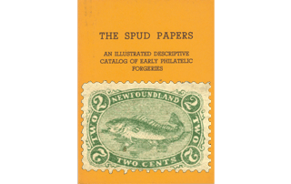
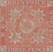
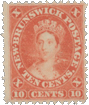
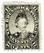
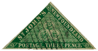
 1857. 3d. Triangular.
At the first glance, the forgery of this stamp looks very well; but, like most of its brethren, it will not bear inspection. I have a certain savage satisfaction in dissecting it, because this same forgery, or one very similar, was a much-prized member of my collection about ten years ago.
Genuine
Engraved in taille-douce; imperf. The groundwork of the central triangle, behind the large trefoil, is engine-turned all over. There are, however, three horizontal lines, where the engine-turning allows more of the dark background to be seen. The name, NEWFOUNDLAND, is in one word. The apostrophe in JOHN’S is correctly shaped; as is also the comma after POSTAGE. The central trefoil is formed of two lines, making a double border. There are three leaves on the left hand of the thistle. The rose and the shamrock do not touch the border in any part, but the stem of the thistle just touches the border at the bottom. The colour is a rich, dark yellow-green.
Forged
Lithographed; imperf. The imitation engine-turning is in four separate strips, so that the dark background shows, without any lines upon it, between the strips. This is especially noticeable in the lower three strips. In the genuine stamps, though these lines do show faintly, yet the engine-turning is all in one piece. The name is in two words, NEWFOUND LAND. The apostrophe in JOHN’S is badly shaped; and the comma after POSTAGE is a badly-
shaped full stop. The outer line of the two lines forming the central trefoil is not a drawn line, but is formed by the absence of the engine-turning permitting the dark background to be seen. In the genuine, the outer line is cut through the engine-turning. The leaf on the left of the rose touches the inner border of the trefoil, and the top leaf of the shamrock almost touches the border also. The stem of the thistle does not touch the border; in fact, the stem does not project below the leaves at all. There are only two leaves on the left of the thistle. There is a flaw in the top of the H in JOHN’S, on the left-hand stroke; and the imitation engine-turning projects a very little too far, just under the first D of NEWFOUND LAND, forming a little white spot or lump. The lettering is ragged, and too thin; and the colour is a chalky bluish-green.
I must confess that the milk of human kindness within me has been considerably soured by an examination of the forgeries hereinafter described. Messrs. Spiro must either have a most wonderful idea of their executive and artistic skill, or else they must suppose that any kind of coloured label will pass muster with philatelists as a genuine stamp, or surely they would never have attempted to forge copies of stamps that are a very marvel of taille-douce engraving. I know of few stamps which can compete with the Newfoundland ones, except perhaps those of Nova Scotia, which were in fact designed by the same artist. When we come to compare the originals with the forgeries, we cannot help feeling disgusted with the paltry imitations. But still, to give everyone his due, the forgers have been very careful, and in all the prominent lines of the designs, they have copied very accurately as far as a lithograph (and a very coarse lithograph) can be said to copy a fine engraving. I have said before, and I say again, that all amateurs ought to devote more time to the study of the various modes in which stamps are printed; and I think, too, that our catalogues ought to be more particular in this respect, and to name the mode employed for each stamp, or set of stamps catalogued. If this were done, those who depended chiefly on their catalogues for their philatelical knowledge, would insensibly be led to understand these things better, and would thereby be less liable to be imposed upon by every impudent forgery which makes its appearance. I know some collectors who seem to think that they can never arrive at being able to detect a forgery for themselves, and who are constantly sold, unless they have something in the style of these papers to give them a minute description of the forgeries, and the tests by which they may be distinguished from the originals. But if philatelists would only study their stamps a little more, instead of merely trying to see how many they can collect, I am certain that they would soon learn for themselves far more than any book or Spud Paper can teach them. All who have a long purse can go into the market and buy most of the stamps that have ever been issued; but if, after doing this, they simply content themselves with putting their stamps into an album, and leave them there unnoticed, they cannot derive much pleasure from them, and we cannot call this philately. And now, after these moral observations, let us talk a little about the stamps specially destined to be dissected this month.
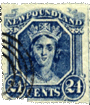 1866. Twenty-four Cents, Blue, perf. 12. (bust of queen).
Genuine
Engraved on bluish-white paper. The groundwork of the frame at bottom, behind figures and words of value, is composed of horizontal lines, partially cross-shaded with vertical lines. The Queen’s hair is darker (much) than any other part of the stamp. Groundwork of name-scroll composed of vertical lines, cross-shaded round the letters with horizontal lines. Background of portrait cross-shaded from top to level of eyes. At the bottom of the stamp, where the value- label joins the figure-circles, on each side is a dot, which does not touch either figure-circle or value-label. The whole stamp exhibits exquisite finish.
Forgery
Lithographed on very yellowish paper. Groundwork of frame at bottom, behind figures
and words of value, is cross-shaded with oblique lines. Queen’s hair much lighter than background. Groundwork of name-scroll is cross-shaded behind the letters with oblique lines. Background of portrait cross-shaded nearly to bottom, and a space left almost unshaded just above each shoulder. The dots on each side at bottom touch the figure-circles.
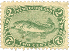 1866. Two Cents, Grenn, Perf. 12 (Cod Fish).
Genuine
Beautifully engraved. The labels bearing the inscriptions NEWFOUNDLAND and TWO CENTS are solid; all the others have a groundwork of very fine lines. The figures and words in the side labels are shaded at the edges with dark colour, which makes them stand out from their backgrounds as though they were solid. The “white” of the eye of the fish is coloured, and the very spines of his fins may be counted.
Forged
Lithographed. Coarsely perf. All the labels are solid, and the lettering and figures look perfectly flat. The “white” of the fish’s eye is white, and very staring, and the spines of the fins are irregular, and not to be counted. The whole stamp is coarsely executed on very white paper.
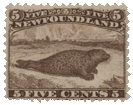 1866. Five Cents, Brown, Perf. 12 (Seal).
Genuine
Engraved. All the hairs of the seal’s whiskers are perfectly distinct, and very light in colour compared with the general hue of the body. The head resembles that of a pug dog, and the mouth and eye can be easily discerned. There is a glimpse of open sea to the right, where there are no icebergs, and only a faint cloud. All the letters and figures are well made.
Forged
Coarsely perf. 13 1/2. Lithographed. The seal’s whiskers are very dark and coarse, and do not seem to belong naturally to his mouth. The head is like that of a water-rat, and there is no visible mouth or eye. The whole of the horizon seems to be filled with icebergs. The lettering and figures at the top are generally more or less imperfect.
The genuine 5 C. was reprinted in black in 1869, and has also been forged; but the above descriptions, changing the colour from brown to black, will serve for them, as both genuine and forged were printed from their respective original matrices.
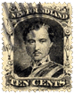 10 Cents, Black, Perf. 12 (Prince of Wales).
Genuine
Engraved, on greyish white paper. On the left side of the Prince’s collar at the bottom are two rows of jewels or braid, on which the small crown rests. The white lines on the right shoulder are very fine, and are properly curved to make the chest appear in relief.
Forged
Lithographed; perf. 13. This stamp has been very carefully copied from the original, almost line for line, and it is almost impossible to give a verbal description of the small differences in some parts of the ornamental frame. It is printed on very yellowish paper, and the ink is very pale, instead of being dark black as in the original. On the left side of the collar at the bottom, there is a single row of pearls, very distinct. The white lines on the right shoulder are very coarse, and are simply drawn obliquely, without any curve. This is a stamp which might possibly deceive; but if the other distinctions fail, we can always discover it by the perforation, which is 13 instead of 12.
 1866. 12 Cents, Flesh; Perf. 12. (Head of Queen).
Genuine
Engraved on pinkish yellow paper. Five pearls visible on the coronet, the last pearl just peeping out from where the coronet buries itself in the hair above the left ear. The stop after NEWFOUNDLAND touches the final D. Tongue of buckle lightly and partially shaded. Shading behind the top of the head composed of finer lines than the rest of the background, but no cross-shading.
Forged
Lithographed on a very white paper. Coarsely perf. 13. Only three pearls to be seen on the coronet; the two at the front being absent, and the last pearl not at all hidden by the hair. The stop after NEWFOUNDLAND is at some little distance from the final D. The ground behind the back, and top of the head, cross-shaded. Tongue of buckle dark, and shaded all over.
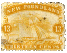 1866. 13 Cents, Orange-yellow, Perf. 12 (Ship).
Genuine
Engraved; on yellowish paper. Background of name- label shaded all over with vertical lines. Nearly all the letters of name touch each other, and the HIR of THIRTEEN are so joined as to appear only one letter. Rocks visible in left-hand corner of landscape.
Clouds composed of horizontal lines, with oblique cross-shading. St. George’s flag on the gaff of the mainsail tolerably distinct, and formed without any curved lines. Hull of vessel very dark, compared with the waves. Over un of name is an egg-shaped dot, lightly-shaded, with a dark dot on each side of it.
Forged
Lithographed, on very white paper; perf. 13. Background of name-label is solid. The w and f of name are the only ones which really touch each other. hir of thirteen set some distance from each other. Indistinct white blotch in lieu of rocks in left bottom corner. Clouds composed of horizontal lines only, and very heavy. St. George’s flag curved (as if its back were broken), and very indistinct. Hull of vessel no darker than waves. No dots over un of name.
 1869. 1 Cent, Violet, Perf. 12 (Prince of Wales).
This stamp was re-engraved in 1871, with some slight differences of design, and in a much paler colour, commonly called brown, but which I should call a sort of red-mauve. It is not with the 1871 issue that we have to do; so I need not trouble the reader with a description of it; but will go on to point out the differences that exist between the 1869 type, and the forgery which purports to represent it.
Genuine
Engraved. The oval frame containing the name ends in a point at the top, like a pear with the small end uppermost. The letters N. and F., at the top, almost touch the outer frame of the oval, and the stops are large and round. The name is in one word; and all the letters composing it, except the o, touch each other. Counting all the white lines in the plaid, both vertical and oblique, there are 14. The rays in the oval frame are composed of alternate sets of deep and faint lines, but without any cross-shading. The eyes are clear and intelligent, and apparently light.
Forged
Lithographed. Coarsely perf. 12 1/2. The oval frame is rounded over the words ONE CENT, instead of coming to a point. The N. and F. are small, and do not come near either the outer or inner lines of frame. The stops are small, and badly shaped. The name is in two perfectly distinct words; and there is a good space between all the letters. There are only 10 lines in the plaid. The rays in the frame are far too distinct, and the light ones are cross-shaded. The eyes in the portrait are very black and staring.
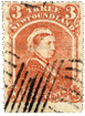 1870. 3 Cents Vermilion (bust of queen in widow’s weeds).
Genuine
Engraved; perf. 12. Queen’s eyebrows turn down at the outer ends. The two stars at the bottom of the stamp are on a groundwork of vertical and horizontal cross-shading. Cap scarcely shaded at all on the top of the head. Separation between back of neck and cap strings very distinctly marked by a strong line of colour. Background of upper value-label shaded with curved lines which run parallel with curved lines of frame.
Forgery
Lithographed: perf. 13. Eyebrows turn up at the ends. Stars at bottom on solid ground. Strong wavy line of shading on cap at top. Cap strings indistinct at back of neck, so that it is difficult to say which is cap string and which is neck. Background of upper value-label solid, except behind the figures on each side. There will be little difficulty in detecting this and the following forgeries, as they are very poorly printed, whereas the originals are beautifully done, and the ink stands out so thick that it can be actually felt with the finger.
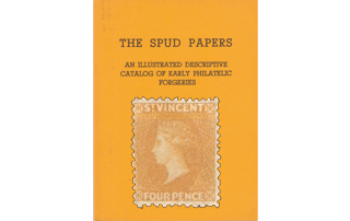
From “The Spud Papers” by Atless, Pemberton & Earée, 1871-1881.

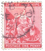
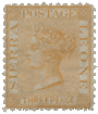
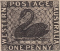 1859. One Penny, black. Imperforate.
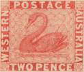
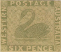 1860. Two Pence, Vermillion, Six Pence, Green. Imperforate.
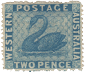
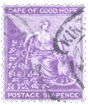
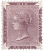
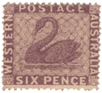 1862-64. Two Pence, Blue, Six Pence, Violet-Brown; Perforated Various.
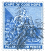
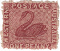 One Penny, Brownish Red; Perforated Various.
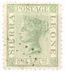
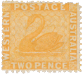 1865. Two Pence, Orange. Perforated 12 1/2.