Posts

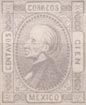
Album Weeds – Bolivia

Album_Weeds_Bolivia1
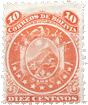
1866. 10 Centavos, brown.

I am sorry to say that I have no genuine specimen of this stamp. There is only one plate, which contains 78 varieties of type.


Genuine

Engraved in taille-douce, like the other values hereafter described. If the stamp be held so that the light falls obliquely upon it, the ink will be seen to stand up from the paper in slight ridges. The upper numerals have their tops pointing towards the top corners of the stamp, while the lower numerals have their tops pointing towards the center of the stamp.

First Forgery

Lithographed, in red-brown or purple-brown, on white wove paper. The ink, of course, does not stand in ridges. Inside the outline of the globe there are six curved lines, parallel with the outline, and three or four vertical lines crossing them, above the AV of CENTAVOS, and two or three oblique lines above the OS. The crossed lines of shading in the spandrels, outside the inscribed oval, are very coarse and wide apart.

Second Forgery

I have only seen this lately. Nicely lithographed in brown, on rather thin, hard, white wove paper. The numerals are short and wide, and placed transversely in the containing-ovals, so that the tops of the upper numerals point inwards, towards the top of the stamp, and the lower numerals point outwards, towards the sides of the stamp. The curved lines on the globe follow the outline, as in the first forgery, but are much finer, and there are nine of them, not including the outline of the globe. There are no lines of shading crossing these. The spandrels in the background, behind the eagle, are formed by rows of square dots, instead of lines.

Album_Weeds_Bolivia2
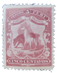
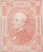
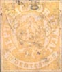
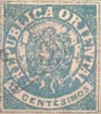
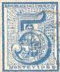
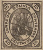
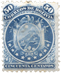
1866. 50 Centavos, orange-yellow.

There is one plate of this value, with 30 varieties of type on it.


 Genuine

Very coarsely engraved in taille-douce, on thin, yellowish paper. The shoulder of the bird’s wing, near the S of CORREOS, is pointed in all my copies; and the outside of this wing is clear of the inner boundary-line of the name-oval, from the top to about the first O of CORREOS, where the wing and the outline of the oval run together into one line. All my copies have five curved lines of shading on the globe, under the bird. The stamp is somewhat rounded at the corners, and all four corners are rounded alike. The ink stands up a good deal from the surface of the paper, after the manner of all

Forged

Apparently engraved in taille-douce, on tolerably stout, white wove paper. The tint is more orange than that of the genuine. The shoulder of the bird’s wing, near the S of CORREOS, is very blunt and rounded, as is also the shoulder of the other wing. The outside of the right wing is joined to the inner outline of the name-oval, from the very bottom to about level with the last O of CORREOS, just where the shoulder of the wing begins to turn round. There are only four curved lines of shading on the globe, beneath the eagle. The bottom corners of the stamp are rounded, but the top corners are square and pointed. The ink stands out in thick masses and ridges from the surface of the paper, so that it feels ribbed to the touch.

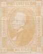
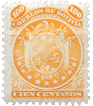
1866. 100 Centavos, greenish-blue.

As in the case of the 50 C., there is only one plate of this value, with 30 varieties of type on it.

Genuine

Engraved in taille-douce, like the 50 centavos, and of a very similar design; same sort of paper. The right wing of the eagle only touches the inner outline of the name-oval, just at the bottom. Each of the little transverse ovals, containing “100”, touches both name-ovals, and also both sides of the outline of the stamp. The figures “100” in each of the lower ovals are in their normal position, with their tops pointing towards the center of the stamp, and this test will serve to detect the forgery very easily.

Forged

Apparently engraved in taille-douce, like the forged 50 centavos, on stout, very white wove paper. The right wing of the eagle touches the inner outline of the name-oval, from the bottom to about level with the first 0 of CORREOS. The ovals containing the figures of value do not touch the name-oval at all; the one at the right-hand top corner touches only the right side of the stamp, and the one in the left bottom corner almost touches the name-oval. The figures of value in the two lower ovals are placed upside-down, with their tops pointing to the bottom corners of the stamp.

My readers will please note that I consider these two stamps decidedly dangerous forgeries, and they will do well to be very careful, especially with the 50 C.

Postmarks

Genuine.—Most of my genuine copies are unused, and all the others bear only a word or figure written in ink upon them, so I am unable to say what is the normal postmark of this set.

Forged.—The forgeries are not cancelled.

Album_Weeds_Bolivia4
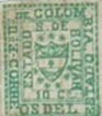
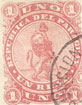
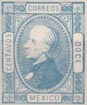
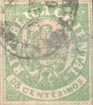
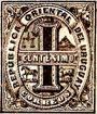
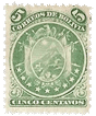
First Issue of 1867. 5 Centavos, lilac.

This is from the last “state” of the plate of the original 5 C. of 1866, with the colour changed from
green to lilac. I understand that the plate was retouched or re-cut at least six times, and there are 72 
types on the plate. The lilac 5 C. was printed, as I have said, from the last “state” of the plate, showing, upon the globe, only curved lines of shading, following the shape of the globe.

Genuine

Coarsely engraved in taille-douce, on rather thin, white wove paper. I have only a single specimen to describe from, and thus cannot guarantee that all the 72 types are alike in the points now to be mentioned. The outer frame is 1/2 mm. distant from the stamp. The E of CORREOS has its central tongue decidedly longer than either the top or bottom limb. There is no cross-bar to the A of BOLIVIA or the A of CENTAVOS. The letters of the inscription are small, as compared with the width of the oval containing them, so that there is at least 1/2 mm. between the tops of the letters and the outer outline of the oval, and more between the bottoms of the letters and the inner outline. The top of the oval reaches within nearly 1/4 mm. of the top of the stamp, not including the outer line; and the bottom of the oval the same. The two chief things to look at are the slight ridges of ink, standing up from the paper, and the curved horizontal lines on the globe.

Forged

Lithographed, in purple-brown, or brownish-purple, on white wove paper. Being a lithograph, the ink does not stand out from the surface of the paper at all. Besides the curved horizontal lines, the globe shows seven or eight vertical lines of shading above the AV of CENTAVOS, and two oblique lines above the OS of that word. The outer line is not equally distant from the stamp all round; being 1/4 mm. at the top, where it is narrowest, and more than 1/2 mm. down the left side. The right side also is wider than the top. The E of CORREOS has its central tongue much shorter than either the top or bottom limb. Each A of the inscription has a cross-bar. The lettering is tall, and comes within 1/4 mm. of the outer and inner edges of the oval. There is quite 1/2 mm. between the top of the oval and the top of the stamp, and the same at the bottom.

Postmarks

Genuine.—As before

Forged.—98, bars much closer together.

See also –> Carlos Royuela’s exhibition of 5 Cents Lup


Spud_Bolivia8 Spud_Bolivia9Spud_Bolivia10Spud_Bolivia11 Spud_Bolivia12
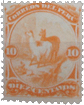
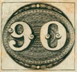
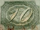
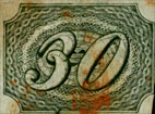
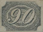
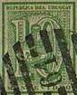
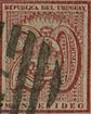
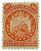
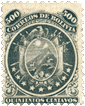
Second Issue of 1867. 5, 10, 50, 100 & 500 Centavos. Nine stars.

The forgeries now to be described are lithographic imitations of a most beautiful taille-douce design. The first forgery is to be found almost everywhere, and I can safely say that I find these wretched things in nine out of ten of the albums sent to me, week by week, for examination and opinion, and occasionally in the books of those who decidedly ought to know better. Indeed, perhaps I may venture just to whisper here that I once found a forgery of the 500 Centavos in the collection of one of our leading amateurs!

But now, in saying all this, I must also say that the mere details of the design have been copied with considerable accuracy. It is the exquisite clearness and fineness of the genuine that the forgers have altogether failed to imitate.

Genuine

Beautifully engraved, in taille-douce, on stout, yellowish-white wove paper, perf. 12. The tail of the llama curls upwards, like that of a rabbit. The butt-end of the flagstaff above the right-hand star is thickened, near the end, something like the butts of the old lances of the Middle Ages, and the butt-end of the staff above the left-hand star is also slightly thickened, but not so much as the other. These butts are not like arrow-heads. The background of the circle, containing the arms, flags, stars, etc., is composed of close, thick, horizontal lines of shading. The snow-cap on the highest peak is a triangular patch of white, running down on the left side to about the level of the place where the lowest flagstaff begins to appear from behind the oval shield. The sun is sometimes rather blurred, but there is no ring of stars round it. The eye of the condor is oblong, and the ring of white feathers is fairly low down on the neck.

The following are the special notes for each value:

  • 5 Centavos.—In the word CLNCO the head and tail of the 1 are both exactly alike; the hanging arm of the T of CENTAVOS does not touch the A.
  • 10 Centavos.—The 1 of the right-hand 10 does not slope very much to the right, not nearly so much as the first I of BOLIVIA below it. The 1 of the left-hand 10 does not slope very much to the left, not nearly so much as the first R of CORREOS below it. The S of CENTAVOS is on the same level as the rest of the word.
  • 50 Centavos. —The value, which is in fat letters, is spelt CINCUENTA.
  • 100 Centavos.—The 1 of each 100 has ornamental curls at the head and foot, and the slope of the numerals is less than that of the R of CORREOS or of the I of BOLIVIA.
  • 500 Centavos.—The value is in fat letters, and is spelt QUINIENTOS.

First Forgery

Lithographed, on stout, white and yellowish-white wove paper, pin-perf. 12 1/2, and also 13 1/2, rather better than usual. The tail of the llama sticks out obliquely to the left, without any curl. The butt-end of the flagstaff, above the left-hand star, is exactly like an arrow-head; and the corresponding butt, over the right-hand star, is very similar. The background of the circle, containing the flags and stars, is of solid colour, instead of lines. The snow-cap on the highest peak does not come down, on the left side, so low as in the genuine. The sun has a circle of small stars round it. The condor’s eye is nearly round, and the ring of feathers encircling the neck is very close to the head.

  • 5 Centavos.—The I of CINCO is like a numeral 1.
  • 10 Centavos.—The numerals slope absurdly, very much more than the lettering below them. The S of CENTAVOS, in some of my specimens, is lower than the level of the rest of the word.
  • 50 Centavos.—The value is in very thin letters, and is spelt CINCOENTA.
  • 100 Centavos.—The 1 of each 100 is a plain numeral, with hardly a sign of any foot-stroke, and without the ornamental curls of the genuine. 500 Centavos.—The value is in very thin letters, and is spelt QUINHENTOS.

Second Forgery

Lithographed, on stout, yellowish-white wove paper, pin-perf. about 11 1/2. The tail of the llama is as in the first forgery, but thicker and clumsier. The butts of the flags are more like the genuine, but too much like lance-heads (not arrow-heads). The background is of horizontal lines, like the genuine, but they are blotchy, and far too fine. The easiest test for this forgery is in the fact that there is only one mountain-peak; the second peak, which ought to show between the high peak in the background and the cottage (or church ?), being absent. The snow-cap runs straight across the peak, instead of running down obliquely to the left. There is no trace of the sun in my specimen (5 C.). The condor’s eye is a triangle; the ring of feathers is absent, and the head is that of a dove.

  • 5 Centavos.—This is the only value that I possess. The right arm of the T of CENTAVOS hangs down so as to touch the A.

Postmarks

Genuine.—1, 29. Also a large numeral.

First Forgery.—1, 5, 10, 100. No. 10 is the most usual.

Second Forgery.—10.

Album_Weeds_Bolivia9 Album_Weeds_Bolivia10Album_Weeds_Bolivia11 Album_Weeds_Bolivia12Issue of 1871. Eleven stars.

I have not yet come across any forgeries of this issue, but the genuine stamps are almost exactly like the issue just described, only with eleven stars instead of nine. Thus, if such forgeries should exist, I think my readers will be able to detect them at once, as the tests for the nine-star issue will serve equally well for this set also.

Essay, 1865. No value. Pale rose, green, greenish-blue.

There is an essay as above, very nicely engraved, in taille-douce, in black ink on coloured paper. I do not know anything of its character, but thought it might be as well to mention it here for those who care about essays, lest they might be taken in by a forgery of it. I cannot afford the space for a full description, but I give a few tests of the places where a forgery would be almost sure to fail.

Genuine

Engraved in taille-douce, in black, on coloured paper, unperforated. First letter of REPUBLICA touches the shading on the ribbon, and last letter touches the cap of liberty. First letter of BOLIVIANA touches cap of liberty, and last letter does not touch shading of ribbon. Llama’s ears very distinct, and directed forwards. Six shaded stars in shield, with white spots in center of each. The ink stands out well from the surface of the paper, as is usual in taille-douce impressions.

Bogus Stamps.

Of the type of the first two issues there are the following bogus values, all lithographed:

  • 2 Centavos, pale yellow
  • 2 C., bright mauve
  • 20 C., brownish-carmine
  • 1 Peso, blue

The 2 C., yellow, is so faint that the design is hardly distinguishable. The 2 C., mauve is rather nicely done. The “1 Peso” resembles the 100 Centavos, but of course the value will instantly condemn it.

The set of so-called “Interior Stamps,” in black, with BOLIVIA at top, CORREOS at bottom, frame like that of the French or Greek stamps, but landscape in center, with value, each side of the mountain—Porte 1/2 (1, 2 & 4) real—is believed to be altogether bogus.

There is a stamp of the same design as these black ones, but without indication of value, and printed in olive-yellow; this also is bogus.

A full set of bogus stamps was issued a few years ago, of a peculiar design, and I believe the dealers accepted them just at first without question. However, their true character soon became known, and I have not seen many of them lately. The stamps are rectangular, on coloured paper, but the design runs obliquely up, from left to right. At each corner is the value in figures, in an oval, then comes, under the value in the top left corner, CORREOS, under this DE BOLIVIA, under this a train running to right, under this IMPRESOS, and under this the value in words. The values and colours are: 1/2 Centavo, red on yellow; 1 C., rose on pale rose; 2 C., mauve on green; 5 C., blue on pale blue; 10 C., orange on pale orange; 20 C., bright green on green; 50 C., rose on pale rose; 1 Boliviano, yellow on pale yellow; 2 Bols., black on lilac; 5 Bols., black on white; 10 Bols., mauve on lilac. There are shades of most of the values. They are poorly lithographed, on fairly thick wove paper, white gum, perf. 11 .


From: ‘Album Weeds’, 3rd edition by R. B. Eareé. 1906


LupFor more information about the classical issues of Bolivia, see —> Carlos Royuela’s exhibition

See also –> Spud Papers – Bolivia

Spud Papers – Honduras

Spud_Honduras11866. 2 Reales, Green, Rose.

These stamps come first, both alphabetically and in the order of merit. The forgers, having only lithographs to imitate, have succeeded in producing some very passable counterfeits, well-calculated to deceive too-confiding youth. I confess to having experienced some little difficulty in finding any sufficiently well-marked and salient points of difference between the forgeries and the originals.

Genuine

Lithographed, in greyish black, on bluish-green, or orange-pink paper. The outer oval touches the outline of the frame at top and bottom. The transverse lines of shading in the pyramid (or cone, or triangle, or whatever it is), do not trespass beyond the outline on either side. The semicircle connecting the two towers is composed of three lines, two outlines and a fine central line. The thick outline of the oval is tolerably smooth all the way round. There is no boundary-line at the sides of the stamps, and the top and bottom lines are very little thicker than the rest. The doors leading into the towers are not more than twice the size of the windows. The crossed branches are rather smudged and indistinct. All the used copies which I have seen, are obliterated with a large pen-and-ink cross.

Forged

Lithographed in black, on yellowish-green or bluish-pink paper. There is a considerable space between the central oval and the boundary-line, both at top and bottom. The transverse lines of shading show beyond the outline of the pyramid, especially on the left side. The semicircle connecting the towers is composed of two lines only. The thick outline of the oval is very wavy below the words DOS REALES. There is a fine boundary-line at the sides of the stamps, and a thick one at the top, much thicker than the rest. The windows in the towers are only about one-fourth the size of the doors. The crossed branches are much clearer and more distinct than in the originals. Instead of contenting themselves with pen-marking the counterfeits, the forgers have actually lithographed the pen-and-ink obliteration found on the originals!

Although, at first sight, these forgeries have a very deceptive look, yet, I think that the tests given above, will be amply sufficient to enable anyone to decide at once between the genuine stamps and their counterfeits. Moens says that the green stamps are for home use, and the pink for foreign postage; but, for my own part, I don’t believe the officials are very particular in this respect. And besides this, I fancy that, in any case, neither the green nor the pink stamps would frank a letter beyond the boundary of the Republic, certainly not to England, as we have no postal convention with these small American States.


From “The Spud Papers” by Atless, Pemberton & Earée, 1871-1881.

Album Weeds – Bolivar

Album_Weeds_Bolivar11863. 10 Centavos, green.

Genuine

Lithographed, on rather hard, somewhat transparent, yellowish-white wove paper. All the three upper points of the shield are of the same height. There are six horizontal lines of shading in the upper compartment, including the lower boundary-line. The outer ends of the cornucopias are both pointed. In the central compartment there is a cap of liberty, on a pole, moderately distinct. The isthmus in the lower compartment is shaded all over with dark colour; only the seas are white. The bottom of the shield ends in a rounded point, which is just one millimeter from the outline below it. The stars round the shield are all eight-pointed, and the middle star of the three above the shield is the highest, while the two on each side of it are both of them on one level. The lower line of the central compartment of the shield, if prolonged to the left, would pass above the top of the upper star, to the left of the middle of the shield. In the inner inscription, the S at the top of the stamp is a block, or sans-serif letter. The vertical stroke of the L of BOLIVAR, if prolonged upwards, would pass almost clear to the right of the stop after BIA above it. The 1 of BOLIVAR, if similarly prolonged upwards, would pass through the right side of the inverted o of ESTADO above it. The A of BOLIVAR slopes a little to the right. At the bottom of the inner inscription, the o of 10 is slightly to the left of the centre of the star above it: and in the Cs, the top and bottom of the C are alike, and end in clumsy knobs, while there is no stop under the small S. In the outer inscription, the tops of the D and E of DE, at the top of the stamp, touch each other. The E of CORRE has its upper and lower limbs exactly alike. The small stop under the little S of ES is central, but the stop under the S of US is too much to the left; the tail of this latter s almost touches the stop below it. The middle line of the three under DE COLOM, if prolonged to the left, would pass almost centrally through the little S of US in the left outer inscription. The foot-stroke of the A of BIA, in the right outer inscription, very nearly touches the stop after it. The head- and foot-strokes of the E of ESTADO trespass across the fine line under OS DEL, and touch the thick pearled line at the bottom of the stamp. The left outer frame contains 20 pearls, and there are 18 pearls in the top frame. I have not been able to count the others. There is a framework of two thin lines, a quarter of a millimeter apart, running right round the stamp, at exactly half a millimeter from it.

First Forgery

Lithographed, on medium, very white wove paper. The middle and left-hand stars at the top of the stamp are about on the same level, but the one to the right is much too low. The right upper point of the shield is much lower than the others. There are only five horizontal lines of shading in the upper compartment of the shield, including the bottom outline. The outer ends of the cornucopise are very blunt and rounded. In the central compartment there is a thing just like a boy’s peg-top, shaded with vertical lines. The isthmus in the lower compartment is slightly shaded with oblique lines, running down from right to left, with patches of white. The bottom of the shield ends in a very sharp point, which is barely half a millimeter from the outline below it. The eight points are not to be seen on all the stars; the one to the right of the ST of ESTADO, on the left side of the stamp, seems to have only six points, and the one above the C of C has only five. The lower line of the central compartment of the shield, if prolonged to the left, would pass exactly through the centre of the upper star, to the left of the middle of the shield. In the inner inscription, the S at the top of the stamp has head- and foot-strokes like an ordinary Roman capital. The vertical stroke of the L of BOLIVAR, if prolonged upwards, would pass almost centrally through the stop after BIA above it. The I of BOLIVAR, if similarly prolonged upwards, would pass exactly through the centre of the O of the inverted word ESTADO above it. The A of BOLIVAR is upright. At the bottom of the inner inscription, the o of 10 is centrally under the star above it; and in the Cs , the top of the C is more pointed than the bottom, with no knobs to either, and there is a very distinct stop under the small S. In the outer inscription, the tops of the D and E of DE, at the top of the stamp, do not anything like touch each other. The E of CORRE has the two ends of the top and bottom limbs very different from each other. The small stop under the little S of ES is central, and so is the one under the S of US; the latter S has no tail to touch the stop after it. The middle line of the three under DECOLOM, if prolonged to the left, would pass a good distance above the little S of US , not touching it anywhere. The foot-stroke of the A of BIA in the right outer inscription, is not visible; it is a block letter. The E of the right-hand ESTADO has no head- or foot-strokes. The left outer frame contains 21 pearls, the top frame 18, the right frame 22, and the bottom frame 18; they are all perfectly distinct and easy to count. There is no framework of lines round the stamp. The genuine is printed in slightly bluish-green; this forgery is of a very decided blue-green. I understand that this forgery dates from about 1891, and was manufactured by a small dealer in London. As the evidence is only hearsay, I refrain from giving his name.

Second Forgery

Very indistinctly lithographed, in very yellowish-green, on stout, very white wove paper. The right upper point of the shield seems to be blotched into the outline of the frame to right of it. The upper compartment of the shield is a simple blotch. The central compartment is perfectly white, with no cap of liberty at all in it. The bottom of the shield, which is even blunter than the genuine, touches the star to left of it, and it is hardly a millimeter from the outline below it. The stars, as far as they can be made out, are all six-pointed. The lower line of the central compartment of the shield, if prolonged to the left, would cut into the upper part of the star, to the left of the middle of the shield. The vertical stroke of the L of BOLIVAR, if prolonged upwards, would cut well into the stop after BIA above it. The tops of the D and E of DE, at the top of the stamp, do not touch each other. The rest of the stamp is too much blotched for me to give any more details; and I would only say that if my readers meet with a stamp in which every letter and line is blotchy, they can safely take it for a forgery.

Bogus Stamp

1 Peso, orange-yellow.

This stamp is supposed to be the 1 peso of the 1863 issue; but the genuine is in red, and this forgery is in orange-yellow, so it will be enough to note it, without troubling to describe it. I have not seen any proper forgery of the 1 peso. I will only add that the genuine has the value “1 Peso”, whilst this forgery has it “1 Po” or “1 Ps.” It is so blotchy (like the second forgery of the 10 c., green) that I am not sure of the little letter.

1863. 10 Centavos, red.

All my used copies of this stamp are exactly the same colour as that of the 1 peso; that is to say, a pale dull red. But some unused specimens, which may perhaps be reprints, have the red a little inclining to rose. Whether the latter are reprints or not, I must leave to others to say, as I am ignorant in the matter.

Genuine

Lithographed, on rather hard, medium, decidedly yellowish-white wove paper. All the three points at the top of the shield are of the same height; the outline between the points makes two very deep hollows or curves, and the left hollow is deeper than the right one. These deep hollows are a very easy test. There are six horizontal lines of shading in the upper third of the shield, including the lower boundary-line. The lines are blotched together, between the end of the right-hand cornucopia and the outline of the shield, so that the said right-hand one seems to be joined to the outline, but the left-hand one does not touch the left boundary-line of the shield. The ornament between the two cornucopias does not touch the top of the shield, and its shape is a fat oval. The middle compartment bears a thing like a mushroom. In the lowest compartment there is a faint mark in the upper sea, to represent a ship, and a very distinct oblong mark in the lower sea. Round the shield, as before, are arranged nine eight-pointed asterisks, each of them fully as large as the S of S DE above the shield; and the middle asterisk above the shield is exactly above the central point of the shield. The value is written “10 Cs”. I do not think I need carry the description further, as the above will be found ample tests for the forgery now to be dissected.

10 Centavos. Forged.

This stamp looks like a lithograph, but the outside frame is decidedly sunk into the paper, like a typograph. It is on stout, very white wove paper, so thickly gummed that it appears very hard, and is printed in bright rose, not in the least like any of the genuine that I have ever seen. The right-hand upper point of the shield is lower than the others, and the right-hand curve or hollow of the top outline is decidedly deeper than the left, which is extremely shallow; in fact, almost a straight line. The right-hand hollow itself is also very much shallower than the genuine. The background of the uppermost third of the shield is quite white, instead of being filled in with horizontal lines of shading; this is another easy test. Both of the cornucopias touch the sides of the shield very plainly; and the ornament between them, which is shaped like the flame of a candle, touches the top of the shield. The thing in the middle compartment of the shield is exactly like a leg of mutton, placed transversely on a short pole. There is no ship in either of the seas in the lowest compartment. The asterisks round the shield are blotchy, far smaller than the S of S DE above the shield, and most of them seem to have only three points, or rather arms; for they are blunt. The middle asterisk is too much to the left, so that it does not come above the top of the central point, above the shield.

Postmarks

Genuine.—I have never seen any of the stamps above described cancelled with anything but a word or words, written in ink across the face of the specimen.

Forged.—Uncancelled; also a written word; also a small unoutlined oval of bars; also 41.


From: ‘Album Weeds’, 3rd edition by R. B. Eareé. 1906


Spud Papers – Peru

Spud_Peru1Spud_Peru2 Spud_Peru31866. 5, 10, and 20 Centavos.

I have a New-Year’s gift for our readers, in the shape of three Peruvian forgeries. Considering the difficulties of counterfeiting any of the works which issue from the atelier of the American Bank Note Company, these imitations are fairly done, the 20 C. being the best of the trio. Each of the originals is from a different plate, and each of the forgeries from a different stone, so that each value requires a separate description. Taking them in the order of their value, we have, to begin with:

5 C. Genuine

Engraved in taille-douce, on thick yellowish-white wove paper; perf. 12. The animals, which are supposed to represent llamas, are much more like mules. The one in front has a cloth or saddle girthed to its back, and the pack is laid upon this cloth. Its hind-quarters are not nearly so darkly shaded as the pack. All four legs are plainly visible; the off hind-leg being very darkly shaded. If a ruler be laid along the line of the face and forehead, it will cut into the R of FRANCO, and the R of PERU. The eye of the llama in the background is quite plain, and its mouth is slightly open. The hoof just under its nose is of normal proportions. The u of peru is not joined at the top, and the small accent over it is white. Outside the top scroll, above CORREOS and PERU, are two unobtrusive triangles, the hypotenuse of each follow- ing the curve of the scroll. The left-hand leaf of the agave (American aloe) is very nearly as long as all the other leaves. The two white dots, outside the end of the bottom value-scroll, are oval.

5 C. Forged

Lithographed, on very white paper, rather thin; pin-perf. 13. The pack upon the back of the front llama appears to be girted directly on to his back, without the intervention of any cloth or saddle. The hind-quarters are as dark as the pack. The off hind-leg is scarcely visible. If a ruler or straight-edge be laid along the line of the face and forehead, it will just touch the o of FRANCO. The eye of the llama in the background is not visible, and there are no symptoms of a mouth. Its front hoof, beneath its nose, is very much too large. The U of
PERU is joined at the top, and the accent over it looks like an accidental break in the top line of the scroll. Outside the scroll, above CORREOS and PERU, are to be seen portions of triangles, very faint, without the hypotenuse. The last leaf (to the left-hand) of the
agavd is very much shorter than the other leaves. The two white dots outside the bottom label are round. Printed in sheets of 25, S X 5 , postmarked with an oval containing six parallel bars, and ungummed. Perhaps the readiest instant tests are the shape of the two dots on each side of the bottom label, and the facial angle of the front llama.

10 C. Genuine

Engraving, paper, and perforation, as in the 5 C. Unmistakable llamas this time. The front llama has some dark shad- ing on the back of its head, and a dark patch on its back, but the two patches are not joined by shading down the back of the neck. The prickly-pear or cactus in the foreground has 11 leaves, and the commencement of a 12th. The llama in the background has a head, neck, and ears, exactly like a greyhound, with very well-marked eyes. The two ends of the C in CENTAVOS almost touch, so as to make it look like an O. The mountain-peaks in the background are so very faint, that they would not be noticed on a cursory inspection. The figure 1 on each side, has a proper head. The mouth and nostrils of the front llama, somewhat resemble those of a camel.

10 C. Forged

Lithographed; paper and perforation as in forged 5 C. The dark shading on the head of the front llama, runs down the back of its neck, and joins the shading on the back. The prickly-pear is very blotchy, and the leaves are not easily counted. The head, and neck, and ears of the llama in the background resemble those of a wolf, and there is only one eye. The C in CENTAVOS is like an English C. The mountain-peaks in the background are very plain, and much too dark. The i on each side has no head. Both the 0’s of 10 have a little dot in the middle of the left-hand limb. This is not found in the genuine. The front llama has a straight mouth and no nostrils. Postmark and number in sheet as before.

20 C. Genuine

Engraving, perforation, and paper, as in the 5 C. genuine. The central picture is exactly the same as in the 10 C., except that there is not quite so much of it seen. The frame cuts off a portion of the prickly-pear. The accents over E of CORREOS and the u of PERU are white. The outer curl of the ornament above E of CORREOS and L of DEL is round. The background of the scroll, behind the words CORREOS DEL PERU, is cross-shaded. Colour, a very rich dark yellowish brown.

20 C. Forged

Lithographed; paper and perforation as in forged 5 C. There are two dark oblique lines of shading on the mountain, which come between the heads of the two llamas, the right-hand line touching the nose of the llama in the background. For the rest of the central
picture, the description under the head of 10 C., will suffice. The figure 2 in the left top corner, and the one in the right bottom corner, both appear to be in two pieces, as if the tail could be separated from the rest of the figure. The accents over E of CORREOS and U of PERU are blotchy. The outer curl of the scroll-ornament over L of DEL is oval, and that on the left, over E of CORREOS is nearly so. The background of the name-label is solid. The colour of the forgeries is much too pale. Number in sheet, and postmark, as before.

I have had some trouble in the description of these stamps, as the forgers have imitated the originals very closely. However, our readers need not have the slightest hesitation in deciding upon the genuineness or otherwise of any of these stamps which may be in their possession, if they will but remember the difference between taille-doucc engravings and lithographs.


From “The Spud Papers” by Atless, Pemberton & Earée, 1871-1881.

Spud Papers – Paraguay

 Spud_Paraguay11870, 1 Real.

Genuine

Engraved, on slightly yellowish white wove paper, rather thick; imperf. The lion is standing on a level piece of ground, represented by some lines of cross-shading drawn across the circle about one fourth from the bottom of the circle. His feet do not touch the boundary-line of the circle. The rest of the circle is shaded by fine horizontal lines. There are two concentric circles round the 1 in each corner, besides the boundary-line of the shading. The lion is shaded nearly all over, and his mane appears to be the darkest portion of the whole stamp. The E of REPUBLICA is properly drawn. The pole supporting the Phrygian bonnet is shaded nearly all over, and where it is not, the lines of the background can be seen through it. The postmark on my own copy of the 1 real is a double circle in blue with name (ASUNCION) and date.

Forged

Lithographed, on white wove paper, slightly thinner than the genuine; imperf. The artist has evidently failed to see that the lion is standing on the ground, for he has made it stand upon the inner line of the circle; and to balance the line which represents the horizon in the original, he has drawn other thick lines behind the lion. This will be found the easiest instant test, for the originals have only one thick line, on a level with the knees of the lion. The two concentric circles round the i in each corner merge into one before the circles are completed; or rather, the inner circle merges into the boundary-line of the shading. The E of REPUBLICA is broken and badly shaped. The face of the lion has a most ridiculous expression. He appears to be grinning, and one of his eyes is shut, and in some copies altogether absent. Over the face, and down the side of the body, are large patches destitute of shading. There is a line drawn between every two stamps on the sheet. The cancelling mark somewhat resembles our own, and is struck where two stamps meet. The colour is a more chalky rose than that of the original. Altogether, this forgery is not nearly so good as the counterfeit Cubas described above; but still there are some who might be deceived by it.


From “The Spud Papers” by Atless, Pemberton & Earée, 1871-1881.


Spud Papers – Guatemala

Spud_Guatemala21, 5, 10 & 20 Centavos, Perf. 14.

Genuine

Taiile-douee. Sun, represented with eyes, nose, and mouth. Thirty-six bright rays round the sun. The “gridiron” in the upper part of shield has six bars, and the beginning of a seventh. All the values from slightly varying types. Postmark of thick parallel bars, with figure in center.

Forgeries

Lithographed. Sun, with three dots only, representing eyes and mouth. Forty-one bright rays round the sun. The “gridiron” in shield has seven perfect bars. All the values printed from the type of the 1 centavo. Perf. 13. Printed in sheets of 25; and postmarked with a large rectangle of dots, slightly larger than the stamps. The execution of these forgeries is very poor; and I think they will not have a very extensive sale.

1878. 2 Reales, Carmine.

Genuine

Engraved in épargne (?), machine perforated 13, very clear. There are six white bars across the wing of each of the birds in the top comers, two of the bars being rather fainter than the rest. The words, DOS REALES, are nearer the top than the bottom of ‘ the containing label. In the head-dress of the female, the two feathers on each side of the central one come outside of the shaded oval, right across the white boundary line, and just touch the colored line outside it. The outer tail-feathers of the birds, hanging down nearly to the bottom of the stamp, are stumpy at the ends, the left one especially. The tail of the 2 in the right-hand corner comes very near the right-hand outline of the little scroll which contains it. It will be noticed that I have put a note of interrogation after the description of the mode of printing; but the fact is, that, having only a very poor genuine specimen to describe from, it is difficult to say whether it is an engraving, or a lithograph.

Forged

Lithographed, in very good style, on paper which has been pink-faced to imitate the tinge of the genuine. It is pin-pricked 13; but, though the same number as the genuine, it is, of course, not
nearly so cleanly cut. There are only four bars of white on the wings of the birds; and all four are equally prominent. The words DOS REALES are nearer to the bottom than to the top of the containing label. In the female’s head-dress, the two feathers on each side of the central one, come only just beyond the shaded oval, and do not project into the outline of the name-scroll at all. The long tail-feathers of the birds, end in very sharp points, which almost touch the label containing
the 2 on each side; indeed, in some copies, the left one does touch the label. The tail of the right-hand 2 is not long enough; and is not anywhere near the right boundary of the containing label, The postmark is a circle, containing GUATEMALA 27 MAYO, 1878.


From “The Spud Papers” by Atless, Pemberton & Earée, 1871-1881.

Spud Papers – Mexico

Spud_Mexico1 Spud_Mexico2Spud_Mexico3 Spud_Mexico4Spud_Mexico5Issue of 1872.


The specimen which is annexed is a very fair sample of the series, all the specimens of which are sold by the Hull firms on their sheets.

The five values are:

  • 
Seis (6) centavos, dull green
  • Doce (12) centavos, blue
  • 
Veinticinco (25) centavos, red
  • Cincueuta (50) centavos, yellow
  • Cien (100) centavos, lilac

In the genuine stamps we find a distinct die for each value, and the paper bearing a blue lithographic pattern at back; the engraving is execrable, so bad that there can really be nothing to prevent their forgery, and use for postage, save the cumbrous system of surcharging each batch of stamps sent to each province with the name of the province, the date, and a number, arbitrary for each name. The word CENTAVOS occurs on the right hand side in the 6c., but on the left in all the others, and the backgrounds vary in fineness in the several values; whereas the forgeries, being from one die, have the background of one uniform coarseness; but the 6c. forgery has the word SEIS on the correct side. Where the originals are so poor, and the forgeries rather excel in boldness of execution, it is somewhat difficult to fix on any particular point, so we will select the left hand frame first, and dissect it sufficiently to enable any one to tell a genuine from this forgery. Above the label are four small curls on each of the imitations, but only three in the genuine. The same label, whether containing SEIS or CENTAVOS, is cut square and straight at the top end in each forgery, but is plainly rounded in all genuine. The forgery delights in a peculiarly square letter o in CENTAVOS, a form which does not occur in the same word in any genuine one. Another, and more crucial test, is that the forgery shews but one outer line, which is border, frame, and all; but in the genuine this outer line is certainly a second, or finishing one, but put so close to the design that it runs into the edges of the labels and corners, which are consequently thickened on the outer parts; whereas the forgery shews a line of uniform thickness everywhere. It is hardly necessary to go any further into details after this last item, but we feel as if we should like to say something about the exasperating expression given to the face on the forgery. The original is not very sweet to look upon, but really it is hardly so wooden-headed as the annexed sample of Hull wares would have us believe. The blue moire pattern lithographed at the backs of the sheets is very closely imitated by the forgeries under discussion, but it is too bold and too blue; the absence of perforation also characterizes these “bogus” stamps.


From “The Spud Papers” by Atless, Pemberton & Earée, 1871-1881.


Spud Papers – Brazil

Album_Weeds_Brazil31843. 90 Reis, Black.

Genuine

Finely engraved, in taille-douce, on yellowish or bluish white wove paper; imperf. The background is composed of an engine-turned design, the white lines of which are very fine, and the black parts, between the intersections of the white lines, of almost microscopic minuteness. The figures of value seem to be, as it were, laid upon the design of the background. Following the curves of the figures, there is a very light black outline outside the shaded parts of each; and the engine-turning of the background can be seen between the outlines and the figures.

Forged

Very coarsely lithographed, on yellowish white wove paper; imperf. The imitation of the engine-turning in the background is poor, all the white lines being very irregular, and of all thicknesses; and the black parts between the intersections of the white lines are very large. The figures of value do not stand well out from the background, although they seem much whiter than in the genuine stamps. There is a coarse outline following the shaded parts of each figure, and the spaces between figure and outline are perfectly white, with no trace of the engine-turning. Immediately inside the inmost line of the ornamental frame there is a sort of chain-pattern running right round the stamp, which is not to be seen in the originals; and inside this again, behind the figures, are three concentric ovals of double black lines, which are intended to represent the darker parts of the engine-turning in the originals.

The forgeries are postmarked RIO DE JANEIRO in large capitals, in a large double circle. A very similar postmark is often to be found on the genuine. I think I have said enough to show that these vermin are not likely to be at all dangerous.


Spud_Brazil1Spud_Brazil2

Italic Figures: 10, 30, 60, 90, 180, 300 and 600 Reis.


Spud_Brazil3 Spud_Brazil4 Spud_Brazil6


Genuine

Wove paper, very well made, and strongly resembling in texture the paper of our own halfpenny newspaper wrappers. The paper is a little thicker than that of the forgeries, but is very soft. The colour affords no great assistance in distinguishing the genuine stamps, because there are two sets, one on white paper, and the other on what is commonly called grey, but which seems to us to be a very pale yellowish brown. The background of the design is formed of fine engine-turned white lines, making what appears to be, on close inspection, a kind of lace-work pattern.

Forged

Thin, irregularly made, white wove paper; groundwork of design composed of dots; figures of value very coarse, and only partially outlined in some of the values. The dotted groundwork of the forgeries will always afford instant means for their detection, so that it is scarcely necessary to take each stamp and describe it; but there are many points of difference in the numerals. For instance, in the forged 10 Reis, the figure I is very blunt at the top and bottom; whereas, in the original, both are sharply pointed. The same holds good with the 180 Reis. In the 300 Reis, the center loop of the 3 is unfinished, instead of being carried round to touch the outline of the lower limb, as in the genuine.

Spud_Brazil9Spud_Brazil11

Roman Figures: 10, 20, 30, 60, 90, 180, 300 and 600 Reis.


Spud_Brazil12 Spud_Brazil13 Spud_Brazil14


Genuine

The paper is the same as that of the italic set, but the groundwork of the design is different. Like the other, however, it is composed of engine-turned white lines. We have not seen any forgeries of the 280 R. vermilion, and the 430 R. orange.

Forged

The paper of these forgeries is not always the same; for we have seen the 10 and 20 Reis on laid. Usually, however, they are on paper similar to the forgeries of the italic set. Sometimes they are printed very faintly, so as to appear grey, instead of black; but the majority are very dark and “smudgy”. The crucial test for these, as for the other set, is that the background is of dots, instead of lines. The right hand side of the foot of the figure in the 10 R., projects beyond the thick-shaded downstroke; whereas, in the genuine, the foot does not even touch the outer line. The top half of the 3 in the 30 R. is larger than the bottom; but in the genuine, the lower limb is the larger of the two. The center of the 6 in the 60 R. is a kidney-shaped blotch, instead of being a shaded oval. The tail of the 9 in the 90 R. is very thick where the final loop commences; and in the genuine, the part of the tail nearest the final loop is the thinnest part of the whole figure. The 8 in the 180 R. is very much taller than the figures on each side of it; in the genuine, all three are the same height. In the 300 R., the lower limb of the 3 is rather below the other two figures; and in the genuine, it is the upper limb which projects slightly above the other two. The same may be said of the 6 in the 600 R.

Spud_Brazil17Blue 10 and 30 Reis.


Genuine

Paper as before; groundwork of engine-turned white lines; colour, shades of prussian-blue. And now a word as to postmarks. We generally find that the obliteration on the genuine stamps are so very much blotched, that it is next to impossible to make out their form. The stamps of the italic set are very often obliterated in red. The most common obliteration (and which is even now in use) is a number of V’s arranged point to point in the form of a circle.

Forgeries

The paper is similar to that of the other forgeries; the colours are in shades of ultramarine; the ground-work is composed of blue dots and scratches.

The forgeries are almost all obliterated with 18 thick oblique bars, forming a large oval; but we have seen one or two cancelled with a date-stamp very like one of our own, containing some unreadable letters and figures.

Spud_Brazil18280 Reis.


Genuine

Engraved in taille-douce, on thin wove grayish paper. In almost all copies, the ink stands out much above the surface of the paper, and is, in some parts, very thick. The wavy outline of the engine-turned central oval touches the outer line in four places; at the left of the 2, above and below the 8, and at the right of the 0. The centers of the 8 and the 0 are heavily shaded. In the right and left hand bottom corners, there are fourteen horizontal lines, besides the boundary line. The colour is a deep vermilion, rather dull.

Forged

Lithographed. The paper is a trifle thinner than the genuine, and is rather whiter. The stamp itself is very poorly done, and instead of the fine engine-turning, there is a sort of oval chain- pattern round the central figures; the rest of the oval being filled in with wavy lines. There is no thickness of ink. The chain-pattern outline does not touch the top of the frame; but, to make up for this, two of the scallops touch the frame at the bottom, under the 8. The centers of the 8 and of the 0 are very lightly shaded. In the right-hand bottom corner there are only twelve horizontal lines, but on the left we find eleven or twelve, because the twelfth is not very conspicuous. It is printed a pale, washy orange, vermilion in the eyes of Messrs. Spiro.

Spud_Brazil19430 Reis.


Genuine

Engraved in taille-douce, like the 280 Reis. The wavy outline of the engine-turning only touches the border in three places; viz., the top, bottom, and left-hand. There are sixteen horizontal lines in the right bottom corner, and fifteen on the left. The engine-turning is (as in the 280 Reis) equally dark almost all over. The colour is lemon.

These forgeries are cancelled in two different ways; the first is a set of four concentric circles, as in the old Baden stamps; and the other is somewhat like the British Guiana cancel-stamps, without the numerals. The forgeries, as I have received them, are in double sheets; each sheet containing two blocks of 25 stamps, 5 x 5 . They are ungummed.

1867. 300 Reis, Envelope.

Genuine

Embossed on laid paper, with the lines running obliquely. The head stands out very much from the paper, but the lettering is not very much embossed. The 3 of “300” on each side of the head, does not go too near the side-boundary of the label. A straight-edge, laid along the center of
the first stroke of the B in BRAZIL, will cut into the E of REIS.

Forged

Embossed on plain wove paper. The head is not very highly embossed, but the lettering is all in high relief. The 3 of each “300” is almost jammed up against the side-boundary of containing label. A straight-edge, laid along the center of the first stroke of the B in BRAZIL, cuts through the 1 of REIS. There is a little white dot between the E and I of REIS; and another between the N and T of TREZENTOS, not quite so plain. The hair looks tumbled on the top of the Emperor’s head; whereas it is perfectly tidy in the genuine. I think the above tests will be found sufficient.


From “The Spud Papers” by Atless, Pemberton & Earée, 1871-1881.


LupSee also:


Spud Papers – Uruguay

Spud_Uruguay2Spud_Uruguay3 Spud_Uruguay41864. 6, 8, 10 and 12 Centisimos.

The originals of this series are, as a rule, such poor lithographs, that it is impossible to state for a certainty that they are all from one stone; but we are inclined to think that such is the case. All copies show the background more or less blurred. The angles are lined, but in each corner there is a blotch of colour. The space between the central design and the band containing value is generally solid, but some- times a line is here and there visible, due to defective printing. There is a large white dot both before and after REPUBLICA ORIENTAL. All the letters, except the first, are fairly formed, and are placed upon a solid band of colour, divided from the central device by a thin white line, not showing beyond N on the right side. The wreath (supporting the shield) well fills the solid space containing it. The horse and balance in the shield are, considering their size, plainly drawn. The lower label projects slightly beyond the background, on the left side, but is a line from it on the right. Each value is from a separate drawing.

Forgeries

6 Centesimos

Entire background and space above label of value clearly lined. No dots either before or after chief inscription. Many of the letters badly shaped. Wreath evidently not passed a budding state. The armorial balance represented by,—well, anything from a bill-file to a bird-cage. Lower label at an equal distance from each side of the background.

8 Centesimos

All the background solid, so that the lettering is upon it, and not upon a band. No period after inscription. Whole execution wretched.

10 Centesimos

Between the lettered solid band and the upper line of frame, there is a slight lined space. Small dots before and after inscription. No white line line between the inscribed band and the central device. Label with value at some distance from each side. Figure 1 with no head-stroke,—it has one in the genuine.

12 Centesimos

Entire background solid, as in the 08 c. A badly-shaped dot before and after chief inscription. Front part of a donkey in upper right portion of shield. Label with value at equal distance from each side.

Spud_Uruguay51866. 1 Centisimo.

Of this stamp there are two forgeries, one very finely done. We will first take the genuine.


Genuine

The solid center of figure is outlined with a thick evenly- patterned line. Between the pans of the balance and the thick line beneath, are two lines of shading. Above the mountain the shading does not come lower than the head of the figure, CORREOS is nearly as deep as the band containing it. That portion of the outer ornament nearest to the c of REPUBLICA touches the white line of frame.

First Forgery

Figure outlined with a straight line. Top of mountain lost in the shading. Bull very like a mule, or a Noah’s-ark lamb. CORREOS much smaller than the band containing it.

Second Forgery

Figure outlined to copy the original, but the pattern is not distinct. Between the pans of the balance and the thick line beneath are three lines of shading. Above the mountain the shading comes below the head of figure, and down to a line with D. CORREOS smaller than the space containing it. The outer ornament nearest to C on the left side is at some distance from the white line of frame.

Spud_Uruguay61866. 5 Centisimos.

Genuine

There is a space between the figure and the lower line. From the background there are short dashes by the head of figure. MONTEVIDEO commences exactly under the side line of inner frame. The armorial insignia are all distinct.

Forgery

Bottom of figure touches the line below. Between the small lettering forming the background, and the head of figure upon each side, there are no short dashes. The tail of the 5 almost touches the upper portion of that figure, M of MONTEVIDEO at some little distance from under the perpendicular line. Between the two last letters considerable space.

Spud_Uruguay710 Centisimos.

Genuine

Inner rectangle of a single line throughout. Between the numeral o and side, lettering is visible. Shield runs into the line inside the figure 1. Beneath the numerals a line of inscription is complete and unbroken. The lettering is all even.

Forgery

The central rectangle has a double line above. The numeral 0 almost touches the side line.
There is no stroke preceding or following the lettering within the numeral mentioned. Shield does not touch ‘ the line within the figure 1. Final o of name very small.

Spud_Uruguay815 Centisimos.

Genuine

Background as fine as in the other values. Sun’s face is before the figure, the point of the shield going against the nose. The surcharging upon the 1 is small, and in the middle. Upon the 5 is CENTECI, and portion of M. The numerals do not touch below, and the top of the 5 is flat.

Forgery

A whitey washed-out looking article, with background of lettering much too large and far apart. The right side of the sun’s face obscured by the 5, the tail of which numeral is close to the side. Figure 1 with the surcharge very prominent, beginning at some distance from the base, and finishing close to the top. Second figure inscribed CENTECIMO, with the final letter very small. The two numerals touch below, and the top of the 5 turns up.

Spud_Uruguay920 Centisimos.

Genuine

Execution fine. Below the center of shield is CIM (c not plain in top line) five times repeated. Under both numerals are two unbroken and distinct lines of inscription. Upper and lower lettering commence at some little distance from the side.

Forgery

Very poor, the small lettering being scarcely readable. Exactly under the shield is NT five times repeated. Under the 2 there is only one unbroken line of inscription, R of upper lettering close to side, and M below the same.


From “The Spud Papers” by Atless, Pemberton & Earée, 1871-1881.


Spud Papers – Chile

Spud_Chile1 Spud_Chile2Spud_Chile3 Spud_Chile4Spud_Chile51867. 1, 2 5, 10, and 20 Centavos.

The forgeries of these stamps are of such miserable execution, that it seems almost a waste of time to describe them. However, as boys will patronize swindlers, but will not study stamps, some hints on this matter are needed for their benefit.

Genuine

Very beautifully engraved. Background of fine engine-turning, extending nearly to the white circle, and showing within the C and between the upper letters, and under COLON. On strong paper.

Forged

Head has the appearance of having a double chin. Background formed of simple crossed straight lines, radiating from the head. None of these lines extend to the white circle. Below COLON a line of dots only. Coarse lithographs, on poor paper, and badly perforated.


From “The Spud Papers” by Atless, Pemberton & Earée, 1871-1881.


LupSee also –> Album Weeds – Chile