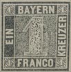
 Issue of 1849. 1 Kreuzer, black.
There are two plates of this stamp. In the first plate the blocks were made of type-metal, in ten rows of nine blocks (Nov., 1849), but this material wore away rapidly; so in September, 1850, a new plate was made, which was in two panes, of 45 brass blocks in each pane. Specimens from this latter plate may be distinguished from plate 1 by the greater sharpness of the impression and clearness of the design. Westoby says that only 2,000 sheets were printed from plate 2. In the catalogs this stamp used to be listed with and without a silk thread in the substance of the paper; but those with the thread are simply proofs, and were not issued to the public.
Genuine
Engraved in épargne, in grayish-black and black, on stout, yellowish- white wove paper. The stamp measures 20 x 20 mm. from outside to outside ; and the central square 12 1/2 x 12 1/2 mm., measuring from black label to black label. The word EIN is 4 1/2 mm. long, and the top and middle tongues of the E are of equal length, while the lowest limb is decidedly longer. The BAYERN label is 12 mm. wide, and the bottom limb of the E is very much longer than the others, the central tongue being the shortest. The word KREUZER is 11 1/2 mm. long, and the two E’s are exactly alike. The word FRANCO is 10J mm. long, the tongue of the F is much shorter than the top limb, and the distance between the head and tail of the C is decidedly less than 1/2 mm. The little numerals in the corner-squares are nicely done; the one in the right top corner has not the strong vertical line of shading at the back that the others have. These numerals are placed on a ground of alternate white and black lozenges, running obliquely down from the left top to the right bottom corner of the little containing-squares. This pattern is part of the arms of Bavaria, being a reproduction of the “shield of pretense,” or little shield, in the center of the large shield of Bavaria. There is no straight outline round any portion of the central square of maze-work, except just at the bottom of the left side. The large central numeral is equidistant between the BAYERN and FRANCO labels, and some of the maze- work can be seen both above and below the numeral. The numeral itself is filled, not with maze work like the background, but with a floriated pattern of conventional leafage, with two distinct, eight-petalled white flowers near the base, to right and left of the branch which bears them. This numeral is not at all prominent, showing more white than black. The white lines separating the various labels from each other are all of the same width.
First Forgery
Lithographed, on thick, hard, yellowish-white wove paper. The stamp is too small; from outside to outside it measures 19 1/2 x 19 1/2 mm., and the central square 12 1/8 x 12 1/8 mm. The word EIN is almost 5 mm. long, the central tongue is shorter than the upper limb, and the said upper limb is decidedly thinner than the others. The BAYERN label is mm. long, and the B is too thin, while the central tongue of the E is very nearly the same length as the top limb. The word KREUZER is 10 1/2 mm. long long, being a good deal too short. The word FRANCO is the same size as the genuine, but the tongue of the F is the same length as the top limb, instead of being much shorter ; the head and tail of the C are more than 1/2 mm. apart. The corner-numerals, in the genuine, are as wide as the width of the I of EIN; but in this forgery they are thinner, especially the one in the right top corner. The one in the left top corner is not in the center of the square. A few of the lozenges in the squares are dark, but they are very badly done, and irregular, instead of being alternately black and white. There is a thin outline along the top and bottom of the maze-work square, and two outlines are visible down the right side of it. The central numeral is much nearer to BAYERN than to FRANCO. The numeral itself is very dark, much darker than either the genuine or any other forgery. There seems to be an attempt at a six-pointed flower, but it is extremely indistinct. The white lines separating the various labels, are very faulty. Those before and after KREUZER are most like the genuine; but those before and after BAYERN are far too thick; the one before EIN is slanting down to the left; the one before FRANCO is too wide; the one after FRANCO slants to the right, and is broader at the top than the bottom. The maze-work, in this forgery is very much too coarse. The dark, central figure is the easiest test for this counterfeit.
Second Forgery
Lithographed, on thick, hard, yellowish-white wove paper. The stamp measures 20 x 20 mm., like the genuine, but the central square, between the EIN label and the KREUZER label, is only a shade over 12 mm. In the word EIN, the top and bottom tongues are equal, and the centre one shorter. The BAYERN label is only 11 1/2 mm. wide, and the top and bottom tongues are also equal. The word KREUZER is 11 mm. long; P’RANCO is just a shade over 10 mm. long; the tongue of the F is very nearly as long as the top limb, and the two ends of the C are nearly 1 mm. apart. The small numerals in the corner-squares are better done than in the first forgery, but the one in the left top corner is not in the center of the square, and the groundwork of the squares is of white lozenges, instead of alternately black and white ones. There is an irregular outline down the left side of the central square of maze-work, and it is also partly outlined along the bottom. The central numeral is nearer to the BAYERN label than to the FRANCO label; none of the maze-work shows above the numeral, and only a sort of double, wavy line below it. There are no flowers in the numeral, and it is a good deal blacker than the genuine, though not so much as the first forgery. The white line before EIN is much broader than any of the others.
Third Forgery
Lithographed, on stout, yellowish-white wove paper. The stamp is distinctly smaller than the genuine, measuring 19 3/4 x 19 3/4 and 12 1/8 x 12 1/8 mm. The middle tongue of the E of EIN is much shorter than the top or bottom limb. The BAYERN label is a little over 11 3/4 mm. wide; the top and bottom limbs of the E of that word are equal, and the central tongue very short. The word KREUZER is 11 1/4 mm. long. The distance between the head and tail of the C is more than 1/2 mm. The small numerals in the corner-squares, on the left side of the stamp, are not truly in the centers of the squares, being placed too much to the right. The background to each of the four squares is of white lozenges. The large central numeral is nearer to the BAYERN label than to FRANCO. The left-hand flower in the numeral may be partly made out, but not the other.
Fourth Forgery
Lithographed, on fairly stout, yellowish-white wove paper. The word EIN is only about 4 1/4 mm. long. The E, in my single specimen, is heavily postmarked, so that I cannot say whether the top and central tongues are of equal length. The BAYERN label is 11 3/4 mm. wide. KREUZER is 11 1/4 mm. long. The distance between the head and tail of the C of FRANCO is rather more than 1/2 mm. The numeral in the left top corner has its base and right side more heavily shaded even than the genuine; but the left side has hardly any outline. The numeral in the left bottom corner leans slightly over to the left, instead of being upright. The groundwork of these corner squares shows parts of one or two of the diamonds dark. The two flowers in the large central numeral are fairly well done. I am sorry that the postmark prevents my giving a more accurate description of this forgery.
Fifth Forgery
In some respects, this is decidedly the best of all the counterfeits. Lithographed, on medium, yellowish-white wove paper. My specimen has “COUNTERFEIT” stamped diagonally across the back, in tall, sans-serif, green letters. The stamp measures 19 1/2 x 19 1/2 mm. The bottom limb of the E of EIN is hardly any longer than the top limb. The bottom half of the B of BAYERN is very little larger than the top half, though it is sensibly larger in the genuine. The shaft of the Y has got a twist to the left at the bottom, instead of being perfectly straight. The word KREUZER is 11 1/4 mm. long, and the lower limb of the first E is longer than that of the second E. A good test for this forgery is the z of KREUZER, the head of the letter being absurdly short. In the genuine, the top of the Z is very nearly 1 1/2 mm. wide; in this forgery it is about 1 1/4 mm. The groundwork of the corner-squares has the black parts exaggerated. In the genuine, the square in the right top corner shows parts of 13 white lozenges; and the square in the right bottom corner also shows parts of 13. In this forgery, the upper square shows parts of 9 white lozenges, and the lower square shows parts of 4 long lozenges. Thus the general appearance of the left lower square is that of white marks on a black ground, instead of alternately white and black. The large central numeral is about 1 1/4 mm. from the BAYERN label, and 1 mm. from the FRANCO label. The two flowers in the numeral are very well imitated.
Sixth Forgery
Lithographed, on thick, yellowish-white wove paper. The stamp measures 20 X 19 3/4 mm., and the central square 12 1/8 x 12 1/8 mm. The word EIN is hardly 4 1/2 mm. long : the bottom limb of the E is the same length as the top limb; the central tongue is covered by the postmark, so that I cannot say anything about its length. The BAYERN label is nearly 12 mm. long, and the E of that word (an easy test) has all three limbs exactly the same length, KREUZER is 11 1/4 mm. long. The ends of the C of FRANCO are 3/4 mm. apart. The small numeral in the left lower corner is set a little too low, and a little too far to the right. There are portions of 10 white lozenges, instead of 13, in the left top square; portions of 9 white lozenges, instead of 13, in the left lower square; and portions of 8, instead of about 12, in the right lower square. The flowers in the central numeral are well copied.
Postmarks
Genuine.—14, 15, 29 (rare). I have also seen something like 1, but with very much larger letters.
First Forgery.—Uncancelled.
Second Forgery.—Apparently a portion of 54.
Third Forgery.—14. The numeral in the center of my specimen is 317.
Fourth Forgery.—14, with numeral 295 in the center.
Fifth Forgery.—Uncancelled ; also 15 with B. P. in the center.
Sixth Forgery—14, with numeral 20 or 40 in the center.
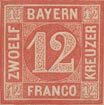
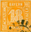 Issue of 1854-58. 12 Kreuzer, red; 18 Kreuzer, yellow.
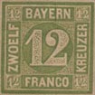
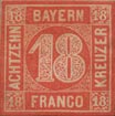 Issue of 1862. 12 Kreuzer, green; 18 Kreuzer, red.
Genuine
Engraved in épargne, on moderately stout, and on much thinner, very rough, white wove paper, with a silk thread in the substance of the paper, running vertically downwards. The lettering is very clear and square-cut.
Forged
Poorly lithographed, on rather thin, smooth, white wove paper; no silk thread. The lettering is ragged and blotchy, the ends of most of the letters being’ rounded, instead of cut off squarely. The absence of the silk thread is such an easy test that I have not troubled to dissect the design. The 18 kreuzer of 1854 is, in this forgery, a sort of brownish ochre, instead of yellow.
Postmarks
Genuine.—14, 15, 29.
Forged.—14; also a blotch. Also 29, with name spelt “Munich.” The German name is, of course, ” Munchen.”
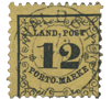
Postage Due.
 Issue of 1862. 3 Kreuzer, black.
Genuine
I have only two specimens from which to make my description, but the reader will bear in mind that, as the stamps are tvpe-set, there will doubtless be many small variations in the setting. They are typographed, in black, on medium, very rough, white, or more generally, yellowish- white wove paper, with a silk thread horizontally in the substance of the paper. The Y of BAYER. has a distinct tail, and there is a round stop after that word, and a similar one after POSTTAXE. The G of EMPFANGER is the usual small (or “lower-case”) German G. The L of ZAHLBAR is almost under the first stroke of the M of EMPFANGER (just a shade to the left), and the left top corner of the R is under the F. The middle tongue of the large central “3,” sticks out level with the centers of the balls which form the head and tail of the numeral. The top horizontal line of the frame round the said “3,” if prolonged to the left, would pass far above the R of the left-hand KREUZER; and if prolonged to the right, it would cut into the ball of the tail of the right-hand “3.” The vertical, right outline of this frame, if prolonged upwards, would cut exactly centrally through the X of POSTTAXE; and if prolonged downwards, it would cut centrally through the G of EMPFANGER. The vertical, left side of this frame, if prolonged upwards, would touch the left side of the A of BAYER.; and if prolonged downwards, it would just touch the right side of the O of VOM. Each Z of the various inscriptions has a loop for its tail, which comes up and joins the centre of the body of the letter. At the outer corners of the stamp, outside everything, are four black diamonds, of equal size and shape.
First Forgery
Lithographed, on rather stout, very hard, somewhat rough, very white wove paper; no silk thread. In my single specimen, which is the only one I have ever met with, the Y of BAYER. has no tail, so that it reads BANER. There is a black blotch just over the head of the P of POSTTAXE , and the stop after that word is exceedingly small and faint, almost invisible, and very much smaller than the stop after BAYER. The G of EMPFANGER is a very distinct numeral “9.” The middle tongue of the large central “3” is too short, and does not reach out level with the centres of the balls which form the head and tail. In the frame round this central “3” the top line, if prolonged to the left, would just graze the R of the left-hand KREUZER. The right side of the said frame, if prolonged upwards, would pass between the letters AX of POSTTAXE, and, if prolonged downwards, it would pass between the letters NG of EMPFANGER. The left side of the said frame, if prolonged upwards, would cut centrally through the A of BAYER, and, if prolonged downwards, it would cut centrally through the O of VOM. The outside corner-ornaments are all of different shapes and sizes, the one in the right top corner being most like the diamond of the genuine.
Second Forgery
This is new to me (1902). Apparently typographed, on white wove paper; no silk thread. The L of ZAHLBAR is exactly under the middle stroke of the M of EMPFANGER, and the R is under the A. The top line of the central frame, if prolonged to the left, would pass very close to the R of KREUZER, and if prolonged to the right, it would pass clear above the right-hand “3.” The right side of this inner frame, if pro- longed upwards, would pass very nearly clear to the left of the x of POSTTAXE; and if prolonged downwards, it would just graze the left side of the G of EMPFANGER. The left side of the frame, if prolonged upwards, would cut almost centrally through the A of BAYER; and if prolonged downwards, it would cut through the centre of the O of VOM. The z of each KREUZER looks somewhat like an elongated “3,” as there is no loop to the tail; while the Z of ZAHLBAR has a loop, which does not merely join the center of the letter, but passes through it, and sticks out at the back. This is a very much better forgery than the first, and is likely to deceive; though, of course, the absence of the silk thread is an easy test.
Third Forgery
This is the best counterfeit that I have seen of this particular stamp. Typographed, on rough, yellowish-white wove paper, rather hard; no silk thread. The stops after BAYER. and POSTTAXE are not round, but of a sort of diamond-shape. The G of EMPFANGER is not a German G, but is like a numeral “9.” One L of ZAHLBAR is exactly under the first stroke of the M of EMPFANGER, and the F of this latter word, if prolonged downwards, would pass to the right of the centre of the R of ZAHLBAR. The bottom of the F is very blunt, though it is very sharply pointed in the genuine. The tongue of the large central “3” has a smoothly rounded point, while it is cut off nearly square in the genuine. The top line of the central frame, if prolonged to the left, would just graze the R of the left-hand KREUZER; and if prolonged to the right, it would pass high above the right-hand “3.” The right outline of the frame, if prolonged upwards, would just graze the left bottom corner of the x of POSTTAXE: and if prolonged downwards, it would graze the left side of the G of EMPFANGER. The left side of this inner frame, if prolonged upwards, would cut centrally through the A of BAYER; and if prolonged downwards, it would cut centrally through the O of VOM. The letters HLB of ZAHLBAR are all of the same height in the genuine, but, in this forgery, the H is the shortest, and the B is the longest. The central frame is in one piece; but in the genuine it is evidently broken at all the four corners. The four thin, inner outlines of the outer frame of the stamp touch the corner- ornaments, but none of them touch in the genuine.
Fourth Forgery
Typographed, on yellowish-white wove paper, smoother than the genuine; no silk thread. The type of which the inscriptions are made is battered, and has evidently seen much service. The Y of BAYER has a very long tail, which reaches to below the end of the A. In the genuine, the tail ends below the middle of the Y itself. The stop after the word is very shapeless. The accent on the A of EMPFANGER consists of two dots in the genuine ; but in this forgery it is like two grave accents (“). The word ZAHLBAR is spelt ZABLBAR, and the first B is much shorter than the second. The R of this word is under the A. The frame round the central “3” is not square, as the top piece slopes down to the right. If prolonged to the left, this top piece would cut well into the tail of the R of the left-hand KREUZER ; and if prolonged to the right, it would cut almost into the centre of the right-hand “3.” The right side of this frame, if prolonged upwards, would just graze the left side of the X of POSTTAXE. The left side of the frame, if prolonged down- wards, would pass between the letters OM of VOM. There is no loop to the tail of the z in either KREUZER. The tail of the z of ZAHLBAR curls up, but does not form a closed loop. There is a distinct hyphen, instead of a stop, after this word. The thin, inner outlines of the outer frame of the stamp all touch the inner corner-ornaments, except in the right top corner. The black diamond in the right top corner, outside the stamp, is not like the rest, as half of it has apparently been cut away.
Postmarks
Genuine.—I have never seen this stamp cancelled.
First Forgery.—14, apparently lithographed at the same time as the stamp, instead of being hand-struck.
Second Forgery.—14.
Third Forgery.—My specimen is uncancelled.
Fourth Forgery.—My specimen of this also is uncancelled.
NOTE.—I have seen no forgeries of the issue of 1870, perforated 11 1/2, but my readers will please recollect that the genuine 1 kreuzer and 3 kreuzer of this issue are on paper watermarked with lozenges.
Returned Letter Labels.
I have met with some counterfeits of these; but, as the originals are not postage stamps in any sense of the word, they are not worth describing, although specimens, genuine or otherwise, from the various offices of Augsburg, Bamberg, München, Nürnburg, Regensburg, Speyer, and Wiirzburg may be found in many collections. These “stamps” were simply used to seal up returned letters, after they had been opened to ascertain the name and address of the writer. I fancy the reason why these labels got into the old albums was from a mistaken idea that the legend on them, “Commission für Retourbriefe,” signified a commission (or tax) on returned letters, whereas the “Commission” simply referred to the officials or department charged with the duty of opening and returning dead letters.
Specimen Stamps.
Of these I must say a few words, as the stamps are so very often found in albums, and various legends are related concerning them. They are the stamps of the numeral series, of the same design as the postals, but printed in black, on colored paper. When the stamps were distributed to the post offices, each packet of 50 sheets had a wrapper round it, and on the wrapper (which was colored like the particular value on the sheets) was struck in black a copy of the stamp. There would therefore be no need for any official to open a packet, to see what was the value of the sheets, and doubtless the stamps saved a good deal of trouble. I fancy many collectors believe that these stamps were used in the same way as the “specimens,” sent to post offices in England by the authorities, whenever new types were issued; but, as will be seen from what I have said, this was not the case, although I have called them “specimen stamps ” for convenience’ sake.
From: ‘Album Weeds’, 3rd edition by R. B. Eareé. 1906
 For more information about the issues of Bayern, see —> Emil Minaar’s exhibition
See also –> Spud Papers – Bayern (Bavaria)
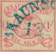
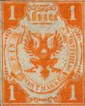
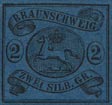
 1852. 1 S.GR. Rose, 2 S.GR. Blue and 3 S.GR. Vermilion – on White Paper.
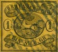
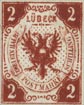
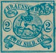
 1 S.GR. Yellow, 2 S.GR. Blue and 3 S.GR. Rose – Coloured paper.
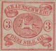 3 S.GR. Rose – White paper.
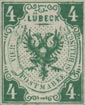
 1865. 1 S.GR. Yellow – White paper.
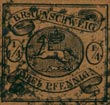 1/4 S.GR (Drei Pfennig).
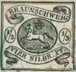 1/3 S.GR. (Vier Silbr. Pf).
 1/2 S.GR. (Fünf Pfennig)