Spud Papers – Heligoland

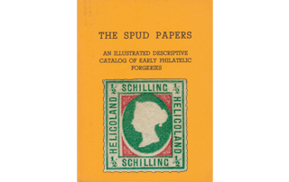
The stamps of this island being pretty, have naturally had a large sale among juvenile collectors; so, in copying these stamps, the forgers have expended some trouble, and as the fruits of their labors, we get some deceptive-looking articles. In each value, both of the genuine and imitation respectively, the centers seem to be from one matrix. The corner ornaments are smaller in the originals than in the counterfeits.

Spud_Heligoland11/2 Schilling.

Genuine

The upper line of central frame is level with the bottom curl of the 2 in left-hand top corner. All the lettering is fine and even.

Forged

The center of the figure 2 in left upper corner is on a level with the top line of inner frame. Letters in the repeated word SCHILLING are rather thick, and slightly uneven.

Spud_Heligoland21 Schilling.

Genuine

Bottom stroke of 1 is a shade above the outer line of central frame in both upper angles. In the lower left corner the 1 is at some distance from the inner rectangle.

Forged

Bottom stroke of 1 in both upper angles is on a level with the outer line of central frame. The figure in lower left corner almost touches the angle of inner frame. Lettering as in the 1/2 Schilling.

Spud_Heligoland42 Schilling.

Genuine

All the figures are uniform, and in the center of the squares containing them. There is the same distance between the labels and the outer line upon the left side as upon the right.

Forged

The figures in the lower corners are nearer to the side labels than to the outer line. The inscribed label on the left side is farther from the frame than the one upon the right.

Spud_Heligoland36 Schilling.

The genuine resembles the 2 Schilling in details, as the forgery of that value is like the forgery of this. It may be mentioned as an additional test, that, in the counterfeit, the 6 in the lower left-hand corner almost touches the inscribed label, and that all the figures are too short.


From “The Spud Papers” by Atless, Pemberton & Earée, 1871-1881.

Spud Papers – Orange Free State

Spud_OrangeFreeState1Spud_OrangeFreeState2Spud_OrangeFreeState3One Penny, Six Pence and One Schilling.

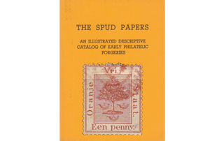
All the values, both of the genuine and counterfeit, are from one matrix respectively. In the forgery, the tree has a whity washed-out look, and the “bullets” thereon are very distinctly visible. Otherwise, this is a very good imitation. It is difficult to seize upon any salient point, whereby to give a written test for its detection; but as the forgery itself is here given, it will suffice to say that the original is very finely engraved, and upon the usual glace paper adopted by De La Rue & Co., in both of which instances the forgery decidedly differs. The genuine is clearly perforated with thirteen dents above; but the counterfeits are badly perforated.

1868. 1d., 6d. & 1s.

These forgeries are remarkably well copied; and I can assure our readers that I have found great difficulty in picking out any very salient points of difference between them and the genuine. The penny, especially, would pass muster very well, at a little distance; and will, I fancy, be the means of directing much coin from the pockets of our innocent young friends into the not too clean hands of Messrs. Spiro and their wholesale customers.

Genuine

Engraved in épargne, on thin white wove, slightly surfaced paper; perf. 14. There are 79 horizontal lines in the central portion, and there is nearly room for another line at the bottom. The top of the tree touches the top line of the background, but does not go above it. The loops by which the post-horns are suspended, are large enough to allow one of the lines of the background to be seen through them in every case. Near the thick end of each horn, there are two thin lines, as though something were bound round it; and a very little further off (i.e., where the cord is tied to the thick end) there are three similar lines on each horn. The knot in the center of the trunk of the tree, where a branch has been lopped off, occupies a space bounded by three of the horizontal lines. The N and j of ORANJE do not touch each other. The stop after STAAT is large.

Forgery

Lithographed, on unsurfaced white wove paper, rather thick; perf. 12 and 12 1/2. There are only 74 horizontal lines in the background, and they come close up to the inner frame at both top and bottom, leaving no room for the addition of another line. The top of the orange-tree goes a little beyond the top line of the groundwork, and touches the inner border of the frame under the curl of the R in VRIJ. The loops of the posthorns are very small, and the left hand one is the only one which allows a line of the background to be seen through it. Near the thick end of the horns only four lines can be seen, instead of five, running round the body of the horns. The knot in the trunk of the tree is larger than in the genuine; and occupies a space bounded by four of the horizontal lines. The tails of the N and J in ORANJE touch each other. The stop after STAAT is very small, merely a tiny dot; and the lettering is all rather thinner than in the genuine. Printed in sheets of 25, 5 x 5 , and postmarked with the old Spanish “gridiron.”

I fancy that, in the originals, the 1d. and 1 /. are of a different type from the 6d., but the difference is so very slight as to be hardly worth mentioning.


From “The Spud Papers” by Atless, Pemberton & Earée, 1871-1881.

Spud Papers – New Granada

The originals of the forgeries that we shall now consider, are usually denominated the 1861 issue, and until recently the correctness of this date has not been seriously questioned. In the September number of the American Journal of Philately a writer who has evidently carefully studied his subject, argues that 1858 is the real date of their appearance, thereby making them the earliest stamps of this state. Although we do not agree with the writer in question, still we consider his opinion worthy of record. He is supported in his views by Bellars and Davie, but we cannot look on those compilers as authorities.

All the genuine are from one matrix, with the lower inscription only varying.

The following are the only authentic colours:

  • 2 i 1/2 centavos, black.
  • 5 centavos, pale yellow, buff
  • 
10 centavos, deep blue, light blue
  • 20 centavos, dull vermilion-red
  • 
1 Peso, rose

In the lowest value the conjunction i is used; and this letter standing for and, has until lately been quite overlooked in all the catalogs.

The stone of the 2 i 1/2 C. was evidently altered to make the pesos; for in very clear copies of the latter, portions of the 2, the dot above the 1, and the upper half of the fraction, with trace of the S of CENTAVOS can be discerned. All of this series have been reprinted, and in the 2 i 1/2 C. and 20 C. the figures have been remade. Dr Magnus gives the following test: “The head of the figure 2 on the 2 i 1/2 C. inclines more to the inner line of the oval frame or band in the original, and more to the outer line in the reprint. On the reprint 20 c. the figure 2 is awry, and its head is bent towards the left.”

We will now describe the counterfeits, all of which were produced from one original drawing, with the lettering below, of course, altered.

1865. “Sobre Porte”. 25 & 50 Centavos.

I have not seen a forgery of the 1 peso, but it is very probable that that value has been imitated, as well as the others. All the values are unlike in design, each one entirely different from the rest; and collectors will do well to remember this, as it will save trouble, and prevent their being imposed upon by falsities.


25 C. Genuine

Lithographed in black, on dull blue paper, wove and rather thick. All the lettering very coarse and clumsy. The frame is broken under the letter N of CENTS. The 2 is not nearly so tall as the 5. The condor is very dark; it has a white patch on the cheek, the eye is plainly visible, and the left wing extends some distance under the R of PORTE. The cannons are thick black smudges, and the wheel on the carriage of the right-hand one is scarcely visible. The horizontal lines of background are very much interrupted, not one of them going right across without a break. The appearance is as though they had not taken up the ink properly. Below TS of CENTS, outside the border, there is a little spot. The words and figures appear to have been printed by types, after the rest of the stamp, but I will not be positive about this.

Forged

Lithographed on paper a little thinner than the genuine. The lettering is very thin, and much more elegant than in the originals. There is no break in the frame. The 2 is as tall as the 5. The condor is not very darkly shaded, there is no white patch on the cheek, no eye, the head and neck are equally shaded all over, there is a broad white collar round the neck where it joins the body, and the left wing is cut short just before it reaches the R of PORTE. The cannons are very lightly shaded, and both wheels are very plain. The horizontal lines of back- ground mostly run across without a break. There is no spot outside the border line. This forgery looks much more genuine than the originals!

50 C. Genuine

I need not spend much time over this stamp. It differs totally from the 25 c., is very boldly drawn, and is enclosed in octagonal frame.

Forged

The artist has made a grand mistake here, and has copied the 50 C. from the design of the 25 C., with only a few minor variations, emanating evidently from his own brain. The octagonal frame is, of course, entirely absent.

1865. 1 Peso, Red.

Genuine

Lithographed on thin, bluish-white wove paper. The top compartment of the shield bears seven horizontal lines of shading. The middle compartment contains a cap of Liberty, very distinct, with the tail tailing over to the left-hand side, and shaded with oblique lines. The lowest compartment, of the shield contains an isthmus, with a ship (or mark to represent one) in each sea, both above and below the isthmus. The bird above the shield is a condor, and it has a ring of feathers at the base of the neck. The neck is rather thin, and swan-like; the eye is very small and round. There is a row of white pearls, of tolerably uniform size and shape, all round the central oval, and none of the pearls are missing. Nine eight-pointed stars or asterisks are outside the pearls, all of them pretty distinct and regular. There is a stop after E and U and COLOMBIA, but none after any of the other parts of the inscription. All the lettering is distinct and easy to read. There are two small, crossed white branches at the bottom of the colored oval band; each branch has seven leaves. The centre tongue of the E of PESO projects so far as to be almost level with the top and bottom strokes of the letter. The white space inside the O of PESO is perfectly square, and the stop after this word is very much nearer to the end of the label than to the O. The postmark is usually a written word, or other obliteration in pen-and-ink; but occasionally the stamp is cancelled with an oval, containing the name of town in large capitals.

Forged

Lithographed on rather thick, white wove paper. The top compartment of the shield is so blotched that only one or two lines can be seen. The thing in the middle compartment is a hopeless-looking blotch, which nobody could fashion into a cap of Liberty. The upper sea of the isthmus in the lowest compartment of the shield has no ship or mark to represent one, and the ship in the lower sea is a large, coarse blot, extending light across the sea. The bird above the shield is of an unknown species; it has no ring of feathers round the base of its neck; the eye is very large, and triangular, and there is a dark line running down the middle of the neck, which is not to be seen in the genuine. The row of pearls is very indistinct round the central oval, and the pearls, are very small, and many of them are missing out of the row. There are nine very blotchy-looking asterisks in the colored oval band, but the points of most of them cannot be counted, and the others vary from five upwards. There is a stop after the E., but no stop after the U, and no stop after COLOMBIA; but there is an abnormal stop below the S of NACIONALES. The E of E. U., &c., is so badly formed that it is like an L; and the U is either like an L also, or like a sort of rectangle, according as it is more or less distinctly printed. The E of DE has no central tongue or projection. At the bottom of the colored oval there are two white blotches, but they are not in the least like the distinct, crossed branches of the genuine. The centre tongue of the E of PESO is ridiculously short and thick, not being anything like level with the top and bottom strokes. The white space inside the o of this word is distinctly oval, and the stop is close to the O. The postmark is the oval formed by four straight parallel lines at top and bottom, and five curved parallel lines each side; the same as on one of the forged Japanese described in the present article.

Spud_NewGranada32 i 1/2, 5, 10, 20 Centavos, and 1 Peso.

Genuine

Nine stars in oval; T in ESTADOS has a short head-stroke.

Spandrils not very clearly done. A good glass (which every collector should possess) will show thirteen lines in the upper left-angle, and twelve in the right; below, fifteen on left side, and thirteen on right, O of CORREOS is too large, and is very close to the angle of inner frame; both the horizontal and perpendicular outer-lines of which would, if continued, go through the side and bottom of the letter respectively. The S of CORREOS, and c of the following word, are narrower and more upright than the other letters. The inscribed oval breaks into the frame below, and at the right side; also, less distinctly, but still very apparent, upon the left.

The lowest value inscribed 2 i Centavos, and the highest 1 Peso.

Forgeries

Eight stars in oval band, T of ESTADOS with long headline extending farther upon the right side than on the left. Spandrils with lines wide apart and distinct; in lower right angle ten lines, in each of the others, thirteen. The lettering of CORREOS NACIONALES thin and elongated throughout, o of the first-named word does not project beyond the level of either the perpendicular or horizontal lines of inner frame. Central inscribed band projects considerably into the outer frame upon the right side and base, but the arc is scarcely visible upon the left.
 The highest value is lettered 1 Peso, and the lowest 2 1/2 Centavos.

1871. 1 Centavo, Green.

Genuine

There is a good deal of variety, both in colour and mode of printing, in the stamps of this issue. The earliest impressions are very well executed, in dark olive-green, somewhat dull and chalky; and the smallest details of the design are brought out clearly. In the later impressions the colour is paler, the green having a slightly yellowish tint, and very dull and chalky. The stamps are on white wove paper, very similar to that of our own newspaper wrappers, but not so soft. The cap of liberty in the fess in the centre of the shield is on a short pole, which can be seen through the cap. (This is very evident in the earliest impressions.) Beneath the fess is a three-masted vessel, sailing to the left; and at the bottom of the shield is a tiny lighthouse, with an equally tiny boat rowing obliquely past it.

Forged

Lithographed, on poor-looking wove paper. Very dull greyish-green, varying from pale to dark. There is a flaw in the line immediately over the top of the S in nacionales, making a white spot which joins the s to the line. The cap of liberty is very indistinct; and there is not the slightest trace of a pole to support it. The thing intended to represent the sailing-vessel is a mere blotch, resembling a one-horse omnibus more than anything else. Below is a single blotch, instead of the lighthouse and boat. Postmarked with parallel bars, forming a circle. Printed in sheets of 25 each.

1872, 2 Centavos, brown.

Genuine

There are two small scrolls across the top containing the motto of the Republic; LIBERTAD in the left-hand scroll, ORDEN in the right. These words can easily be read, and will serve as a good test. In the bottom corners there is a figure 2, with a dot before, after, and beneath it, (• 2 •). The spears bearing the flags are very distinct, and one third of the left-hand flag (the 1/3 nearest the pole) is covered with little dots. These dots signify in heraldry, that the part covered with them is to be gold.

Forged

RTAD in left top corner totally unreadable. ORDEN in right top corner becomes ORGIA. NO dot after 2 in the left bottom corner, and none either before, or after in right. The inscription reads EF. UU, instead of EE. UU. Staff of spear formed of a single line instead of two, and the part of left-hand flag nearest to pole is left quite white. Postmarked with rough blotches, forming a rude rectangle the size of the stamp. Printed in sheets of 25 each.

1870 , 2 1/2 Centavos, Reddish Violet.

Genuine

This stamp is very clearly printed in black, on coloured paper. The figure 2 in 2 1/2 has a solid top with dot in center. The solid label bearing the inscription is divided into three parts by faint lines, one of which is under the CO of CORREOS, another under S of NALES, and the third under the S of CENTS. Both limbs of the UU are of equal thickness.

Forged

Lithographed, and most dreadfully smudged. Much darker in colour than the genuine. No line under CO of CORREOS, and the other two lines only just distinguishable. The 2 of has a curled head. In the UU, the right-hand limbs are hair strokes. Postmarked with an enormous O inscribed with BOGOTA in large thick capitals. None of these stamps are gummed, though of course this is not a crucial test, because this defect could be supplied in an instant by anyone. The reader will notice that we have not attempted to describe the whole of the design, but simply those parts which differ in the originals and the forgeries.


From “The Spud Papers” by Atless, Pemberton & Earée, 1871-1881.


Spud Papers – La Guaira

Of the stamps issued in 1864, there were two designs, one engraved in this country, with the value expressed in reales, and used for the franking of letters from La Guaira to St. Thomas; the other, with value in centavos, was of native make, and freed letters and papers between St. Thomas and the ports of Venezuela.

1,2, 3, and 4 Centavos.

Genuine

Not badly engraved, and with linear ground straight and regular. Sixteen lines from the top to shading representing waves, and right hand mast of vessel going through the fifth line. Ornaments clearly shown, and period following each word.

Forged

The whole execution is wretched, the lined background being more or less broken and irregular throughout; the masts of the steamer are taller than in the genuine, and the right hand one touches the third line. The ornaments in the upper angles, and at base of the central rectangle, are shapeless and smudged. There is no stop either after PACKET or CABELLO.

1864. 3 C., Black on Yellow.

There have been several forgeries of the stamps of this series, but this 3 C. seems to belong to a new set of forgeries; at all events, I have never met with it before, and it is quite distinct from the two sets of forgeries which I described in The Philatelical Journal, and again in The Stamp-Collector’s Magazine, vol. XI., pp. 73. 74. In some respects it is better than either of the above-named forgeries, but I do not think I should call it a dangerous forgery.

Genuine

Lithographed, in rather oily-looking black ink, on dull yellow paper; imperf. The outline of the stamp is formed of one thin black line. There is a large dot under T of ST., another after GUAIRA, and another after CABELLO. There is a very tiny flag on the mainmast of the steamer. The masts are very nearly the same height, and neither of them comes near the top of the containing rectangle. The 3 has an extra outline on the right side. The scroll containing CENTAVO is very plainly discernible, and is rounded at both ends. The stop after CENTAVO is on the outline of the scroll, and the letters (all except the C) are joined together, top and bottom, by thin lines following the curve of the scroll. There is a small oblong ornament under NTA of CENTAVO. The smoke of the vessel does not reach the edge of the frame. The horizontal lines in the background are very clear, and are drawn at regular distances from each other.

Forgery

Lithographed, in jet-black ink, on bright yellow paper; imperf. There are two distinct forgeries on the same sheet. The first has the horizontal lines in the background very clearly drawn, and the L of LA is only half its proper height. In the other the horizontal lines of the background are badly done, especially behind the 3; and the L of LA is the same height as the A. The following description will apply to both, unless otherwise specified. The outline of the stamp is formed of two thin lines, which run together on the right side,
forming one thick line. No. 2 forgery has a very tiny dot under T of ST. In most copies there is no stop at all after GUAIRA and CABELLO; but if there is a stop after the one, it is not visible after the other; so that those copies which have a stop after GUAIRA, have none after CABELLO, and vice versa. There is a very distinct flag on each mast. The main-mast is very much higher than the fore-mast, and touches the inside of the frame, almost under A of GUAIRA. The 3 is an ordinary figure. The scroll containing CENTAVO is very badly drawn, especially in No. 2 forgery, and the right end is not rounded off. The stop after CENTAVO is inside the scroll. The letters of CENTAVO are not joined together. There is no oblong ornament under the NTA of CENTAVO. The smoke of the vessel touches the inside of the frame, opposite the S of THOMAS. These forgeries are not postmarked.

Spud_LaGuaira5Spud_LaGuaira6Medio and Dos Reales.

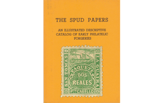
Of the genuine there are two dies, varying chiefly in the corner numerals, and in the portion containing ship. The earliest were those with small figures, and considerable shading over the steamer; these were always with small perforations. When the large serpentine denticulation was adopted, the second die was introduced, and in it we find no shading above the vessel, and larger figures in the angles.

The forgeries are copies of the first die, and are either imperforate or with dents a little larger than in the genuine piques. The best and most simple mode of testing one of the Spiro-made La Guaira of this type, is to compare it with the specimen here given, for both values of it are from one matrix, with merely the number of Reales altered.

As the originals were engraved by Waterlow and Sons, no one should be deceived by such trash as these forgeries.

187O. 1/2 Real, Green.

Genuine

Lithographed (?) on yellowish wove paper; pin-pricked 10, or perf. 13. The outside line of the frame is scalloped all round, with 15 scallops at top and bottom, and 17 down each side. There is a stop after each of the letters J. A. J., and-the horizontal lines of the z are carried beyond the knobs which ought to end them. The scroll containing the value almost touches the frame on each side. There are two ornamental tongues sticking out of the centre of the left side of the body of each J. The steamer’s mizen is set, and can be readily seen.

Forged

Lithographed, on white wove paper; pin-perf. 13. The principal and easiest test is the number of scallops round the frame. There are 16 at top and bottom, and 20 at each side. There is no stop after the last J; the stop after the A. is not very distinct, and the Z is like an ordinary capital z. The ends of the value-scroll are at some distance from the sides of the frame. There is only one ornamental tongue sticking out from the center of each J, making these letters look more like F than J. The steamer’s mizzen-sail is not set, though the gaff (or boom, or whatever it is called) is plainly visible.

Postmarks

The genuine stamps generally bear a double circle blue or black, containing large letters (CORREOS, & C.); and the forgeries have four concentric circles in black, and no lettering. The gum on the genuine is yellow; the forgeries are ungummed.

1870. 2 Reales, Rose.

Genuine

Lithographed (?) on yellowish paper; pin-pricked 10, or perf. 13. The outside of the frame is composed of a scalloped line all the way round. There are 15 scallops at top and bottom, and 17 at each side. There is a stop after each of the letters J. A. J., and the top and bottom of the Z are carried a little beyond the small knobs which usually finish off that letter. The figure 2 in each corner is very short and fat. The scroll containing DOS REALES just touches the inner line of frame, under TO of FTO. There are two ornamental tongues or curves in the center of the left side of each J; the G of GUAIRA is rather like a C; the Q of PAQUETE has a long tail; the letters TO of PTO are nearly as thick as the P, though much smaller.

Forged

Litgraphed, in bright red, on white paper; perf. 13. This forgery may be speedily detected by the number of scallops in the outer line. There are 16 at the top, 15 at the bottom, 19 on the right side, and 21 on the left. There is no stop after the last j; the stop after A is not very distinct, and the z is like an ordinary capital Z. The figures of value in the corners are tall and thin and are not all alike. The value-scroll does not touch the frame anywhere. There is only one ornamental curve or tongue to the left of the center of each j, which makes these letters look more like F than J. The G of GUAIRA is like a G; the Q of PAQUETE has a very short tail.

The letters TO of PTO are very thin and faint.


Postmarks

The genuine stamps are obliterated usually with a double circle (blue or black) containing large lettering (CORREOS), whilst the forgeries are cancelled with four concentric circles in black, and no lettering. The gum on the genuine is yellow, whilst the forgeries are ungummed.


From “The Spud Papers” by Atless, Pemberton & Earée, 1871-1881.

Spud Papers – El Salvador

Each of the genuine stamps of this state has been separately and most carefully engraved, so that forgers must ever find them very difficult to imitate. It is useless wasting space in minutely describing the counterfeits, when they are all so plainly branded with the mark of their own condemnation, as those are which are now under review. In the originals, each of the quartet has its value many times repeated, in very small letters, between the inscribed labels and the central oval. In the shams, this background is shown by a plaid pattern; and the labels themselves are, of course, of poor workmanship.


From “The Spud Papers” by Atless, Pemberton & Earée, 1871-1881.

Spud Papers – Egypt

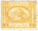
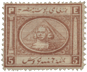
Spud_Egypt11867. Pyramid and Phinx. 5 Paras, yellow.

Genuine

There is a scarcely-perceptible break between the column and capital of the pillar. Places holding numerals oblong, and extending considerably beyond the vertical lines above.

Forged

Egyptian lettering reading 5 Piastres, instead of Paras. A wide break between the capital and column of Pompey’s pillar. The squares with numerals not extending farther than in a line with the white vertical stroke dividing the side devices from the center. The colour is always too reddish.

The Egyptian inscriptions of value upon both of these are correct, as is also the shape of the squares with numeral. The other details are as in the the previously-noted forgeries; but the colour in which the first-named is printed, is nearer to that of the genuine.

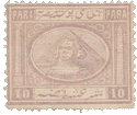
Spud_Egypt210 Paras.

Genuine

The sphinx’s head does not go against the line of pyramid. Very slight division in the pillar; and the central lettering in lower label touches the frame. The 0 in right-hand corner is thin and elongated, that on the left being the thickest.

Forged

Head of sphinx touching the line of pyramid on left-hand side. Pompey’s pillar divided as in the 5 paras. The center of lower inscription does not touch the frame, and the thickest o is the one in right-hand angle.

Spud_Egypt320 Paras, green.

Forged

This forgery partakes of the usual peculiarity of the pillar, and is of equal execution with its fellows. As each value of the originals is printed in blocks of four slightly different dies, it makes it the more difficult to give a good test for the counterfeits; but the easiest and safest course is to look upon their backs, and if the impressed star and crescent is missing, then they may be safely relegated to the “verminbook,” or into the fire.

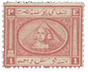
Spud_Egypt41 Piastre, red.

As there is more than one type of the original, it is very difficult to describe Spiro’s well-executed counterfeit. The following is the chief noticeable distinction.

In the genuine, the white line to the left of the upper and lower right-hand angles is always exactly vertical to the stroke at the side of Cleopatra’s needle; in the imitation, the lines by each of the referred-to squares are perceptibly nearer to the side of the stamps than is the longer line.

The colours in which the shams are printed is much too orange.

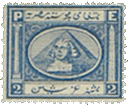
Spud_Egypt52 Piastres, blue.

Genuine

The sphinx’s head touches the line of pyramid on the left side, but not on the right. The whole of the pillar is well-formed, and the “needle” touches the top of frame.

Forged

The head of sphinx touches both the front lines of pyramid, and the whole head is wide and much blurred. The capital of the pillar is shapeless, and upon one side. The remarks concerning the corner squares in the 1 Piastre will apply to this.

Spud_Egypt65 Piastres, brown.

Genuine

Very small head (comparatively), small numbered angles as in forged 5 Paras. All the genuine stamps have a star over crescent pressed upon the reverse after the paper is made.

Forged

Egyptian inscription reading 5 Paras instead of Piastres. It may be noticed here that the forger very stupidly reversed the due order in the two “5” stamps. Head of sphinx large, and extended fully across face of pyramid. Corners containing numerals, oblong, as in genuine 5 Paras.

The Egyptian inscriptions of value upon both of these are correct, as is also the shape of the squares with numeral. The other details are as in the the previously-noted forgeries; but the colour in which the first-named is printed, is nearer to that of the genuine.

Spud_Egypt71872. 5 Piastres, Green.

Genuine

Engraved in épargne, on thick, rough, yellowish paper, perf, 12 1/2, watermarked with crescent and star. All four crescents curved alike, and the top left-hand star is of a perfectly regular shape. The upper tail of each 5 in the right of the stamp almost touches the top outline of the containing oblong. The sphinx has two distinct dabs of shading under her right eye; and her right ear seems to be stuck on all on one side as it were. The outline of the pyramid, on the right-hand side of the stamp, is not perfectly straight, but is very slightly undulating; and the dark-shaded side of the said pyramid roughly represents courses of masonry. The central design does not touch the containing oval, but leaves a space, of equal width, all round it, which shows as a broad white line.

Forged

Lithographed, on thinnish perfectly white paper, pin-pricked 13, rather well done, no watermark. The right bottom crescent is not curved nearly so much as the others; and the top left-hand star is shamefully drawn. None of the upper tails of the 5’s come near to the top outline of their containing oblongs. There is only one long blotch of shading under the right eye of the sphinx; but her right ear is correctly drawn, better than in the genuine. The outline of the pyramid on the right-hand side of the stamp is quite straight; and the dark-shaded side is simply shaded with horizontal, crossed by oblique lines. The central design encroaches too much upon the broad white line above the pyramid, and also below the right shoulder of the sphinx. This, like the last, is a tolerably successful forgery; but the paper is very different, and the absence of watermark will, of course, show its worthlessness at once.


From “The Spud Papers” by Atless, Pemberton & Earée, 1871-1881.


LupSee also


Spud Papers – South African Republic

The only forgeries we have at present seen are the two middle values; but doubtless the penny and shilling are either prepared, or in process of fructification. As they will, in all probability, be from one matrix, it will not be difficult to detect them by our present tests. The genuine threepence is of a later, and different engraving to the other values.

Three Pence.

Genuine

Eagle is well defined, and looks towards the right. The wagon shafts touch the side of shield. The two ends and center of the mottoes riband almost touch the frame; and the lower spearheads quite do so. The inscription and figures are clear and perfect. The colour varies considerably, but has always a strong lilac tone.

Forged

Over the shield is a certain winged thing, the meaning of which may, after the manner of the Delphic oracle, be taken in two ways. If we regard it as an owl, then its head soars towards the left; but if we look upon it in the light of an eagle, we shall find that its beak points towards the right, and that it has a small ventilating tube at the back of its head. The engraver seems to have gone on the showman’s principle of ” you pays your money, and you takes your choice.”The armorial bushranger’s right leg is not so beautifully wooden as in the original, and looks far too natural. The shafts of wagon are immature, and do not touch the line of shield. The ends of the lettered riband do not come within some distance of the frame, and the points of the lowest spear-head at each side do not touch it. The figures in upper angles are badly shaped, and the same may be said of the lettering. The colour is a rich violet, or mauve, with a deep reddish tint.

Six Pence.

Genuine

A lamb-headed eagle, with outstretched pinions. Wagon as in the three penny; riband not so close to the frame, but nearer than in the imitation. Lower right-hand spear-head very nearly goes against the frame; and the dot after Z. same size as the one after AFR.

Forged

The description of the three Penny will apply to this. Both the counterfeits are obliterated by four straight lines struck in black; whereas, the originals are always postmarked with three concentric rings, or else with the date-stamp, sometimes in blue, but more often in black.


From “The Spud Papers” by Atless, Pemberton & Earée, 1871-1881.

Spud Papers – Costa Rica

The stamps of this republic, being finely engraved, offer great difficulty to the forger. The imitations are so coarse, in comparison with the originals, that anyone beyond the merest tyro would at once detect them. There are four values:

  • 1/2 Real
  • 2 Reales
  • 4 Reales
  • 1 Peso.

All the forgeries are from one matrix, after the manner of the genuine. Taking the latter first, we find that the stars are all well-formed; and the groundwork of the stamps is composed of minute lines very close together. The almost triangular space between the smallest vessel and the rocks, is shaded throughout. The utmost point at the central star, is at some distance beneath the ribbon of the wreath, and the tout ensemble of the design is perfect. In the counterfeits, the stars are of various shapes, the back-ground is coarse, the space between the rocks is nearly unshaded, and the point of the middle star goes between the ends of the wreath.

Spud_CostaRica1The 1 Peso was very stupidly imitated, PESEDA having taken the place of the orthodox word.
 It may be as well to mention that, although the genuine real is evidently from the same matrix as its companions, it presents a slight difference, there being a semi-circle of deep shading above the upper label.

In the two highest values, an outer line has been added to the frame.


From “The Spud Papers” by Atless, Pemberton & Earée, 1871-1881.


LupSee also –> Album Weeds – Costa Rica

Spud Papers – Pacific Steam Navigation Company

Pacific Steam Navigation Company

As these stamps had a currency of barely three months (from December 1st, 1857, to the 26th of the following February), original copies are extremely rare, but reprints are easily attainable. The only issued stamps seem to have been as follows:

  • 1 real, blue, on paper blued by the gum
  • 2 real brown, on paper blued by the gum
  • 1 real carmine, on white laid paper
  • 
2 real blue, on white laid paper

The reprints are always upon wove paper. Most of Spiro’s imitations of the 1 real have a strong and disagreeable odour pervading them, due to the oil in which the sheets were steeped for the purpose of giving them the appearance of age.

Spud_PSNC11/2 oz. 1 Real.

Genuine

A magnificently-engraved stamp; all the details showing with clearness, s is joined to the dot following it, and the top of the 1 almost touches the oval.

Forged

There is a clear space between s and the dot following it. The engine-turning is very indistinct, and the shading within the central oval is somewhat coarse. Between the top of the figure 1 and the oval frame is a slight space. The tout etsemble is very poor.

1 oz. 2 Reales.

The forgery of this value is instantly detected the left, instead of to the right, as in the original.


From “The Spud Papers” by Atless, Pemberton & Earée, 1871-1881.

Spud Papers – Phillippines

As these papers are written for the benefit of the inexperienced, we think that as the 5 Cuartos stamps of 1859, 1861, and 1863, only vary in detail, a few remarks concerning them will not be unacceptable in this place.
Although there is considerable difference in the lettering, the simplest plan for our present purpose is to distinguish the issues by their dots. Of the first upon our list, there are four types, which were engraved in quaternary blocks, repeated several times upon the sheet; in these stamps there was no stop after CORREOS. According to Dr. Magnus, both this and the following emission have been reprinted, and in this view the learned doctor is supported by Mr. Overy Taylor (a most careful authority), and by other leading amateurs.

In the second type we have mentioned, CORREOS is followed by a large dot, so as to match the increased size of the inscription. The earliest 1863 issue (with smaller letters), has a single dot after CORREOS, and another, following value.

In the original of the forgery we are about to describe, there are two dots after CORREOS, and one after cs. There was only one die engraved for this, or for the two previously-named types respectively.

1863, Second Type, 5 c.
 From the slight knowledge which most young philatelists possess of the Philippine stamps, the counterfeit here given has doubtless had an extensive sale.

The following are the leading characteristics of the genuine:

  • Letters of inscription small
  • F of FRANCO at some little distance from the side of the label containing it
  • A small stop after cs.
  • Head is not badly engraved
  • The lips are thick
  • The nose slightly retrousse.

1864

The forgeries of this issue have had an extensive circulation through their deceptive appearance. All the values of the genuine, and of the forged, are from one matrix respectively, but the former are lithographed, whilst the originals are engraved.


3 1/8, 6 2/8, 12 4/8 and 25 Cent. PO. FE.

Genuine

There is the slightest depression under the chin. The hair over the ears is waved, with even undulations, and the back hair is clear and shows careful arrangement. The bow and ends of riband are distinct; the latter slant towards the side. Diadem is very distinct, and shows nine pearls and three jewels. Looped oval goes up close to the upper riband. Period before CORREOS rather below the center of the C, and slightly nearer to the end of riband than to the inscription.

Forged

There is a small, but marked depression beneath the Queen’s chin. The hair is waved at the side of the head, and three of the twists (if they may be so called) are wide and prominent; the ends of the riband below the back hair hang straight down, and are close together. The nape of the neck skews a kind of white loop, as thick above as below. The diadem is indistinctly drawn, and the pearls cannot be counted. The loop pattern surrounding the center is poorly done, and permits a considerable portion of the background to be seen between it and the upper riband, C of CORREOS is rather like a G. The period before the C of upper inscription is on a level with the middle of that letter, and nearer to it than to the end of the label.


From “The Spud Papers” by Atless, Pemberton & Earée, 1871-1881.