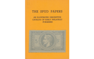
Spud Papers – Peru

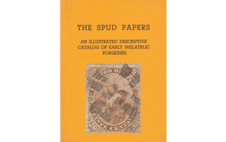
Spud_Peru1Spud_Peru2 Spud_Peru31866. 5, 10, and 20 Centavos.

I have a New-Year’s gift for our readers, in the shape of three Peruvian forgeries. Considering the difficulties of counterfeiting any of the works which issue from the atelier of the American Bank Note Company, these imitations are fairly done, the 20 C. being the best of the trio. Each of the originals is from a different plate, and each of the forgeries from a different stone, so that each value requires a separate description. Taking them in the order of their value, we have, to begin with:

5 C. Genuine

Engraved in taille-douce, on thick yellowish-white wove paper; perf. 12. The animals, which are supposed to represent llamas, are much more like mules. The one in front has a cloth or saddle girthed to its back, and the pack is laid upon this cloth. Its hind-quarters are not nearly so darkly shaded as the pack. All four legs are plainly visible; the off hind-leg being very darkly shaded. If a ruler be laid along the line of the face and forehead, it will cut into the R of FRANCO, and the R of PERU. The eye of the llama in the background is quite plain, and its mouth is slightly open. The hoof just under its nose is of normal proportions. The u of peru is not joined at the top, and the small accent over it is white. Outside the top scroll, above CORREOS and PERU, are two unobtrusive triangles, the hypotenuse of each follow- ing the curve of the scroll. The left-hand leaf of the agave (American aloe) is very nearly as long as all the other leaves. The two white dots, outside the end of the bottom value-scroll, are oval.

5 C. Forged

Lithographed, on very white paper, rather thin; pin-perf. 13. The pack upon the back of the front llama appears to be girted directly on to his back, without the intervention of any cloth or saddle. The hind-quarters are as dark as the pack. The off hind-leg is scarcely visible. If a ruler or straight-edge be laid along the line of the face and forehead, it will just touch the o of FRANCO. The eye of the llama in the background is not visible, and there are no symptoms of a mouth. Its front hoof, beneath its nose, is very much too large. The U of
PERU is joined at the top, and the accent over it looks like an accidental break in the top line of the scroll. Outside the scroll, above CORREOS and PERU, are to be seen portions of triangles, very faint, without the hypotenuse. The last leaf (to the left-hand) of the
agavd is very much shorter than the other leaves. The two white dots outside the bottom label are round. Printed in sheets of 25, S X 5 , postmarked with an oval containing six parallel bars, and ungummed. Perhaps the readiest instant tests are the shape of the two dots on each side of the bottom label, and the facial angle of the front llama.

10 C. Genuine

Engraving, paper, and perforation, as in the 5 C. Unmistakable llamas this time. The front llama has some dark shad- ing on the back of its head, and a dark patch on its back, but the two patches are not joined by shading down the back of the neck. The prickly-pear or cactus in the foreground has 11 leaves, and the commencement of a 12th. The llama in the background has a head, neck, and ears, exactly like a greyhound, with very well-marked eyes. The two ends of the C in CENTAVOS almost touch, so as to make it look like an O. The mountain-peaks in the background are so very faint, that they would not be noticed on a cursory inspection. The figure 1 on each side, has a proper head. The mouth and nostrils of the front llama, somewhat resemble those of a camel.

10 C. Forged

Lithographed; paper and perforation as in forged 5 C. The dark shading on the head of the front llama, runs down the back of its neck, and joins the shading on the back. The prickly-pear is very blotchy, and the leaves are not easily counted. The head, and neck, and ears of the llama in the background resemble those of a wolf, and there is only one eye. The C in CENTAVOS is like an English C. The mountain-peaks in the background are very plain, and much too dark. The i on each side has no head. Both the 0’s of 10 have a little dot in the middle of the left-hand limb. This is not found in the genuine. The front llama has a straight mouth and no nostrils. Postmark and number in sheet as before.

20 C. Genuine

Engraving, perforation, and paper, as in the 5 C. genuine. The central picture is exactly the same as in the 10 C., except that there is not quite so much of it seen. The frame cuts off a portion of the prickly-pear. The accents over E of CORREOS and the u of PERU are white. The outer curl of the ornament above E of CORREOS and L of DEL is round. The background of the scroll, behind the words CORREOS DEL PERU, is cross-shaded. Colour, a very rich dark yellowish brown.

20 C. Forged

Lithographed; paper and perforation as in forged 5 C. There are two dark oblique lines of shading on the mountain, which come between the heads of the two llamas, the right-hand line touching the nose of the llama in the background. For the rest of the central
picture, the description under the head of 10 C., will suffice. The figure 2 in the left top corner, and the one in the right bottom corner, both appear to be in two pieces, as if the tail could be separated from the rest of the figure. The accents over E of CORREOS and U of PERU are blotchy. The outer curl of the scroll-ornament over L of DEL is oval, and that on the left, over E of CORREOS is nearly so. The background of the name-label is solid. The colour of the forgeries is much too pale. Number in sheet, and postmark, as before.

I have had some trouble in the description of these stamps, as the forgers have imitated the originals very closely. However, our readers need not have the slightest hesitation in deciding upon the genuineness or otherwise of any of these stamps which may be in their possession, if they will but remember the difference between taille-doucc engravings and lithographs.


From “The Spud Papers” by Atless, Pemberton & Earée, 1871-1881.

Spud Papers – Sardinia

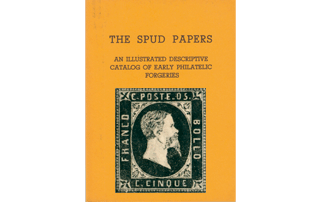
Spud_Sardinia1Spud_Sardinia21851. 5 & 4O Centesimi.

This issue consists, as everybody knows, of a set of three stamps, 5, 20, and 40 centesimi; but I have only seen forgeries of the first and last. The 20 C. is common, and I suppose the forgers did not think it worth their while to imitate it. The genuine stamps are lithographed, as well as the forgeries, but I do not consider the latter to be much of a success. However, our readers must judge for themselves.

5 C. Genuine

Lithographed in black, on yellowish white paper. Every C in the inscriptions has very square corners, which makes it look more like an E without the central tongue. The king appears to have got the mange, or some other similar disease, for his hair is all coming off in patches, and is cropped very close. The eye is very faintly indicated. The beard points very much forward, and comes down level with the middle of the final letter of BOLLO. There is a hyphen between POSTE and 05. The o does not appear to be larger than the 5. There is a very distinct border of pearls round the outside of the stamp. The line of shading- on the bust, which marks the spring of the shoulder, scarcely curves up at all, and follows almost exactly, the outline of the base of the neck. There is a small ornamental fleur- de-lis in each corner, in a sort of square. The spandrels in the corners are very difficult to describe, but they are quite different from those of the forgeries. The colour of the stamp is a dull, greasy-looking black.

5 C. Forged

Lithographed in intense black, on very white paper. The C’s in the inscriptions are all different, but they are all more or less properly shaped. The king’s hair is long and wavy, though there is a white patch at the back of his head. The eye and eyebrow are strongly marked. The beard is short, and hangs downward, not coming lower than the last L of BOLLO. There is no hyphen between POSTE and 05. The o looks larger than the 5. There is an indistinct and irregular border of dots round the outside of the stamp, which does duty for the pearl border of the originals. The line of shading near the bottom of the neck is very much arched; and, towards the back of the neck, it is at some distance from the outline of the base. The fleurs-de-lis in the corners are not very plain; and the bottom ones might, at a first glance, be taken for crosses pattee. The thyroid cartilage (“Adam’s apple”) in the throat is not visible, whereas it is well developed in the genuine stamps, both 5 C. and 40 C.

40 C. Genuine

Lithographed in rose-pink, on yellowish white paper. This stamp is very similar to the 5 C., and I shall therefore only describe the points where it differs, referring the reader to the 5 C. for the rest. The hair is of a medium length, and curly. There is some very light shading on the right shoulder. The mustache is very heavy, and the upward curl of the nostril is well marked. The tail of the Q in QUARANTA is a straight down-stroke. The 4 of 40 is at some distance from the O. In both the 5 C. and 40 C., the top fleurs-de-lis almost touch the corners of the inner frame, C’s, as in 5 C.; hyphen, iptto; pearls, ditto; spandrels, ditto; beard, ditto.

40 C. Forged

Lithographed in dull chalky pink, on white paper, C of FRANCO rather square, but the others properly shaped. No hyphen between POSTE and 40. Hair much too light. Back of neck darkly shaded, but no shading on the shoulder. The line of shoulder curved as in forged 5 C. Mustache and beard as in forged 5 C. Pearls, ditto. The top fleurs-de-lis are not near
the corners of inner frame. Tail of Q in QUARANTA slopes away to the right. Eye very large and staring. No upward curl in nostril. Printed in sheets of 25, 5 x 5 , and postmarked with one of the old Spanish marks, i.e., an oval containing 6 straight bars. The first two stamps in the top row are printed upside down.


From “The Spud Papers” by Atless, Pemberton & Earée, 1871-1881.


LupSee also —> Fournier forged cancellations of Sardinia


Spud Papers – Paraguay

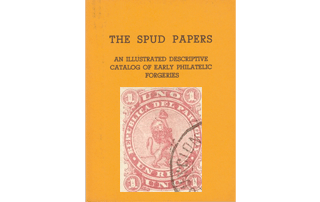
 Spud_Paraguay11870, 1 Real.

Genuine

Engraved, on slightly yellowish white wove paper, rather thick; imperf. The lion is standing on a level piece of ground, represented by some lines of cross-shading drawn across the circle about one fourth from the bottom of the circle. His feet do not touch the boundary-line of the circle. The rest of the circle is shaded by fine horizontal lines. There are two concentric circles round the 1 in each corner, besides the boundary-line of the shading. The lion is shaded nearly all over, and his mane appears to be the darkest portion of the whole stamp. The E of REPUBLICA is properly drawn. The pole supporting the Phrygian bonnet is shaded nearly all over, and where it is not, the lines of the background can be seen through it. The postmark on my own copy of the 1 real is a double circle in blue with name (ASUNCION) and date.

Forged

Lithographed, on white wove paper, slightly thinner than the genuine; imperf. The artist has evidently failed to see that the lion is standing on the ground, for he has made it stand upon the inner line of the circle; and to balance the line which represents the horizon in the original, he has drawn other thick lines behind the lion. This will be found the easiest instant test, for the originals have only one thick line, on a level with the knees of the lion. The two concentric circles round the i in each corner merge into one before the circles are completed; or rather, the inner circle merges into the boundary-line of the shading. The E of REPUBLICA is broken and badly shaped. The face of the lion has a most ridiculous expression. He appears to be grinning, and one of his eyes is shut, and in some copies altogether absent. Over the face, and down the side of the body, are large patches destitute of shading. There is a line drawn between every two stamps on the sheet. The cancelling mark somewhat resembles our own, and is struck where two stamps meet. The colour is a more chalky rose than that of the original. Altogether, this forgery is not nearly so good as the counterfeit Cubas described above; but still there are some who might be deceived by it.


From “The Spud Papers” by Atless, Pemberton & Earée, 1871-1881.


Spud Papers – Italy

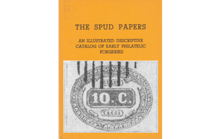
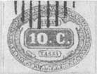
Spud_Italy11863. Unpaid-Letter Stamp. 10C., Yellow-Ochre.

Genuine

Lithographed, on coarsely-wove white paper. The lines behind the shield are all wavy. Corner scroll to the left of SEGNA is lower than the one to the right. The bottom of the 1 of 10 C. is on a level with the O and the C. This is best seen by putting the edge of a sheet of paper across the stamps, until it just touches the bottom of the OC; when it will be seen that the i is on the same level. There are 50 of the v-shaped ornaments in the outer oval.

Forged

Lithographed, on finely-wove, very white paper. The lines behind top and bottom of scroll are wavy, but those at the sides are straight. The corner scroll to left of SEGNA is much higher than that on the right. The bottom of the 1 of 10 C. does not come nearly so low as the OC. There are 49 v-shaped ornaments in the outer oval, and one of them (almost below T of TASSA) appears to be inverted, or is very badly drawn.
Postmarked with an oval of parallel bars (8), rather larger than the stamp.


From “The Spud Papers” by Atless, Pemberton & Earée, 1871-1881.

Spud Papers – Western Australia

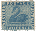
There are, apparently, two dies for these stamps, one for the penny, and one for the other values. The background of the four labels is formed of zig-zag white lines in the penny, but is solid in the higher values.

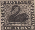
Spud_WesternAustralia11859. One Penny, black. Imperforate.

Genuine

Engraved in taille-douce on greyish-white paper. The W of name is cut off square at the bottom. There is a mark just before P of POSTAGE which looks like a w placed sideways, with the commencement of another w. After E of POSTAGE there is a mark like the Masonic square-and-compass emblem, also placed sideways. The first and last letters of AUSTRALIA are both very close to the outer border. Background of engine-turning.

Forged

Lithographed on very white paper, imperf. This stamp is printed in very deep black, not at all like the grey-black of the originals. The w of name is sharply pointed at the bottom, POSTAGE on solid label, without marks. First and last letters of AUSTRALIA are at some little distance from the border, but the first is nearer than the last. Background of dots and scratches.

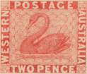
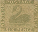
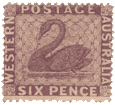
Spud_WesternAustralia2Spud_WesternAustralia31860. Two Pence, Vermillion, Six Pence, Green. Imperforate.


Genuine

Engraved in taille-douce. Solid backgrounds to labels (this is copied by the forgeries), w square at bottom as before. N of WESTERN almost touches the border. All the lettering of equal thickness. Central background composed of engine-turned lines.

Forged

Lithographed, no watermark, imperf.

W pointed at bottom, N of WESTERN at some little distance from border. Lettering of POSTAGE thicker than the rest. Central background of dots and scratches.

Spud_WesternAustralia4Spud_WesternAustralia51862-64. Two Pence, Blue, Six Pence, Violet-Brown; Perforated Various.


Genuine

Same matrix as above. Tests, ditto.

Forged

Ditto, ditto. Not perforated.

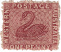
Spud_WesternAustralia6One Penny, Brownish Red; Perforated Various.

Genuine

Same type as One Penny, black. Same tests.


Forged

Same type as forgery of 1d., black. Same tests; not perforated.

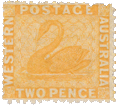
Spud_WesternAustralia71865. Two Pence, Orange. Perforated 12 1/2.

Genuine

Same tests as before.

Forged

Ditto. No watermark; not perforated.

The forgeries are all postmarked with four concentric circles. Some of them would pass muster very well amongst school boys, et hoc genus omne; I think the six pence, green, is most likely to deceive. The easiest instant test for the forgeries is, that they all have the w sharply pointed at the bottom ; whereas, in the genuine, the two bottom points of the w are cut off quite square. It seems very absurd that the forgers should persist in attempting to imitate well-engraved designs. If I were a forger, I should certainly only try my hand at counterfeiting lithographed originals. I remember a forgery of one lithographed original which I had the pleasure of dissecting some time ago (it was a green Hanover, I think), and the forgers had actually produced a copy which was better executed than the original; whereas, lithographed copies of taille-douce originals must, of necessity, be very poor imitations.


From “The Spud Papers” by Atless, Pemberton & Earée, 1871-1881.

Spud Papers – France

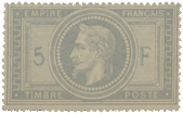
Spud_France11869. 5 Francs, Mauve, Lilac, Lavender.

Genuine

Engraved (typograph); perf. 13 1/2; on wove greyish paper. Sixty-four pearls round the head. A distinct five-lobed leaf at each corner of the inside oblong. Figure 5 at equal distance between the inner line of frame and the outside line of central circle. Value generally (but not always) of a different shade from the rest of impression, being printed afterwards. All the lettering in very thin French type. Emperor’s eye well open, with distinct pupil. Strong wrinkle on the forehead. Greek bordering very thin. Dots at four corners small and round, FRANCAIS with cedilla under the C. M of EMPIRE and TIMBRE somewhat like a reversed W.

Forged

Lithographed on vertically-laid white paper, which has been smeared over (on one side only) with a cream-coloured wash, before printing. Perforated 13 (very badly). Only 63 pearls round the head. Five-lobed leaf very indistinct,—a mere blotch in most cases. Back of 5 nearly touches outside of circle. Value in exactly the same shade as the rest of impression. All lettering thick and clumsv. Emperor’s eye nearly closed, and pupil indistinct.

No wrinkle on the forehead. Greek border thick and clumsy like lettering. Dots at four corners ditto, FRANCAIS without cedilla under the C. M really an inverted W. With all those differences, it is astonishing how well the forgery looks at first sight. It is certainly printed in an unusually red shade of lilac, but the originals are sometimes seen of the same colour. Perhaps the best instant test is to be found in the perforation,—which is always clearly and neatly done in the originals,—but which will be found to be very ragged, clumsy, and imperfect in the forgeries. This our readers will see for them- selves in the annexed specimen.


From “The Spud Papers” by Atless, Pemberton & Earée, 1871-1881.


LupSee also


Spud Papers – Cape of Good Hope

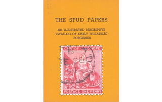
Spud_Cape1Spud_Cape2 Spud_Cape3Spud_Cape41863-71. 1d, 4d, 6d & 5s.

Genuine

Typograph; perf. 14; watermark CC and crown. Head of figure exactly under first O of GOOD. Head of ram with eye, mouth, and horn, perfectly distinct. All lettering tall enough to pretty well fill up the labels. The figure wears a bandeau or tiara on her head. The dress is fastened on each shoulder by a small brooch or buckle. The flukes of the anchor are diamond-shaped.

Forged

Lithographed; perf. 13 (very badly); no watermark. Head of figure under G of GOOD. Head of ram is all eye and horn, and very indistinct. Lettering very small, and not nearly tall enough to reach from top to bottom of labels, C of CAPE looks like a G. No tiara on the head of figure. No brooches on the shoulders. The anchor flukes are barbed. The 6d. has no hyphen between the two words, and the 4d. has no stop after PENCE; and the provisional lettering and canceling are of a bright scarlet, instead of dull carmine. In the 5s. the words of value are in such large type that they almost touch each other in the genuine stamps; whereas, in the forgeries they are very small, with considerable spaces between them.


From “The Spud Papers” by Atless, Pemberton & Earée, 1871-1881.


LupSee also –> Album Weeds – Cape of Good Hope

Spud Papers – Antigua

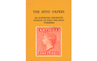
Album_Weeds_Antigua11862-73. One Penny.

Genuine

There are several varieties of this stamp, varying in the colour, perforation and watermark. The one intended to be imitated by the forgers is the orange-vermilion of 1867, with star watermark, and perf. 14 to 15 1/2, compound. Engraved in taille-douce (?) on pinkish white paper. The groundwork is composed of strips of two patterns of engine-turning disposed alternately, nine in all; each strip separated from its neighbor by a fine white vertical line, and the central strips of course more or less hidden by the head. The two outer strips have 17 very prominent diamond-shaped dots running down their center. One of the inner rows (having the same pattern) shows one of these spots just where the hair springs, on the forehead below the coronet. This spot is a trifle larger than any of the others. The body or band of the coronet is jewelled in two rows,—the top one being of pearls, and the lower one of a few oblong jewels. The lower half of the Queen’s ear is visible. The face and neck are shaded all over, and there is no shading behind the face on the background, except just beneath the chin.

Forged

Perf. 13. Lithographed on yellowish paper, no watermark. Groundwork of dots to represent engine-turning. The 17 dots on the outer rows are not at all conspicuous, and, at a first glance would not be noticed. Where the hair springs in front of the forehead beneath the coronet is a dim blotch, not at all resembling the sharply-defined dark spot in the same place on the originals. The band of the coronet is jewelled with two rows of pearls, but there is one of the oblong jewels to be seen, below the second cinquefoil. There is an indistinct mark where the ear ought to be, but it would require a very strong effort of imagination to resolve that mark into an ear. The lower part of the cheek, and the back of the neck are heavily shaded (I do not refer to the dark shading on the background behind the neck, as that is common to both genuine and forged), and the upper part of the cheek, below the eye, is left unshaded. The background is shaded behind the front of the face.

Album_Weeds_Antigua21862-73. Six Pence.

Genuine

Engraved in taille-douce (?), same die as the above.

Forgery

Lithographed, perf. 13. Same matrix as forgery of penny; no watermark. Very pale chalky green, on very white paper.

N.B.—It will be seen that I have put a note of interrogation against the description of the engraving of the genuine stamps. Mr. Pemberton, in his new catalogue, states that these stamps are typographed, but I cannot help thinking that they are taille-douce, especially as they show all the marks which Dr. Magnus gives as being the tests of taille-douce. All the original stamps of this colony bear a postmark consisting of lines forming an oval, with a numeral, or numerals, in the center. The forgeries are postmarked with a rectangle of dots, somewhat larger than the stamps.


From “The Spud Papers” by Atless, Pemberton & Earée, 1871-1881.


LupSee also —> Album Weeds – Antigua

Spud Papers – Bayern (Bavaria)

Album_Weeds_Bavaria11849. 1 Kr., Black.

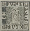
I am afraid I shall not be able to give very satisfactory tests to distinguish the forgery now to be commented upon, as the design of the original has been very carefully copied. I cannot help thinking that the forgers have lately adopted a different and better plan with regard to their lithographic imitations. Formerly, there were very great and striking differences in the design of the forgeries, as compared with the genuine stamps,—but, within the last few months, the designs of the forgeries have been, in all their salient points, almost identical with the designs of the real and authentic emissions. I therefore fancy that Messrs. Spiro Gebrüder have begun to be very particular in their lithographic transfers.

Genuine

Typograph. Greyish black on yellowish paper. The solid labels, which bear the words of value, are very little darker than the rest of the stamp, and are rather spotty {i.e., the ink has left little places here and there untouched). The figure in centre is at an equal distance between the top and bottom of the central square of maze-work. The maze-work itself is rather irregular at the top, and under the letters AYE of BAYERN it does not come up far enough, thereby leaving a broader space of white than in any other part. The little figures in the corners are all well made, and perfectly distinct.

Forged

Lithographed in very black ink on very white paper. The solid name and value labels are intensely black, and there are no spots of white upon them. The figure in center is nearer to the bottom than to the top of the central square. The maze-work comes close up to the top and bottom boundary-lines, but not quite so close to the side lines. The little figures in the corners are not all alike, and are not very distinct. There have been several forgeries of
this stamp; some of them better in execution than the one now under discussion, but not so accurate in minute details. I think the readiest test for the present forgery is the intense blackness of the labels, especially that bearing the word EIN, which, being a short word, allows more of the label to be seen. If I remember rightly, the old Bavarians used to be postmarked with a thing like a wheel without its tire, (i.e. with only the center and the spokes), but these forgeries are postmarked with an oval composed of straight lines. Printed in sheets of 63, 7 x 9, and ungummed.


From “The Spud Papers” by Atless, Pemberton & Earée, 1871-1881.


LupFor more information about the issues of Bayern, see —> Emil Minaar’s exhibition

See also –> Album Weeds – Bayern (Bavaria)

Spud Papers – Newfoundland

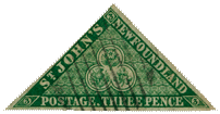
Spud_Newfoundland01857. 3d. Triangular.

At the first glance, the forgery of this stamp looks very well; but, like most of its brethren, it will not bear inspection. I have a certain savage satisfaction in dissecting it, because this same forgery, or one very similar, was a much-prized member of my collection about ten years ago.


Genuine

Engraved in taille-douce; imperf. The groundwork of the central triangle, behind the large trefoil, is engine-turned all over. There are, however, three horizontal lines, where the engine-turning allows more of the dark background to be seen. The name, NEWFOUNDLAND, is in one word. The apostrophe in JOHN’S is correctly shaped; as is also the comma after POSTAGE. The central trefoil is formed of two lines, making a double border. There are three leaves on the left hand of the thistle. The rose and the shamrock do not touch the border in any part, but the stem of the thistle just touches the border at the bottom. The colour is a rich, dark yellow-green.

Forged

Lithographed; imperf. The imitation engine-turning is in four separate strips, so that the dark background shows, without any lines upon it, between the strips. This is especially noticeable in the lower three strips. In the genuine stamps, though these lines do show faintly, yet the engine-turning is all in one piece. The name is in two words, NEWFOUND LAND. The apostrophe in JOHN’S is badly shaped; and the comma after POSTAGE is a badly-
shaped full stop. The outer line of the two lines forming the central trefoil is not a drawn line, but is formed by the absence of the engine-turning permitting the dark background to be seen. In the genuine, the outer line is cut through the engine-turning. The leaf on the left of the rose touches the inner border of the trefoil, and the top leaf of the shamrock almost touches the border also. The stem of the thistle does not touch the border; in fact, the stem does not project below the leaves at all. There are only two leaves on the left of the thistle. There is a flaw in the top of the H in JOHN’S, on the left-hand stroke; and the imitation engine-turning projects a very little too far, just under the first D of NEWFOUND LAND, forming a little white spot or lump. The lettering is ragged, and too thin; and the colour is a chalky bluish-green.

I must confess that the milk of human kindness within me has been considerably soured by an examination of the forgeries hereinafter described. Messrs. Spiro must either have a most wonderful idea of their executive and artistic skill, or else they must suppose that any kind of coloured label will pass muster with philatelists as a genuine stamp, or surely they would never have attempted to forge copies of stamps that are a very marvel of taille-douce engraving. I know of few stamps which can compete with the Newfoundland ones, except perhaps those of Nova Scotia, which were in fact designed by the same artist. When we come to compare the originals with the forgeries, we cannot help feeling disgusted with the paltry imitations. But still, to give everyone his due, the forgers have been very careful, and in all the prominent lines of the designs, they have copied very accurately as far as a lithograph (and a very coarse lithograph) can be said to copy a fine engraving. I have said before, and I say again, that all amateurs ought to devote more time to the study of the various modes in which stamps are printed; and I think, too, that our catalogues ought to be more particular in this respect, and to name the mode employed for each stamp, or set of stamps catalogued. If this were done, those who depended chiefly on their catalogues for their philatelical knowledge, would insensibly be led to understand these things better, and would thereby be less liable to be imposed upon by every impudent forgery which makes its appearance. I know some collectors who seem to think that they can never arrive at being able to detect a forgery for themselves, and who are constantly sold, unless they have something in the style of these papers to give them a minute description of the forgeries, and the tests by which they may be distinguished from the originals. But if philatelists would only study their stamps a little more, instead of merely trying to see how many they can collect, I am certain that they would soon learn for themselves far more than any book or Spud Paper can teach them. All who have a long purse can go into the market and buy most of the stamps that have ever been issued; but if, after doing this, they simply content themselves with putting their stamps into an album, and leave them there unnoticed, they cannot derive much pleasure from them, and we cannot call this philately. And now, after these moral observations, let us talk a little about the stamps specially destined to be dissected this month.

Spud_Newfoundland11866. Twenty-four Cents, Blue, perf. 12. (bust of queen).

Genuine

Engraved on bluish-white paper. The groundwork of the frame at bottom, behind figures and words of value, is composed of horizontal lines, partially cross-shaded with vertical lines. The Queen’s hair is darker (much) than any other part of the stamp. Groundwork of name-scroll composed of vertical lines, cross-shaded round the letters with horizontal lines. Background of portrait cross-shaded from top to level of eyes. At the bottom of the stamp, where the value- label joins the figure-circles, on each side is a dot, which does not touch either figure-circle or value-label. The whole stamp exhibits exquisite finish.

Forgery

Lithographed on very yellowish paper. Groundwork of frame at bottom, behind figures
and words of value, is cross-shaded with oblique lines. Queen’s hair much lighter than background. Groundwork of name-scroll is cross-shaded behind the letters with oblique lines. Background of portrait cross-shaded nearly to bottom, and a space left almost unshaded just above each shoulder. The dots on each side at bottom touch the figure-circles.
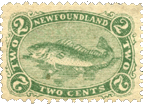
Spud_Newfoundland21866. Two Cents, Grenn, Perf. 12 (Cod Fish).

Genuine

Beautifully engraved. The labels bearing the inscriptions NEWFOUNDLAND and TWO CENTS are solid; all the others have a groundwork of very fine lines. The figures and words in the side labels are shaded at the edges with dark colour, which makes them stand out from their backgrounds as though they were solid. The “white” of the eye of the fish is coloured, and the very spines of his fins may be counted.

Forged

Lithographed. Coarsely perf. All the labels are solid, and the lettering and figures look perfectly flat. The “white” of the fish’s eye is white, and very staring, and the spines of the fins are irregular, and not to be counted. The whole stamp is coarsely executed on very white paper.
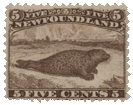
Spud_Newfoundland31866. Five Cents, Brown, Perf. 12 (Seal).

Genuine

Engraved. All the hairs of the seal’s whiskers are perfectly distinct, and very light in colour compared with the general hue of the body. The head resembles that of a pug dog, and the mouth and eye can be easily discerned. There is a glimpse of open sea to the right, where there are no icebergs, and only a faint cloud. All the letters and figures are well made.

Forged

Coarsely perf. 13 1/2. Lithographed. The seal’s whiskers are very dark and coarse, and do not seem to belong naturally to his mouth. The head is like that of a water-rat, and there is no visible mouth or eye. The whole of the horizon seems to be filled with icebergs. The lettering and figures at the top are generally more or less imperfect.

The genuine 5 C. was reprinted in black in 1869, and has also been forged; but the above descriptions, changing the colour from brown to black, will serve for them, as both genuine and forged were printed from their respective original matrices.

Spud_Newfoundland410 Cents, Black, Perf. 12 (Prince of Wales).

Genuine

Engraved, on greyish white paper. On the left side of the Prince’s collar at the bottom are two rows of jewels or braid, on which the small crown rests. The white lines on the right shoulder are very fine, and are properly curved to make the chest appear in relief.

Forged

Lithographed; perf. 13. This stamp has been very carefully copied from the original, almost line for line, and it is almost impossible to give a verbal description of the small differences in some parts of the ornamental frame. It is printed on very yellowish paper, and the ink is very pale, instead of being dark black as in the original. On the left side of the collar at the bottom, there is a single row of pearls, very distinct. The white lines on the right shoulder are very coarse, and are simply drawn obliquely, without any curve. This is a stamp which might possibly deceive; but if the other distinctions fail, we can always discover it by the perforation, which is 13 instead of 12.

Spud_Newfoundland51866. 12 Cents, Flesh; Perf. 12. (Head of Queen).

Genuine

Engraved on pinkish yellow paper. Five pearls visible on the coronet, the last pearl just peeping out from where the coronet buries itself in the hair above the left ear. The stop after NEWFOUNDLAND touches the final D. Tongue of buckle lightly and partially shaded. Shading behind the top of the head composed of finer lines than the rest of the background, but no cross-shading.

Forged

Lithographed on a very white paper. Coarsely perf. 13. Only three pearls to be seen on the coronet; the two at the front being absent, and the last pearl not at all hidden by the hair. The stop after NEWFOUNDLAND is at some little distance from the final D. The ground behind the back, and top of the head, cross-shaded. Tongue of buckle dark, and shaded all over.
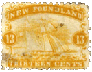
Spud_Newfoundland61866. 13 Cents, Orange-yellow, Perf. 12 (Ship).

Genuine

Engraved; on yellowish paper. Background of name- label shaded all over with vertical lines. Nearly all the letters of name touch each other, and the HIR of THIRTEEN are so joined as to appear only one letter. Rocks visible in left-hand corner of landscape.

Clouds composed of horizontal lines, with oblique cross-shading. St. George’s flag on the gaff of the mainsail tolerably distinct, and formed without any curved lines. Hull of vessel very dark, compared with the waves. Over un of name is an egg-shaped dot, lightly-shaded, with a dark dot on each side of it.

Forged

Lithographed, on very white paper; perf. 13. Background of name-label is solid. The w and f of name are the only ones which really touch each other. hir of thirteen set some distance from each other. Indistinct white blotch in lieu of rocks in left bottom corner. Clouds composed of horizontal lines only, and very heavy. St. George’s flag curved (as if its back were broken), and very indistinct. Hull of vessel no darker than waves. No dots over un of name.

Spud_Newfoundland71869. 1 Cent, Violet, Perf. 12 (Prince of Wales).

This stamp was re-engraved in 1871, with some slight differences of design, and in a much paler colour, commonly called brown, but which I should call a sort of red-mauve. It is not with the 1871 issue that we have to do; so I need not trouble the reader with a description of it; but will go on to point out the differences that exist between the 1869 type, and the forgery which purports to represent it.

Genuine

Engraved. The oval frame containing the name ends in a point at the top, like a pear with the small end uppermost. The letters N. and F., at the top, almost touch the outer frame of the oval, and the stops are large and round. The name is in one word; and all the letters composing it, except the o, touch each other. Counting all the white lines in the plaid, both vertical and oblique, there are 14. The rays in the oval frame are composed of alternate sets of deep and faint lines, but without any cross-shading. The eyes are clear and intelligent, and apparently light.

Forged

Lithographed. Coarsely perf. 12 1/2. The oval frame is rounded over the words ONE CENT, instead of coming to a point. The N. and F. are small, and do not come near either the outer or inner lines of frame. The stops are small, and badly shaped. The name is in two perfectly distinct words; and there is a good space between all the letters. There are only 10 lines in the plaid. The rays in the frame are far too distinct, and the light ones are cross-shaded. The eyes in the portrait are very black and staring.

Spud_Newfoundland81870. 3 Cents Vermilion (bust of queen in widow’s weeds).

Genuine

Engraved; perf. 12. Queen’s eyebrows turn down at the outer ends. The two stars at the bottom of the stamp are on a groundwork of vertical and horizontal cross-shading. Cap scarcely shaded at all on the top of the head. Separation between back of neck and cap strings very distinctly marked by a strong line of colour. Background of upper value-label shaded with curved lines which run parallel with curved lines of frame.

Forgery

Lithographed: perf. 13. Eyebrows turn up at the ends. Stars at bottom on solid ground. Strong wavy line of shading on cap at top. Cap strings indistinct at back of neck, so that it is difficult to say which is cap string and which is neck. Background of upper value-label solid, except behind the figures on each side. There will be little difficulty in detecting this and the following forgeries, as they are very poorly printed, whereas the originals are beautifully done, and the ink stands out so thick that it can be actually felt with the finger.


From “The Spud Papers” by Atless, Pemberton & Earée, 1871-1881.