Album Weeds – France

Album_Weeds_France1 Album_Weeds_France2 Album_Weeds_France3 Album_Weeds_France4 Album_Weeds_France51849-50. 10, 15, 20, 20, 40 c., 1 fr.

Genuine

Very nicely engraved, on thickish wove paper, more or less tinted, but never quite white. In the large majority of copies, the paper presents a very strong yellowish tinge, probably due to age. The shading under the eye and on the neck consists of well-defined, parallel lines of dots.

The fifth dotted line of shading on the neck, counting’ from the bottom, goes right across the neck, from front to back. There are five very distinct ears of wheat in the head-dress, on the side shown, and the tips of two other ears can be seen, peeping round from the other side of the head. The front of the eyebrow does not touch the front outline of the face. There is an indent of colour in the middle line of the upper lip, which almost amounts to a defect in the drawing. The lower lip has a distinct line of shading on it, to mark the form of the red part of it. There are three lines of shading above the eyelid, and beneath the eyebrow. Round the portrait there are ninety-seven pearls, all large, round, very close together, and most of them touching the white ring outside them. The key-pattern, down the left- hand side of the stamp, has four entire “keys” pointing outwards, in the part of the frame which is above the central circle, and a portion of a fifth “key” as well; there are also four entire ones, and part of a fifth, in the lower portion of this left-hand frame. The key-pattern, on the right-hand side of the stamp, has four entire “keys” both above and below the central circle; counting, as before, only those “keys” which are turned outwards. This whole key-pattern may be likened to a bent ribbon, with both edges of it clearly shown in perspective. There is a small, but distinct stop, both before and after every word, etc., of both inscriptions. Taking the 25 c. value for instance, the inscriptions run . REPUB . FRANC . . 25 . c . POSTES . 25 . c . The line above the frame of the value-label is the same width as the similar white line below the name-label. The vine-leaf in the head-dress is very distinct, and there are seventeen grapes in the bunch, though several of them are partly hidden by the rest.

Forged. First Set.

I have before me a full series of this set of counterfeits. They are lithographed, on very white wove paper, rather thicker than the genuine. The fifth line of shading on the neck, counting from the bottom, does not go across from the back to the front. The ears of wheat on the front of the head-dress are here represented by very long willow-leaves, a little more serrated at the edges than willow-leaves usually are, and there seem to be only four of them, all in one bunch, instead of two separate bunches or groups. The tips of the two ears of wheat which ought to be visible from the other side of the head are absent. The front of the eyebrow just touches the front outline of the face. There is no line of shading on the lower lip, to mark the shape of the red part of it. There are just one hundred pearls round the portrait; they are small and far apart, and none of them touch the white ring round them. There are only four outward-turned “keys” in the top half of the left-hand frame, four in the bottom half, and the same number in each of the halves of the right-hand frame. The stops before and after the different words and figures of the two inscriptions are so very small as to be almost invisible; and, in several of the values, the stop before REPUB., and the one before the first figure in the bottom label, are absent. The white line above the frame of the value-label is very much wider and more prominent than the similar white line below . REPUB . FRANC . The large leaf in the head-dress is not much like a vine-leaf. There seem to be only fifteen grapes in the bunch, but they are very indistinct, and difficult to count.

Forged. Second Set.

Of this set I have only seen the 25 c., and the 1 franc. Very coarsely lithographed, on particularly rough, coarse, wove paper, of a decidedly yellowish tint. The fifth line of shading on the neck does not go across from back to front. The ears of corn are tolerably well represented, but the two which ought to show from the other side of the head are absent. The vine-leaf is very badly drawn, and there are only fourteen grapes in the bunch. There are only eighty-six pearls round the circle; they are exceedingly small, and very far apart, and none of them touch the white ring round them. The eyebrow touches the outline of the front of the face. There is a large stop between the words REPUB . FRANC, and a stop each side of the word POSTES in the lower label. There is no line of shading on the lower lip, to mark the outline of the red part; but the lip is abnormally hollowed out in the part where the “imperial” would grow in a man. There are four outward-turned “keys” of the key- pattern in both halves of the frame, down the left-hand side of the stamp, four in the lower half of the right-hand frame, and five in the upper half of it; but the two immediately above the circle, in this latter compartment, are jumbled together. I do not think this set ought to deceive anybody; the execution is so very coarse.

Forged. Third Set.

Of this set I have only the 1 franc, though 1 think I came across two or three other values, some time ago. It is lithographed, in a peculiar sort of orange-red, on thick, hard wove paper, of a pale yellow tint, not yellowish-white. None of the dotted lines of shading on the neck run right across, from back to front. There are five ears of wheat, moderately distinct, in the head-dress; but they are in one group instead of two, and there are none visible from the other side. The front of the eye- brow is a long way from the outline of the front of the face; even more distant than in the genuine. The red part of the lower lip is outlined, as in the genuine. There are eighty-six very small pearls round the circle, far apart, and not touching the white ring round them. There are four outward-turned “keys” in each of the four pieces of key-pattern at the sides. All the stops in the inscription are as in the genuine, except the one before the first I, and the one after the last FR., both of which are absent. The leaf is like that of a horse-chestnut, and there are only sixteen grapes in the bunch.

Forged. Fourth Set.

This I have not seen. So far as I know, there is only the one stamp, the rare 1 franc, orange, and it is said to be a very dangerous forgery. I copy the description from the Monthly Journal. I think it was made in 1898:

“The colour is very successfully imitated, but the paper is thicker and coarser than that of the genuine, and more grey in some. The shading under the eye cannot be resolved into parallel lines, but is much less pronounced than the genuine. The key-pattern at the left side consists of a single bent line, with mere traces of a second line. On the right side, the second line is more noticeable; but it is far from being as clear as in the originals. The indent in the middle of the line of the upper lip is entirely absorbed into the curved line of colour of the upper lip. The three lines of shading, above the eyelid and beneath the eyebrow, are absent in this counterfeit.”

Postmarks

Genuine.—These are very various. My earliest copies bear 40; others have 42; others 37; others have a six-pointed star, composed of small round dots, and with numerals in the centre of the star. But the latter cancellation is not common on this set, being more used later on.

Forged.—The forgeries bear either 40, or a square of oblong dots.

There is a 20 c., blue, of this set, which is rare. It must not be taken for a forgery, but was simply an error. I do not remember ever having seen a used copy.

Album_Weeds_France6Album_Weeds_France71852. Presidency, 10 c., 25 c.

These stamps, it will be remembered, have the head of Napoleon replacing that of Liberty; but still bear the old inscription REPUB . FRANC.


Genuine

Engraved in épargne, on similar paper to that of the first issue, but a little softer. The shading on the chin comes forward, as far as the point of the mustache and the base of the imperial. The front of the neck is shaded, down to the very bottom. There is some very light shading along the side of the nose. Below the bottom of the neck there is a very distinct B, the initial of the engraver, whose name was Barr£, I believe. This can be seen very easily, and is a good test. There are eighty-eight pearls in the circle. The rest of the frame seems to be an exact copy of the first issue.

Forged

Rather nicely lithographed, on thick wove paper, very white. The shading on the chin does not touch either the imperial or the point of the mustache. There is no shading at all down the front of the neck, or on the side of the nose. The engraver’s initial is wanting. The circle contains only eighty-five pearls. There are only three outward turns in each of the lower key-pattern ornaments at the sides, and four similar ones in each of the upper ornaments. Besides all these discrepancies, there is one very marked thing which strikes the eye at once, and that is the very broad white line, right across the stamp, just above the lower inscription, which is two or three times as broad as the similar line below the upper inscription. This is, certainly, the most marked feature of these counterfeits, and is of itself quite enough to condemn them.

Postmarks

Genuine.—All my own genuine copies bear the large, six-pointed star, composed of small round dots, with numerals in the centre of the star; but I have seen others cancelled with 42.

Forged.—The forgeries are obliterated with a diamond or square of large oblong dots, or with a similar square of pear-shaped clots.

Album_Weeds_France81853-60; Empire; 1 Franc.

Genuine

Engraved in épargne, on rather strongly-toned wove paper. The tests for this stamp are exactly the same as those for the genuine Presidency issue just described, except that the upper inscription reads EMPIRE FRANC., instead of REPUB . FRANC., and that there is no engraver’s initial at the base of the neck. The number of pearls in the circle, and the key-pattern, etc., are just as before.

Forged

Same as the forgeries of the Presidency issue, except for the necessary alteration from REPUB. to EMPIRE. In this counterfeit, the white line across the stamp, forming the upper outline of the bottom label, is narrower, and more like the genuine. The wrong shading, and the defective key-pattern, as in the last-named forgeries, will suffice to detect this counterfeit.

Postmarks

Genuine.—I fancy there is not much variety in the cancellation of the genuine. My own specimens are all obliterated with the large square of dots already described.

Forged.—The forgeries have a square of variously-shaped clots, some small and irregular, others large and pear-shaped.

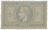
Spud_France11869. 5 Francs.

Genuine

Engraved in épargne, on tinted wove paper; perforated 13 1/2. The circle round the head contains sixty-four pearls. There is a distinct, five-lobed leaf at each corner of the inside oblong’. The figure 5 is equidistant between the outside of the circle and the inside line of the inner frame. The value is generally of a different tint from that of the rest of the stamp, being printed afterwards. All the lettering is in very thin, French type. The Emperor’s eye is well open, with a distinct pupil. There is
a very strong wrinkle on the forehead. The key-pattern bordering is very thin, being distinctly thinner than the letters of the inscription, at the top and bottom of the stamp. The dots at the four corners of the stamp are small and round. There is a distinct cedilla under the C of FRAN9AIS. The M of EMPIRE is rather like an inverted w, as is also the M of TIMBRE.

Forged

Lithographed, on wove, and also on vertically-laid paper, both being thinner and harder than the genuine; badly perforated 13. The front of the paper has been tinted with a surface coloring. There are only sixty-three pearls round the head. The five-lobed leaves are extremely indistinct, being generally nothing more than blotches. The back of the 5 nearly touches the outline of the circle; but this is not a particularly trustworthy test, as I have found that the position of the genuine 5 occasionally varies. The inscription, 5 F, is exactly the same tint as the rest of the impression. All the lettering is thick and clumsy. The eye is nearly closed, and the pupil is indistinct. There is no wrinkle on the forehead. The key-pattern border is as thick as the lettering. The dots at the four corners are blotchy, the one in the left-hand lower corner being oval instead of round. There is no cedilla under the c of FRANCAIS. The M of EMPIRE is an unmistakable W, turned upside down; and so is the M of TIMBRE. The colour of the stamp is a redder shade than that of the originals.

Postmarks

Genuine.—My genuine copies all bear the large, six-pointed star of small round dots, with numerals in the center, as described above.

Forged.—The forgeries are cancelled, not to say daubed, with five extremely thick parallel bars, like 80; also with a very large square or diamond, of very large square dots.

1877 & 1892. 15 Centimes, blue.

Genuine

Engraved in épargne, on wove or quadrille paper as above, perf. 14 x 13 1/2. The imprint in the left lower corner is J A SAGE INV ; that in the right lower corner is E MOUCHON D & I. These are in microscopic, but legible letters. The top leaf of the olive-branch in the right hand of the female figure, touches the fourth dark, horizontal line from the top of the stamp, counting the two lines of the frame, and the lowest berry on the branch lies exactly in the center of her right breast, and is very prominent. She appears to have flowers in her hair, and has a fairly contented expression of countenance. Her left great toe is abnormally long and pointed; it has no nail, and is directed towards the left top corner of the R of REPUBLIQUE, below it. Her left forefinger, resting on the globe, is curved inwards, so as to point to the right top corner of the i of the figure 15 below it. The figure of Mercury shows curls on his forehead, below the front of his cap. The tip of the right wing of the cap reaches to the center of the sixth horizontal line from the top, including the two frame-lines, the tip of the left wing reaches to the top of the seventh horizontal line. He has a somewhat drooping nose, and the left corner of the mouth turns very slightly upwards. The top of the serpent- twined rod in his left hand ends in a round ball; the serpents have no eyes. The left leg is shaded so very darkly, that it hardly stands out at all, from the background. At the top of the globe, in the small portion visible, just above the clasped hands, there is a curved line of four short dashes, following the contour of the globe. These are quite distinct. The two round dots at the two ends of the name-label are large, quite twice as wide as the width of any of the lines forming the letters of the name.

Forged

Lithographed, on white wove paper, perf. 13 1/2 all round. The names of the artist and engraver, in the lower corners, are absolutely illegible. The top leaf of the olive-branch touches the sixth dark, horizontal line from the top, and there is no berry on the right breast. The lady wears what appears to be a laurel-wreath, and the head is more like that of a Roman Emperor, than of a woman, and has a pained expression of countenance. The great toe is not visible. The fore-finger of the hand on the globe points to the 5 below it. The head of Mercury shows a sort of chaplet, instead of curls, in front of his cap; the tip of the right wing reaches to the top of the fifth dark horizontal line, from the top, and the tip of the left wing touches the sixth line. His nose is simply two sides of a triangle, and the left corner of the mouth droops very slightly downwards. His rod has a top like a candle-flame on the top of a small ball, and each serpent has a dot for an eye. The left leg is nearly as prominent as the right, being more lightly shaded than the genuine, and with a darker outline. The line of dashes at the top of the globe is absent. The two round dots, one at each end of the name-label, are very small, being exactly the width of the I of FRANCAISE.

Postmarks

Genuine.—29.

Forged.—29. This is, apparently, a genuine Paris postmark: in that case it must have passed the post. It would thus appear that this counterfeit was probably made to defraud the Government, and not us long- suffering philatelists.


From: ‘Album Weeds’, 3rd edition by R. B. Eareé. 1906


LupSee also


Album Weeds – Finland

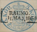
The first stamps issued for this country were envelopes only; and it was not till 1856 that adhesives came into use. The earliest envelopes used to be rather puzzling to collectors, not only because of their rarity, but also because it was believed that there were two issues of 1845, the second issue being in reversed colours (i.e., 10 kop., red, instead of black; and 20 kop., black, instead of red). The original stamps of this soi-disant second issue, in the reversed colours, are forgeries. Mr. Breitfuss, who has kindly given me many details, tells me that they were made by a Herr Elb, in Dresden, who sold them as entire envelopes, also cut square; and that he got 50 pounds and more, for each stamp!

The apparently genuine stamps in the reversed colors are fancy reprints. In 1850-60 the belief was almost universal that the so-called “second issue of 1845” existed; and, accordingly, in 1862, Moens ordered the following reprints, on strips of paper, also as tete-beche varieties: 10 kop., black; 10 kop., carmine; 20 kop., carmine; 20 kop., black. Even the Helsingfors postmaster, Herr Griffenberg, of whom M. Moens ordered the supply of reprints, was of the opinion that the reversed colors existed. In 1872, Moens again ordered a supply of reprints (of 1845 and 1850), and, in these second reprints, those of the 1845 set exist only in the proper colors, 10 kop., black, and 20 kop., carmine; in strips, also tete-beche.

1845. Envelopes; 10 k., black; 20 k., red.

Genuine

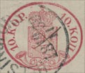
Engraved in colour, on rough laid paper, stamped in the left lower corner of the envelope. The lower arm of the cross, where it rests upon the orb, on the top of the crown, is wedge-shaped, and thicker at the bottom than at the top. The circlet at the base of the crown contains five very long, diamond-shaped jewels, with dots between them; but the jewels are so long, that their points run into the dots. These jewels are not by any means prominent; and at a first glance they look more like a sort of irregular wavy line than a row of jewels. I think this is the easiest test for the genuine. The left upper corner of the shield is quite sharp, but the right upper corner of it is cut off. The left lower corner is nicely rounded; but the right lower corner is cut off somewhat obliquely, instead of being rounded like the other. The outline of the circular bend of the right-hand post-horn is broken, just where it would almost touch the middle of the right-hand side of the shield, if complete. The P of PORTO is nearer to the top of the left-hand post-horn than the L of STEMPEL is to the top of the right-hand post-horn; but the difference is not very marked. The lower ends of both post-horns curl inwards, towards the rounded bottom corners of the shield.

Forged

Lithographed, on very smooth, laid paper, with the laid lines running straight up and down, instead-of obliquely. The lower arm of the cross is the same width as the others, all the way. The circlet at the base of the crown contains five very stumpy diamonds, very far apart, with dots between them; but the diamonds do not touch the dots at all. These diamonds are very distinct, and can be readily seen at a glance. Both the upper corners of the shield are quite sharp, and both the lower corners are nicely rounded. The outline of the ring of the right-hand post-horn is not broken, and it is at some little distance from the outline of the shield. The L of STEMPEL is a good deal nearer the top of the right-hand post-horn than the P of PORTO is to the top of the left-hand post-horn. In nearly all the forgeries, the lower end of the right-hand post-horn points downwards, almost towards the last K of KOPEK.

Bogus Envelopes

10 k., rose, vermilion; 20 k., black, greenish-black.

These, I conclude, are the productions of Elb, of Dresden, of which I have already spoken. They are lithographed, on thick, smooth, laid paper, with the laid lines running straight up and down, or on thinnish, and rather hard, white wove paper. The tests are exactly the same as for the forgeries of the first issue. In the 10 k., there is a queer little tail to the last K of KOPEK, which runs into the stop after that word.
The genuine stamps are usually very badly printed, so that the arms and the lines of shading on the shield are all blotched, and almost undecipherable. The forgeries are a little more clear and distinct.

Postmarks

Genuine.—All the originals that I have seen were cancelled with a pen-and-ink cross, or with a word, or part of a word, written upon them.

Forged. —The forgeries are generally unobliterated; but some of them bear part of a large circle or oval, with unreadable letters.

1850. Envelopes; 5, 10, 20 Kopeks.

The stamps of this issue may be known from the very similar ones of 1856, by the fact that the bell-mouths of the post-horns, below the shield, have no balls or pearls in them; whereas in the 1856 issue, each horn has a little white pearl in its mouth.
Mr. Breitfuss says, in one of his letters to me : “All cut specimens of the 1850 issue, 5 kop., blue, and 10 kop., carmine, without pearls in the post-horns, must be considered cut envelopes, even if used as adhesives; and ?iot as a special issue of adhesives without pearls.”

It will be seen that Mr. Breitfuss does not agree with ” L. Hanciau”, in the Monthly Journal for November 30th, 1903, who makes out that the cut specimens of the pearl-less envelopes of 1850 are really a first issue (March, 1856) of adhesives, and that the real adhesive issue with pearls (April, 1856) is a second issue of adhesives.

Genuine

Engraved, in a transverse oval, instead of the upright oval of the issue of 1845; stamped on the flap of the envelope, in the following varieties:

  • 5 k., blue, 10 k., rose; both on thin, blue wove paper.
  • 5 k., blue, 10 k., rose, 20 k., black, and greenish-black, all on thick, yellowish-white wove paper.
  • 20 k., black, and greenish-black, on white laid paper.

This latter 20 k. was the last issued of this set, and did not appear, I believe, until just before the next set, with the pearls in the post-horns, to be hereafter described. The design is much clearer than that of the two issues of 1845.

There are seven five-pointed stars in the shield, and the lines in it are a good deal farther apart than in either the genuine or forged stamps of 1845. The lion’s crown has five distinct rays or points to it. The projection at the base of the shield is rather long and sharp, and it points exactly between the crossed mouthpieces of the post-horns below it. The cross on the top of the large crown has a wedge-shaped base, as before, resting on the orb. There are nine pearls on each of the side-arches of the large crown, and four pearls in the central arch. Issuing from the top of the lower circlet of the crown, there are seven rays something like teeth, as in the last issue, though I did not mention them then, as the forgeries were similarly provided. The jewels in the lower circlet consist of five longish diamonds, tolerably far apart, with no dots between them. In some very darkly-printed copies, I notice that the ground behind some of the diamonds is dark; but usually the jewels are light, on a light ground. The lion holds an uplifted sword in his right front paw, and treads on a short sheath with the other three; the left front paw coming just to the front end of the sheath. Neither of the post-horns touches the shield anywhere. The lettering on the left side is in Finnish, that on the right side is in Russ, the final letter on the right being like two capital I’s joined together at the top. All the stops after the letters and figures are diamond-shaped.

First Forgery

I have seen but one forgery of this set; very poorly done, and not likely to deceive. Very coarsely lithographed, on thick, soft, coarsely-made, white wove paper, showing the marks of the meshes of the canvas 01″ wire-gauze very distinctly. There are only four stars on the shield, and they are six-pointed. The lion’s tail is single, instead of being double like the genuine, and has a star at the end of it, by way of tassel, I suppose. The crown on his head has no rays or points on it, and is very indistinct. The projection at the base of the shield is very short, and points to the left of the center of the crossing of the horns. The cross on the top of the large crown is too large, and very badly shaped; it touches the outline of the frame above it; and the lowest arm is not wedge-shaped. There are eleven pearls on the right arch of the crown, ten on the left arch, and none at all in the central arch. The orb is unshaded, though there ought to be two transverse lines across it. The circlet at the base of the crown is quite plain, and has no jewels upon it; there are no rays issuing from the top of the said circlet. The lion has no sword, and the sheath is so long that it reaches as far as the raised front paw. The middle curl of the right-hand post-horn touches the base of the shield. The final letter of the right-hand inscription is an English capital H; and all the stops are round, or as nearly round as the artist could make them for the money.

Second Forgery

Of this set I have seen only the 5, and the 20 kopeks. They are cleanly lithographed, on very thin, hard, white wove paper. There are eight stars in the shield, one being added just above the lion’s crown, which is not very plain. These stars are mostly four-pointed, though the two in the rounded corners of the base of the shield are five-pointed. The pearls on the side-arches of the crown are so exceedingly small, and so jumbled together, that it is quite impossible to count them, though there seem to be about twelve on the right-hand arch, and thirteen on the left-hand one. The pearls in the central arch are even smaller still. The orb and cross are all on one side, leaning considerably over to the right; this can be seen in an instant, and is an easy test for these forgeries. On each side of the central diamond, in the circlet at the base of the crown, there is a little white St. Andrew’s cross, which, of course, does not appear in the genuine. The stops in the inscription are all round, instead of being diamond-shaped. The word of value on the right-hand side reads KOIL, and has no stop after it; this will suffice, of itself, to condemn this counterfeit. I do not think this set of forgeries is very common. I have only seen one specimen each of the 5 and 20 kop., as mentioned above. They have a German look, but I do not know where they came from.

Postmarks

Genuine.—The genuine stamps are postmarked with a large transverse oblong, containing a Finnish inscription in large capitals, and some are found cancelled with a pen.

Forged.—The forgeries bear part of a large oval, containing lettering.

Reprints

The reprints of this issue (ordered by Moens in 1872) are printed on very hard, very thick, very white wove paper, and look clean and fresh. They are more carefully printed than the originals, and are, of course, always unused.

1856. Envelopes and Adhesives, 5, 10 Kopeks.

There are some slight differences between these stamps and those of the issue just described; but the most noticeable points are, that there is a small white pearl in the open end of each of the post- horns, and a very small pearl underneath the crown, between it and the top of the shield, and somewhat to the left of the center, i.e., just above the face of the lion. The varieties are as follows:

  • Envelopes: 5 k., blue, 10 k., rose, both on yellowish-white wove paper
  • Envelopes: 5 k., blue, 10 k., rose, both on thick, hard laid paper, with laid lines running obliquely
  • Adhesives: 5 k., blue, 10 k , rose, both on stoutish, yellowish-white wove paper.

These adhesives are exactly like the envelopes, and, when the latter are cut, those on the wove paper cannot be distinguished from the adhesives.

Album_Weeds_Finland15 Kopeks.

Genuine

Engraving, paper, etc., as before. The lion’s paw holding the sword is only partly shaded, and the point of the upper tail almost touches the bend of the lower one. The pointed base of the shield goes down so low, as to come almost into the angle formed by the crossed mouth-pieces of the horns. The dot between the top of the shield and the base of the crown is tolerably round. Three out of the five diamonds on the circlet at the base of the crown (i.e., the three to the left) have their points drawn out so as to touch; thus all the three are linked together. There are three distinct pearls in the central arch of the crown, and there is some appearance of a fourth, just at the very point of the central ray which touches them; and they and the ray are all joined together. All the stops are very large, and very distinctly diamond-shaped. The pearls in the wide ends of the post-horns are perfectly round, and the left-hand one is a good deal larger than the other. The final letter of the right-hand inscription is, as before, like two capital I’s, with a line running across the top, from one of the uprights to the other. The crown is put exactly midway between the two sides of the shield.

Forged

Lithographed, on white or bluish-white wove paper. The paw of the lion which holds the sword is of absolutely solid colour, and is much the darkest part of the whole of the design on the shield. The point of the upper tail docs not nearly touch the rounded part of the under one; in fact, there is a good space between them. The dot between the top of the shield and the base of the crown is of a very well-marked diamond-shape. The five diamond-shaped jewels on the circlet, at the base of the crown, do not touch each other. There are three small pearls in the central arch of the crown; but they appear to hang down from the orb above them, and do not touch the pointed ray beneath them. Some copies have no stop after the 5 on the left-hand side, and those which have it show the stop rounder and smaller than the others. The pearls in the open ends of the post-horns are anything but round, and both are about the same size. The final letter of the right-hand inscription is formed by two capital I’s, without any line running across, to join their tops together. The crown is slightly nearer to the right-hand side of the shield than to the left-hand side. The pointed base of the shield is very short, and does not go near the angle formed by the crossed mouthpieces of the post-horns.

Album_Weeds_Finland210 Kopeks.

Genuine

Engraving, paper, etc., as before. The upper tail of the lion is very wide at the end, and touches the rounded part of the lower one. There are four vertical lines of shading on the arm which holds the sword. The white dot, between the top of the shield and the base of the crown, is diamond-shaped. There are three pearls in the central arch of the crown, indistinct, and far apart. The two sides of this central arch project slightly above the level of the side-arches, but do not stand up higher than the pearls on the said side-arches. The uppermost star, on the left-hand side of the shield, just touches the upper boundary line of the shield; and the uppermost star on the right-hand side very nearly touches the boundary-line above it, in a similar manner. There is a tiny, dark dot to the right of the uppermost star, on the right-hand side of the shield, caused by the vertical line of shading being broken. The point at the base of the shield is like that of the genuine 5 kopeks, and comes down to almost within the angle formed by the crossed mouthpieces of the post-horns. These mouthpieces are of a sort of funnel-shape. The pearls in the large ends of the horns are very small, and the right-hand one is a little the larger of the two. The last letter of the right-hand inscription is, as before, distinctly joined at the top.

Forged

Lithographed, on slightly yellowish, very thin, white wove paper. The upper tail of the lion is not particularly wide at the end, and it does not nearly touch the rounded part of the lower tail. There is one oblique line of shading on the arm which holds the sword. The white dot between the top of the shield and the base of the crown is round. There appear to be four pearls on the central arch of the crown; but I am not quite sure, as they are very indistinct, and very close together. The two sides of this central arch project a great deal too far above the level of the side-arches; in fact, they come up almost as high as the very top of the orb, and far above the level of the pearls on the side-arches. The stars in the upper corners of the shield are at some distance from the out-line of the top of the shield. There is no dot to the right of the right- hand, top star. The point at the base of the shield is like that of the forged 5 kopeks, and does not go near the angle, formed by the crossed mouthpieces of the post-horns; besides which, it is placed too much to the left, instead of being central. The said mouthpieces end in things just like button-mushrooms, instead of being funnel-shaped. The pearls in the large ends of the horns are far too large, being almost as large as those of the genuine and forged 5 kopeks, and the left-hand one is larger than the other. The last letter of the right-hand inscription has no join at the top.

Postmarks

Genuine.—The genuine are very often only pen-stroked; but many copies bear part of a large circle, which contains name and date. I have sometimes seen both these cancellations together on a stamp. Sometimes also a word is written upon the stamp; and I have seen this both on the envelopes and adhesives.

Forged.—The forgeries usually bear a small circle, smaller than the size of the stamp, instead of larger, containing lettering and figures; and some of them are pen-stroked besides.

Reprints

These stamps have been reprinted, on very white, very hard, thick wove paper: the impressions, though very clean and fresh, show a marked deterioration of the dies, and are generally blotchy.

1860.

When the amateur has got thus far in collecting Finland stamps, he usually becomes rather “mixed“ in his ideas; for the varieties are certainly rather puzzling. In the stamps now to be described, there are two different types of the envelopes, one having only seven stars in the shield, the shield itself being shaded with fine vertical lines; and the other having an additional star, just over the lion’s head, and with the lines in the shield far apart. The first type is found, normally, impressed on yellowish-white wove paper; but the authorities, I suppose, found that it would be a pity to waste all the stock of the oval envelopes, and so impressed this new rectangular design upon the old envelopes, in the left-hand upper corner, at the same time cancelling the oval stamp, which had originally been struck on the flap. Thus the present set is found on the thick laid paper of the earlier set, with the laid lines running obliquely; also on the yellowish-white wove paper of which I have just spoken, etc.; but it would take up too much space to attempt to describe each variety, as they have little to do with the detection of counterfeits, so I had better, perhaps, simply give Moens’s list of the double envelopes. Of the seven star type he gives:

  • 
5 kop., on the 5 kop. of 1850
  • 5 kop., on the 10 kop. of 1850
  • 5 kop., on the 20 kop. of 1850

Of the eight star type he gives:

  • 5 kop., on the 5 kop. of 1850
  • 5 kop, on the 10 kop. of 1850
  • 10 kop., on the 10 kop. of 1845
  • 10 kop., on the 20 kop. of 1845
  • 10 kop. on the 5 kop of 1850

As the paper varies in these old envelopes of 1845, etc., it will be, of course, understood that it will naturally vary for these “economy-envelopes” now under discussion; and thus the variety-seeker will have enough to do to fill his pages of Finland. If any argument were needed for the retention of entire envelopes, it would be supplied in the present instance; for it is impossible to show both the stamps unless the whole envelope be kept. But now for the tests of the genuine.

Album_Weeds_Finland3 Album_Weeds_Finland41860. Type 1, seven stars; 5, 10 kop.

Genuine

Engraved in épargne, on any, or all, of the different kinds of paper hitherto mentioned. The stars in the shield are all small and five-pointed. There seem to be twenty-one lines in the shield, counting them along the extreme base of the shield; but they are difficult to see clearly. The cross on the top of the crown comes almost under the tail of the K above it. The lion has two tails, and a face like that of a monkey. The shield has a thick outline all the way round, except just under the base of the large crown. The lower peak of the shield points to the tail-end of the K below it. There are nine upward-pointing “keys” of the key-pattern in the left-hand frame, and nine downward-pointing “keys” in the right-hand frame. The white lines which define the circlet at the base of the large crown are very much curved upwards in the middle. The orb on the top of the crown, underneath the cross, is very distinct. The final letter of the upper inscription is joined at its top, but not at the bottom; and the two upright lines of the letter are far apart. It will be understood that all these tests serve equally for the 5 and the 10 kop.

Forged

I have only seen the 10 kop. forged, but the tests given above will easily serve to detect the 5 kop., if that value should exist. It is lithographed, on thinnish, white wove paper, rather hard. The stars in the shield are large, flat-looking, and all six-pointed. There are only eighteen lines of shading in the shield. The cross on the top of the crown comes exactly under the straight, commencing-stroke of the K above it. The lion has only one tail, and that has a large tassel at the end of it, instead of the small bulbs at the ends of the tails in the genuine. The lion’s face is something like that of a man, with a pointed beard; but it is not very distinct. The shield has a thick outline only at the base and the right-hand side, and its lower peak points to the first stroke of the K below it. There are only eight upward-pointing “keys” in the left-hand frame, and the same number of downward-pointing “keys” in the right-hand frame. The white lines which define the circlet at the base of the crown are not nearly so curved as in the genuine; in fact, the upper one is almost straight. The orb on the top of the crown is almost invisible. The two perpendicular lines, forming the last letter of the upper inscription, are joined by cross-strokes, both at the top and bottom, and are so close together that they almost run into each other.

1860. Adhesives, 5, 10 kop., seven stars.

Genuine

These are exactly the same as the envelopes just described; but they are printed on toned wove paper, which is very distinctly colored, throughout its substance, and are perforated “en serpentin”. This mode of separation ought rather to be called “roulette,” for there is no portion of the paper removed; but the stamps dovetail, as it were, into each other. I think it is about the very worst mode of separation which could well have been imagined; for any attempt to tear two stamps apart almost invariably results in a much more extensive tear than was intended. It is needless to repeat the tests for this set, as the stamps are exactly the same as the envelopes.

Forged

I have not yet seen any forgeries of these adhesives; but if there should be any, the tests for the genuine envelopes will serve to detect them.

1860. Second type, eight stars, 5, 10 kop.

Genuine

Engraved in épargne, as before, on any, or all, of the papers hitherto mentioned for the envelopes. There are some differences between the two stamps of this set. For instance, the wavy lines outside the central oval are very wide apart in the 5 kop., and very close together in the 10 kop. I will take, however, the points common to both values. The blade of the sword is single. The head of the lion has the same monkey-face as before. The lettering of the two inscriptions is so tall, as to extend to the very top and bottom of the containing-labels. The top figure of value is even further from the K of the inscription, than the bottom figure is from the K following it. The circlet at the base of the crown contains three very distinct, diamond-shaped jewels, and portions of two others. Both the upper corners of the shield are sharp, and the base of the shield does not touch the dotted oval anywhere. There are ninety-two dots in the oval, in the 5 kop., and eighty-four in the 10 kop. There are fourteen vertical lines of shading in the shield of the 5 kop., and seventeen in the shield of the 10 kop., not counting the outlines of the shield itself.

Forged

The counterfeiters have made an adhesive of this, and have not there-by improved its appearance. Lithographed, in a very blotchy way, on thin, white wove paper; pin-perf. 14. I only possess the 10 kop. of this set of forgeries. The blade of the sword is double, so that the lion appears to have two swords in his hand or paw. His head is like that of a goat, with a small, pointed beard, and open mouth. The lettering of the upper and lower inscriptions is far too low and dumpy, so that the figures and letters do not extend nearly to the top and bottom of their containing-labels. The o of the upper 10 almost touches the K immediately following it, but the o of the lower 10 is at a good distance from the K which follows it. The circlet at the base of the crown contains six oblong white dots, not very distinct. The right-hand, upper corner of the shield has been cut off; and the rounded portion of the base of the shield, on the right-hand side, touches the dotted oval, and the similar portion on the left-hand side almost touches it. There are only sixty-four clots in the oval, and no fewer than twenty-five vertical lines of shading in the shield.

Postmarks

Genuine.—In both these issues, the genuine are usually cancelled either with a pen-stroke, or with two lines of capitals, in an oblong frame.

Forged.—The forgeries bear either a set of five parallel bars, or an inscription in an oval, with a very peculiar, thin, wavy outline. The cancellation on the flap design on the “economy-envelopes” is a simple cross, in pen-and-ink.

1866. 8 Pennia, adhesive.

There is, of course, a full set of the genuine, comprising 5, 8, 10, 20, 40 pen., and 1 mark; all, by the way, differing greatly from each other; but I have only met with the 8 pen. forged.

Genuine

Engraved in épargne, as before, on colored, wove or laid paper, very thin serpentine roulette. The lion has the usual monkey-face, and the mouth is shut. There are three distinct, diamond-shaped jewels in the circlet at the base of the crown, and portions of two others. The shield bears twenty vertical lines of shading, counted from the base, and not including the out- lines of the shield itself. There are 105 dots in the oval, and they are all more or less square. The base of the shield is a long way from these dots. The wavy lines outside the oval are ratter coarse, and far apart, so that they show no tendency to run together. The large crown is a long way from the dotted oval.

Forged

This is a fair copy, but the printing is so badly done that it is not likely to deceive in its present state. Lithographed, on thick, bluish-green wove paper; unperforated. The lion has the goat’s face of the last-described forgery, with open mouth and pointed beard. There are eight oblong blotches in the circlet at the base of the crown, and several of these blotches run together. The shield bears about twenty-seven lines of shading, but they are very much blotched, and difficult to count. The oval has only sixty-four dots, and most of them are round, instead of square. The rounded base of the shield, at the right-hand side, touches the dots, and the left-hand side of the shield almost touches them also. The crown comes very close to the dots; indeed, it almost touches them on the left-hand side. The wavy lines, outside the oval, are very fine and close together, so that they almost touch each other.

Postmarks

Genuine.—The genuine stamps are usually cancelled with a rough circle, containing name and date.

Forged.—The forgeries bear the five parallel bars as before.

N.B. — The description given above will only serve for the 8 pennia; for, as I have said, the different values vary greatly, each being separately engraved.

Bogus Perforation

1877, etc. 1 mark, lilac.

This stamp is found perf. 11 or 12 1/2, or 11 x 12 1/2 according to date. The Timbre-Poste, in 1896,
described a bogus stamp, manufactured out of an imperforate proof or essay, having serpetitine perfs.

I have not seen this fraud, but understand that the serpentine perf. on three sides does not agree with the gauge of the old serpentine perf. of Finland, and that the cancellation is of some unknown type. My readers will therefore understand that any 1 mark, lilac, with serpentine perfs., that may be offered to them, is bogus.


From: ‘Album Weeds’, 3rd edition by R. B. Eareé. 1906


Album Weeds – Fiji

1871. No surcharge; 1d., 3d. & 6d.

Album_Weeds_Fiji1One Penny. Genuine

Engraved in épargne, on thin, soft, white wove paper, badly perforated 125, watermarked FIJI POSTAGE through the middle row of stamps in the sheet. The dark shading at the bottom of the crown is in a perfectly straight line. The ends of all the white strokes, forming the letters C R, are tapered off until they are quite fine; but they get wider in the center, as they would in ordinary written capitals, made with pen-and-ink. The central circle is surrounded by sixty white pearls, all circular in shape, and of one uniform size. The bottom of the P of POSTAGE is a little sloped off, so as not to touch the outline of the frame to the left of it. The Y of PENNY has its arms splayed out far too much. The whole of this lower inscription is slightly sunk into the paper, almost as though it had been done with type. The outline of the circle, just inside the pearls, is formed by a very thin, colored line, between two thin, white ones.

One Penny. First Forgery

Lithographed, on very white paper, thicker than the genuine, pin-perforated what seems to be about 15, but so extremely badly done that it is impossible to say what is the proper gauge; no watermark. The dark shading at the bottom of the crown is considerably curved or rounded downwards in the center. The strokes forming the letters C R are, as nearly as possible, the same thickness, throughout their whole length. The central circle contains only fifty-five pearls, and they are oval instead of round, and some of them smaller than the others. The bottom of the P of POSTAGE is joined to the frame to the left of it. The Y of PENNY is of the normal shape; i.e., the arms are not unduly splayed out. As the stamp is a lithograph, I need hardly say that the lower inscription does not show any appearance of being sunk into the paper, but is perfectly flat. The outline of the circle, immediately inside the row of pearls, is composed of one broadish white line only.

One Penny. Second Forgery

This is not nearly so good an imitation as the last. Lithographed, on soft paper, very like that of the genuine; no watermark; perforated 14. The dark shading at the base of the crown is rounded downwards, instead of being in a straight line, and the crown itself is extremely blotchy and indistinct. The letters C R are tapered more like the genuine than the first forgery; but their outline is ragged. There are only fifty-two pearls in the circle, and they are very irregular, both in shape and size. The P of POSTAGE does not touch the side of the frame to the left of it, but the bottom of the letter is not sloped off at all. The T of the; same word is very tall and lanky; the O of ONE is very much smaller than the NE; and the E of PENNY has hardly any indication of a central tongue. This inscription is not sunk into the paper.

Album_Weeds_Fiji2Threepence. Genuine

Paper, watermark, perforation, etc., the same as in the genuine one penny. The design of this stamp is different from that of the penny, the circle having sixty-nine dark dice, alternating with sixty-nine light ones, instead of pearls. The crown and the letters C R are the same as in the genuine penny.

Threepence. Forged

Lithographed, on thin, white wove paper, rather harder than the genuine; no watermark; perforated 12 1/2. Except for the inscription— POSTAGE THREE PENCE—this stamp is an exact copy of the first forgery of the penny, having the fifty-five pearls, the rounded base to the crown, the C R in letters of uniform thickness, etc.

Album_Weeds_Fiji3Sixpence. Genuine

Paper, watermark, perforation, etc., the same as in the genuine one penny. This stamp again is different from either of the other values.

The outline of the central circle is composed, not of pearls, as in the one penny, nor of little white dice, or rectangles, as in the threepence; but of a pattern of thirty-nine dark zig-zags, on a lighter ground. The base of the crown is straight; the letters C R are tapered nicely at their ends, as before; the lower corners, above POS of POSTAGE, and above NCE of PENCE, contain large triangles, composed of white dots. The ends of the upper label, containing the name, are of peculiar, curly ornaments, in place of the crosses of the one penny and threepence values. The tail of the s of six is drawn considerably too long, as are also the lowest strokes of both the first and second E of PENCE. A hexagon of white lines is visible in the central circle.

Sixpence. First Forgery

Lithographed, on white wove paper, similar to that of the genuine, but harder; no watermark; perforated 12. The forgers have copied nearly the whole of this stamp from the forged one penny. The outline of the circle contains fifty-five pearls, instead of the zig-zag line of the genuine. The base of the crown is rounded downwards. The letters C R are of uniform thickness throughout, instead of being tapered at their ends. The triangles, above POS of POSTAGE;, and above ENCE of PENCE, are formed each of one broad, white line, instead of dots. This is very conspicuous. The ends of the upper label are copied from the genuine sixpence. Each E of PENCE is of the normal shape, as is also the S of Six, though they are very much out of shape in the genuine. There is no hexagon in the central circle.

Sixpence. Second Forgery

Electrotyped, in a sort of violet-carmine, on stout, green wove paper, no watermark, perf. 9 1/2! The central circle is bounded by zig-zags, as in the genuine, and four out of the six white lines of the hexagon in the said circle are visible. The bottom part of the crown is rounded, but not so much so as in the first forgery. After the paper and perforation, the easiest test for this counterfeit is the white band at the base of the crown. In the genuine (in all issues and values) this white band is ornamented with five ermine-spots or “tails”; each represented by a sort of small >, lying on its side, with the sharp point to the right. In the forgery, this band is plain white, without any ermine spots. I never saw this forgery until 1891.

Spud_Fiji11872. Same stamps surcharged 2, 6 & 12 Cents.

These are exactly the same as the genuine stamps described above, except that the one penny is surcharged in black TWO CENTS, the threepence is surcharged SIX CENTS, and the sixpence
is surcharged TWELVE CENTS.

First Forgery

These will easily be detected, as they are simply the first set of forgeries just described, with the surcharge added. Both the above-described forgeries of the one penny value are found with the TWO CENTS surcharge.

Second Forgery

These are very much more dangerous, being’ the genuine stamps of the 1871 set, with forged surcharge. I am sorry to say that they passed through my hands at a time when I had no opportunity of taking notes of the surcharge; but, as far as I remember, the types used to print the surcharge on the forgeries were well-nigh identical with those used for the genuine; so that collectors would do well to make quite sure of the source whence those offered to them for sale were procured.

Album_Weeds_Fiji51875. 2c., 6c„ 12c., with “V.R.”

There are two varieties of the “V.R.” surcharge; the one in Roman capitals, and the other in (so-called) “Gothic” letters. They are usually divided in the catalogs, as though they were distinct issues; but, as a matter of fact, both of them (together with many sub-varieties) are found on the same sheet.
Roman V.R.; 2c., 6c. & 12c.

Genuine

From the center of the V to the center of the R, there is a distance of 4 millimeters; and, from the center of the stop after the V to the center of the stop after the R, there is also a distance of 4 millimeters. The stops are large.

Forged

The letters are a great deal too far apart. From the center of the V to that of the R, the distance is very nearly 8 1/2 millimeters, and there is also a distance of 8 1/2 millimeters between the two stops. The said stops are very small, and the one after the V is placed rather below the level of the bottom of the letter.

“GoAlbum_Weeds_Fiji6thic” V.R.; 2c, 6c. & 12c.

Genuine

The center of the letters, V.R., are 4 1/2 millimeters apart, and the centers of the stops are 4 1/2 millimeters apart. The little cross-strokes in the sides of the V are level with each other; and the side-lines are broken to allow of the admission of the said cross-strokes. The vertical, first stroke of the R is similarly broken in the center, to allow the thick cross-stroke to pass through it. The top of this vertical stroke projects only very slightly to the left. The rounded part of the head of the R has a projection to the right. In normal copies, the stops are nicely-shaped diamonds, with concave sides; both being the same size and shape.

Forged

The centers of the letters, V.R., are very nearly 6 millimeters apart, and the centers of the stops are 5 1/2 millimeters apart. The cross-stroke in the left side of the V is decidedly higher than the other. The whole letter is in one piece, so that there is no break for the admission of the cross-strokes. (The same is the case with the R.) The top of the first, or vertical, stroke of the R projects considerably to the left, in the shape of a clumsy blotch. The rounded part of the head of the R is like that of an ordinary Roman R, without any projection. The stops are very shapeless, the one after the V being considerably larger than the other.

Album_Weeds_Fiji71882. Five Shillings, black and salmon-red.

Genuine

Engraved in épargne, on medium, white wove paper, perf. 10. There are eleven distinct pearls outside the curved white line above FIJI; the one to the extreme left touches the frame around the
5, and the corner of the white line runs into this pearl. The last pearl but one to the right is almost exactly above the last I of FIJI. The bottom of the F of the lower FIVE is cut off slantingly down, from left to right. The pearls on stalks in the Queen’s crown are large and round. The ornaments between the said pearls are a thistle, a shamrock, and a thistle; the shamrock being very much lower than the pearls each side of it. The profile is not outlined; being formed, as usual,
merely by the stoppage of the horizontal lines of the background. The chin projects somewhat. There is a tolerably long curl hanging from the chignon.

Forged

Electrotyped, on medium, white wove paper, ungummed. This has probably been made as an illustration to some cataloge, for the perforation is merely printed round the stamp. If pierced, it would gauge 11 1/2 x 11, etc. There are eleven pearls above FIJI, but the eleventh to the left is a mere abortion, which does not touch the frame round the 5, and is at the top of the line, instead of at the corner of it. The last pearl but one to the right is far to the right of the last I of FIJI. The bottom of the F of the lower FIVE is rounded. The pearls on stalks in the crown are very indistinct, and two of them seem to be diamond- shaped. The ornaments between the said pearls are a thistle (very badly shaped, and far too short), a very tall fleur-de-lys, and a shapeless object, to represent a thistle. The profile has a distinct, dark outline, and the chin is very retreating. There is a dark, projecting lump below the chignon, but it is not at all like a curl. The central medallion is pink, instead of salmon-red.

Postmarks

Genuine.—65, without numerals. The lines must have been highly embossed on the hand-stamp, and with sharp edges; for they cut through the stamp, and sometimes even through the paper of the envelopes to which the stamps are affixed. I suppose the Fiji postal authorities are resolved that the stamps shall never do duty a second time.

Forged.—10, 76, 100.

Private Stamps – “FIJI TIMES EXPRESS.”

Album_Weeds_Fiji81870. 1d., black on rose.

Genuine

Type-set; printed in black, on rose-coloured, quadrille paper, or on laid bâtonné, rouletted 20, on dotted lines. The numeral 1 is just 4 millimeters high at the highest point. A line drawn along the tops of the letters of PENNY would cut almost centrally through the last S of EXPRESS. T h e horizontal line above TIMES, and the similar one below PENNY, are a great deal thicker than any of the other lines. In my specimen, the line above TIMES is broken just before the T ; and the one below PENNY is broken in two places, below the centre of each N of that word.

Forged

Type-set, on stout, violet-rose wove paper, and also on very pale, rose laid paper rouletted 20, on dotted lines, or pin-perf. about 12. The 1 is 5 3/4 millimeters high at its highest point. A line drawn along the tops of the letters of PENNY would pass just clear below the last S of EXPRESS. All four lines of the frame are, as nearly as possible, the same thickness, and the top and bottom lines are not broken anywhere.

Album_Weeds_Fiji91870. 3d., black on rose.

Genuine

Paper, printing, etc., same as in the genuine one penny. The numeral is a plain 3.

Forged

The 3 is an ornamental numeral, with an outline all round it. The top line is broken above the S of TIMES, and the bottom line is broken under the P of PENCE. The other tests are the same as for the forged one penny.

1870. 6d., black on rose.

Genuine

Paper, printing, etc., the same as in the genuine one penny. The top line is broken, in my copy, above the E of TIMES; and the bottom line is broken in two places, below the beginning and end of the E of PENCE. The 6 is a plain numeral, nearly 7 millimeters high.

Forged

The top line is unbroken; the bottom line is broken below the end of the E of PENCE. The 6 is just five millimeters high; it is an ornamental numeral, with an outline all round it. The other tests are the same as for the forged one penny.

1870. 9d., black on rose.

Genuine

The numeral is plain, but I do not know the The top line is broken above the end of the S of TIMES, and the bottom line is broken under the P of PENCE. The 9 is a plain numeral this time, very nearly 6 millimeters high. The other tests are the same as in the forged one penny.

1870. 1s., black on rose.

Genuine

Paper, printing, etc., as in the genuine one penny. The top line, in my copy, is broken, above the E, and beyond the end of the S, of TIMES; and the bottom line is broken, below the end of the H, and below the beginning of the second L, of SHILLING. The I is an ornamental numeral (the only one of the set); it is 6 millimeters high, and has an outline all round it.

Forged

My specimen, on wove paper, has the top line unbroken. The bottom line is extremely thin, but it appears to be unbroken. The left-hand line is broken, opposite the first I of FIJI, and the right-hand line is broken, opposite the P of EXPRESS. In one specimen, on laid paper, the top line is unbroken, the bottom line is also unbroken, the left-hand line is broken, opposite to the first I of FIJI, and the right-hand line has a wide gap, opposite to the space between the R and second E of EXPRESS. In another specimen on the laid paper, the top line is broken, above the E of TIMES, the bottom line is broken, below the second L of SHILLING, the left-hand line is broken by the J of FIJI, and the right-hand line is broken, opposite to the R of EXPRESS.

Soi-disant “reprints” of the Times Express stamps

Bacon’s Reprints says that so-called “reprints” of all five values were made in 1876, on laid, bâtonné rose paper. The stamps are shorter (16 mm., instead of 18 1/2 mm.), and differ in type; and the 6d. has a small numeral of value, instead of a large one. They are unperforated, also pin-perf.
NOTE.—The “rouletting on colored lines” is done in these stamps (genuine and forged) by notched (brass ?) rule, which is rather higher than the type. The rule gets inked with the rest of the impression, and when the platen descends, the pressure which forces the paper down on the types, also forces the notches in the rule through the paper, making a row of cuts, while the sides of the notches ink the paper, making a row of dashes.


From: ‘Album Weeds’, 3rd edition by R. B. Eareé. 1906


LupSee also


Album Weeds – Egypt

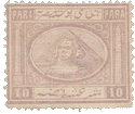
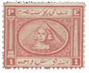
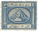
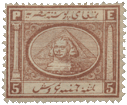
Album_Weeds_Egypt11866. 5, 10, 20 Paras; 1, 2, 5, 10 Piastres.

Genuine

As the design varies for each separate value, I shall have to describe them one by one; but first I may take the tests common to all the values.

Typographed (?) in colour, on thin, greyish-white wove paper; watermarked (all but the 1 Piastre) with a ten-rayed star, or flower, whichever it may be, over a pyramid; perforated 12 1/2 all round, or sometimes perforated 12 1/2 top and bottom, and unperforated at the sides. The characters of the top surcharge are all joined together; the one like a magnified comma touching the oblique stroke to the left of it with its tail.

5 Paras. Genuine

The right-hand end of the middle surcharge is a very small, blunt, upward hook; and the left-hand end of it is a long, large, upward hook, whose upper point ends on a level with the right-hand hook. The bottom surcharge has one dot below the first character on the right-hand end, three clustering dots below the center of the said surcharge, and one dot over a short wavy line, above the surcharge, a little to the right of the center. The 5 in each corner is small and compact, with its head quite as large as its tail. The central flower has fourteen petals. The borders of the stamp are formed of diamond-shaped ornaments; but the point of a large diamond runs into the middle of each piece of bordering, at the top and bottom and sides. The top border has three entire diamonds to left of the large one, and almost three entire diamonds to the right; but the large diamond hides a small part of the inner diamond on the right. The bottom border contains three entire diamonds to the right, and also three entire ones to the left of the large one. The inner points of these large diamonds, at top and bottom, do not touch the frame, or rather the points of the frame, of the central flower.

5 Paras. Forged.

Lithographed, on stout, very white wove paper; no watermark; perforated 12, and sometimes 12 1/2. The character like a magnified comma, in the top surcharge, does not touch the oblique stroke to the left of it with its tail. The right-hand end of the middle surcharge is a small knob, which points downwards, obliquely, to the right. The left-hand side of the said surcharge ends merely in a curve, with a blunt end, a good deal lower than the level of the right-hand end. The bottom surcharge is quite different from the genuine, being a copy of the bottom one of the genuine 20 Paras, to be described hereafter. There is a stroke under the first character of this surcharge to the right, three clustering dots under the last character to left, and no dot at all above the surcharge. Each 5 is of a peculiar shape, with the tail very much larger than the head. The central flower has nineteen petals. In the top border, there are only two and a half entire, small diamonds, on each side of the point of the large diamond. In the bottom border, there are three to the left, and two and a half to the right of the large diamond. The inner points of the top and bottom large diamonds are joined to the points of the frame round the central flower.

10 Paras. Genuine

The paper, watermark, and perforation are the same as m the genuine 5 Paras; the central surcharge also is exactly the same. In the bottom surcharge, there is a short, upright stroke at the right-hand end, and a thing like a figure 8 with the top broken, at the left-hand end, with three clustering dots below it. There are twenty-eight circles round the central oval. The coloured line outside this oval is not blotched anywhere, and it is the same thickness all the way round. The 10 in the left-hand upper corner has the 1 without any oblique side-stroke; i.e., it is simply a straight line, and the o is very much thicker than the 1. The 10 in the lower left-hand corner has its I a simple straight stroke like the other, and the 1 and the o are of equal thinness.

10 Paras. Forged

Paper, perforation, etc., the same as in the forged 5 Paras. The large, central loop of the middle surcharge is broken at the top. In the bottom surcharge, there is a dot at the right-hand end, a large hook at the left-hand end, and three separate dots and a sort of a comma at various distances along the top of the inscription. (This is a copy of the bottom surcharge on the genuine 1 Piastre.) There are only twenty-seven circles round the central oval. The colored line surrounding this oval is blotched, to the left of the bottom of the oval, and too thick to the right of the bottom of the oval. There is a stop before the 1 of the 10 in the upper left-hand corner, and the 1 has an oblique side-stroke; the 1 and the o are of equal thickness. The 10 in the lower right-hand corner is like the other, but there is no stop before the 1.

20 Paras. Genuine

Paper, perforation, watermark, etc., the same as in the genuine 5 Paras. The right-hand end of the middle surcharge is a very small loop, with a white center. The right-hand end of the bottom surcharge is like a capital V, laid on its side, with its point to the left, and with a short, wavy stroke below it. There is a thick, small o, forming the top of the central letter of the inscription, and with three clustering dots below the left-hand end of it. The P of PARA in the upper, left-hand corner is of the same thickness as the rest of the letters of the word; and the top of each A is pointed. The P of PARA in the lower, right-hand corner is like the other one; but the top of each A is cut off square.

The bottom, heart-shaped point of the central cross or ornament inclines too much to the right of its proper position.

20 Paras. Forged

Paper, perforation, etc., the same as in the forged 5 Paras. The right-hand end of the middle surcharge is a black knob; and the center of the middle loop of it is round, instead of being oval, as the genuine is. The bottom surcharge is like that of the genuine 5 Paras, with a dot below the first letter at the right-hand end, a dot and a stroke above the middle of it, and three clustering dots below the middle. The P of PARA in the upper, left-hand corner is very thin, and squeezed up, compared with the rest of the letters of the word; the first A is pointed, and the second A is cut off square. The P of PARA in the lower, right-hand corner is very badly shaped; the first A is cut off square, and the second A is rounded at the top. The bottom point of the central cross or ornament inclines too much to the left of its proper position.

1 Piastre. Genuine

Paper, perforation, etc., the same as in the genuine 5 Paras. This value, as I said before, is not watermarked. The little loop at the right-hand end of the central surcharge is on a level with the line to the left of it. This surcharge exactly fills up the width of the central oval; that is to say, it is as long as the oval is wide. The semicircular portions of the arabesque oval, which project into the corner-labels containing the figures and letters, are all of exactly equal size and shape. There is a round, white stop between the letters P.E, in the left-hand, upper corner, and the E is taller than the P. There is also a round white stop between the letters P.E, in the lower, right-hand corner, and the E is very much taller than the P. There are ninety-seven equal-sized pearls round the frame. The outer line of the stamp is thicker at the top and bottom than at the sides.

1 Piastre. Forged

Paper, perforation, etc., the same as in the forged 5 Paras. The right-hand loop of the central surcharge is bent downwards, below the level of the line to the left of it. This surcharge is too short, and does not fill up the width of the central oval. The pieces of the arabesque oval, which project into the corner-labels, are of different sizes; and those which go into the corners, containing the figure 1, are very much larger and rounder than those which go into the other corners, containing the letters P.E. There is a square, white stop between the letters P.E, in the upper, left- hand corner, and both the said letters are of the same height. There is an almost invisible stop between the letters P.E, in the lower, right-hand corner, and both the letters are of the same size. There are eighty-four pearls round the frame, of all sizes and shapes. The outer line of the stamp is thinner at the top and at the bottom than at the sides.

2 Piastres. Genuine

The paper, watermark, perforation, etc., are the same as in the genuine 5 paras. The right-hand end of the middle surcharge is a small, round loop, which is level with the line to the left of it; the 
center of the large loop, in the middle of this surcharge, is an oval; the left-hand end of it is a large, upward hook, as before, with its tail pointing almost towards the large, central loop. The design or ornament in the central circle is not at all prominent, and has very little white about it; indeed, the colour of the stamp is usually so pale, that it is almost impossible to describe the shape of the central flower. The ring round this central circle is shaded all the way round, with crossed, vertical and horizontal lines. The octagonal frame, round the whole design, is filled with a double spiral pattern, difficult to describe, but almost exactly like the twined snakes to be seen on the stamps of the Dutch Indies, though, of course, smaller, and not in the least like a rope. There is a distinct, white stop after each of the letters P.E., in the left-hand upper corner; the letters are very thick and clumsy, and the middle tongue of the E projects as far as the upper and lower strokes. The same description exactly holds good for the letters P.E, in the lower, right-hand corner. The 2 in the upper, right-hand corner is compact in shape ; the tail is quite as thick as the rest of the figure. The other 2, in the lower, left-hand corner, is exactly the same. The ordinary color of this stamp is a pale, dull “ochreish” orange.

2 Piastres. Forged

Paper, perforation, etc., the same as in the forged 5 Paras. The small loop at the right-hand end of the middle surcharge is bent downwards, below the level of the line proceeding from it; the center of the large loop, in the middle of this surcharge, is triangular in shape; the left-hand end is a semicircle, whose end points directly upwards. The central design is very white and prominent, looking like four white ivy leaves, arranged in the form of a cross. The ring round this design is shaded with vertical lines only. The pattern filling the octagonal frame, round the whole design, is a rope, with rather loose strands, and not in the least like the double spirals of the genuine. There is a very small stop after the P, in the upper, left-hand corner, but only a sort of indication of a stop after the E; the letters are not too thick, and are properly made; and the central tongue of the E is shorter than the upper and lower ones. This description will hold good also for the letters in the lower right-hand corner, except that there is a small stop after both P and E. The 2 in the upper, right-hand corner is thin—thinner than the letters opposite to it— and the tail is thinner still. The 2 in the lower, left-hand corner is just the same, except that its tail, or part of it, is so thin as to be almost in- visible. The colour of the forgery is generally either a greenish-lemon, or greenish-orange; the latter, I think, is the more common.

5 Piastres. Genuine

Paper, watermark, perforation, etc., the same as in the genuine 5 Paras. The middle surcharge is exactly like that on the genuine 2 Piastres just described. In the lower surcharge, there is a dot below the first letter on the right-hand side; and above the surcharge, counting from the right-hand end, there is, first of all, a dot with a short vertical stroke below it, then a dot, a little to the left, then a comma, and then another dot, with a stroke beneath the dot. (It will be understood that these are all at various distances along the top of this surcharge.) The central design is a flower, with seven petals; and immediately round the flower there is a small ring, shaded with vertical lines. Just inside the largest oval there is a very narrow oval, filled with pearls; these pearls are very indistinct, and would hardly be noticed at a first glance. There are eleven of them in the top part of the oval, twelve in the bottom part, eleven on the right-hand side, and thirteen on the left-hand side. There is a stop after each of the letters P.E., in the upper, left-hand corner, and a stop after the P only, in the lower, right-hand corner. There is a stop after the 5, in the upper, right-hand corner, and the head and tail of the figure are both of the same thickness. There is no stop after the 5, in the lower, left-hand corner, and the head of the 5 is much thinner than the tail. Each of the corner-circles distinctly touches both sides of each corner; indeed, the upper, right-hand circle projects slightly beyond the right side of the stamp.

5 Piastres. First Forgery

Paper, etc., as in the forged 5 Paras. The large, central loop of the middle surcharge is broken at the top, and the left-hand hook has a blunt point, instead of a very sharp one. The lower surcharge is a passable imitation of the genuine. The central design is a flower, with six petals, and the little ring round it is perfectly white, without any shading at all. This is a very easy test. The pearls are much too distinct, and too far apart; there are ten of them in the top of the oval, ten in the bottom of it, twelve on the right-hand side, and ten on the left. In both the lettered circles, there is a stop only after the P. There is no stop after either 5: the upper one is a large, straggling figure, with the tail larger than the head; the lower one is more compact, with head and tail of equal thinness. The corner-circles do not really touch any of the boundary-lines, though there is a blotch to the left of each of those on the left side, which makes them look as though they touched the left-hand outline of the frame.

5 Piastres. Second Forgery

Paper, etc., the same as in the forged 5 Paras. The right-hand end of the middle surcharge is opened out into a semicircle, and the left-hand hook is blunt. The lower surcharge is not in the least like the genuine, being a copy of that upon the genuine 10 Piastres. There are only six petals to the central flower, and the ring round it is white, as in the first forgery of this value. The pearled oval has ten pearls at the top, ten at the bottom, thirteen on the right-hand side, and ten on the left-hand side. There is a stop after both P and E, in the upper, left-hand corner, and a stop after the P only, in the lower, right-hand corner. There is a stop after the upper 5, which figure has its head larger than its tail. There is no stop after the lower 5, which figure has its tail very much larger than its head. The head and tail of both these figures are of equal thickness; the corner-circles do not touch the outline of the frame.

5 Piastres. Third Forgery

Paper, etc., the same as in the last forgery. The right-hand end of the middle surcharge is opened out into a semicircle. The large loop, in the center of this surcharge, is broken at the top, and the tail of the left-hand hook is blunt. The central flower has six petals. The ring round it is white, instead of being shaded. There are ten pearls at the top of the pearled oval, nine at the bottom, about twelve on the right-hand side, and ten on the left-hand side. There is a stop after each of the letters P.E., in the upper, left-hand corner; but a stop after the E only, in the lower, right-hand corner. The upper 5 is altogether undecipherable, being blotched into the background. The lower 5 has its tail very sharply pointed, and larger than the head, and thinner. The circles do not touch the out- line of the frame. This is the worst forgery of the lot, and ought not to deceive anybody.

10 Piastres. Genuine

Paper, watermark, etc., the same as in the genuine 5 Paras; middle surcharge exactly the same as the last. The central oval is filled with an arabesque design, but so faint that the details cannot be described. The points of the large corner-triangles do not anything like touch each other, and there is a space of at least a quarter of an inch between them, on each side of the outer oval, and rather less at the top and bottom of it. There is a white stop after both P and E, in both corners, and one also after the upper 10. The letters do not touch the boundary of the little frames containing them. The colour of the stamp is slate.

10 Piastres. Forged

This appears to be from another set. The paper is thicker and smoother, and of a decidedly yellowish tint. The little loop at the right-hand end of the middle surcharge is broken at the top, and the hook at the left-hand end points directly upwards, instead of towards the large, central loop. The top surcharge is not all in one piece. The tail of the magnified comma does not touch the oblique line to the left of it. The central oval is the best test for this forgery, as it is filled simply with crossed, vertical, and horizontal lines, without any arabesque pattern in it at all. The points of the large corner-triangles come very close together; those on the right almost touch, those on the left are nearly as close, but those at the top and bottom are a little further from each other. There is a white stop after the p only, in the top corner, a stop after both p and E, in the lower corner, and the top E touches the outline of the little frame round it. There is no stop after either 10. At a first glance, this forgery looks rather better than the genuine; but the oval of crossed lines will at once betray it. The colour is a greenish neutral tint, not at all like the dull slate of the genuine.

Postmarks

Genuine.—1, 3, 12.
Forged.—1, 37 (no numerals), 52, 101.


1867. 5, 10, 20 Paras; 1, 2, 5 Piastres.
Spud_Egypt1 Spud_Egypt2 Spud_Egypt3 Spud_Egypt4 Spud_Egypt5 Spud_Egypt6


There are four types of each value in this issue, distinguished by the position of the pyramid in the central oval, and by the shape of the Arabic letters, but I have not been able to obtain entire sheets of the different values. Some of the forgeries are rather well done, and are considerably more deceptive than the counterfeits of the first issue.

Genuine

All the values are engraved in colour, on hard moderately thick, white wove paper, watermarked with a star over a crescent; perforated 15 x 12 1/2. I have called the design on the s back a “watermark”; but the fact is that this design is impressed after the paper is made, something after the manner of the oval design on the backs of the Swiss stamps of 1862-82; whereas a proper watermark is made in the paper, during the manufacture, before it is quite solidified.

5 Paras. Genuine

The head of the sphinx does not touch the two outlines of the front face of the pyramid, and there is a pretty good space between the head and the said outlines. There are twenty horizontal lines of shading in the left-hand half of the central oval, and only nineteen in the right-hand half. The
point of the pyramid projects very slightly above the topmost line of shading. The dark oval touches the frame to left, to right, and at the top; but not at the bottom. The left shoulder of the sphinx (i.e., to the right of the stamp) has two horizontal lines across it, separating it, as it were, into three divisions; but these divisions are not like steps. The point of the pyramid is rather blunt. The labels at the bottom, containing the figures of value, are very much wider than the width of the side-frames which contain the pillar and “needle”; indeed, they are nearly as wide as the two labels at the top, which contain the word PARA.

5 Paras. First Forgery

I have only one copy of this counterfeit. It is very good, and not common. The specimen is cut closely, so I am not able to say whether it has been perforated or not. Lithographed, on hard, white wove paper, very like that of the genuine, but without any watermark. The head of the sphinx almost touches the two outlines of the front face of the pyramid. There are twenty-one horizontal lines of shading on the left-hand side of the central oval, and the same number on the right-hand side. The pyramid ends in a tolerably sharp point, which only just comes up as far as the uppermost line of shading, and does not project beyond it. The dark oval touches the frame on the right side, and very nearly touches it on the left; but is at a considerable distance from the top and bottom of the frame. The left shoulder of the sphinx, on the right side of the stamp, is cut into three very distinct steps. The labels at the bottom, containing the figures of value, are as wide in this forgery as in the genuine.

5 Paras. Second Forgery

This is much less like the genuine than the one just described, but is very much more common; in fact, I continually find the whole set of this type in the collections sent to me for opinion.

Lithographed, in reddish-orange, instead of golden-yellow, on thick, rather soft, very white wove paper; no watermark; badly pin-perforated 12 1/2. The head of the sphinx almost touches the outlines of the front face of the pyramid, as in the first forgery. There are twenty-two horizontal lines of shading on the left-hand side of the oval, and twenty-one on the right-hand side. The pyramid is sharply pointed, and the point does not project beyond the topmost line of shading. The left shoulder of the sphinx, on the right-hand side of the stamp, is cut into three distinct steps, as in the first forgery. The great test, however, for this counterfeit is in the fact that the lower labels, which contain the figures of value, are only as wide as the width of the side-frames, which contain the “needle” and the pillar. The dark oval touches the frame on the right side only. The Egyptian inscription in the bottom label is that of the genuine 5 Piastres, to be described hereafter.

10 Paras. Genuine

Perforation, watermark, etc., exactly the same as in the genuine 5 Paras. Indeed, to save trouble and unnecessary repetition, I may say here that all the genuine are alike in these characteristics. The head of the sphinx does not touch the two outlines of the front face of the pyramid. In one type, there are twenty horizontal lines of shading on each side of the central oval, behind the pyramid; and in another type, there are twenty on the left-hand side, and nineteen on the right-hand side. In the former type, the point of the pyramid projects considerably beyond the topmost line of shading, and in the other type, it does not project at all—the dark oval touches only the right-hand side of the frame. The left shoulder of the sphinx looks somewhat as though it had been cut into steps, but not so markedly as in the forgery of the 5 Paras. The labels at the bottom are nearly as wide as the corresponding ones at the top. The 1 of 10 in the left-hand label has a distinct side-stroke, exactly like the 1 in the right-hand label. The last character at the left-hand end of the lower inscription does not touch the left-hand side of its containing-frame, but is at a considerable distance from it.

10 Paras. Forged

Lithographed; paper, perforation, etc., the same as in the second forgery of the 5 Paras. The head of the sphinx almost touches the two outlines of the front face of the pyramid. There are twenty-two horizontal lines of shading to the left of the pyramid in the central oval, and the same number on the right-hand side. The point of the pyramid is sharper than in the genuine, and projects very slightly beyond the top- most line of shading behind it. The dark oval touches the frame at the sides only, and not at the top or bottom. The left shoulder of the sphinx is cut into three unmistakable steps. The labels at the bottom are like the genuine. The 1 of the 10 in the left-hand label has no oblique side- stroke; the 1 in the right-hand label is like the genuine. The last character at the left-hand end of the lower inscription touches the left side of its containing-frame. The colour of the genuine stamps varies from lilac to mauve; the forgeries are more of a violet colour.

20 Paras. Genuine

Watermark, etc., the same as in the genuine 5 Paras. There is a distinct space between the head of the sphinx and the two outlines of the front face of the pyramid. There are twenty horizontal lines of shading in the central oval, to the left of the pyramid, and the same number to the right of it. The point of the pyramid is very blunt, and comes just up to the topmost line of shading. The dark oval touches the frame on the right-hand side, and very nearly touches it on the left-hand side; but the top and bottom are at a good distance from the frame. The hieroglyphics on Cleopatra’s needle are so very faint, that they are hardly visible; and the needle appears to be white at a first glance. Pompey’s pillar is very lightly shaded, and the main shaft of it is not put centrally on to the base, but far too much to the left. This is an easy test for the genuine. The white line of the frame, to the right of the pillar, if prolonged down- wards into the lower label, would cut exactly through the o of the 20 in the left-hand, lower label. The shoulder of the left-hand 2 does not project backwards further than just level with the end of the tail.

20 Paras. Forged

Paper, etc., the same as in the second forgery of the 5 Paras. The head of the sphinx almost touches the two outlines of the front face of the pyramid. There are twenty-two horizontal lines to the left of the pyramid, and the same number to the right. The point of the pyramid is very sharp, and the dark part of it comes right up to the very top of the central design, and touches the thin, colored line which runs round it. The dark oval outside this touches the frame to the right and to the left, and almost touches it at the top. The hieroglyphics on Cleopatra’s needle are very dark and heavy. The pillar is very heavily shaded, and it is put centrally on to the base, thus altering the mistake of the en- graver of the genuine. The white line of the frame, to the right of the pillar, if prolonged downwards, would only pass through the left side of the 0 of 20, instead of through the center of it. The shoulder of the left-hand 2 projects backwards, beyond the level of the end of the tail. The originals are in yellowish-green; these forgeries are much darker, and of almost a bluish-green.

1 Piastre. Genuine

There is a good space between the head of the sphinx and the two outlines of the front face of the pyramid. There are twenty horizontal lines of shading in the oval, on each side of the pyramid. The dark oval touches the frame only on the right-hand side. The hieroglyphics on the needle are very faint, and the shading on the pillar is light. One of the easiest tests of the genuine is that the white line, to the left of the E, in the right-hand, upper corner of the stamp, is an exact continuation of the line below it, which forms the left side of the frame of the needle. The figures in the bottom corners are very broad, even broader than the upright strokes of the P and E in the upper corners.

1 Piastre. Forged

Paper, etc., the same as.in the second forgery of the 5 Paras. This is a nice-looking stamp, and very likely to deceive. The head of the sphinx touches the two outlines of the front face of the pyramid. There are twenty-two lines of shading in the central oval, to the left of the pyramid, and the same number to the right of it. The dark oval touches the frame to right and left, and almost at the top. The hieroglyphics on the needle are dark and distinct, and the right side of the pillar is heavily shaded. The white line to the left of the E is far too much to the right, and does not form a continuation of the white line to the left of the needle. The figures in the bottom corners are very thin, and much thinner than the upright strokes of the P and E in the upper corners.

2 Piastres. Genuine

Paper, watermark, etc., the same as in the genuine 5 paras. The head of the sphinx does not touch the two outlines of the front face of the pyramid. There are twenty horizontal lines of shading on the left-hand side of the central oval, and nineteen on the right-hand side. The dark oval just touches the frame on the left-hand side, but not on any of the other sides. The white line to the left of the E, in the right-hand, upper corner, forms one continuous line, down to the bottom of the stamp; i.e., it is joined to the line which passes to the left of the needle, as in the genuine 1 Piastre, just described. The tail of each 2 is just about level with the rounded shoulder of the figure; i.e., it does not project further to the right than the shoulder of the letter does. All my copies of this value are rather blotchy, and more heavily printed than the other values. I fancy this may be on account of the blue colour being more difficult to work than the other tints.

2 Piastres. Forged

Paper, etc., the same as in the second forgery of the 5 Paras. The head of the sphinx almost touches the two outlines of the front face of the pyramid. There are twenty-two horizontal lines of shading in the oval, to the left of the pyramid, and the same number to the right of it. The dark oval touches the right side, and almost touches the left side of the frame. The white line to the left of the E is not continuous with the white line to the left of the needle, but a good deal too much to the right of where it ought to be, as in the forged 1 Piastre just described. The body of the right-hand 2 leans forward a little to the left, and the tail of the left-hand 2 projects further to the right than merely level with the rounded shoulder of the figure. The colour of this forgery is exactly the same as that of the genuine.

5 Piastres. Genuine

Paper, watermark, etc., the same as in the genuine 5 Paras. The head of the sphinx does not touch the two outlines of the front face of the pyramid. There are nineteen horizontal lines of shading on the left-hand side of the central oval, and the same number on the right-hand side of it. The dark oval touches the frame at the top only. The white line to the left of the E, in the right-hand upper corner, is continuous with the white line down the left of the needle. The needle and pillar are very lightly shaded, so as to appear almost white.

5 Piastres. First Forgery

This is printed on thick paper, like the first forgery of the 5 Paras. My only copy is cut close, so that I cannot tell the perforation. There is no watermark. The head of the sphinx almost touches the two out- lines of the front face of the pyramid. There are twenty-two horizontal lines of shading in the oval, on the left of the pyramid, and the same number to the right of it. The dark oval touches the frame on the right, and almost on the left. The white line forming the left side of the frame of the needle does not correspond either with the line to the left of the E, in the upper, right-hand corner, or with the similar line to the left of the 5, in the lower, right-hand corner, being too much to the left of both of them. This is an easy test for this forgery. The inscription in the lower label is the same as that on the genuine; the little frames in the bottom corners, containing the figures of value, are also about the same width as in the genuine.

5 Piastres. Second Forgery

Paper, etc., the same as in the second forgery of the 5 Paras. This is not nearly so good as the last, though much more common. The head of the sphinx almost touches the two outlines of the front face of the pyramid. There are twenty-two lines of shading in the central oval, on each side of the pyramid. The dark oval touches the frame to right and left, but not at the top or bottom. The white line down by the left-hand side of the needle is not continuous with the similar white line, to the left of the E, in the upper, right-hand corner; but is set too much to the left. The easiest test of this forgery is in the fact that the forgers have made the lower labels, which bear the figures of value, twice as wide as the upper labels, which bear the letters P, E. In fact, the lower labels in this stamp have been copied from the genuine 5 Paras value, which has them broad. There is also another error, not so obvious; for the inscription at the bottom is the same as that on the genuine 5 paras, instead of that on the 5 Piastres; and the second forgery of the 5 Paras, described above, has the inscription which ought to appear on this value, so that the forgers have evidently mixed up the two values. The proper inscription, in the lower label of the genuine 5 Paras, is in three separate words, or sets of characters; whilst the proper inscription, in the lower label of the genuine 5 Piastres, is in five separate words, or sets of characters; but the two, as I have said, are just reversed in these two forgeries.

Spud_Egypt71872. 5, 10, 20 Paras; 1, 2, 2 1/2, 5 Piastres.

The stamps of the 1867 issue are not what would be considered marvels of beauty; but they are very superior to the set now to be described. Some of the later copies of the 1872 issue are so extremely bad as to be almost undecipherable, and look as though they had been boiled for an hour or two, after being printed. Fortunately for me, the general differences between the genuine and forged are so well marked that I shall be able to describe the whole set at once, instead of having to take each value separately, as in the issues already dissected.

Genuine

Engraved in épargne, on thick, rough, rather hard, yellowish-white wove paper; watermarked—or rather impressed at the back—with a star over a crescent; and machine-perforated 12 1/2, 13 1/2, and compound. The 10 Paras, and the 1 and 5 Piastres, were also issued unperforated in 1873; these latter are rare. There are four white stripes in the hair on the head of the sphinx, three of them being particularly distinct. The ear is small, and the top of it is level with the eyebrow. There is a distinct white line, running almost across the stamp, near the top, forming the lower outline of the label containing the Egyptian inscription; and there is a similar, distinct white line, running almost across the stamp, near the bottom, forming the upper outline of the frame containing POSTE, etc. The right side of the top stroke of the T of POSTE is altogether wanting; the inscription thus reading POSTE KHEDEUIE EGIZIANE. The A of this latter word is a distinct A, and not an R. There is hardly any indication of a dark line round the broad, white outline of the central oval. The P of POSTE is almost invariably jammed against the side of the frame to left of it.

Forged

Lithographed, on paper very similar to the. genuine, but smoother and whiter; no watermark; pin-perforated 11. There are five white stripes in the hair on the head of the sphinx, four of them being particularly distinct. The top of the ear is placed much too low, being hardly level with the bottom of the eye. The whole ear is apparently like a large S, curling down into the back of the neck. There is the faintest possible indication of a white line, to form the lower outline of the upper label, which contains the Egyptian inscription; and there is no white line at all, to form the upper outline of the label at the bottom, containing POSTE, etc. The T of POSTE is shaped like an ordinary capital T, and the A of EGIZIANE is changed into an R; thus the whole inscription reads POSTE KHEDEUIE EGIZIRNE. There is a wide, dark line, surrounding the white outline of the central oval. There is a good space between the P of POSTE, and the upright line of the frame to the left of it.


From: ‘Album Weeds’, 3rd edition by R. B. Eareé. 1906


See alsoLup


Album Weeds – Ecuador

Album_Weeds_Equador11865-72. Medio Real, blue.

Genuine

Lithographed, in slate-blue, and also in ultramarine, on thin, greyish-white wove paper. The sun’s face has several dots on it, but they cannot be said to resemble eyes, nose, and mouth, as, in all
legible copies, there is merely a straight row of dots, touching each other, where the eyes would be, and two dots, very much to the left, where the nose ought to come. There are seventeen rays round the sun, including those which form part of the rainbow. The key-pattern is in four separate pieces, each piece containing five “keys”. The branch on the left side, between the oval and the flag, bears thirteen leaves. The right-hand flag has five white stripes on it, and the left-hand flag has four. The head of the axe shows very distinctly, projecting from the left-hand end of the fasces, below the central oval. The steamer in the oval has a large, dark flag flying from the left-hand mast. There are seventy pearls round the large circle; they are large, uniform in size and shape, and do not touch each other anywhere. The vertical lines of shading in the spandrels are very fine, and many of them run together, so that I have been unable to count them. Some copies of these stamps are very badly lithographed, so that the design can hardly be made out at all; this is more especially the case with those printed in slate-blue. Those printed in ultramarine, especially the dark shades, are usually much better executed.

Forged

Lithographed, in Prussian blue, on greasy-looking wove paper, which has a very strong shade of greenish-blue on the surface, showing more or less through the substance of the paper. The sun’s face bears regular eyes, nose, and mouth, which can easily be seen. There are twenty-eight rays round the sun. The key-pattern is very coarse, and there are only three ” keys ” in each piece. The branch on the left-hand side bears nine leaves only. The right-hand flag has five white stripes on it; the left- hand flag has five also. The fasces would hardly be recognized, and there is no axe-head to be seen projecting from the left-hand end. The steamer has no flag, and what ought to be the funnel appears like a palm tree with a dome-shaped head. There are 102 pearls round the large circle; they are very small, and some of them are pointed, instead of being round. The vertical lines of shading in the spandrels are very coarse, more especially on the left-hand, at the bottom.

Postmarks

Genuine.—1, 29, 38.

Forged.—1, with name, etc., in a straight line, in the center

Album_Weeds_Equador21865-72. Un Real, shades of yellow.

Genuine

Lithographed, in pale yellow, ochre-yellow, orange-yellow, or greenish-yellow, on greyish-white, or on bluish-white wove paper, also on quadrille paper, i.e., having laid lines, forming squares or oblongs. The large circle contains seventy-seven pearls, but they are not so large nor so regular as those of the MEDIO REAL. There are five “keys” in each of the four pieces of key-pattern, as in the genuine MEDIO REAL. The white lines forming this key- pattern, the crosses in the four corners, and the letters of both top and bottom inscriptions, are all of as nearly as possible the same width. There is a white stop before UN, and a similar one after REAL, and these two words do not anything like fill up the label which contains them. There are five white stripes on the right-hand flag, and four on the left-hand one, as in the genuine MEDIO REAL; and seventeen rays round the sun, including those which form part of the rainbow.

Forged

Very coarsely lithographed, in vermilion, on roughly-made, bluish-white wove paper. The large circle contains 108 pearls, very irregular in shape and size, and many of them running together. There are only three “keys” in each of the four pieces of key-pattern. The words ECUADOR CORREOS are in thin letters, like the genuine, but the bordering lines of the key-pattern are thicker than the lettering of the said words. The words UN REAL are thicker still, and the crosses in the corners are thickest of all; whereas, as I have pointed out, all these are of the same thickness in the genuine. I hope I have made it sufficiently clear that the above description has reference to the thickness or thinness of the white lines composing the said letters, key-pattern, and crosses. The words UN REAL fill up the label containing them, and there is no stop either before or after them. Each flag has five white stripes in it. I have only a very bad copy of this counterfeit, but there seem to be far more than seventeen rays round the sun, and they are blotched together a good deal. This forgery is not at all likely to prove dangerous; it is even coarser than the forged MEDIO REAL.

Postmarks

Genuine.—The genuine—at least all the copies which I have seen— bear a very singular cancellation, differing from any others with which I am acquainted. It consists of four concentric oblongs, with a very boldly zigzagged outline, and containing P. I., in large, outlined letters. I have six or eight copies of this UN REAL, yellow, in my collection, and they all, without exception, bear this postmark, the only variation being that one of them is struck in red, and all the others in black.

Forged.—54, without numerals; 62.
It will be noticed that I have not described the genuine UN REAL so minutely as the MEDIO REAL ; but the colour is invariably so very faint that it is extremely difficult to make out any details at all. The forgery is a down-right vermilion, about the same shade as the normal hue of the 40 centimes of the French Republic of 1849.

1872. 1 Real, orange-yellow, and orange-vermilion.

Genuine

This stamp is an evident copy of the first Costa Rica set, but of very inferior execution, compared with those beautiful stamps. Lithographed on white wove paper, usually rather thin and soft (but
I have one copy on quite stout paper); perforated 11. The condor’s neck is very thin, but not unnaturally so; it is about the same thickness as the upright stroke of the T in PORTE. The sun is set rather high up on the rainbow; that is to say, supposing the rainbow passed in front of the sun, instead of behind it, the lower part of the sun’s face would be hidden, and the upper third of it would appear above the rainbow. There are seventy-eight horizontal lines of shading, including the border-lines, counting down the right side of the stamp. The horizontal lines inside the scroll-work—that is to say, behind the condor, flags, and shield—are very close together, quite twice as close as the lines on the outer portion of the design. This is, perhaps, the best test of the genuine, for it can be very readily seen. The cross- strokes of the T and E of PORTE, and of the E and L of REAL, are very thin—much thinner than the vertical strokes of the said letters. The white outline of the little oval containing the figure I, at the top of the stamp, is perfect all round, and the top of this oval touches the fourth line from the top of the stamp, including the outer line. The two lines running round the whole stamp are very close together, so much so that there is not room for another line to be put between them. The white spot, representing the paddle-box, is in its proper place in the center of the hull of the steamer; the lower part of the funnel is dark, and the upper half is white. There is a very distinct cloud of steam or smoke coming tut of the funnel, and going to the right.

Forged

This is not at all a bad imitation, and I have no doubt it has taken in a good many unwary ones. Lithographed, in pale vermilion, on thin, yellowish-white wove paper: pin-pricked 12 1/2. The condor’s neck is unnaturally thick, being quite twice as thick as the upright stroke of the T of PORTE. The sun is set centrally on the rainbow; that is to say, supposing the rainbow were to pass in front of it, it would hide the center of the sun’s face, leaving a little bit of equal size showing both at the top and the bottom. There are only sixty-nine horizontal lines of shading in the general background of the stamp, counting down the right-hand side, and including the top and bottom lines. The horizontal lines inside the scroll-work, behind the condor, flags, shield, etc., are no closer together than the others, being, in fact, merely continuations of them. This is very easily seen, and will be a good test for this forgery. The cross-strokes of the T and E of PORTE, and the E and L of REAL, are the same thickness as the upright strokes of the said letters, except that the lower cross-stroke of the E of REAL is a little thinner than the rest. The white outline of the little oval containing the figure I, at the top of the stamp, is broken below, just above the word DEL; and it is placed too high up, so that it touches the third line from the top, counting the top line as one. The two lines running round the whole stamp are at some distance from each other, so that another line could easily be put between them. The white spot, representing the paddle-box, is too much to the left; the funnel is dark all the way up; and the cloud of steam or smoke appears to be issuing from the left-hand mast, instead of from the funnel.

Postmarks

Genuine.—I only possess one obliterated copy of the genuine, and it is cancelled with dots, which almost pierce the paper; but I cannot make out the form of the handstamp.

Forged.—The forgery is obliterated with 62. It must be borne in mind that this forgery is deceptive, not because it is so good, but rather because the genuine is so poor.

Album_Weeds_Equador41872. Un Peso, rose, carmine.

Genuine

Typographed (?) in rose or carmine, on very white wove paper; perforated 11.

There is a good space of white between the rays of the sun and the border of the shield. The mountain-peaks have a sort of oblique snow-line marked upon them, and their points are rather higher than the smoke from the steamer. The front flags are shaded all over, except a very small portion, near the outer edge. The axe, in the lictor’s fasces, below the shield, has its head properly shaped. There are eighty-three square white dots round the circle. The inside of the u of UN is square at the bottom, and the inside of the O of PESO is nearly square. The point of the condor’s right wing, i.e., on the left-hand side of the stamp, does not touch the outline of the circle.

Forged

Very nicely lithographed, in carmine, on white wove paper, which shows very plainly the meshes of the wire gauze on which it was made; pin-perf. 12 1/2 and also 13. The upper rays of the sun almost touch the top of the shield. There is no oblique snow-line upon the mountain-peaks, and their summits are slightly lower than the smoke of the steamer. A large portion of the front flags is altogether unshaded. The head of the axe in the lictor’s fasces appears to be cleft in two. There are only sixty-eight square, white dots round the circle. The inside of the U of UN is rounded, and the inside of the O of PESO is very nearly round. The point of the condor’s right wing touches the circle, below the E of ECUADOR.

Postmarks

Genuine.—The genuine stamps usually bear a double circle, with name between the circles at the top, FRANCA at the bottom, and date, etc., in the center of the inner circle.

Forged.—The forgeries are cancelled with a rectangle, or a diamond, of square dots.

Reprints

The issues of 1865 and 1866, and the circular surcharge of 1897 here shown have all been reprinted. Full particulars will be found in Mr. Bacon’s Reprints. With regard to the 1865 issue, however, the MEDIO REAL and the UN REAL, in both colors, come within the scope of my book, as they differ in size from the genuine, and must therefore have been redrawn, which makes them forgeries, and not ordinary reprints. The genuine MEDIO REAL measures 19 x 22 mm., and the UN REAL measures 18 1/2 to 19 x 23 to 23 1/4 mm. In these soi-disant “reprints,” the MEDIO REAL measures 19 1/2 x 23 1/2 mm., and the UN REAL 20 to 20 1/4 x 24 1/4 mm. I have not seen these stamps myself, but have transcribed this information from Mr. Bacon’s book.


From: ‘Album Weeds’, 3rd edition by R. B. Eareé. 1906


LupSee also


Album Weeds – Netherlands Indies

Album_Weeds_Netherlands-Indies11864. 10 Cents, brownish-carmine.

This stamp was first issued unperforated; but in 1865 it was machine-perforated 12 1/2 x 12. The type of both perforated and unperforated is exactly the same.


Genuine

Finely engraved in taille-douce, on soft, thin, yellowish- white wove paper, the face of which almost invariably shows a tinge of the same colour as the stamp, no doubt owing to the imperfect wiping of the plate during the process of printing. The same thing may be very well seen on some stamps of the United States, and on the 50 Reis, blue, of the first head issue of Brazil. The stamp is either unperforated, or machine-perforated 12 1/2 x 12, as above-mentioned; and the gum with which it is backed is of a dark, yellowish-brown colour, almost as dark as that on the first 3 cents of St. Thomas. The background, behind the head, is composed partly of crossed, vertical and horizontal lines, and partly of horizontal lines only; the portion of the background in the top, left-hand corner, has only horizontal lines. The king’s nose stands out well, with a blunt and rounded point. The front of the mustache is clipped rather short, so that the contour of both lips can be seen ; the upper lip is decidedly pointed in front. On the shoulder, above the L of ‘ZEGEL, will be seen a dim, white blotch, and one or two indistinct, white lines, forming the button and part of the shoulder-strap of the epaulette; but the whole would not be noticed, unless expressly looked for. The ground of the two side-labels, containing NEDERL INDIE, is very decidedly shaded with crossed, vertical and horizontal lines, which can be easily seen. The side-stroke of the 1 of 10 does not touch the tail of the left-hand dolphin; and the bottom of the said 1, and that of the T of CENT are both slightly pointed, instead of being cut off square. There are four lines of shading on the label, to the right of the T of CENT, and all four are of different lengths. This is very well marked.

Forged

Rather nicely lithographed, on white wove paper, very thin, not at all tinted, backed with white gum; unperforated. The whole of the background, behind the head, is shaded uniformly with crossed, vertical and horizontal lines. The king’s nose is much too white, and the point is quite sharp, compared with the genuine. The front of the mustache hides the upper lip altogether, and the outline of the mouth is one straight line. On the shoulder, above the L of ZEGEL, there is a very prominent and distinct mark, like a V on its side, with a large white dot or blotch inside it. The ground of the two side-labels, containing the words NEDERL INDIE, appears to be perfectly solid and uniform at first sight; though it is really formed by crossed lines, which are set so close that they have run together in almost every part. The side-stroke of the 1 of 10 touches the tail of the left-hand dolphin; and the bottoms of the 1, and of the T of CENT, are cut off almost square; indeed, that of the T is quite square. The four lines of shading, to the right of the T of CENT, are of equal height. The colour of this forgery is something like that of the genuine, but with more red and less brown in it. Mr. Pemberton calls the genuine stamp “rose”, but I never saw one that could be said even to approach that colour. One of my own specimens slightly resembles the normal tint of our own obsolete red 1d., and I suppose even that would hardly be called rose.

Postmarks

Genuine.—The genuine stamps bear 1, also 13.

Forged.—The forgeries have 1, also 72.

Spud_Netherlands-India31869. 5, 10, 20, 50 Cents. 1874-82. 15 Cents.

Genuine

Engraved, in épargne, on thickish, white wove paper; no watermark. There are eighty-seven V pearls in the circle round the head. The lower lobe of the ear is very small, and part of it is shaded. The serpents, twining round the rods in the tops of the side-labels, have very distinct wings, each with four feathers. The bottoms of the anchors are both alike, both pointed, and their flukes are also all alike, and very distinctly barbed, like arrow-heads. The flukes or barbs are 5 separated from the arms of the anchors by little lines, which form the lower outlines of the barbs. The tails of the serpents do not touch the outline of the central circle. The pearls are very large, perfectly round, and all of exactly the same size. The letters of the inscriptions are very clear and broad, with their ends cut off perfectly square. There is a short, strong vertical line on the lower eyelid, below the front of the pupil.

First Forgery

Lithographed, rather carefully clone, on very white, and rather thick wove paper; unperforated, or pin-perf. 13. There are only eighty-six pearls round the central circle, and they are much smaller than those in the genuine, and irregular in shape; some of them being blotched together occasionally. The lower lobe of the ear is much larger than in the genuine, more prominent, and altogether without shading. The wings on the rods are not very distinctly drawn; they only show three feathers each, and the serpents below them have no eyes, though these can be distinctly seen in the genuine. The tail of one of the serpents, round the right-hand rod, almost touches the outline of the circle round the head, and in many copies it does touch it. The bottom of the left-hand anchor is more sharply pointed than the right-hand one, and the barbs are not all alike, one or more being generally a mere blotch. The letters of the inscriptions are too thin, blotchy or ragged, and their ends are all more or less rounded. There is a round dot on the lower eyelid, to represent the vertical line of the genuine.

Second Forgery

Not nearly so good as the one just described. Lithographed, on stout, very yellowish-white wove paper; pin-perf. 13. There are only sixty-seven pearls round the circle, and they are absurdly irregular in shape, most of them being like white hyphens. The lower lobe of the ear is shaded by two clots, instead of the fine lines of the genuine. The wings on the rods above the serpents’ heads are mere blotches, and the serpents do not appear to have any heads, much less mouth and eyes. The anchors are very sharply pointed at the bottom, but the barbs are only indistinct blotches. The right fluke of the left anchor splays out more than the corresponding one of the right anchor. The inscriptions are better than in the first forgery, though the rest of the impression is worse. There is a dot, or, sometimes, an oblique line of shading, on the lower eyelid, below the front of the pupil. I do not think this counterfeit likely to be at all dangerous.

Postmarks

Genuine.—1, 13 & 42

Forged.—A large circle with lettering. Also 13.


From: ‘Album Weeds’, 3rd edition by R. B. Eareé. 1906


LupSee also


Album Weeds – Dominican Republic

Album_Weeds_Dominican-Republic21862. Medio Real, rose; Un Real, deep green.

Un Real. Genuine

Typographed, in black, on medium, rather coarsely-wove, deep yellow-green paper.

The four lines forming the frame do not touch each other, but leave wide gaps at the corners. A straight-edge, laid along the top edge of the book in the shield, would cut centrally through the C of CORREOS. There are nineteen horizontal lines in the left top compartment of the shield; eighteen vertical lines in the right top compartment; about seventeen vertical lines in the left bottom compartment; and eighteen horizontal lines in the right bottom compartment. All these lines are thin, and regularly drawn; though some of them are difficult to make out. The easiest test is the cap of Liberty, in front of the book; the top of the cap curls over to the left. The pole on which the cap is supported evidently goes inside the cap, and too much to the right of the center. The arms of the little cross, above the book, are extremely short, in comparison with the long stem. Below the pole and cap of Liberty there is an indescribable, mossy-looking thing, which hides from view the center of the triangular space, between the flags and the bottom edge of the book; so that the large triangle is broken into two unequal ones, and the vertical lines cannot be counted all the way across. Below the right-hand flag are to be seen plainly the butt of the left-hand flag-staff, and the handle of a sword. Below the left-hand flag are visible the butt of the right-hand flag-staff, and the stock of a musket. A semi-circular line arches above the book, cross, etc., and, just above the cross, there is a very tiny, semicircular excrescence on the large semicircle; i.e., the large arched line has an extremely small arch upon it, just above the cross; not central, but placed a shade too far to the right.

Medio Real, Un Real. Forged

Lithographed; the MEDIO REAL on tolerably bright rose, the UN REAL on pale, yellowish-green wove paper, very stout and hard, with a rough, dull surface; though the paper of the genuine is rather shiny. The four lines, forming the frame, are joined at all four corners, making a complete square. A straight-edge, laid along the top edge of the book, would cut centrally through the first 0 of CORREOS, in both values. The lines in the shield are as follows: Left top compartment, seventeen horizontal lines; right top compartment, twelve vertical lines; left bottom compartment, thirteen vertical lines; right bottom compartment, thirteen horizontal lines. I have not reckoned the boundary-lines, either in genuine or forged. All these lines are coarse, thick, uneven, and more or less irregularly drawn. The cap of Liberty is rather like a bee-hive, but the top, such as it is, curls over distinctly to the right. The pole seems to stop short at the back edge of the cap, instead of going inside it; and it is exactly central. The top and side-arms of the cross are quite as long as the stem below the arms. There is a distinct, triangular space below the book, formed by the lower edge of the book, and the flags. This triangle contains eight vertical lines; and the “thing” which hides part of the triangle in the genuine is absent in the forgeries. Below the right-hand flag are to be seen the butt of the left-hand flag-staff (very much shorter than in the genuine) and the hooked end of a walking- stick. Below the other flag are the end of the right-hand flag-staff (also shorter than the genuine) and what looks like the mouth of a small cannon. There is no little arch above the cross, on the large semi-circular line. The bottom point of the shield is open; i.e. there is a break in the outline, just at the point, which is not the case with the genuine.

Album_Weeds_Dominican-Republic3Album_Weeds_Dominican-Republic41865. Medio Real, pale green; Un Real, straw, buff.

Genuine

Typographed, in black, on medium, colored laid paper. The laid lines run horizontally in my specimen, but I do not know whether this is always the case. The dark parts in the texture of the
paper are slightly wider than the light, laid lines. There are eleven dents or concave scallops in the top line of the frame. A straight-edge, laid along the top edge of the book, would pass clear between the C and O of CORREOS. The tests for the shield, etc., are the same as in the first issue. The spear-heads on the flag-staves are short, and rather blunt or stumpy. There are two other spear-heads, above the book, which are very distinct.

First Forgery. Medio Real

Of this I have only the MEDIO REAL. Lithographed (?) on thinnish, vertically-laid paper, of the palest possible tint of yellowish sea-green; indeed, it might be called greenish-white paper. There are only ten dents in the top frame of the stamp. A straight-edge, laid along the top edge of the book, cuts almost through the center of the first O of CORREOS. The spear-heads of the flags are very long and pointed, especially the left one. The spear-heads above the book are blunt stumps, the left one is only a dot. The lines in the shield are as follows: Left top compartment, sixteen horizontal lines; right top compartment, thirteen vertical lines; left bottom compartment, twelve vertical lines; right bottom compartment, fourteen horizontal lines. The vertical lines are much thicker and more irregular than the horizontal ones. The triangular space, between the book and the flags, is much the same as in the forgeries of the first issue; except that the two lines forming the pole extend into it, diverging as they go, so that the pole looks like a long cone or extinguisher, reaching from the flags to the cap of Liberty. There are the butts of three flag-staves showing below each flag; and the musket and sword are absent. The cross leans over to the right.

There is a black dot in the large, semicircular line (just above the cross), to represent the little semicircle, or arch. The lettering is evidently done with a lithographic pen, instead of being from types. The white vertical bar, at the bottom of the stamp (a portion of the large white cross which divides the shield in four), is not central; but the center of the bar is too much to the left of the center of the bottom of the shield.

Second Forgery. Un Real

Of this I have only the UN REAL. Lithographed, on yellow, and on dirty buff laid paper, moderately smooth, and very thick and hard. The laid lines run sometimes vertically, sometimes horizontally. They are rather peculiar, as the light lines are much wider than the dark ones, and can be seen plainly, as the stamp lies on the table. A straight-edge, laid along the top of the book, would cut centrally into the first O of CORREOS. The lines in the shield are as follows: Left top compartment, fifteen horizontal lines; right top compartment, thirteen vertical lines; left bottom compartment, fifteen vertical lines; right bottom compartment, fourteen horizontal lines. The vertical lines are very coarse and irregular, looking as though they had been re-drawn. There is the plain triangle between the book and the flags, as in the other forgeries; and there is a sort of extinguisher in it, but it hardly seems to form part of the pole. The cross is made too tall, so that it touches the outline of the large semicircle. Just above the cross is a small blotch, to represent the little semicircle. There are three spear-butts visible, each side, below the flags; and the musket-stock and sword-handle are absent. There are two dim blotches above the book, not at all like spear-heads. The C and O of CORREOS are much smaller than the other letters. The letters all look as though made with a pen, instead of being printing letters; that is to say, they are printing letters, but hand-made in appearance.

Album_Weeds_Dominican-Republic51866 to 1874. Medio, Un Real.

Genuine

Lithographed (?), with CORREOS and the value printed in afterwards, generally more or less out of the proper position. The lower half of the S of DIOS is larger than the upper half. The first A of PATRIA is crossed very low down; the upright stroke of the T slants decidedly over to the left; the tail of the R points directly downwards; the I is almost exactly vertical, and the last A, which is very sharply pointed, is crossed higher up than the first A. The upper fork of the left-hand end of the scroll containing the Latin words is a good distance from the side of the frame. The left upper compartment of the shield contains seventeen horizontal lines; the right upper compartment contains fifteen vertical lines; the left lower compartment contains thirteen vertical lines; and the right lower compartment contains fifteen horizontal lines. The two flags on the face of the shield are very distinct, and all the various lines upon them can easily be counted with the microscope. The little outlined white cross in the center of the upper part of the shield, above the cap of Liberty and the open book, is nicely drawn; and the vertical part is very nearly as long above, as below the arms. The semicircular black line shows a little black ball in it, just above the cross, and the ends of this semicircular line do not quite touch the flag-staves.

Forged

Of the first forgery, now to be described, 1 have a sheet, containing, on the left side, one pane of twenty-five stamps (5 x 5) of the UN real, and, on the right side, a pane of the same number of the Medio real. They are not quite alike, so I describe them separately.

First Forgery. Medio Real

Lithographed, on thin (but not pelure) pale green wove paper. CORREOS and MEDIO REAL are lithographed at the same time, as part of the design, instead of being printed in afterwards; CORREOS being rather too much to the right, and MEDIO REAL rather too much to the left. The lower half of the S of DIOS is decidedly smaller than the upper half. Each A of PATRIA is crossed rather high up; the upright stroke of the T is very nearly vertical; the tail of the R points obliquely to the right; the I slants very much over to the right, and the last A has a square top. The upper fork of the left-hand end of the scroll almost touches the side of the frame. The left upper compartment of the shield contains thirteen horizontal lines; the right upper compartment contains twelve vertical lines; the left lower compartment contains ten vertical lines; and the right lower corner contains eleven horizontal lines. All these lines are too thick, and coarse and blotchy. The two flags on the face of the shield are not nearly so distinct from the shield as in the genuine; the lines on the said flags are so blotched as to be indistinguishable. The little cross, near the top of the shield, is badly shaped; the upper limb is very much shorter than the lower one, and the right arm thick and out of shape. The semicircular line above the flags has no black ball in its centre, and its two ends touch the two flag-staves.

First Forgery. UN Real

Lithographed, on the same paper as the Medio real, just described. The design is the same as in the Medio Real, except in the following points: Correos and UN real are placed centrally in their respective labels. The s of DIOS leans over to the left. In the word PATRIA, the R is distinctly taller than the letters each side of it, and the head looks bigger than the tail. The T of this word is quite vertical, and the top of the last A is pointed. The lines in the shield are: Left upper compartment, fourteen horizontal lines; right upper compartment, ten vertical lines; left lower compartment, ten vertical lines (like the Medio Real); right lower compartment, twelve horizontal lines. The cross is much better drawn than that of the Medio Real, but the end of the left arm is often broken, though not always. There is a black ball, in the center of the semicircular line, just above the top of the cross. The cap of Liberty, in both of the above counterfeits, has a large, prominent hook.

Second Forgery. UN Real

Of this I have only the UN real. Lithographed (including CORREOS and the value), on thin, (but not pelure), very hard, very pale rose, and also on softer, yellow wove paper. The lower half of the S of DIOS is smaller than the upper one, and the tail is joined to the body, making it look very like an 8. The T of PATRIA is vertical; the R has an absurdly swollen head and hardly any tail; the I is much too short, and slants over decidedly to the right; the last A has no cross-bar. Only part of the L of LIBERTAD is visible, instead of the whole of it being” perfectly distinct. The upper fork of the left-hand end of the scroll almost touches the frame, as in the first forgery. The lines in the shield are as follows: Left upper compartment, fourteen horizontal lines; right upper compartment, ten vertical lines; left lower compartment, ten vertical lines; right lower compartment, twelve horizontal lines. The two flags do not show up well from the face of the stamp, but they are better than in the first forgery. The little outlined cross is short and stumpy. The open book below the cross has no lines on it; though there are five dotted, horizontal lines (to represent printing), on the right-hand page, in the genuine. The cap of Liberty in front of the book is a curious, hook- shaped object, and it is not on a pole, though the pole is distinct in the genuine. The staff of the left-hand flag runs right up to the boundary of the shield, and has no spear-head to it. In the genuine, the spear-head is visible, and does not go anywhere near the outline of the shield.

Third Forgery. Medio Real

This is the common one, which may be seen in the album of every school-boy. I do not know how many varieties there may be; but I have it on white, bluish green, Prussian blue, greyish-olive, ochre-yellow, and pale magenta.

Lithographed, colors as above, on thin, (not pelure,) wove paper, rather hard. CORREOS and the value are lithographed at the same time, instead of being printed in afterwards; CORREOS is placed centrally in the label; MEDIO REAL ditto. The S of DIOS slopes over to the right, instead of being vertical. The P of PATRIA (which has a very short stem in the genuine, making it look rather like a D) has a long stem in this forgery; the I slopes considerably over to the right, and the top of the last A is square. The A of LIBERTAD is generally very curiously blotched, or malformed, as though a v had first been drawn, and then corrected. There are two vertical lines, instead of one, separating the cross from the left upper compartment of the shield, and one of these two lines is crooked, and touches the left arm of the cross. The left-hand end of the scroll almost touches the side of the frame. The lines in the shield are as follows: Left upper compartment, seventeen horizontal lines ; right upper compartment, thirteen vertical lines (very crooked), and two or three dotted lines besides; left lower compartment, nine vertical lines; right lower compartment, fourteen horizontal lines; the lower ones going to the very point of the shield, which is blank in the genuine. The flags show up fairly well, and the lines on them are distinct. The outlined cross is too tall, and the upper arm “is not in the same straight line with the lower one, but set considerably to the right of its proper place. The cap of Liberty is a blunt cone, with a dark, oblique projection from its left side, near the point. It is set in front of a white square, not at all like a book, and there is an oblique black line reaching from the right upper corner of the square to the right side of the cap of Liberty, near the top. This is not visible in the genuine, or in the other two forgeries, already described. There are no dotted lines on the book. The semicircular black line has no little black ball in it, above the cross ; and the said line joins the outlines of the flags; so that flags and line together form a sort of blunt ace of spades figure, which is very much more prominent and decided than in the genuine. The line below CORREOS goes right across, so as to touch the inner line of the frame on both sides. It does not touch at either end in the genuine, though it is very close on the left side. The inner line above CORREOS is drawn too long on the left side, so that it projects slightly beyond the vertical line which meets it.

Third Forgery. UN Real

Lithographed, on white, Prussian blue, pale magenta, and greyish-olive wove paper, the same substance as in the Medio Real, just described. The design is the same as the third forgery of the Medio Real, where not otherwise stated. The words UN REAL are placed slightly too much to the left. The S of DIOS does not slope nearly so much to the right as it does in the Medio Real. The A of LIBERTAD generally, but not always, shows a blotch. There is only one vertical line, separating the cross from the left upper compartment of the shield, and it does not touch the cross. The lines on the shield are: Left upper compartment, fourteen horizontal lines (the bottom line is very thick, and is really double); right upper compartment, fourteen vertical lines; left lower compartment, twelve vertical lines; right lower compartment, about fourteen horizontal lines. The sixth horizontal line in the left, upper compartment has been drawn much too far, and projects from the side of the shield. There is a black ball just above the cross in the semi-circular line. The inner line of the frame, above CORREOS, is not drawn too long in this forgery. There is a line drawn partly or entirely along the tops of the letters of REAL, joining them together. Some specimens show this line extending from the N of UN, through, and even beyond, the L of REAL, but it does not extend so far in all my copies. The rest of the tests are the same as for the third forgery of the Medio Real.


From: ‘Album Weeds’, 3rd edition by R. B. Eareé. 1906

Album Weeds – Dominica

Spud_Dominica1 Spud_Dominica2 Spud_Dominica31874 & 1877. 1d., 6d. & 1s

Genuine

Engraved in épargne, on thin, white wove paper, slightly surfaced; perforated 12 1/2 or 14, as above; watermarked with a Crown and CC. All the values are from the same die. The circle containing the name does not touch the value-label. The T of POSTAGE is very much dwarfed. The lower part of the tiara is divided into three compartments, with an oblong jewel in the first, over the forehead, a diamond-shaped one in the center, and another oblong one in the third, over the ear. The lobe of the ear is very round and fat. The last pearl of the tiara, over the ear, leans towards the left. The portrait is shaded all over, with very fine lines. The hair covers part of the eyebrow at the outer corner.

The colors of the genuine are:

  • 1d., bright mauve
  • 6d., emerald-green
  • 1s., rich rose, with a very slight tint of blue.

Forged

Lithographed, on soft, white wove paper, rather thick, and unsurfaced; imperforated, or pin-perf. 13, very badly; no watermark. All the values are from the same stone. The circle containing the name runs into the value-label, below the T of POSTAGE; and the said T is the same size as the other letters of that word. There is no jewel over the forehead; the center jewel is blotched; and the one over the ear is very indistinct. The lobe of the ear is quite thin, and does not hang down. The last pearl of the tiara, over the ear, is upright. The forehead is unshaded, and there is a white patch at the back of the neck. The hair does not touch the eyebrow.

The colors of these counterfeits are:

  • 1d., lilac
  • 6d., dark yellow-green
  • 1s., chalky rose

Postmarks

Genuine.—I have not yet seen any postmarked specimens of the genuine.

Forged.—The forgeries are cancelled with 62.


From: ‘Album Weeds’, 3rd edition by R. B. Eareé. 1906


LupSee also –> Spud Papers – Dominica

Album Weeds – Denmark

Album_Weeds_Denmark11851. 2 R.B.S., blue.

Genuine

Typographed, on stout, decidedly yellowish-white wove paper; backed with thick, yellow gum; watermarked with a crown. This watermark is particularly distinct, and can very often be traced even on the face of the stamp as it lies on the table. There is a net-work pattern, in pale brown, over the face of the whole stamp; but in some copies this is so faint as to be hardly visible. This same pattern will be found on the 4 R.B.S., brown, which is common enough in all collections; and this will be a guide to those who do not possess a genuine specimen of the 2 R.B.S. The front of the tail of the 2 is very sharp, and points obliquely towards the top hook of the G of RIGSBANK. The back end of the “tail of the 2 curls upwards, and almost inwards, towards the rounded shoulder of the figure. The letters of the central inscription are all slightly sunken into the paper, as is also the numeral above them. There are very well-marked cross-strokes to the top and bottom of the R of RIGSBANK. The I is a little taller than the R. The top of the G comes well forward, and is level with the bottom of it. The S is nearer to the G than to the B. The A is very much squeezed up, i.e., the sides do not spread out much. The upper oblique tail of the K is quite as large as the lower one. The S of SKILLING is almost exactly under the R of RIGSBANK, and is of the same width. The two tail-strokes of the K meet at the center of the letter. The bottoms of the letters KILLIN all touch each other. The cross-strokes of the 1 are large. The G is smaller than the N, and is at some distance from it. There is a stop after SKILLING, which just touches the border of the circle round it. There is a hyphen after the word RIGSBANK, which does not touch either the K or the outline of the circle. The colored line, immediately round the center of the stamp, is very thin just under the crown, but broader all the rest of the way, and broadest on the right-hand side.’ The lower part of the crown, i.e., the part from which the arches spring, is divided into three compartments; the middle compartment has one largish dot in the center of it; each of the others contains three small dots. There are only two dots on the central arch; the dots on the other arches cannot be counted, as they generally run together more or less in the printing. The cross on the top of the crown
is not at all distinct; the upright stroke of the said cross slants over a little to the left; the cross-stroke is thinner than the upright-stroke. There is a large white hyphen, with squarely-cut ends, after the word POST. The little piece of dark background, behind the cross on the top of the crown, is of a more or less circular shape; but it is not at all prominent, and would hardly be noticed unless expressly looked for. There are four places, between the arches of the crown, where the dark background of the circular label shows through. These dark places are irregular in form; the two outside ones are very small, and the two inner ones are large. All four are of a sort of three-cornered shape. Outside the circle, containing the words FRIMAEERKE, etc., there is a white line, running just outside the rim of the circle; but only extending from about level with the I of FRIMAERKE, round the top of the circle, to about level with the O of POST. The floral work, outside this circle, is all in one unbroken piece; and every one of the crescent-shaped portions of the scroll-work touches the outer border of the stamp. These last two tests ought to be particularly noticed. The scroll-work forms a sort of rough fleur-de-lys in each of the corners. The central coil of the post-horn is very large, quite dwarfing the mouthpiece and the bell; indeed, this coil is so large that it reaches almost to the rim of the bell. There is a row or ring of small dots all round this coil, about twenty-five in number, but so small as to be uncountable without a microscope. The hyphen after the word POST is level with the bottom of the T. There is a large white stop after KGL, very close to the L. The watermark is like that on all the small square Danish stamps; it is evidently made in the usual way, i.e., during the manufacture of the paper itself.

First Forgery

Lithographed, on transversely-laid paper, very thin and soft, sometimes very white, but more generally of a dirty, yellowish-brown tinge. I believe these latter are soaked in coffee, to give them the appearance of being very old. There is no watermark, neither is there any net-work pattern over the face of the stamp. The front of the tail of the 2 is blunt, as though broken off. The back end of the tail curls upwards, but not inwards. None of the lettering is sunken. The cross-strokes at the top and bottom of the R of RIGSBANK are not at all prominent. The 1 is the same height as the R. The top part of the G does not come forward enough, and so it is not level with the bottom part. The S is almost equidistant between the G and the B. The A is not squeezed up, and the sides spread out well. The lower tail of the K is considerably larger and longer than the upper one. The S of SKILLING is not centrally under the R of RIGSBANK, but is too much to the right, and it is very much larger than the R. The two tail-strokes of the K of SKILLING meet a good deal above the center of the letter. The bottoms of the letters KI touch each other, but not the others. The letters LL are far apart. The next I is not near the last L, and its cross-strokes are very small, and indistinct. The G is rather taller than the N, and tolerably close to it. The foot of the K touches the border. There is no stop after SKILLING, but there is a small hyphen after RIGSBANK. The colored line, immediately round the center of the stamp, is of one uniform thickness all the way round. The lower part of the crown, from which the arches spring, is not divided into compartments at all, but contains a straight row of eight dots, all of the same size and shape. There are four dots on the central arch, very small, but quite distinct. The cross on the top of the crown is small, but very distinct; and its cross-bar is thicker than the upright stroke. There is no hyphen after POST. The little piece of dark background, behind the cross, on the top of the crown, is of an oblong shape, and very dark, standing out prominently from the lighter portion of the stamp. The four places in the arches of the crown, where the dark background shows through, are all large ovals of equal size. Outside the circle which contains FRIMAERKE, etc., there is no white rim, except just for a very little way at the very top. The floral work, outside the circle, is broken up into separate, crescent-shaped ornaments; and very few of them touch the outer line of the boundary. There is no fleur-de-lys in any of the corners. The central coil of the post-horn is quite small, and it does not encroach at all upon the bell or the mouthpiece. It is shaded with a few short transverse strokes, very different from the clear, colored dots in the genuine, which are perfectly round. There is a very small, white spot after KGL, and it is equidistant from the L and from the P of POST.

Second Forgery

This is very much better than the last, and I should call it a dangerous forgery; in fact, I was taken in by it myself a few years ago. Litho- graphed, on wove paper, rather thinner than the genuine; watermarked with a crown. How the forgers have managed to imitate this watermark I cannot say; but it seems to me that the crown has been embossed on the stamp (by means of an oiled die ?) with heavy pressure, and then smoothed flat again, leaving its traces on the stamp. The watermark is visible, both looking at the light through the stamp, and also when the stamp is lying on the table. It is rather different from the genuine watermark, somewhat larger, and neater; but is otherwise a very good imitation. The paper is only very slightly yellowish, and there is no net-work pattern over the face of the stamp. I have seen one or two copies of this forgery, steeped in some dirty concoction, like those of the last-described counterfeit; but most of them are on white paper. The front of the tail of the 2 is rounded downwards, and points to the S of RIGSBANK. The back end of the tail curls upwards, but not inwards. None of the lettering is sunken. The R of RIGSBANK has hardly any bottom-stroke. The I is taller than the R, as in the genuine. The G is badly shaped, the shoulder is cut slantingly, and the top comes too much forward. The S is exactly equidistant from the G and B. The A is not squeezed up. The lower tail of the K is larger than the upper one. The hyphen after RIGSBANK touches the outline of the circle, but it does not touch in the genuine stamps. In the word SKILLING, the S is under the R of RIGSBANK, as in the genuine. The two tail-strokes of the K meet too high up. The bottoms of the letters KILLIN do not touch each other. The first I has no cross-strokes. The letters LL are not close together, and they lean away from each other at the tops. The next I is placed at an equal distance from the L and the N, and the cross-strokes do not show on the right-hand side. The G is the same size as the N, but is placed on a lower level. The stop after SKILLING is not near the outline of the circle at all. The colored line, immediately outside the central circle, is the same breadth all the way round. The lower part of the crown, from which the arches spring, is not divided into compartments at all, and bears a row of nine oblong dots. There are two dots on the central arch, as in the genuine, but they are very much too small. The cross on the top of the crown is very distinct, though the ball on which it rests is almost invisible. Both strokes of the cross are about the same thickness, and it is perfectly upright. There is a hyphen after the word POST, but only one of its ends is cut square; the other is more or less rounded, and it is level with about the middle of the T. The little piece of dark background, behind the cross, is quite circular in shape, and stands out too prominently from the background, though not so much so as in the last counterfeit. The dark places in the arches of the crown are very like those of the genuine, except that the outer ones are rather too large, and the inner ones are not triangular in shape. There is no white line running round the outer rim of the dark circle. Many of the crescent-shaped ornaments of the scroll-work touch each other, as in the genuine, but all those along the top of the stamp are distinctly separate, and one or two on the left-hand side do not touch the border of the stamp; the others touch the border too much, i.e., the border seems to cut part of them away. The corners have a sort of fleur-de-lys pattern, but they are not all alike. The central coil of the post-horn is too small, and does not encroach at all upon either the bell or the mouth-piece. There are about four dots on the coil, just at the top of it, and very different from the complete circle of dots in the genuine. There is a white stop after the letters KGL, but it is almost as near to the P of POST as it is to the L; at any rate, it does not nearly touch the L. And now I think that any amateur who allows himself to be taken in, after this extremely minute description of both genuine and forged, richly deserves to lose his money.

Album_Weeds_Denmark21853-1857. 8 Skilling, green, dotted ground.

Genuine

Engraved in épargne, on rather thin, yellowish-white wove paper; very distinctly watermarked with a crown. The cross on the top of the crown, in the design, is very plain, though small. The handles of the crossed sword and scepter do not touch the wreath, though the handle of the sword comes very close to it. The wreath touches the lettered outer frame at the top, and almost touches it at the bottom, but is not near it at the sides. All the letters of all the inscriptions are very far apart. The top and bottom tongues of the G in the left-hand inscription do not touch each other; the L is well-formed and there is a small stop after it. In the right-hand inscription, there is a stop after the R, and another after the M; and the R is nearer to the F than to the M. In the bottom inscription, there is such a distance between the 8 S. and the winged rods on each side of them, that there would be plenty of room to put another full-sized letter to right and left of the inscription. The dotted groundwork, between the wreath and the frame, is of no particular pattern; i.e. the dots are disposed irregularly. The hell-mouths of the little post-horns in the four corners are quite distinct.

Forged

This is one of the two forgeries which I said I had not seen until recently. It is very poorly done, and ought not to deceive anybody.

Lithographed, very badly, on white wove paper, thinner and harder than the genuine, no watermark. There is a white blotch projecting from the top of the crown, but it does not, in the smallest degree, resemble a cross. The handles of the crossed sword and scepter both touch the wreath, and the scepter is very crooked towards the middle. The wreath hardly seems to touch the frame at the top or bottom, but touches it very distinctly on each side. The letters of all the inscriptions are much too close to each other, especially in the word POST, where they almost touch. In the left-hand inscription, the top and bottom tongues of the G touch each other, the upright stroke of the L is hollowed out on its left hand side, and there is a very distinct stop after it, much plainer than in the genuine, where the stop would hardly be noticed. In the right-hand inscription, there is no stop after the R, and an almost invisible stop a long way after the M, while the R and M touch each other at the bottom. In the bottom inscription, there is no room for the introduction of any more letters, and the 8 looks like a badly-formed 3. The dots of the groundwork, between the wreath and the frame, are arranged in a wavy form, being, apparently, a sort of compromise between the genuine stamp of this issue and the 8 Skilling of 1858, which had the groundwork composed of wavy lines, instead of dots. The curl of the tube in each of the little post-horns is so much exaggerated that the bell-mouth can hardly be seen at all, being hidden by the curl.

Album_Weeds_Denmark31853-1857. 16 Skilling, lilac, dotted ground.

Genuine

Engraved in épargne , on yellowish-white wove paper, like that of the 8 Skilling; watermarked with a crown. This stamp is exactly the same type as the last, only lettered 16 S. instead of 8 Skilling. All the tests are just the same as for the genuine 8 Skilling. This value was never issued with the wavy ground.

First Forgery

Exactly the same as the forgery of the lower value, but lettered 16 Skilling.

Second Forgery

Lithographed, more carefully than the 8 Skilling, on thin, white wove paper; no watermark. The handle of the scepter is a very long way from the wreath, as though the bottom knob had been broken off altogether: the handle of the sword touches the wreath. The wreath itself appears to touch the frame on all four sides. The top and bottom tongues of the G in the left-hand inscription touch each other. The top inscription resembles that of the genuine. There is no stop after either the FR or the M, in the right-hand inscription, and the tail of the R is curiously splayed out. The winged rod almost touches the M, though it is at a considerable distance from it in the genuine. And, lastly, the ground-work, between the wreath and the frame, is composed of wavy lines, though, as I said, the genuine 16 Skilling is never found with anything but the dotted ground. Thus this forgery is much more easy to detect than the one last described, though it is very much better executed. I do not think this counterfeit is very common; I have never seen but one copy, which was kindly lent to me, for the benefit of my readers, by Mr. J. Albert, of Paris.


From: ‘Album Weeds’, 3rd edition by R. B. Eareé. 1906


LupSee also –> Spud Papers – Denmark


Album Weeds – Danube Steam Navigation Company

Spud_Austria_DDSG11866. 17 Soldi, vermilion.

Genuine

Rather nicely lithographed, on thin, white wove paper; very badly perforated 9 1/2. I have seldom seen worse perforation on any genuine stamps; but probably the extreme thinness of the paper prevented the little punches from cutting out clean holes. The wavy lines which compose the groundwork, outside the central oval, are continued to the very edge of the stamp, where they are cut short off, without any boundary-line at all. The outer oval is formed of two lines, the inner of the two being much thinner than the other; and the letters of the upper inscription do not touch this thin inner line of the outer oval in any place, nor do the letters of the lower inscription touch the outline of the central oval anywhere either, or the line below them. The circle round the 17 is composed of one thick, dark, zig-zag line, between two similar, but thin ones. Both the anchors are well drawn. Both flukes of each anchor are perfectly distinct, and so are the cables twisted round their shanks. There is a single, large round stop after the 17. The stop after the first little K in the upper inscription is tolerably round; that after the second K is slightly diamond-shaped; that after PR is square, and that after GESELLSCHAFT is also square, and fully as large as any of the others. The middle tongue of the E of ERSTE is placed centrally; that is to say, in the middle of the letter. The thin, inner line of the outer oval is not broken anywhere. The bottoms of all the letters which end in straight strokes are cut off square. The top of the T of GESELLSCHAFT, above the cross-bar, is as thick as that part of the lower stroke which touches the cross-bar; the said lower stroke being slightly wedge-shaped, and thickest at the bottom.

First Forgery

Lithographed, on moderately stout, white wove paper, which shows the meshes of the gauze on which it was made very distinctly, despite the thickness of the paper. I do not remember ever seeing just the same kind of paper before: when held up to the light it shows light points, on a very regular, dark lattice-work. The perforation is compound, 12 1/2 by 13; not very well done, but better than that of the genuine. There is no shading on either of the anchors, though both are shaded in several places in the genuine. The portion of rope, from the eye or ring of the anchor to the stock or cross-bar on each side, is marked with oblique lines, to represent the strands, the same as the rest of the rope; but in the genuine, this portion of each rope is white, and destitute of strands. The lower end of the right-hand rope has the marks of the strands only for about half its length, being white at the end; while, in the genuine, it has the strand-marks to the very end, just like the left-hand rope. There is no stop after the 7, which has a very curly head, instead of the flat head of the genuine, and the tail of the said 7, which ought to be cut off very sharply and sloppingly, is rounded. All the stops, including the one after GESELLSCHAFT, are small and round. The middle tongue of the E of ERSTE is considerably nearer to the head than to the foot of the letter. The thin, inner outline of the outer oval is broken in several places. The bottoms of several of the letters are rounded, instead of being cut off square. The T of GESELLSCHAFT is much thinner above the cross-bar than it is below it, and the part below the cross-bar is straight, instead of slightly wedge-shaped. Notwithstanding all these differences, this forgery looks very well, especially as the forgers generally manage” to conceal the curly head of the 7 by drawing the cancellation-bar right across it.

Second Forgery

Lithographed, on smooth, very white wove paper, thicker than that of the genuine; pin-perf. 13. There is a thin boundary-line all round the stamp; but the forgers often cut off the perforations, and then, of course, the said thin line disappears. In the upper inscription, all the taller letters touch the boundary-line above them; and, in the lower inscription, all the taller letters touch the outline above them, and most of the letters touch the line below them. The circle round the 17 is very indistinct and blotchy, but the inner zig-zag circle appears to be about the same thickness as the middle one, and the outermost one runs into the solid background in several places. There is a stop before the head of the 1, another before the foot of the 1, and a large one, followed by a smaller one, after the 7. The 7 is the same shape as the genuine. All the stops in the inscription are round, or very nearly so; the one after GESELLSCHAFT being a good deal too small. The thin, inner line of the outer oval is broken in many places. Only one or two of the letters are cut off square at the bottom, the rest being more or less rounded. The T of GESELLSCHAFT is very thick and clumsy. In the genuine stamps, of all the values, there are thirteen convex waves to be counted, in the wavy lines of the background; but this forgery only shows nine. The lettering is all decidedly ragged, and this counterfeit ought not to deceive; yet I find it in most of the albums sent to me for inspection.

Spud_Austria_DDSG21866. 10 Soldi, mauve.

Genuine

This is exactly like the genuine 17 Soldi, above-described, except for the alteration in the numerals; so that the tests for the 17 Soldi will serve for this stamp.

First Forgery

This is an absurd production, not likely to deceive anyone. It is on very thick, white wove paper, and looks almost as though done with pen and (violet) ink. I think it will be sufficient to say that the perforations have been apparently cut with scissors, a la serpentine; the lines of the background are very nearly straight, and the first letter of DAMPF-SCHIFFAHRT is spelt with a J, instead of a D; besides which there is no stop after the 10.

Second Forgery

Lithographed, on medium, hard, white wove paper; unperforated, or pin-perf. 13. This is exactly the same as the second forgery of the 17 Soldi, with the value altered.

1868. 10 Soldi, green.

Genuine

Lithographed, on thin, white wove paper, perf. 95. This is usually much better printed than the 17 Soldi, but the design is the same; and, except for the alteration in the numerals, the tests are also the same.

First Forgery

Lithographed, on moderately stout, white wove paper, unperforated. The paper and impression are exactly like those of the first forgery of the 17 Soldi, except that the numerals are altered. There is no stop after the 10.

Second Forgery

Lithographed, on smooth, very white, very finely-wove paper, unperforated. Except for the alteration in the numerals, this is exactly the same as the second forgery of the 17 Soldi. The colour is a bluish green, very different from the decidedly yellow-green of the genuine.

1871. 10 Soldi, red.

Genuine

Lithographed, on thin, white wove paper, perf. 9 1/2. The design is the same as that of the genuine 17 Soldi, with altered numerals.

Forged

I have only one forgery of this stamp. It is lithographed, on thin, very smooth and shiny, very white, finely-wove paper, unperforated. The design is the same as that of the second forgery of the 17 Soldi, with altered numerals. The stop after the 10, which is decidedly large in the genuine, is small in this forgery, and midway between the o and the zig-zag circle; whereas, in the genuine, the stop is much nearer to the circle than to the o. I hardly think this last counterfeit is very common.

Postmarks

Genuine.—The genuine stamps are not often to be met with post-marked; unless the black bar with which many are furnished is a postmark; but I fancy this may have been the cancellation of surplus stock, as in the three bars of the Spanish stamps. I have one stamp cancelled with a large circle in blue, containing GALATA in large letters, together with some numerals.

Forged.—The forgeries have the postmarks 4, and 101, and also the Austrian cancellation of K. K. ZEITUNGS-EXPEDITION, in a large, single circle.

Reprints

These date from 1877. The paper is thicker, the colours are brighter, and they are perf. 10, instead of 9 1/2, but are also found unperforated.


From: ‘Album Weeds’, 3rd edition by R. B. Eareé. 1906


LupSee also –> Spud Papers – Danube Steam Navigation Company