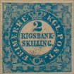
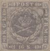
Album Weeds – Finland
The first stamps issued for this country were envelopes only; and it was not till 1856 that adhesives came into use. The earliest envelopes used to be rather puzzling to collectors, not only because of their rarity, but also because it was believed that there were two issues of 1845, the second issue being in reversed colours (i.e., 10 kop., red, instead of black; and 20 kop., black, instead of red). The original stamps of this soi-disant second issue, in the reversed colours, are forgeries. Mr. Breitfuss, who has kindly given me many details, tells me that they were made by a Herr Elb, in Dresden, who sold them as entire envelopes, also cut square; and that he got 50 pounds and more, for each stamp!
The apparently genuine stamps in the reversed colors are fancy reprints. In 1850-60 the belief was almost universal that the so-called “second issue of 1845” existed; and, accordingly, in 1862, Moens ordered the following reprints, on strips of paper, also as tete-beche varieties: 10 kop., black; 10 kop., carmine; 20 kop., carmine; 20 kop., black. Even the Helsingfors postmaster, Herr Griffenberg, of whom M. Moens ordered the supply of reprints, was of the opinion that the reversed colors existed. In 1872, Moens again ordered a supply of reprints (of 1845 and 1850), and, in these second reprints, those of the 1845 set exist only in the proper colors, 10 kop., black, and 20 kop., carmine; in strips, also tete-beche.
1845. Envelopes; 10 k., black; 20 k., red.
Genuine
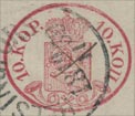
Engraved in colour, on rough laid paper, stamped in the left lower corner of the envelope. The lower arm of the cross, where it rests upon the orb, on the top of the crown, is wedge-shaped, and thicker at the bottom than at the top. The circlet at the base of the crown contains five very long, diamond-shaped jewels, with dots between them; but the jewels are so long, that their points run into the dots. These jewels are not by any means prominent; and at a first glance they look more like a sort of irregular wavy line than a row of jewels. I think this is the easiest test for the genuine. The left upper corner of the shield is quite sharp, but the right upper corner of it is cut off. The left lower corner is nicely rounded; but the right lower corner is cut off somewhat obliquely, instead of being rounded like the other. The outline of the circular bend of the right-hand post-horn is broken, just where it would almost touch the middle of the right-hand side of the shield, if complete. The P of PORTO is nearer to the top of the left-hand post-horn than the L of STEMPEL is to the top of the right-hand post-horn; but the difference is not very marked. The lower ends of both post-horns curl inwards, towards the rounded bottom corners of the shield.
Forged
Lithographed, on very smooth, laid paper, with the laid lines running straight up and down, instead-of obliquely. The lower arm of the cross is the same width as the others, all the way. The circlet at the base of the crown contains five very stumpy diamonds, very far apart, with dots between them; but the diamonds do not touch the dots at all. These diamonds are very distinct, and can be readily seen at a glance. Both the upper corners of the shield are quite sharp, and both the lower corners are nicely rounded. The outline of the ring of the right-hand post-horn is not broken, and it is at some little distance from the outline of the shield. The L of STEMPEL is a good deal nearer the top of the right-hand post-horn than the P of PORTO is to the top of the left-hand post-horn. In nearly all the forgeries, the lower end of the right-hand post-horn points downwards, almost towards the last K of KOPEK.
Bogus Envelopes
10 k., rose, vermilion; 20 k., black, greenish-black.
These, I conclude, are the productions of Elb, of Dresden, of which I have already spoken. They are lithographed, on thick, smooth, laid paper, with the laid lines running straight up and down, or on thinnish, and rather hard, white wove paper. The tests are exactly the same as for the forgeries of the first issue. In the 10 k., there is a queer little tail to the last K of KOPEK, which runs into the stop after that word.
The genuine stamps are usually very badly printed, so that the arms and the lines of shading on the shield are all blotched, and almost undecipherable. The forgeries are a little more clear and distinct.
Postmarks
Genuine.—All the originals that I have seen were cancelled with a pen-and-ink cross, or with a word, or part of a word, written upon them.
Forged. —The forgeries are generally unobliterated; but some of them bear part of a large circle or oval, with unreadable letters.
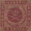
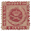
1850. Envelopes; 5, 10, 20 Kopeks.
The stamps of this issue may be known from the very similar ones of 1856, by the fact that the bell-mouths of the post-horns, below the shield, have no balls or pearls in them; whereas in the 1856 issue, each horn has a little white pearl in its mouth.
Mr. Breitfuss says, in one of his letters to me : “All cut specimens of the 1850 issue, 5 kop., blue, and 10 kop., carmine, without pearls in the post-horns, must be considered cut envelopes, even if used as adhesives; and ?iot as a special issue of adhesives without pearls.”
It will be seen that Mr. Breitfuss does not agree with ” L. Hanciau”, in the Monthly Journal for November 30th, 1903, who makes out that the cut specimens of the pearl-less envelopes of 1850 are really a first issue (March, 1856) of adhesives, and that the real adhesive issue with pearls (April, 1856) is a second issue of adhesives.
Genuine
Engraved, in a transverse oval, instead of the upright oval of the issue of 1845; stamped on the flap of the envelope, in the following varieties:
- 5 k., blue, 10 k., rose; both on thin, blue wove paper.
- 5 k., blue, 10 k., rose, 20 k., black, and greenish-black, all on thick, yellowish-white wove paper.
- 20 k., black, and greenish-black, on white laid paper.
This latter 20 k. was the last issued of this set, and did not appear, I believe, until just before the next set, with the pearls in the post-horns, to be hereafter described. The design is much clearer than that of the two issues of 1845.
There are seven five-pointed stars in the shield, and the lines in it are a good deal farther apart than in either the genuine or forged stamps of 1845. The lion’s crown has five distinct rays or points to it. The projection at the base of the shield is rather long and sharp, and it points exactly between the crossed mouthpieces of the post-horns below it. The cross on the top of the large crown has a wedge-shaped base, as before, resting on the orb. There are nine pearls on each of the side-arches of the large crown, and four pearls in the central arch. Issuing from the top of the lower circlet of the crown, there are seven rays something like teeth, as in the last issue, though I did not mention them then, as the forgeries were similarly provided. The jewels in the lower circlet consist of five longish diamonds, tolerably far apart, with no dots between them. In some very darkly-printed copies, I notice that the ground behind some of the diamonds is dark; but usually the jewels are light, on a light ground. The lion holds an uplifted sword in his right front paw, and treads on a short sheath with the other three; the left front paw coming just to the front end of the sheath. Neither of the post-horns touches the shield anywhere. The lettering on the left side is in Finnish, that on the right side is in Russ, the final letter on the right being like two capital I’s joined together at the top. All the stops after the letters and figures are diamond-shaped.
First Forgery
I have seen but one forgery of this set; very poorly done, and not likely to deceive. Very coarsely lithographed, on thick, soft, coarsely-made, white wove paper, showing the marks of the meshes of the canvas 01″ wire-gauze very distinctly. There are only four stars on the shield, and they are six-pointed. The lion’s tail is single, instead of being double like the genuine, and has a star at the end of it, by way of tassel, I suppose. The crown on his head has no rays or points on it, and is very indistinct. The projection at the base of the shield is very short, and points to the left of the center of the crossing of the horns. The cross on the top of the large crown is too large, and very badly shaped; it touches the outline of the frame above it; and the lowest arm is not wedge-shaped. There are eleven pearls on the right arch of the crown, ten on the left arch, and none at all in the central arch. The orb is unshaded, though there ought to be two transverse lines across it. The circlet at the base of the crown is quite plain, and has no jewels upon it; there are no rays issuing from the top of the said circlet. The lion has no sword, and the sheath is so long that it reaches as far as the raised front paw. The middle curl of the right-hand post-horn touches the base of the shield. The final letter of the right-hand inscription is an English capital H; and all the stops are round, or as nearly round as the artist could make them for the money.
Second Forgery
Of this set I have seen only the 5, and the 20 kopeks. They are cleanly lithographed, on very thin, hard, white wove paper. There are eight stars in the shield, one being added just above the lion’s crown, which is not very plain. These stars are mostly four-pointed, though the two in the rounded corners of the base of the shield are five-pointed. The pearls on the side-arches of the crown are so exceedingly small, and so jumbled together, that it is quite impossible to count them, though there seem to be about twelve on the right-hand arch, and thirteen on the left-hand one. The pearls in the central arch are even smaller still. The orb and cross are all on one side, leaning considerably over to the right; this can be seen in an instant, and is an easy test for these forgeries. On each side of the central diamond, in the circlet at the base of the crown, there is a little white St. Andrew’s cross, which, of course, does not appear in the genuine. The stops in the inscription are all round, instead of being diamond-shaped. The word of value on the right-hand side reads KOIL, and has no stop after it; this will suffice, of itself, to condemn this counterfeit. I do not think this set of forgeries is very common. I have only seen one specimen each of the 5 and 20 kop., as mentioned above. They have a German look, but I do not know where they came from.
Postmarks
Genuine.—The genuine stamps are postmarked with a large transverse oblong, containing a Finnish inscription in large capitals, and some are found cancelled with a pen.
Forged.—The forgeries bear part of a large oval, containing lettering.
Reprints
The reprints of this issue (ordered by Moens in 1872) are printed on very hard, very thick, very white wove paper, and look clean and fresh. They are more carefully printed than the originals, and are, of course, always unused.
1856. Envelopes and Adhesives, 5, 10 Kopeks.
There are some slight differences between these stamps and those of the issue just described; but the most noticeable points are, that there is a small white pearl in the open end of each of the post- horns, and a very small pearl underneath the crown, between it and the top of the shield, and somewhat to the left of the center, i.e., just above the face of the lion. The varieties are as follows:
- Envelopes: 5 k., blue, 10 k., rose, both on yellowish-white wove paper
- Envelopes: 5 k., blue, 10 k., rose, both on thick, hard laid paper, with laid lines running obliquely
- Adhesives: 5 k., blue, 10 k , rose, both on stoutish, yellowish-white wove paper.
These adhesives are exactly like the envelopes, and, when the latter are cut, those on the wove paper cannot be distinguished from the adhesives.
 5 Kopeks.
Genuine
Engraving, paper, etc., as before. The lion’s paw holding the sword is only partly shaded, and the point of the upper tail almost touches the bend of the lower one. The pointed base of the shield goes down so low, as to come almost into the angle formed by the crossed mouth-pieces of the horns. The dot between the top of the shield and the base of the crown is tolerably round. Three out of the five diamonds on the circlet at the base of the crown (i.e., the three to the left) have their points drawn out so as to touch; thus all the three are linked together. There are three distinct pearls in the central arch of the crown, and there is some appearance of a fourth, just at the very point of the central ray which touches them; and they and the ray are all joined together. All the stops are very large, and very distinctly diamond-shaped. The pearls in the wide ends of the post-horns are perfectly round, and the left-hand one is a good deal larger than the other. The final letter of the right-hand inscription is, as before, like two capital I’s, with a line running across the top, from one of the uprights to the other. The crown is put exactly midway between the two sides of the shield.
Forged
Lithographed, on white or bluish-white wove paper. The paw of the lion which holds the sword is of absolutely solid colour, and is much the darkest part of the whole of the design on the shield. The point of the upper tail docs not nearly touch the rounded part of the under one; in fact, there is a good space between them. The dot between the top of the shield and the base of the crown is of a very well-marked diamond-shape. The five diamond-shaped jewels on the circlet, at the base of the crown, do not touch each other. There are three small pearls in the central arch of the crown; but they appear to hang down from the orb above them, and do not touch the pointed ray beneath them. Some copies have no stop after the 5 on the left-hand side, and those which have it show the stop rounder and smaller than the others. The pearls in the open ends of the post-horns are anything but round, and both are about the same size. The final letter of the right-hand inscription is formed by two capital I’s, without any line running across, to join their tops together. The crown is slightly nearer to the right-hand side of the shield than to the left-hand side. The pointed base of the shield is very short, and does not go near the angle formed by the crossed mouthpieces of the post-horns.
 10 Kopeks.
Genuine
Engraving, paper, etc., as before. The upper tail of the lion is very wide at the end, and touches the rounded part of the lower one. There are four vertical lines of shading on the arm which holds the sword. The white dot, between the top of the shield and the base of the crown, is diamond-shaped. There are three pearls in the central arch of the crown, indistinct, and far apart. The two sides of this central arch project slightly above the level of the side-arches, but do not stand up higher than the pearls on the said side-arches. The uppermost star, on the left-hand side of the shield, just touches the upper boundary line of the shield; and the uppermost star on the right-hand side very nearly touches the boundary-line above it, in a similar manner. There is a tiny, dark dot to the right of the uppermost star, on the right-hand side of the shield, caused by the vertical line of shading being broken. The point at the base of the shield is like that of the genuine 5 kopeks, and comes down to almost within the angle formed by the crossed mouthpieces of the post-horns. These mouthpieces are of a sort of funnel-shape. The pearls in the large ends of the horns are very small, and the right-hand one is a little the larger of the two. The last letter of the right-hand inscription is, as before, distinctly joined at the top.
Forged
Lithographed, on slightly yellowish, very thin, white wove paper. The upper tail of the lion is not particularly wide at the end, and it does not nearly touch the rounded part of the lower tail. There is one oblique line of shading on the arm which holds the sword. The white dot between the top of the shield and the base of the crown is round. There appear to be four pearls on the central arch of the crown; but I am not quite sure, as they are very indistinct, and very close together. The two sides of this central arch project a great deal too far above the level of the side-arches; in fact, they come up almost as high as the very top of the orb, and far above the level of the pearls on the side-arches. The stars in the upper corners of the shield are at some distance from the out-line of the top of the shield. There is no dot to the right of the right- hand, top star. The point at the base of the shield is like that of the forged 5 kopeks, and does not go near the angle, formed by the crossed mouthpieces of the post-horns; besides which, it is placed too much to the left, instead of being central. The said mouthpieces end in things just like button-mushrooms, instead of being funnel-shaped. The pearls in the large ends of the horns are far too large, being almost as large as those of the genuine and forged 5 kopeks, and the left-hand one is larger than the other. The last letter of the right-hand inscription has no join at the top.
Postmarks
Genuine.—The genuine are very often only pen-stroked; but many copies bear part of a large circle, which contains name and date. I have sometimes seen both these cancellations together on a stamp. Sometimes also a word is written upon the stamp; and I have seen this both on the envelopes and adhesives.
Forged.—The forgeries usually bear a small circle, smaller than the size of the stamp, instead of larger, containing lettering and figures; and some of them are pen-stroked besides.
Reprints
These stamps have been reprinted, on very white, very hard, thick wove paper: the impressions, though very clean and fresh, show a marked deterioration of the dies, and are generally blotchy.
1860.
When the amateur has got thus far in collecting Finland stamps, he usually becomes rather “mixed“ in his ideas; for the varieties are certainly rather puzzling. In the stamps now to be described, there are two different types of the envelopes, one having only seven stars in the shield, the shield itself being shaded with fine vertical lines; and the other having an additional star, just over the lion’s head, and with the lines in the shield far apart. The first type is found, normally, impressed on yellowish-white wove paper; but the authorities, I suppose, found that it would be a pity to waste all the stock of the oval envelopes, and so impressed this new rectangular design upon the old envelopes, in the left-hand upper corner, at the same time cancelling the oval stamp, which had originally been struck on the flap. Thus the present set is found on the thick laid paper of the earlier set, with the laid lines running obliquely; also on the yellowish-white wove paper of which I have just spoken, etc.; but it would take up too much space to attempt to describe each variety, as they have little to do with the detection of counterfeits, so I had better, perhaps, simply give Moens’s list of the double envelopes. Of the seven star type he gives:
- 5 kop., on the 5 kop. of 1850
- 5 kop., on the 10 kop. of 1850
- 5 kop., on the 20 kop. of 1850
Of the eight star type he gives:
- 5 kop., on the 5 kop. of 1850
- 5 kop, on the 10 kop. of 1850
- 10 kop., on the 10 kop. of 1845
- 10 kop., on the 20 kop. of 1845
- 10 kop. on the 5 kop of 1850
As the paper varies in these old envelopes of 1845, etc., it will be, of course, understood that it will naturally vary for these “economy-envelopes” now under discussion; and thus the variety-seeker will have enough to do to fill his pages of Finland. If any argument were needed for the retention of entire envelopes, it would be supplied in the present instance; for it is impossible to show both the stamps unless the whole envelope be kept. But now for the tests of the genuine.

 1860. Type 1, seven stars; 5, 10 kop.
Genuine
Engraved in épargne, on any, or all, of the different kinds of paper hitherto mentioned. The stars in the shield are all small and five-pointed. There seem to be twenty-one lines in the shield, counting them along the extreme base of the shield; but they are difficult to see clearly. The cross on the top of the crown comes almost under the tail of the K above it. The lion has two tails, and a face like that of a monkey. The shield has a thick outline all the way round, except just under the base of the large crown. The lower peak of the shield points to the tail-end of the K below it. There are nine upward-pointing “keys” of the key-pattern in the left-hand frame, and nine downward-pointing “keys” in the right-hand frame. The white lines which define the circlet at the base of the large crown are very much curved upwards in the middle. The orb on the top of the crown, underneath the cross, is very distinct. The final letter of the upper inscription is joined at its top, but not at the bottom; and the two upright lines of the letter are far apart. It will be understood that all these tests serve equally for the 5 and the 10 kop.
Forged
I have only seen the 10 kop. forged, but the tests given above will easily serve to detect the 5 kop., if that value should exist. It is lithographed, on thinnish, white wove paper, rather hard. The stars in the shield are large, flat-looking, and all six-pointed. There are only eighteen lines of shading in the shield. The cross on the top of the crown comes exactly under the straight, commencing-stroke of the K above it. The lion has only one tail, and that has a large tassel at the end of it, instead of the small bulbs at the ends of the tails in the genuine. The lion’s face is something like that of a man, with a pointed beard; but it is not very distinct. The shield has a thick outline only at the base and the right-hand side, and its lower peak points to the first stroke of the K below it. There are only eight upward-pointing “keys” in the left-hand frame, and the same number of downward-pointing “keys” in the right-hand frame. The white lines which define the circlet at the base of the crown are not nearly so curved as in the genuine; in fact, the upper one is almost straight. The orb on the top of the crown is almost invisible. The two perpendicular lines, forming the last letter of the upper inscription, are joined by cross-strokes, both at the top and bottom, and are so close together that they almost run into each other.
1860. Adhesives, 5, 10 kop., seven stars.
Genuine
These are exactly the same as the envelopes just described; but they are printed on toned wove paper, which is very distinctly colored, throughout its substance, and are perforated “en serpentin”. This mode of separation ought rather to be called “roulette,” for there is no portion of the paper removed; but the stamps dovetail, as it were, into each other. I think it is about the very worst mode of separation which could well have been imagined; for any attempt to tear two stamps apart almost invariably results in a much more extensive tear than was intended. It is needless to repeat the tests for this set, as the stamps are exactly the same as the envelopes.
Forged
I have not yet seen any forgeries of these adhesives; but if there should be any, the tests for the genuine envelopes will serve to detect them.
1860. Second type, eight stars, 5, 10 kop.
Genuine
Engraved in épargne, as before, on any, or all, of the papers hitherto mentioned for the envelopes. There are some differences between the two stamps of this set. For instance, the wavy lines outside the central oval are very wide apart in the 5 kop., and very close together in the 10 kop. I will take, however, the points common to both values. The blade of the sword is single. The head of the lion has the same monkey-face as before. The lettering of the two inscriptions is so tall, as to extend to the very top and bottom of the containing-labels. The top figure of value is even further from the K of the inscription, than the bottom figure is from the K following it. The circlet at the base of the crown contains three very distinct, diamond-shaped jewels, and portions of two others. Both the upper corners of the shield are sharp, and the base of the shield does not touch the dotted oval anywhere. There are ninety-two dots in the oval, in the 5 kop., and eighty-four in the 10 kop. There are fourteen vertical lines of shading in the shield of the 5 kop., and seventeen in the shield of the 10 kop., not counting the outlines of the shield itself.
Forged
The counterfeiters have made an adhesive of this, and have not there-by improved its appearance. Lithographed, in a very blotchy way, on thin, white wove paper; pin-perf. 14. I only possess the 10 kop. of this set of forgeries. The blade of the sword is double, so that the lion appears to have two swords in his hand or paw. His head is like that of a goat, with a small, pointed beard, and open mouth. The lettering of the upper and lower inscriptions is far too low and dumpy, so that the figures and letters do not extend nearly to the top and bottom of their containing-labels. The o of the upper 10 almost touches the K immediately following it, but the o of the lower 10 is at a good distance from the K which follows it. The circlet at the base of the crown contains six oblong white dots, not very distinct. The right-hand, upper corner of the shield has been cut off; and the rounded portion of the base of the shield, on the right-hand side, touches the dotted oval, and the similar portion on the left-hand side almost touches it. There are only sixty-four clots in the oval, and no fewer than twenty-five vertical lines of shading in the shield.
Postmarks
Genuine.—In both these issues, the genuine are usually cancelled either with a pen-stroke, or with two lines of capitals, in an oblong frame.
Forged.—The forgeries bear either a set of five parallel bars, or an inscription in an oval, with a very peculiar, thin, wavy outline. The cancellation on the flap design on the “economy-envelopes” is a simple cross, in pen-and-ink.
1866. 8 Pennia, adhesive.
There is, of course, a full set of the genuine, comprising 5, 8, 10, 20, 40 pen., and 1 mark; all, by the way, differing greatly from each other; but I have only met with the 8 pen. forged.
Genuine
Engraved in épargne, as before, on colored, wove or laid paper, very thin serpentine roulette. The lion has the usual monkey-face, and the mouth is shut. There are three distinct, diamond-shaped jewels in the circlet at the base of the crown, and portions of two others. The shield bears twenty vertical lines of shading, counted from the base, and not including the out- lines of the shield itself. There are 105 dots in the oval, and they are all more or less square. The base of the shield is a long way from these dots. The wavy lines outside the oval are ratter coarse, and far apart, so that they show no tendency to run together. The large crown is a long way from the dotted oval.
Forged
This is a fair copy, but the printing is so badly done that it is not likely to deceive in its present state. Lithographed, on thick, bluish-green wove paper; unperforated. The lion has the goat’s face of the last-described forgery, with open mouth and pointed beard. There are eight oblong blotches in the circlet at the base of the crown, and several of these blotches run together. The shield bears about twenty-seven lines of shading, but they are very much blotched, and difficult to count. The oval has only sixty-four dots, and most of them are round, instead of square. The rounded base of the shield, at the right-hand side, touches the dots, and the left-hand side of the shield almost touches them also. The crown comes very close to the dots; indeed, it almost touches them on the left-hand side. The wavy lines, outside the oval, are very fine and close together, so that they almost touch each other.
Postmarks
Genuine.—The genuine stamps are usually cancelled with a rough circle, containing name and date.
Forged.—The forgeries bear the five parallel bars as before.
N.B. — The description given above will only serve for the 8 pennia; for, as I have said, the different values vary greatly, each being separately engraved.
Bogus Perforation
1877, etc. 1 mark, lilac.
This stamp is found perf. 11 or 12 1/2, or 11 x 12 1/2 according to date. The Timbre-Poste, in 1896, described a bogus stamp, manufactured out of an imperforate proof or essay, having serpetitine perfs.
I have not seen this fraud, but understand that the serpentine perf. on three sides does not agree with the gauge of the old serpentine perf. of Finland, and that the cancellation is of some unknown type. My readers will therefore understand that any 1 mark, lilac, with serpentine perfs., that may be offered to them, is bogus.
From: ‘Album Weeds’, 3rd edition by R. B. Eareé. 1906