Spud Papers – Sardinia
 1851. 5 & 4O Centesimi.
This issue consists, as everybody knows, of a set of three stamps, 5, 20, and 40 centesimi; but I have only seen forgeries of the first and last. The 20 C. is common, and I suppose the forgers did not think it worth their while to imitate it. The genuine stamps are lithographed, as well as the forgeries, but I do not consider the latter to be much of a success. However, our readers must judge for themselves.
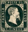
5 C. Genuine
Lithographed in black, on yellowish white paper. Every C in the inscriptions has very square corners, which makes it look more like an E without the central tongue. The king appears to have got the mange, or some other similar disease, for his hair is all coming off in patches, and is cropped very close. The eye is very faintly indicated. The beard points very much forward, and comes down level with the middle of the final letter of BOLLO. There is a hyphen between POSTE and 05. The o does not appear to be larger than the 5. There is a very distinct border of pearls round the outside of the stamp. The line of shading- on the bust, which marks the spring of the shoulder, scarcely curves up at all, and follows almost exactly, the outline of the base of the neck. There is a small ornamental fleur- de-lis in each corner, in a sort of square. The spandrels in the corners are very difficult to describe, but they are quite different from those of the forgeries. The colour of the stamp is a dull, greasy-looking black.
5 C. Forged
Lithographed in intense black, on very white paper. The C’s in the inscriptions are all different, but they are all more or less properly shaped. The king’s hair is long and wavy, though there is a white patch at the back of his head. The eye and eyebrow are strongly marked. The beard is short, and hangs downward, not coming lower than the last L of BOLLO. There is no hyphen between POSTE and 05. The o looks larger than the 5. There is an indistinct and irregular border of dots round the outside of the stamp, which does duty for the pearl border of the originals. The line of shading near the bottom of the neck is very much arched; and, towards the back of the neck, it is at some distance from the outline of the base. The fleurs-de-lis in the corners are not very plain; and the bottom ones might, at a first glance, be taken for crosses pattee. The thyroid cartilage (“Adam’s apple”) in the throat is not visible, whereas it is well developed in the genuine stamps, both 5 C. and 40 C.
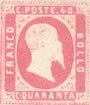
40 C. Genuine
Lithographed in rose-pink, on yellowish white paper. This stamp is very similar to the 5 C., and I shall therefore only describe the points where it differs, referring the reader to the 5 C. for the rest. The hair is of a medium length, and curly. There is some very light shading on the right shoulder. The mustache is very heavy, and the upward curl of the nostril is well marked. The tail of the Q in QUARANTA is a straight down-stroke. The 4 of 40 is at some distance from the O. In both the 5 C. and 40 C., the top fleurs-de-lis almost touch the corners of the inner frame, C’s, as in 5 C.; hyphen, iptto; pearls, ditto; spandrels, ditto; beard, ditto.
40 C. Forged
Lithographed in dull chalky pink, on white paper, C of FRANCO rather square, but the others properly shaped. No hyphen between POSTE and 40. Hair much too light. Back of neck darkly shaded, but no shading on the shoulder. The line of shoulder curved as in forged 5 C. Mustache and beard as in forged 5 C. Pearls, ditto. The top fleurs-de-lis are not near the corners of inner frame. Tail of Q in QUARANTA slopes away to the right. Eye very large and staring. No upward curl in nostril. Printed in sheets of 25, 5 x 5 , and postmarked with one of the old Spanish marks, i.e., an oval containing 6 straight bars. The first two stamps in the top row are printed upside down.
From “The Spud Papers” by Atless, Pemberton & Earée, 1871-1881.
![]() See also —> Fournier forged cancellations of Sardinia
See also —> Fournier forged cancellations of Sardinia


Leave a Reply
Want to join the discussion?Feel free to contribute!