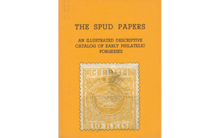
Spud Papers – Sâo Tomé & Principe
 1870. 5, 10, 20, 25, 50 & 100 Reis.
These stamps are very nicely designed and printed, but the forgers have succeeded tolerably well in their imitations of them. The originals seem to be all from the same matrix, though the 5 Reis may possibly be a different type.
Genuine
Engraved in epargne (typograph) on moderately stout surfaced white paper; perf. 13. The little pearls in the circle round the crown are all strung together, and are 122 in number. The accent over the E of THOME is quite visible in all the values, but the one over the E of PRINCIPE can only be seen in the 5 reis. The line under CORREIO goes quite to the boundary-line of the stamp on each side; as does also the line above the value. A straight line drawn upwards through the crown and through the cross on the top of it, would just miss the E of name. The body of the 1 of REIS is perfectly straight between the top and bottom cross-strokes. Above the NC of PRINCIPE, and in the three corresponding corners, there are two little circles formed by curls in the spandrels. Each of these circles contains a tiny quatrefoil, with an open dot in the center of it. The little white space in the center of each o of CORREIO is an oval. The letters of the name are in very thin ornamental type. I have not seen any used copies, so I cannot say what is the ordinary postmark. I have had several sets from Portugal, but they were invariably unused. The gum is brownish.
Forged
Lithographed on thinnish unsurfaced paper, ungummed; perf. 13.
5 Reis.—I am obliged to take this value separately, as it is different from the others. It may be known from the genuine 5 R. by the following tests:
- The letters of CORREIO are too tall, and some of them touch (or almost touch) the outline at the top
- The line under CORREIO touches the boundary-line on both sides of the stamp, and the line above the value touches on the left side only.
- The right-hand end of the Etruscan ornament in the circle points towards the E of PRINCIPE instead of outwards.
- The little ornaments in the corners are wrong; all the ends pointing one way, instead of all pointing inwards as the genuine ones do.
- The pearls are much too small, and are separate.
10, 20, 25, 50 & 100 Reis.—All these are from one matrix, which is distinct from that of the 5 R. The little pearls in the circle round the crown are all separate from each other, and there are only 98 of them. In some copies there is no accent to be seen at all, and in others (20 and 25 reis) it is over the separate letter E instead of the E of THOME. The lines under CORREIO and above the value do not touch the outer boundary-line on either side. A straight line drawn upwards through the center of the crown and of the cross on the top of it, would pass between the E and P. The body of tile 1 of REIS widens out at top and bottom where it meets the transverse strokes. The circles above NC of PRINCIPE, and in the other three corresponding corners, have no ornament in them. The little white space in the center of each 0 of CORREIO is a rectangle. The letters of the name are much too thick, and are very clumsy. The postmark is like our own, but minus the central figures.
From “The Spud Papers” by Atless, Pemberton & Earée, 1871-1881.


Leave a Reply
Want to join the discussion?Feel free to contribute!