
Spud Papers – Romania
First Type. Head to right.
Only one die was engraved for the genuine 2 Parale; and the only differences discernible in the 5 Parale, are in the size and position of the figures in angles. Two dies are found of the highest value; the variations are but slight, and only noticeable by comparison. In one die the inscription might be read as PRANCO, which is due to one of the dots in the lattice-work ground coming between the two “fangs” of the F. We may as well state in this place, that the colour of the forgeries is no guide to their detection, as they are printed in numerous shades.
 2 Parale
Genuine
Inscription DOUA PARALE is easily readable. In the portrait the hair is very close to the oval. The final letter of FRANCO is rather smaller than the others, but well shaped.
Forged
The inscription above is very indistinct, and reads more like BODAPIOME than anything else. The head is much too small; the o in FRANCO is flat-bottomed.
 5 Parale
Genuine
The inscriptions are well defined, and all the figures are well matched, upright, and evenly formed.
Forged
All the lettering is badly formed, and the lattice-work ground is too strongly marked. Three out of the four 5’s look as if they had been sat upon,—they are so flattened. There is a little white speck (not found in the genuine) at the extremity of the hair upon the forehead.
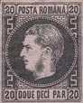
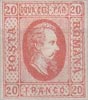 20 Parale
Genuine
The figures are pretty much of one size. The 2 in the top left-hand square touches the frame. The inscription DOUA DECI PAR. is moderately distinct; so much so, that it can be read. The expression of the face is sensible, and the nose is pointed.
Forged
This is an extra good facsimile, but the prominent failing is in the figures of value, all being too large and tall. The top of the 2 in the left-hand upper corner almost touches the frame. The upper inscription is not decipherable, and the head of the sovereign is narrow and elongated, the face having the “sheepish” expression which is common to all three values.
Second Type. 1866. Head to left, coloured paper.
The same head was used for the trio, but the number of pearls surrounding the disc varied in each value. There are also other minor differences, and of the highest value there are two dies.

 2 and 5 Par.
Genuine
The head is evenly fixed in the circle. The Grecian pattern is thin and pretty even throughout. At the top of the left-hand lower device there is a very short stroke, considerably less in length than the bottom horizontal line of the said pattern.
Forged
These two values are from one matrix. The head is not placed in an upright position, but slants towards the left. The Grecian pattern in the border on the right-hand side is thicker than on the left, and is also coarse and heavy-looking. The bordering in the left-hand lower portion of the forgeries differs from the genuine in the following respects: that portion of the top of the design which runs towards the central disc, is almost as long as the similar line running parallel with it at the bottom.
 20 Par.
Genuine
Not badly engraved, with all the letters even and distinct. In one die the tail of the R in PAR is almost straight, in the other it slants towards the border. There are also marked differences in the position of the Grecian border.
Forged
Very coarsely executed in comparison with the lower values. The two A’S in ROMANA are much below the other letters. The Grecian pattern is of like character with the previously described shams.
Third Type. 1868-69. Head to left, white paper.
For each value of the genuine stamps two dies have been used. The discrepancies are not very apparent under a casual examination, but on closer inspection the differences will be plainly recognized. The framework is identical in all four values, and in each stamp upon every sheet, but the head in one die is at some little distance from the beaded circle, whilst in the other it comes very close to it,—but not touching. The lettering has evidently been added after the execution of the original matrix, as in one die the final letter of ROMANA is farther apart from the corner square than in its companion die. The figures also slightly vary. Some of the 2 bani have a small circular flaw under POSTA.

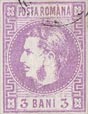

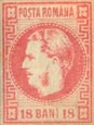 2, 3, 4 and 18 Bani.
Genuine
All the letters are tall and pointed. There is a dot over the 1 in value; not very perceptible on some copies, but still existing. The two border lines are so close together, that it would be impossible to place another line of the same thickness between them.
Forged
The facsimiles are all from one matrix, the figures only being afterwards added; so the description of the primary differences will apply equally to the quartet.
All the lettering is “flat” (i.e., not upright, and narrow). There is no dot over the 1 in BANI. The two thin perpendicular lines running up by the border upon each side are wide enough apart to admit of another line being ruled between them.
Fourth Type. 1869. “Posta Romana” at sides.
All the values are from one matrix. There is a leading point in the genuine, which is of course common to each value, and in which respect the facsimiles fail.
Upon the genuine the word POSTA is placed equally between the border and the oval, whereas in the forgery it is conspicuously nearer the former than the latter.
 10 Bani.
Genuine
There is no mentionable foot-stroke to the final letter in BANI.
Forged
The 1 in Bani is the same below as at top.
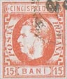 15 Bani.
Genuine
CINCIS PREDECE is in thin upright letters, all of one form. There is a small semi-circle over and under PR.
Forged
Cincis is in thicker type than PRE DECE (printed as two words.) There is no break in the lines above and below the just-quoted inscription.
 25 Bani.
Genuine
Lettering denoting value is thin and elongated; filling the band prepared for it. Above the C in DECI there is a slight break in the border, but no ” excrescence.”
Forged
The upper portion is composed of letters which leave a well- defined space between the lines enclosing them. Above and below the c in DECI is a small, but prominent wedge-shaped figure.
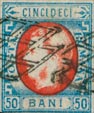 50 Bani.
Genuine
The denomination of value may easily be mistaken for a single word. The dot in lower line comes a little to the right of the final 1 in CINCI.
Forged
There is sufficient space between CINCI and DECI to leave no doubt as to their being separate words. There is a small dot (formed by the breaking of the line) between the last c and 1 below CINCI.
We have not yet seen any forgery of the 5 BANI of our fourth type, or of the PERIODICI impression; but if not already in the market, they probably soon will be.
From “The Spud Papers” by Atless, Pemberton & Earée, 1871-1881.
![]() For more information about the issues of 1865-1872, see —> Dan N. Dobrescu’s exhibition
For more information about the issues of 1865-1872, see —> Dan N. Dobrescu’s exhibition
For more information about the issues of 1872-1889, see —> Paul Hirsch’s exhibition

Leave a Reply
Want to join the discussion?Feel free to contribute!