Album Weeds – Baden

 1 Kreuzer, black on buff, 1851; black on white, 1853.
Genuine
Engraved in épargne, on buff (1851) or white wove paper (1853); imperf. The “F” of “Freimarke” does not touch the line above it. The right-hand inscription is “Vertrag v. 6. April 1850.” The oblique side- stroke, at the top left-hand side of the central numeral, is thin, tapering, slightly curved outwards, and appears naturally to belong to the numeral. There are six horizontal rows of small, pear-shaped ovals in the back- ground of the central circle, formed by and among the wavy lines. These pear-shaped ovals have the small ends uppermost. The stop after the I is not abnormally large ; it does not touch the numeral, and lies between two of the horizontal rows of ovals.
In all the stamps of this design, the engraver has introduced a secret mark, in the shape of a little dot. The position is rather difficult to describe without a diagram. The inner border of the circle round the central numeral is a set of crescent-shaped lines, and, outside these crescents, there is a circle of black triangles, joined at their points, forming black scallops. The secret mark in this 1 kr. is a white dot in the inner edge of the black triangle which is opposite to the left lower corner, i.e., the third from the bottom. Nobody would take this for anything but a flaw.
Forged
Lithographed, in black, on brown, or on white wove paper. The “F” of “Freimarke” touches the line above it. The right-hand inscription is “Vertrag d. 6 April 1850.” The oblique side-stroke to the left-hand of the top of the central numeral is straight, much too thick, not tapered, and does not seem to belong to the numeral. There are seven rows of (not pear-shaped) ovals in the background of the central circle. The stop after the numeral is abnormally large ; it touches the numeral, and exactly obliterates one of the little ovals. There is no secret mark.

 6 kr., black on green, 1851; 6 kr., black on yellow, 1853.
Genuine
Engraved as before, on green (1851) or yellow wove paper (1853); moderately stout The thin line of the frame above BADEN is as thin as the line below that word, and is not ragged. The “F” of ”Freimarke” does not touch the line above it. The left-hand inscription reads “Deutsch = Oestr. Postverein,” with a sort of very short double hyphen, close to the “Deutsch,” a full-stop after “Oestr,” and another after “Postverein” ; the latter stop almost touches the “n” before it. The right-hand inscription is “Vertrag v. 6. April 1850.” In each corner of the stamp there is an heraldic rose, the centre of which forms a sort of star of four points, with blank centre. Most of the points of these four stars are long enough to touch the turned-over edges of the petals of the roses. The stop after the “6” is round. The background of the central circle is composed of pairs of interlaced or crossing’, wavy horizontal lines. The light scalloped line round the central circle is much thinner than the light ring surrounding it.
The secret mark, in this value, is a dot, the color of the paper, in the edge of the black triangle opposite to the right lower corner, i.e., the third from the bottom to the right.
Forged
Lithographed, on rather thin, green or yellow wove paper. The green is decidedly blue-green ; very different from the yellow-green of the genuine. The inner line of the frame above BADEN is considerably thicker than the line immediately below that word, and it is very ragged. The ” F ” of ” Freimarke” touches the line above it. The dot to the “i” of “Freimarke” is like a comma, instead of being diamond-shaped, and it touches the “i.” The left-hand inscription is “Deutsch: Oestr Postverern,” with a very small colon, nearer to ” Oestr” than to ” Deutsch,” and the stop after “Postverern” is at a considerable distance from the “n.” The right-hand inscription is, “Vertrag v 6 April 1850” (sometimes “1350”), with no stops except after “1850.” The black stars in the center of the four heraldic roses in the corners of the stamp have very blunt points, very short, and hardly any of them long enough to touch the turned-over rims of the petals of the roses. The stop after the “6” is very shapeless. The background of the central circle is composed of pairs of straight, oblique lines in a sort of lattice-work, running down from left to right, and from right to left. The scalloped line round the central numeral is much thicker than the ring outside it.
There is no secret mark. I have no forgeries of the 3 and 9 kr., but I might mention that the secret mark of the 3 kr. is a light dot in the edge of the top triangle, under the D of BADEN ; and, in the 9 kr., it is the same as in the 6 kr.
Postmarks
Genuine.—5
Forged.—Four concentric circles of equal thickness, and without numeral in the centre.
Most of the unused copies of this issue now to be had are reprints; unused originals are not common.
1861. 1, 3, 6, 9 kr. Perf. 13 1/2.


 These are the first perforated set, with the central square shaded with horizontal lines. I have the 9 kr. of one type of forgery and the 1 kr. of another type. It is very possible that a full set exists of each type.
Genuine
Engraved in épargne, on thin, white wove paper ; perforated 13 1/2. The band which passes obliquely across the shield contains eighteen vertical, colored lines. The upper outline of this band is distinctly darker and somewhat thicker than the corresponding lower outline. All the dots of color on the shield are of a good size, very distinct, and regularly placed. The space each side of the central arch of the crown is dark and solid, so that none of the lines of the background can be seen through either. The cross at the top of the crown reaches up to the third of the horizontal lines of the background, counting from the top. The central leaf below the shield has its end-lobe hardly at all projecting beyond the side-lobes, and this end-lobe touches the third of the horizontal lines of the background, counting from the bottom. In the word BADEN, all the different strokes of the letters of the word are of the same width, and the lower limb of the E is only very slightly longer than the upper limb.
First Forgery
Rather well lithographed, on stout, white wove paper; perforated 13 1/2, like the genuine, but not so cleanly cut. The band which passes obliquely across the shield contains seventeen vertical dark lines. The upper outline of this band is not more prominent than the lower one. The colored dots on the shield are very faint, inconspicuous, small, and irregularly placed. The space each side of the central arch of the crown is light in color, and allows several of the horizontal lines of the background to be seen through it. The cross at the top of the crown reaches up to the second horizontal line of the background, counting from the top. The central leaf, below the bottom of the shield, has its lower lobe projecting far below the side-lobes ; it reaches to the second horizontal line of the background, counting from the bottom. In the word BADEN, the left-hand stroke of the A, the horizontal strokes of the E, and the first stroke of the N are all palpably narrower than the rest; this is very easily seen in the A, both of whose limbs ought to be of the same width. The lower limb of the E of this word is abnormally longer than the upper one. The ornaments in the corners are very different from those of the genuine, but it would be impossible to explain the differences without an illustration.
Second Forgery
I have only the 1 kr., black on yellow. This is a hideous thing, and not at all likely to deceive. Coarsely lithographed in black, on yellow wove paper, unperforated. There are twenty scratchy, crooked, and imperfect vertical lines on the oblique band across the shield. The upper outline of this band is very much thicker than the lower one in parts, but is very irregular. The dots of black on the shield are placed fairly regularly, but some of them are much smaller than others. The crown is covered by the postmark, but, as far as I can discern, it is of a quite different design from that of the genuine. As far as I can make out, the central lobe of the leaf, below the shield, touches the outline of the bottom label, above the end of the E of KREUZER. The top and bottom limbs of the E of BADEN are of equal length.
Third Forgery
This is, if possible, worse than the last. I have only the 1 kr., vermilion on yellow. Badly lithographed, on very rough, pale dull yellow wove paper, unperforated. There are only twelve vertical lines on the oblique band across the shield. Both outlines of the band are of equal thickness. The black dots on the shield are irregular, and, in my specimen, many of those in the lower half of the shield are missing. The crown is covered by the postmark, so I am unable to describe it, but there seems to be a ball on the top of it, instead of a cross. The background at the top is composed of very wavy horizontal lines, and at the bottom it is formed by rows of long black diamonds. The center-lobe of the leaf, below the shield, projects below the side-lobes, so as to very nearly touch the outline of the label below it. The bottom limb of the E of BADEN is too thin. The corner-ornaments in this counterfeit are exceedingly unlike the genuine ; and the one in the left top corner is a mere caricature of the original design.
Postmarks
Genuine.—5 ; the outer and inner circles are usually a little thicker than the others; also 1, 29, 71.
Forged.—Five concentric circles, the outer and inner ones very much thicker than the rest, and without numeral in center.
1862-64. 3 kr. Perf. 13 1/2. 1, 3, 6, 9, 18, 30 kr. Perf. 10.


These stamps are of the same design as those just described, except that the central square behind the arms is plain white, instead of being filled in with horizontal lines. The 3 kr., perforated 13 1/2, is rare, as only 2,000 sheets were printed, before the gauge of the perforation was altered to 10.
Genuine
Engraved in épargne, on white wove paper ; perforated 13 1/2 or 10, as above. The right-hand griffin, supporting the shield, has eleven feathers in its wings, but there are only ten feathers in the wings of the left-hand griffin. The crown has five arches, containing pearls ; and, beginning from the left outer arch, the pearls are 7, 5, 3, 7, 8. They are tolerably easy to count. The dark space, each side of the central arch of the crown, is filled with closely-set horizontal lines, which look solid in some copies. There are eighteen vertical lines in the oblique band across the shield. The dots on the shield are very distinct, and placed in regular rows. The cross on the top of the crown is very nearly under the centre of the D of BADEN. The two spiral curls, on the inner ends of the two ribbons on which the two griffins stand, are exactly alike; except, of course, that they curl different ways. In the word POSTVEREIN, the top and bottom limbs of each E are of equal length; and, if a line be drawn along the center of the tongue of the first E, through the centre of the tongue of the second E, it will cut exactly through the center of the R between them. The centers of the RKE of FREIMARKE are all exactly in one line; and the upright stroke of the K only just touches the joined oblique strokes.
First Forgery
Of this I have the 3, 18, and 30 kr. Lithographed, on white wove paper; badly perforated 11 1/2 or sometimes 12. There are twelve feathers in the wings of the right-hand griffin and ten” in the wings of the left hand one. The arches on the crown are confused and uncountable; only the two each side of the central one have pearls. These pearls are in the places occupied by the dark spaces of the genuine. There are only fourteen vertical lines in the oblique band across the shield. The dots on the shield are indistinct, and irregularly placed. The cross on the top of the crown is a good deal to the right of the center of the D of BADEN.
Second Forgery
Of this I have only the 3 kr. Lithographed, on thin, white wove paper, perforated 13 1/2, very nicely. There are eleven feathers in the wing of the right-hand griffin, and eleven also in the wing of the left- hand one. There are five arches with pearls on the crown, as in the genuine ; but the numbers of the pearls, beginning with the left-hand arch of the crown, are 9, 7, 3, 5, and 7; and the spaces each side of the central arches are quite solid, instead of being filled with horizontal lines. The cross on the top of the crown is quite under the right-hand stroke of the D of BADEN. There are seventeen vertical lines in the oblique band across the shield. The dots on the shield are very faint, but placed pretty regularly.
Third Forgery
This is the worst of the lot, and hardly worthy of a place in this book. Typographed in black, on rough, rather thin grey paper, unperforated, and colored on the face by hand. (My copy is colored bright Prussian blue !) I have only the 18 kr. The wings of the right-hand griffin show only nine feathers and a stump, and I fancy there are only eight in the wings of the left-hand griffin, but the postmark covers this part, so I am not sure. The heads of these animals are not in the least like eagles’ heads, and their crowns are exactly like the small crown watermark of the first English id. and 2d. stamps. The crown on the shield has six arches, formed of solid black lines without any pearls, and with blank spaces between. There are only eleven vertical lines in the oblique band across the shield, and nearly all the dots on the shield are absent. I do not think any further tests are needed ; though I may add that the corner-ornaments are four-petalled flowers, containing a black upright cross, with a white dot in the center of each cross.
Fourth Forgery. 18 Kreuzer.
This is a very excellent production ; and quite new, I believe. Nicely engraved, in épargne, on yellowish-white wove paper, somewhat thicker and smoother than that of the genuine; perf. 10. The spiral curl on the right side is not exactly like that on the left; having, apparently, half a twist more. The upper limb of each E of POSTVEREIN is decidedly longer than the lower limb ; and a straight line joining the tongues of the two letters would cut through the R a little above its center. The center of the K of FREIMARKE is somewhat lower than the centers of the R and E each side of it; and the oblique strokes of the said K are firmly joined to the vertical stroke, instead of just touching it. Beyond these slight differences, the stamp seems to be a facsimile of the genuine ; though the postmark may possibly hide a few others. The lines and dots on the shield are exactly copied.
Postmarks
Genuine.—5, 6.
Forged.—1, 5.


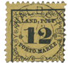 Issue of 1862. “Land-post.”
1, 3, 12 Kreuzer, black on yellow.
These were rural stamps, for a messenger service, to connect the rural villages that had no post office with the nearest State post office, something like the Russian locals. The Land-post also conveyed letters and parcels between the villages, and was used to collect the delivery-charges on parcels, etc. The post was established in 1859, but stamps were first issued in 1862. The stamps were not sold to the public, but used only by the officials. When the Baden stamps were sold in 1872, Goldner, of Hamburg, bought nearly a million of these Land-post labels. I give these details from Mr. Westoby’s book, as so many collectors have the very vaguest ideas as to the use and meaning of these stamps.
1 Kreuzer. Genuine
Typographed, in black, on orange-yellow wove paper ; machine-perforated 10. The N of LAND is nicely shaped. The O of POST and each 0 of PORTO are block letters; i.e., with the black outline the same thickness all the way round. The S of POST is nicely shaped. The M of MARKE is almost perfectly upright. It is a block letter, with thefirst and last upright strokes of equal thickness. The letters of MARKE do not follow a perfect curve; i.e., suppose a perfect arc of a circle to be drawn from the left lower corner of the M to the right lower corner of the E, then the right lower corner of the M would come too low, and the left lower corner of the E would be too high. There is a horizontal line in the ornamental border, above the D-P of LAND-POST, and a similar one under the O-M of PORTO-MARKE. These lines are only very slightly wavy. The two little leaves, to the right and left of the middle of the numeral of value, do not touch the horizontal, pyramid-shaped stalks from which they are supposed to spring, although each leaf has a tiny bit of stalk projecting from its base. The horizontal stroke at the foot of the numeral extends from very nearly the left top corner of the T of PORTO to nearly the middle of the R of MARKE.
1 Kreuzer. Forged
Nicely typographed, on pale, primrose-yellow wove paper, cleanly machine-perforated 9. The right-hand upstroke of the N of LAND stands out too far from the oblique stroke. The black outline of each o is thinner at the top and bottom than at the sides, as is usual in Roman type. The M of MARKE slopes over to the left, and its first stroke is much thinner than the last stroke. The bottoms of the letters of MARKE follow a perfect curve. The horizontal lines, respectively above D – P of LAND-POST and below O-M of PORTO-MARKE, are very wavy. The leaves to the right and left of the numeral are joined to the horizontal, pyramid-shaped stalks issuing from the border. The horizontal foot-stroke of the numeral extends from the middle of the T of PORTO to the beginning of the R of MARKE.
3 Kreuzer. Genuine
Typographed, the paper and perforation the same as in the genuine 1 kr. The N of LAND somewhat squeezed up, and a little taller than the letters each side of it. The S is nicely shaped. Each 0 is a block letter. The M of MARKE has its first and last strokes of equal thickness. The horizontal lines at the top and bottom of the stamp are very slightly wavy. The two leaves do not touch the pyramid-shaped stalks. The bottom limb of the 3 is not much larger than the top limb. There are nice, square-ended head- and foot-strokes to the letters of the inscription. The black frame round the stamp is barely half a millimeter broad. Nearly all the different curls of the ornaments inside the frame all round are separated more or less distinctly from each other.
3 Kreuzer. First Forgery
Nicely typographed, on pale, primrose-yellow wove paper, cleanly machine-perforated 9. The bottom limb of the 3 is decidedly larger than the top limb. The other tests are the same as those for the forgery of the 1 kr. just described. I have not seen the 12 kr. of this type of forgery, but it doubtless exists; and the tests for the 1 kr. will be sufficient to identify it, should any of my readers possess it.
3 Kreuzer. Second Forgery
Lithographed, on yellow wove paper, which is not such an orange-yellow as the genuine, but not such a pale primrose-yellow as that of the forgery last described; and badly pin-perforated 12. The N of LAND is a wide or “extended” letter, and exactly the same height as the letters each side of it. The top tongue or kern of the S of POST is wanting, and the letter is not a nice shape. Each O of the inscription is a Roman letter. The first stroke of the M of MARKE is much thinner than the last stroke. The horizontal lines at the top and bottom of the stamp are coarsely wavy. The leaves are joined to the pyramids. The bottom limb of the 3 is much larger than the top limb; this may best be seen by holding the stamp upside-down. The head-stroke of the P of PORTO is nice and square, but none of the others are, although they ought to be. The frame of the stamp is more than three-quarters of a millimeter broad; i.e., very nearly double the breadth of the genuine. Most of the ornamental curls round the stamp are joined together. This is a poor forgery, compared with that of the 1 kr., the latter being dangerous.
12 Kreuzer. Genuine
Typographed, the paper and perforation the same as in the genuine 1 and 3 kr. There is a short, thick hyphen between the D and P of LAND-POST, and it is nearer to the D than to the P. The bottom-stroke of the 1 of 12 extends from the middle of the O of PORTO to the middle of the hyphen after that word. The horizontal wavy stroke below O-M of PORTO-MARKE touches the curls each side of it, and extends from the end of the O to beyond the middle of the M. All the other tests are the same as in the genuine 3 kr.
12 Kreuzer. Forged
Lithographed, the paper the same as in the forged 3 kr. My only copy is cut close, but is probably badly pin-perforated 12, like the forged 3 kr. There is a longish hyphen between the words LAND-POST, and this hyphen is nearer to the P than to the D. The bottom-stroke of the 1 of 12 extends from the top left corner of the R of PORTO to the beginning of the hyphen after that word. The horizontal, wavy stroke under the O-M does not touch either of the curly ornaments each side of it, and extends from the beginning of the hyphen to the middle of the M of MARKE.
Postmarks
Genuine.—Postmarked stamps of this issue are decidedly rare, though they are common enough unused. The most usual cancellation is something like 14; there is also to be found an oval postmark, bearing the names of the local receiving-office and the State office with which it was connected.
Forged.—1, 5. Also one similar to 29.
From: ‘Album Weeds’, 3rd edition by R. B. Eareé. 1906


Leave a Reply
Want to join the discussion?Feel free to contribute!